Turnkey Enterprise Academy | Free Website Template | Rocket
Franchify is a launch-ready franchise training landing page template built for franchise training providers who need to convert skeptical visitors into qualified leads. It uses a split-screen, 50/50 layout with a network-effect scroll structure, a logo bar header, and a single click-through goal: driving visitors to a full program breakdown page. No forms, no friction, just compounding proof.
by Rocket studio
Quick summary
Franchify is a single-page, split-screen landing page template built specifically for franchise training providers. It opens with a scrolling logo bar showing recognizable franchise brand names, layers in video testimonials, cohort metrics, and a regional map, then closes with a full-width call-to-action panel. Every design decision focuses on one goal: earning enough trust that clicking "See the Full Training System" feels obvious.
Who this template is for
This template is built for professionals who need a high-credibility franchise website that converts visitors without asking them to fill out a long form. The target audience is specific, and the layout speaks directly to each group.
- Multi-unit operators scaling a fifth location and onboarding a manager who has never run a register before
- Emerging franchisors who just sold their first territory and need a training system that looks as polished as the franchise brand itself
- Corporate learning and development teams converting company-owned stores into franchise locations
What problem this template solves
Franchise training providers often struggle to communicate scale and credibility quickly. Visitors arrive skeptical, unsure whether the platform serves serious franchise business operators or just sells generic courses. The page solves this by leading with proof, not promises.
- Visitors leave before understanding the program because the current website buries credentials below the fold
- Emerging franchisors and multi-unit operators need to see that the system works at real scale before they commit to learning more
- A generic landing page fails to support franchisees by communicating the specific operational depth the program delivers
What you get with this template
Franchify gives you a fully structured, single-page layout ready to customize and launch. Every section is pre-designed to a specific purpose, so your marketing team can move from brief to live page without rebuilding the architecture from scratch.
- A five-section page with a logo bar hero, three split-screen content sections, and a full-width closing call-to-action panel
- A Startup Velocity visual system with pre-set colors, typography choices, and animation cues that reflect a high-energy franchise brand
- A sticky bottom bar that appears after the third scroll and keeps the primary call-to-action visible without interrupting the reading experience
Feature list
This template is built around a tight set of features, each tied directly to the conversion goal and the franchise training use case.
Scrolling Logo Bar Hero
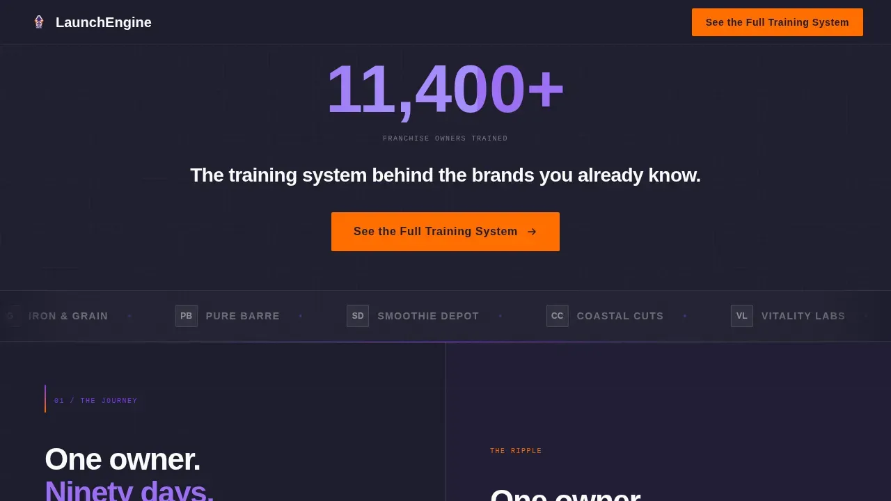
The header opens with a horizontal marquee ticker displaying franchise brand logos in clean monochrome against a deep charcoal background. Above the ticker, an oversized stat in electric violet reads "11,400+ franchise owners trained." Below it, a single white headline completes the social proof block. The hero section communicates immediate value through authority signals before a visitor reads a single word of copy.
Split-Screen Network Effect Layout
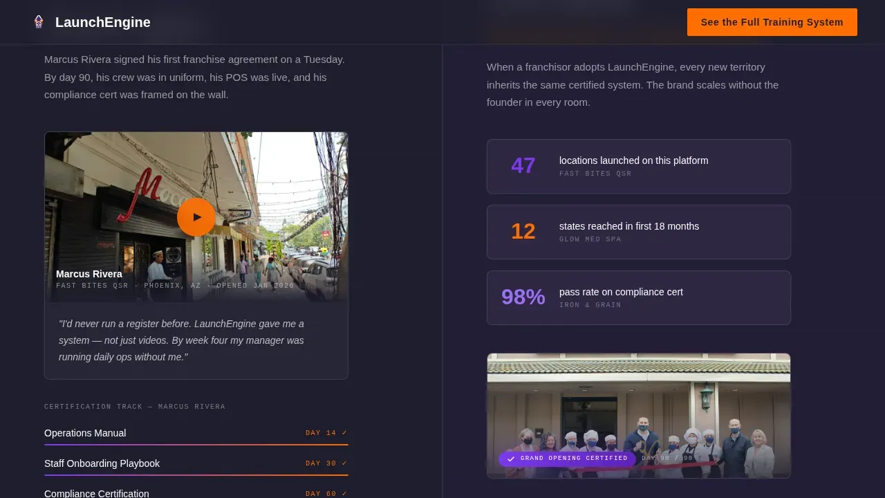
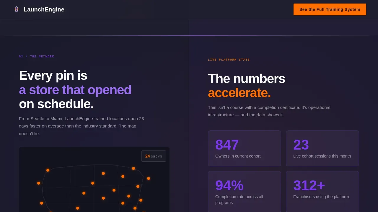
Each of the three middle sections uses a strict 50/50 split. The left panel shows a single franchisee's journey: a video testimonial card, a certification badge, and an opening-day photo. The right panel shows the ripple effect: how many franchise locations that brand launched using the platform, plus a mini-map of regional pins. Section by section, one owner becomes ten becomes a hundred, giving visitors a visceral sense of infrastructure rather than just a course.
Scroll-Linked Animation System
Panels load in sequence as visitors scroll. Count-up numbers tick upward, the regional map grows denser with pins, and beam animations connect data points across the screen. These scroll-linked reveals are driven by IntersectionObserver logic, so each new section feels like a live system activating, not a static page loading.
Sticky Bottom Call-to-Action Bar
After the third scroll, a persistent bottom bar appears carrying the primary call-to-action button: "See the Full Training System." It stays visible through the remainder of the page without blocking content. This keeps the conversion goal in view at all times and matches the calls to action already placed inline, so no visitor ever has to scroll back up to take action.
Full-Width Closing Panel
The final section snaps both split-screen halves together into a single full-width call-to-action block. The design shift signals a structural close: the network proof is complete, the case is made, and the next step is one click away. This panel is the natural endpoint of the network effect narrative the page builds from the very first scroll.
Dopamine Pop Color and Typography System
The visual identity uses electric violet (#7C3AED) for section backgrounds and headline treatments, ignition orange (#FF6D00) on every button and progress indicator, deep mission-control charcoal (#1E1E2E) for typography and data panels, and clean-launch white (#FAFAFA) for breathing room between blocks. Plus Jakarta Sans handles headings and body text, while JetBrains Mono renders all stats and labels for a data-dashboard feel.
Page sections overview
| Section | Purpose |
|---|---|
| Logo Bar Hero | Anchor credibility with franchise brand logos, oversized stat, headline, and primary call-to-action |
| The Journey Panel | Show a single franchisee's path from signing to opening alongside brand ripple metrics |
| The Network Panel | Display a regional pin map on the left and accelerating cohort numbers on the right |
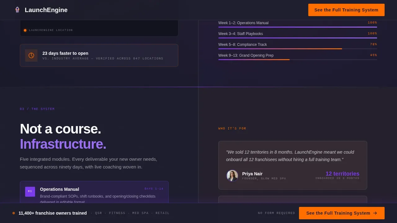
| The System Panel | Preview program modules on the left with a social proof stack on the right |
| Full-Width Call-to-Action | Snap both halves together into a single closing panel with the sticky bottom bar active |
| Footer | Linear single-row footer with essential links and brand identity elements |
Design & branding system
The design language is built around the Startup Velocity theme and a Dopamine Pop color system. The palette was chosen to feel like the moment a new franchisee completes their final certification: a screen full of confetti over a dark dashboard. Every color has a specific functional role, and the typography reinforces the data-forward, operational identity the brand needs to project.
- Violet (#7C3AED) dominates section backgrounds and headline type; orange (#FF6D00) fires on every button, badge, and progress indicator; charcoal (#1E1E2E) grounds all body text and data panels; white (#FAFAFA) creates breathing room so the energy never tips into visual chaos
- Plus Jakarta Sans is used for all headings and body copy, keeping the franchise brand voice clean and readable; JetBrains Mono handles every stat, label, and metric, giving data points a mission-control feel that reinforces scale and precision
- Brand guidelines encoded into the color and type system make it straightforward for any franchisor or marketing team to customize the template while keeping the brand unique and visually consistent across all franchise locations
Mobile & speed optimization
The template is designed desktop-first, reflecting the reality that multi-unit operators and corporate learning and development teams typically evaluate franchise training platforms on a larger screen. However, the layout is fully responsive so that the page remains navigable and readable on any device.
- Over 58% of web traffic is now mobile-based, making a responsive structure essential; the split-screen panels stack vertically on smaller screens so content remains clear and scannable
- Clickable elements, including the sticky call-to-action bar and all inline buttons, are sized and spaced for comfortable use on mobile without requiring pinch-to-zoom
- Server Components handle static sections while Client Components manage animations, keeping the page architecture organized and the interactive elements isolated to where they are actually needed
How this template helps you convert
The page is built around a single conversion goal: a click to the full program breakdown and pricing page. There is no lead capture form on this page. The strategy is to earn the click through compounding proof, so that by the time a visitor reaches the final panel, clicking feels less like a leap and more like catching up to something already in motion.
- The logo bar and oversized stat establish immediate authority in the first viewport, giving visitors a clear picture of the platform's scale before they scroll; authority signals like franchise brand logos and partner credentials are among the most reliable trust builders on landing pages, and this template puts them first
- Each split-screen section adds a new layer of proof: video testimonials from real franchisees, a growing regional map, accelerating cohort numbers, and a social proof stack that builds toward the final call-to-action; key elements of an effective landing page include social proof, video overviews, and a strong call-to-action, and this template uses all three in sequence
- The sticky bottom bar activates after the third scroll, ensuring the primary call-to-action is always visible without interrupting the narrative; transparency about the program's scope and scale qualifies prospects early and keeps unqualified visitors from cluttering the sales pipeline
Other information about this template
This section covers additional context that helps franchisors, franchise development teams, and marketing professionals understand how the Franchify launch-ready franchise training landing page template fits into a broader digital strategy.
- Franchise web design best practices call for a website structure organized around a single business goal per page; this template applies that principle by removing all friction points except one deliberate click, making it a focused franchise web design asset rather than a general-purpose site
- A franchise website built around franchise development typically requires a separate, purpose-built page away from the main customer-facing site; this template functions as that dedicated franchise development page, keeping the target audience focused and the message clean
- Franchise marketing strategies that combine organic search engine optimization with paid ads perform best when each channel drives to a dedicated, high-converting page; this template is built to be that destination whether traffic comes from search engines, paid ads, social media presence, or direct outreach
- The franchising process typically takes between 90 and 120 days, and legal documents including the franchise disclosure document (FDD) and franchise agreement are required before you can sell franchises; this template does not replace those legal documents, but it gives the franchise system a credible digital face that supports the sales conversation while legal preparation is underway
- Establishing brand guidelines is critical for long term success; the color and typography system built into this template gives franchisors a ready-made visual framework that franchisees can recognize and current customers can trust across every touchpoint
- A franchise branding checklist typically includes fonts, colors, logo usage, language tone, and graphic shapes that keep a brand unique; all of those elements are pre-set in this template's design system, reducing the effort required to develop a compliant, on-brand franchise website from scratch
- Franchise templates can include training plans, operations manuals, and marketing strategies; while this template focuses on the landing page layer, it is designed to sit at the top of a broader franchise system that includes those operational resources
- The supply chain of trust that converts a cold visitor into a qualified lead runs through social proof, operational credibility, and a frictionless next step; this template sequences those elements in the exact order that research shows increases click-through rates on franchise development pages
- Topics covered by this template's design include network-effect visual storytelling, scroll-linked interactivity, franchise brand logo display, cohort metrics, regional expansion mapping, and a sticky conversion bar, giving your efforts a strong structural foundation from the first day the page goes live
- Digital marketing efforts that target franchise prospects through paid ads or search engines benefit from a landing page that does one thing exceptionally well; this template's single-goal structure makes it easy to measure lead generation outcomes and optimize future efforts without rebuilding the page
Theme
Startup Velocity
Creative direction
Network Effect
Color system
Dopamine Pop
Style
Split Screen (50/50)
Direction
Click-Through
Page Sections
Scrolling Logo Bar with Social Proof Headline
50/50 Split-screen Network Effect Sections
Scroll-linked Count-up Animations
Sticky Bottom Call-to-action Bar
Full-width Closing Call-to-action Panel
Dopamine Pop Visual Identity System
Related questions
Does this template include a lead capture form?
Can I use this template to promote multiple franchise locations?
What level of customization does the color and type system support?
Is this template suitable for an emerging franchisor with a small network?
Does the template support both desktop and mobile viewing?


