Hospital & Clinic Construction Portfolio Website Template
Scalpel is a split-screen landing page built for hospital and clinic architecture firms. It leads with a metrics wall showcasing clinical impact, then walks visitors through project case studies that connect design decisions to patient outcomes. The Industrial Raw visual identity, a direct sales structure, and an inline assessment form make it purpose-built for winning high-stakes healthcare capital projects.
by Rocket studio
Quick summary
Scalpel is a single-page, split-screen landing page designed for healthcare architecture firms. It opens with four oversized performance metrics, then builds credibility through sequential project case studies. A primary call to action drives facility assessment bookings. A secondary path captures early-stage prospects with a downloadable planning resource. Every section reflects the precision and function of the clinical spaces the firm designs.
Who this template is for
This template is built for specialized firms that design clinical environments where layout decisions directly affect patient care. It speaks to practices that need to communicate technical credibility to sophisticated, budget-holding clients.
- Hospital and clinic architecture firms pitching large-scale capital projects
- Healthcare design studios targeting hospital CEOs, clinic founders, and healthcare system operations leads
- Firms whose work spans operating theaters, emergency departments, intensive care units, and patient wards
What problem this template solves
Most architecture firm websites describe services in abstract terms. Healthcare clients planning $200 million expansions need evidence, not brochure copy. This template replaces generic portfolio pages with a structured, narrative-driven case for why this firm produces measurably better clinical outcomes.
- Generic portfolio layouts fail to connect design decisions to operational results
- High-value prospects need a clear path to engage before they are ready to commit
- Firms lose leads who are deep in capital planning cycles but not yet ready to schedule a call
What you get with this template
You get a complete, single-page layout structured to move healthcare decision-makers from awareness to action. The template includes every section, component, and content structure described below, ready to be populated with your firm's actual projects and metrics.
- A stats and metrics header wall with four oversized clinical performance figures
- A scrolling case study narrative section with paired split-screen project panels
- An inline facility assessment form and a secondary lead-capture path for a downloadable checklist
Feature list
This template delivers a focused set of components matched to the direct sales goal of booking facility assessments with high-value healthcare clients.
Metrics Wall Header
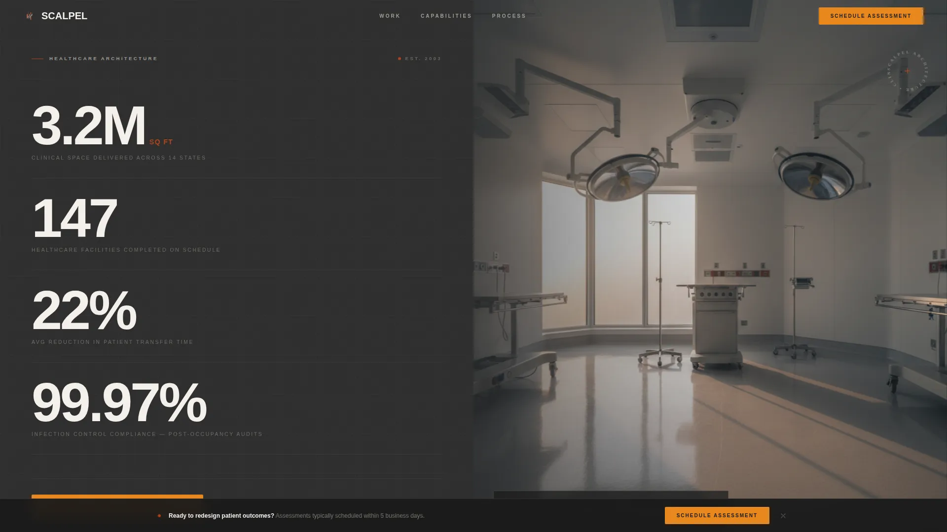
The header opens with a 50/50 split. The left panel displays four oversized figures in stacked rows: clinical square footage delivered, facilities completed, reduction in patient transfer time, and infection control compliance rate. The right panel holds a single full-bleed construction or clinical photograph. Numbers are set in a condensed industrial typeface against raw charcoal.
Scrolling Case Study Panels
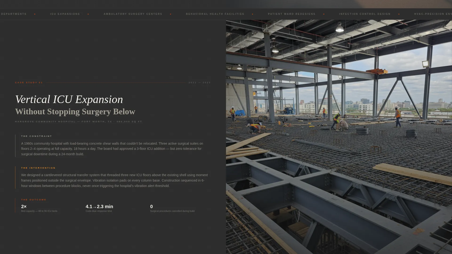
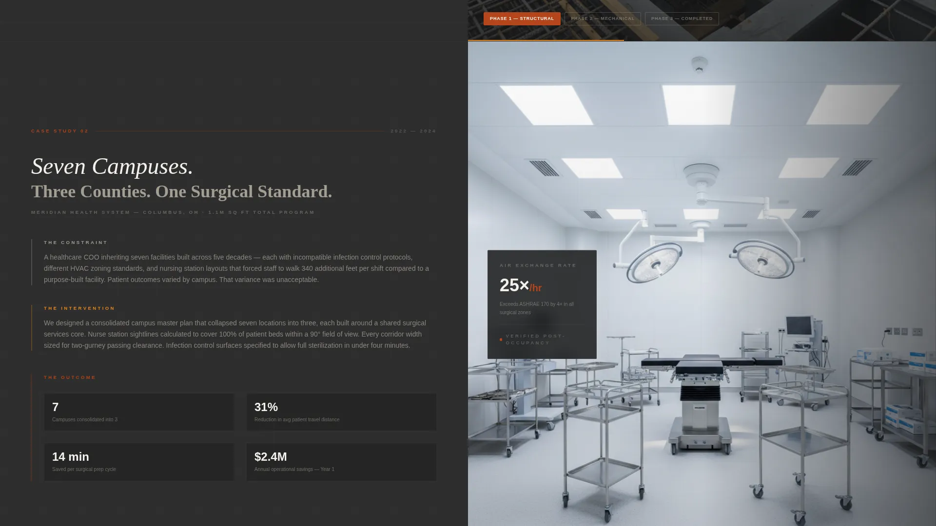
Each case study occupies a full split-screen pair as visitors scroll down the page. The left side presents the project constraint, the design intervention, and the measurable outcome. The right side transitions from construction photography to the finished clinical space. The visual progression reinforces the narrative that design decisions produce clinical results.
Pinned Primary Call to Action
The "Schedule a Facility Assessment" call to action appears after the second case study and then pins to the bottom rail for the remainder of the scroll. This keeps the conversion action visible without interrupting the case study reading experience.
Inline Facility Assessment Form
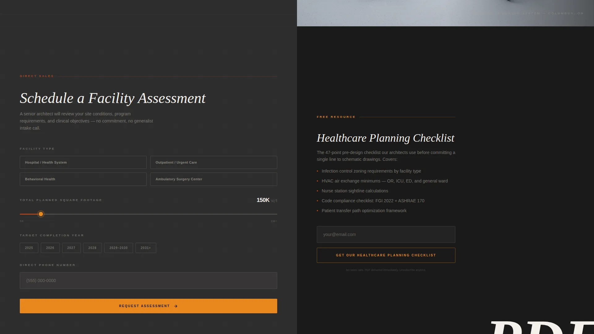
Clicking the primary call to action opens an inline form. It collects facility type via a dropdown selection, planned square footage via a slider, target completion year, and a direct phone number. The form is structured to qualify leads at the point of capture.
Secondary Lead Capture Path
A secondary conversion path offers a downloadable PDF titled "Get Our Healthcare Planning Checklist." It requires only an email address. This path catches prospects who are deep in a capital planning cycle but not yet ready to schedule a direct conversation.
Industrial Raw Visual Theme
The Fire and Earth color system applies kiln-fired terracotta, exposed ductwork charcoal, poured concrete warm gray, and emergency amber across the layout. Typography uses a condensed industrial typeface. The overall visual language mirrors the honest, load-bearing aesthetic of a building mid-construction.
Page sections overview
| Section | Purpose |
|---|---|
| Metrics wall header | Opens with four clinical performance figures and a trauma bay photograph |
| First case study | Presents constraint, intervention, and outcome for project one |
| Second case study | Deepens credibility with a higher-stakes clinical project story |
| Primary call to action block | Introduces the facility assessment call to action after case study two |
| Third case study | Continues the narrative with a progressively more complex project |
| Pinned bottom rail | Keeps the assessment call to action visible for the remainder of the scroll |
| Inline assessment form | Collects facility type, square footage, completion year, and phone number |
| Checklist lead capture | Offers the planning PDF download in exchange for an email address |
Design & branding system
The visual identity follows an Industrial Raw theme built around the Fire and Earth color system. Every color choice references the honest materiality of a healthcare construction site, where structural elements are left visible because they are doing real work.
- Kiln-fired terracotta (#B5451B) and exposed ductwork charcoal (#2D2D2D) form the primary palette, with poured concrete warm gray (#A39E93) used for supporting surfaces
- Emergency amber (#E8871E) is reserved exclusively for calls to action and data callouts, ensuring high-contrast visibility where conversion decisions happen
- Typography uses a condensed industrial typeface for headers and metrics, keeping the layout dense with information without feeling cluttered
Mobile & speed optimization
The split-screen layout is designed to reflow cleanly on smaller screens, ensuring the case study narrative and conversion components remain accessible across devices used by busy healthcare executives.
- Split-screen panels stack vertically on mobile so the story and imagery read in the correct sequence
- The pinned bottom rail call to action remains visible on scroll across screen sizes, preserving the conversion path on every device
- The inline form uses a slider and dropdown inputs that are practical to complete on a touchscreen without requiring typed-field precision
How this template helps you convert
The page is structured around a progressive trust-building sequence. Each scroll section deepens the case before asking for a commitment.
- The metrics wall establishes credibility immediately by leading with clinical outcomes rather than service descriptions, giving high-value prospects a reason to keep reading before a single word of copy appears.
- The case study narrative connects each design decision to a measurable patient outcome, building the argument that this firm's work changes clinical performance, not just floor plans.
- The dual conversion paths capture prospects at two different stages of readiness, the assessment form for decision-makers ready to talk, and the checklist download for those still building the internal case for a capital project.
Other information about this template
This template is categorized under Construction and Home, within the Hospital and Clinic Construction subcategory, targeting the Hospital and Clinic Architect niche. It is a strong fit for firms competing for large healthcare capital projects where the sales cycle is long and the decision-makers are sophisticated.
- The template style is Split Screen (50/50), a layout well-suited to pairing narrative copy with strong clinical or construction photography
- The creative direction is Case Study Narrative, which is particularly effective in architecture and healthcare design because it grounds claims in documented project outcomes
- The header concept is a Stats and Metrics wall, giving firms with a proven track record an immediate credibility signal before visitors read a single line of descriptive copy
- The landing page direction is Direct Sales, meaning every structural decision prioritizes moving a qualified prospect toward booking a facility assessment
Theme
Industrial Raw
Creative direction
Case Study Narrative
Color system
Fire & Earth
Style
Split Screen (50/50)
Direction
Direct Sales
Page Sections
Metrics Wall Header with Clinical Data
Scrolling Case Study Narrative Panels
Pinned Facility Assessment Call to Action
Inline Facility Assessment Form
Secondary Checklist Lead Capture
Industrial Raw Visual Identity
Related questions
Who is this landing page designed for?
Can I use this template for smaller clinic projects, not just hospital expansions?
What content do I need to fill this template?
How does the dual conversion path work?
Can I showcase different types of healthcare facilities across the case study panels?



