General Surgeon Appointment Booking Landing Page
Scalpel is a general surgeon appointment booking landing page template built for evidence-first patient trust. It pairs a bold stat-forward hero with a zigzag alternating scroll layout, Forest Trust color system, and a dual call-to-action structure that moves visitors directly to an external scheduling portal. Clear, warm, and clinically confident from the first scroll.
by Rocket studio
Quick summary
Scalpel is a single-page template for a general surgery practice. It opens with a massive centered headline and three floating amber statistics, then walks visitors through alternating data and context sections that build trust with every scroll. The page ends with a full-width call to action that sends new patients to an external booking portal.
Who this template is for
This template is built for general surgeons who need a focused, patient-facing landing page that converts cautious researchers into booked consultations. It works equally well for solo practitioners and small surgical groups.
- General surgeons seeking a professional online presence for new patient acquisition
- Practice managers or referring physicians who want a clear, credible page to share with patients
- Surgical practices ready to route appointment bookings through an external scheduling portal
What problem this template solves
Patients researching a surgeon before committing to a consultation face a specific kind of anxiety. They need proof before they need personality. Most practice pages bury the evidence and lead with generic bios, which loses visitors before trust is established.
- Visitors leave before reading credentials because nothing concrete appears early enough
- Patients who need surgery often delay booking because the page does not answer their fear-driven questions
- Practices lose qualified leads when the path from "I need a surgeon" to "I booked a consultation" has too many steps
What you get with this template
You get a complete, structured landing page ready to represent a general surgery practice. Every section is purposefully ordered to move a hesitant patient toward a single, clear action.
- A stat-forward hero section with a giant centered headline and three floating amber data points
- A zigzag alternating scroll layout that pairs procedure statistics with plain-language recovery context
- A dual call-to-action system with a primary amber booking button and a secondary phone link throughout
- A mobile-first persistent bottom bar that keeps the booking action visible while scrolling on phones
Feature list
A quick paragraph before the features: each capability below is drawn directly from the template design brief and reflects what the layout delivers out of the box.
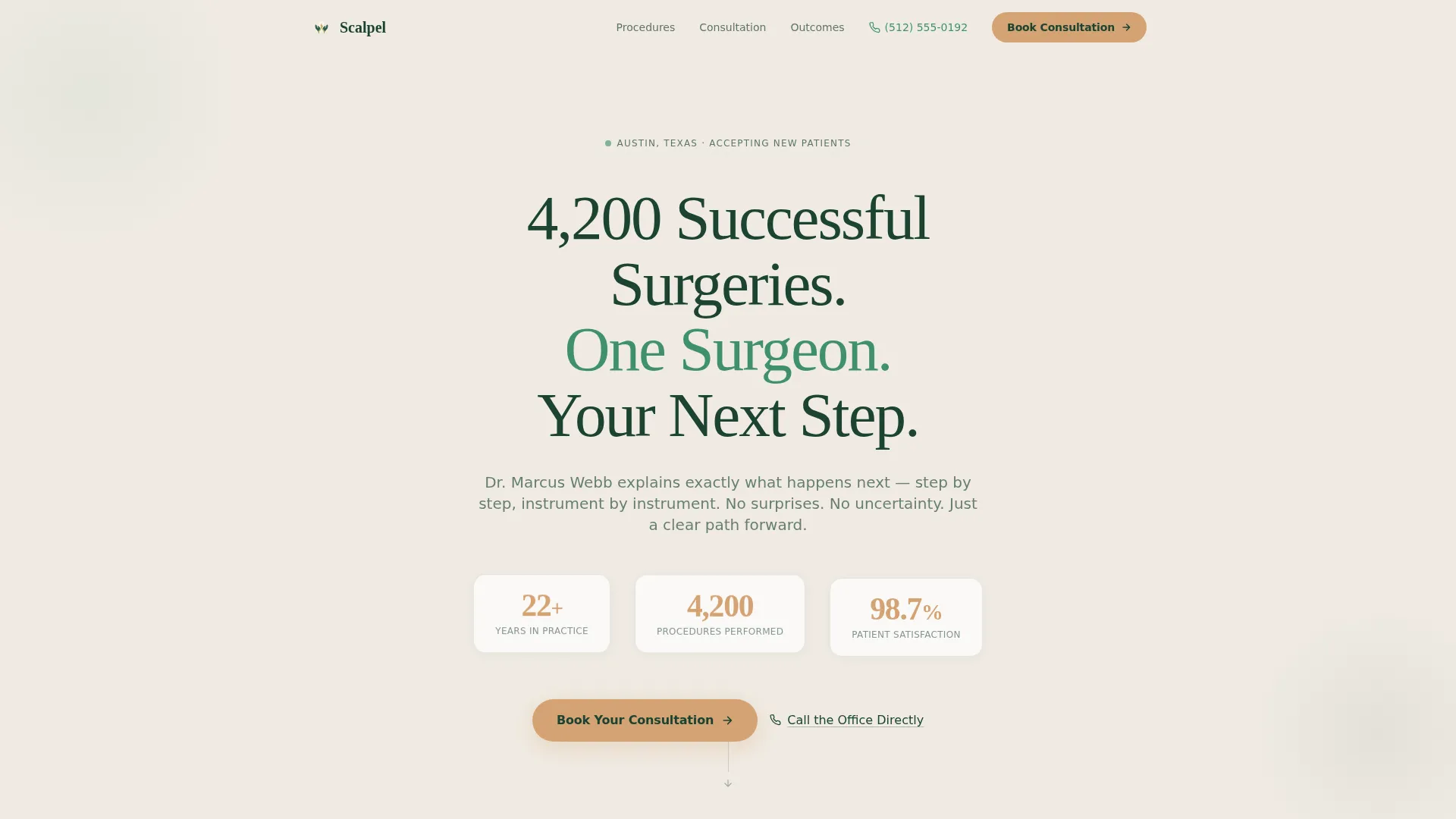
Giant Headline Hero with Floating Stats
The hero centers a bold, humanist serif headline on a birch bark white field. Three statistics rendered in heartbeat amber float below it in a horizontal row. No competing imagery. The numbers carry the full opening argument.
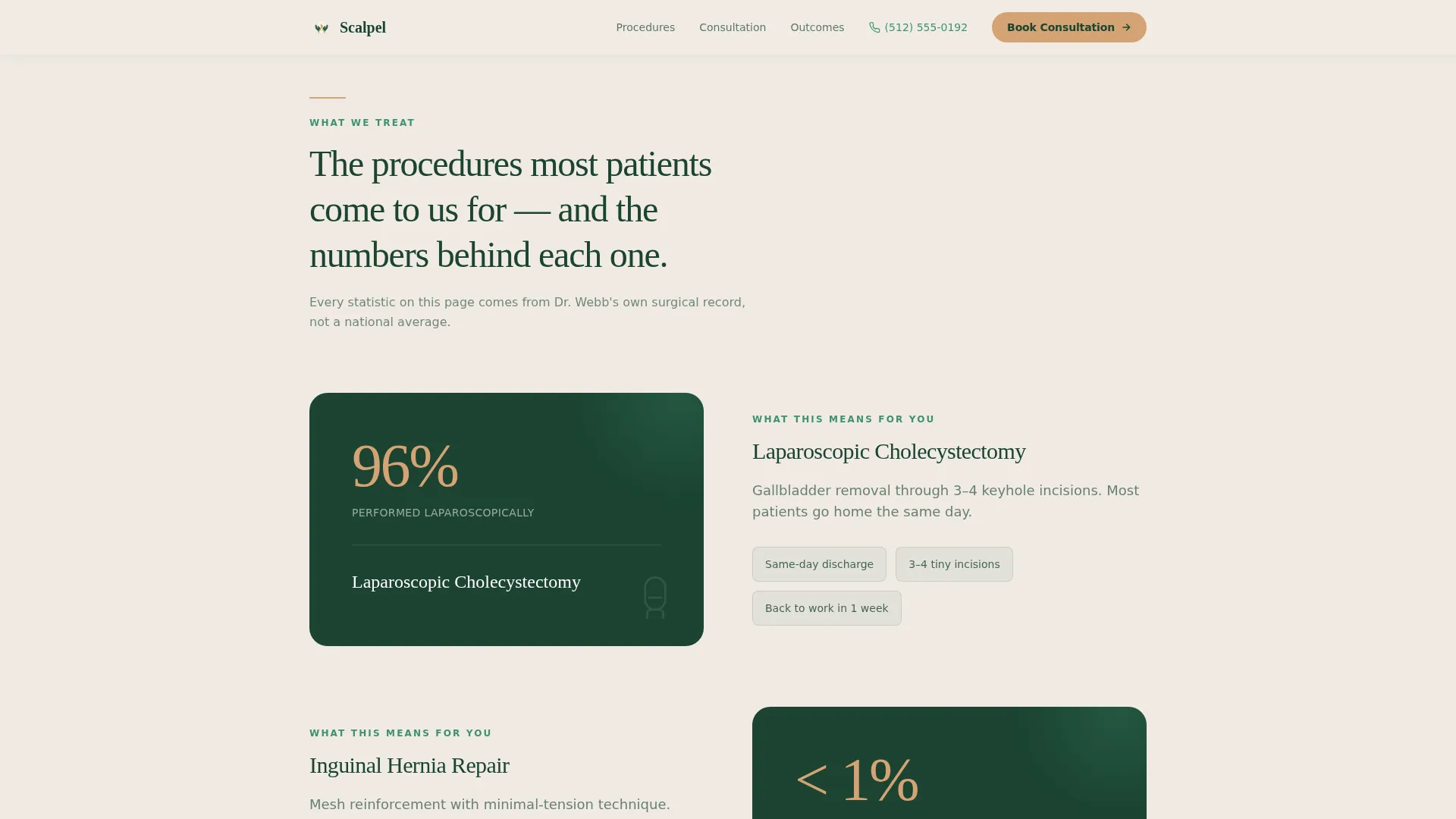
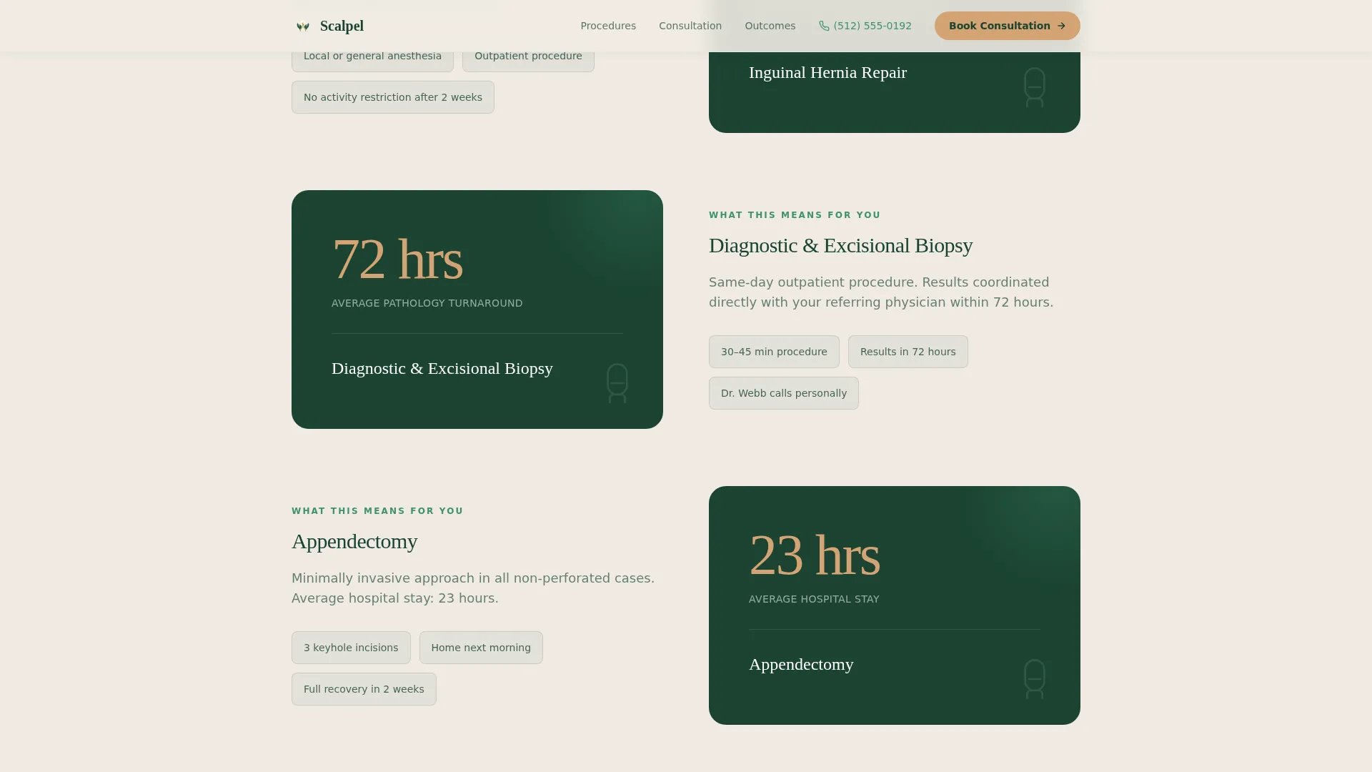
Zigzag Alternating Section Layout
Each scroll section alternates between a data-led panel and a narrative panel. One side shows a minimally invasive procedure rate or credential stack; the other side explains what that means in plain language. The structure builds confidence incrementally with every alternation.
Outcomes Bento Grid
A dedicated bento-style panel surfaces key outcome data: patient satisfaction percentage, total procedure volume, and complication rate. The data is presented large and readable, with amber reserved for the figures that matter most.
Dual Call-to-Action System
Every call-to-action pairing includes a primary "Book Your Consultation" button in heartbeat amber that links to an external scheduling portal. A secondary "Call the Office Directly" text link sits beside it for patients who prefer a human voice before committing.
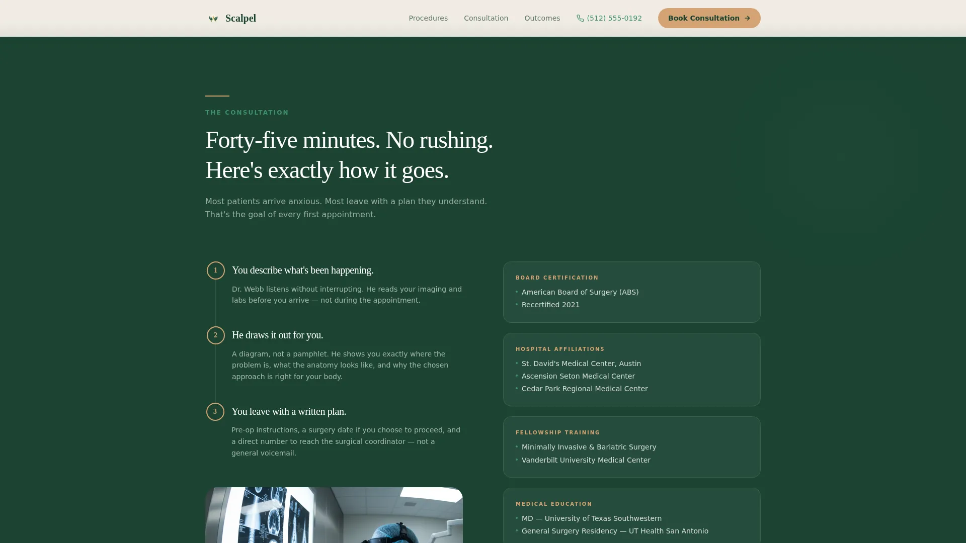
Credential and Affiliation Stack
A dedicated section presents board certifications, hospital affiliations, and fellowship details in a structured right-aligned block. The layout positions credentials as supporting evidence, not the lead argument, so the page earns trust before it claims authority.
Pre-Op Consultation Narrative Section
A plain-language section walks the patient through the pre-operative consultation process step by step. It reduces procedural anxiety by explaining what to expect before the appointment, which lowers the barrier to booking.
Page sections overview
| Section | Purpose |
|---|---|
| Hero with Stats | Opens with headline and three amber floating statistics |
| Procedures Zigzag Left | Pairs minimally invasive stat block with recovery narrative |
| Consultation Process Zigzag Right | Pre-op narrative alongside credential stack |
| Outcomes Bento Panel | Displays satisfaction, volume, and complication data |
| Final Call to Action | Full-width evergreen panel with amber button and phone link |
| Footer | Linear single-row footer with practice essentials |
Design & branding system
The visual identity follows an Organic Flow theme. The palette evokes a walk through an old-growth forest after rain: grounded, oxygenated, and carrying quiet authority. Typography pairs a humanist serif for headlines with a clean sans-serif for body text.
- Evergreen (#1B4332) anchors alternating section backgrounds; moss (#40916C) softens secondary panels and iconography; birch bark white (#F0EBE3) provides open breathing space
- Heartbeat amber (#D4A373) is reserved strictly for buttons, key statistics, and primary data points, so the eye lands exactly where action is needed
- Fraunces (a humanist serif) handles headlines to project confidence and warmth; DM Sans handles body copy for clean, fast readability
Mobile & speed optimization
The template is built mobile-first, recognizing that most patients research their surgeon on a phone, often in private moments between appointments or late at night.
- A persistent sticky call-to-action bar anchors to the bottom of the screen on mobile, keeping the booking button reachable without requiring the user to scroll back up
- Staggered scroll reveals and blur-fade entry animations are kept lightweight, powered by minimal JavaScript so static content loads cleanly
- Server Components handle all static content sections, reducing unnecessary processing for layout elements that do not change per visitor
How this template helps you convert
The page is structured as a click-through landing page. Every design and content decision points toward one outcome: moving the visitor to the external scheduling portal as a new patient.
- The hero leads with outcomes, not introductions. Visitors see 4,200 successful surgeries and years of practice before they read a single credential, so the emotional case is made before the logical one needs to begin.
- The alternating zigzag layout raises confidence incrementally. Each section answers a specific patient concern: recovery time, procedure safety, consultation experience, and surgeon qualifications. By the final call to action, the visitor has already seen the evidence that answers every question fear would have asked.
- The secondary phone link beside every button removes the last friction point. Patients who are not ready to book online can call directly, which keeps them in the conversion path rather than losing them to a dead end.
Other information about this template
This template is part of a broader library of healthcare and medical practice landing page designs built for patient acquisition. It suits practices in the United States operating under standard scheduling workflows.
- The page uses US date format and English language throughout, with no currency display required
- Animation intensity is set to medium: staggered scroll reveals and blur-fade entries give the page a polished feel without overwhelming a visitor who is already in a careful, research-oriented mindset
- The footer follows a linear single-row pattern, keeping the bottom of the page clean and distraction-free
- The template style is categorized under Surgeon (General) Appointment Booking and is designed to support the specific patient journey from initial research to consultation booking
Theme
Organic Flow
Creative direction
Stats-First Impact
Color system
Forest Trust
Style
Zigzag/Alternating
Direction
Click-Through
Page Sections
Stat-forward Hero Section
Zigzag Alternating Layout
Outcomes Bento Data Panel
Dual Call-to-action System
Credential and Affiliation Block
Mobile Sticky Booking Bar
Related questions
Does this template include an on-page appointment booking form?
What sections are included in this template?
Is this template designed to work well on mobile phones?
Can this template be adapted for a group surgical practice?
Can the colors and fonts be changed to match an existing practice brand?


