Radiology Medicine Education Website Template
Scanexplained is a single-column radiology clinic landing page built to calm anxious patients before they arrive. It walks visitors through their fears honestly, then answers each one with clear explainers, a procedure timeline, and a results flowchart. The primary call to action is a downloadable Pre-Scan Guide, collected with a simple three-field form.
by Rocket studio
Quick summary
Scanexplained is a focused radiology clinic landing page that turns patient anxiety into informed confidence. It opens with a commanding centered headline, moves through an honest fear-and-answer arc, and closes with a Pre-Scan Guide download form. The layout is single-column, typographically led, and designed for patients researching on their phones late at night.
Who this template is for
This template is built for radiology clinics and imaging centers that want to educate patients before they arrive. It is especially useful when your front desk spends time reassuring callers who do not know what to expect.
- Radiology clinics serving first-time MRI, CT, X-ray, ultrasound, or DEXA patients
- Pediatric imaging practices where parents need clear, honest preparation materials
- Post-surgical imaging centers handling follow-up patients who want step-by-step clarity
What problem this template solves
Most radiology clinic pages list services and phone numbers. They do not address the specific fears patients carry when they receive an unfamiliar referral. That gap creates anxiety, last-minute cancellations, and front-desk burden.
- Patients arrive unprepared because no one explained what happens inside the room
- Parents of pediatric patients have no clear resource to read the night before an appointment
- Clinics lose trust when the page feels clinical and cold rather than calm and informative
What you get with this template
You get a fully structured single-column landing page that follows a deliberate Problem to Solution arc. Every section has a clear role: build honest acknowledgment first, then deliver relief through information.
- A hero section with a giant centered serif headline and a clinic stats subline
- A fear section with full-width honest patient questions on a deep charcoal background
- An explainer section with a minute-by-minute timeline, an MRI bore diagram, and a results flowchart
- A trust section with credibility stats and patient testimonials
- A Pre-Scan Guide download form collecting first name, email, and scan type
- A secondary video walkthrough link and a minimal horizontal-flow footer
Feature list
This template includes the following built-in capabilities drawn directly from its design brief.
Problem to Solution Scroll Arc
The page is structured so the first half names patient fears out loud and the second half resolves each one with clear visual explainers. This deliberate arc builds emotional momentum that makes the guide download feel like a natural next step rather than an interruption.
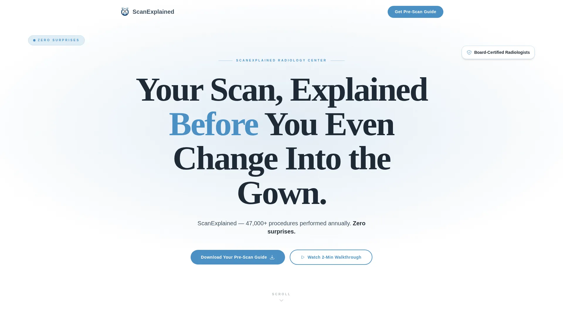
Giant Centered Hero Headline
The hero uses a large Fraunces serif headline that occupies roughly 60 percent of the viewport on a clean white field. A single slate-colored subline carries the clinic name, annual procedure count, and the phrase "zero surprises." No imagery competes with the type.
Minute-by-Minute Procedure Timeline
A dedicated explainer section shows patients exactly what happens during their scan, broken into timed steps. A cross-section diagram of the MRI bore with dimensions sits alongside the timeline, giving spatial context to reduce fear of the machine itself.
Results Flowchart
An illustrated step-flow section shows how imaging results travel from the scanner to the reporting radiologist to the referring doctor. This answers one of the most common post-scan questions patients are too anxious to ask.
Pre-Scan Guide Download Form
The primary conversion element is a lightweight three-field form collecting first name, email address, and scan type. It appears after the fear section and again in the footer, positioned where patient motivation is highest.
Scroll-Triggered Reveal Animations
The template includes medium-intensity scroll-triggered animations. Fear questions stagger into view one at a time. The hero grid uses a parallax effect. Explainer blocks reveal on scroll. These animations are handled by client-side components while static content uses server-side rendering.
Page sections overview
| Section | Purpose |
|---|---|
| Hero headline | Set authority and calm with a dominant centered typographic statement |
| Patient fear questions | Name anxiety out loud using full-width honest copy on a dark background |
| Procedure explainer | Answer each fear with a timeline, bore diagram, and illustrated step flow |
| Results flowchart | Show how scan results move from machine to referring doctor |
| Trust and testimonials | Build credibility with procedure stats and real patient quotes |
| Pre-Scan Guide form | Capture first name, email, and scan type for guide delivery |
| Video walkthrough | Offer a two-minute embedded facility tour as a secondary conversion path |
| Footer | Provide minimal horizontal navigation and contact information |
Design & branding system
The visual identity follows an Educational Guide theme built on a Slate and Sky color system. Every color choice is deliberate: the palette reads like an early morning sky over a hospital campus, composed and trustworthy without being sterile.
- Deep charcoal (#1E2A36) for high-contrast headlines, clinical slate (#3D4F5F) for body text, soft sky (#A8C6DF) for breathable section backgrounds, and cerulean (#4A90C4) for buttons and interactive elements
- Fraunces serif for all headlines, DM Sans for body text and user interface elements
- Atmospheric grid overlay on the hero, with no competing photography in the header area
Mobile & speed optimization
The template is built mobile-first, recognizing that most radiology patients research their procedure on a phone, often late at night or in a waiting room. Layout decisions prioritize thumb-friendly reading and fast loading on mobile connections.
- Single-column flow ensures content stacks cleanly on small screens without horizontal scrolling
- Server-side components handle all static content while client-side components manage the form and scroll animations
- Scroll-triggered reveals and staggered animations are designed to perform smoothly on mid-range mobile devices
How this template helps you convert
The page is not built around a hard sell. It is built around earning trust through information, which makes the conversion feel like a natural conclusion rather than a demand.
- The fear section builds honest emotional resonance early, creating a felt need for the Pre-Scan Guide before it is ever offered
- The explainer and flowchart sections position the clinic as the most knowledgeable and transparent option a patient has encountered, reinforcing guide download intent
- The guide form appears twice at the moment of peak motivation, and the secondary video walkthrough offers a lower-commitment path for visitors who are not yet ready to share their email
Other information about this template
This template is categorized under Health and Medical, specifically within the Radiology Medicine subcategory. It is designed for the Radiology Clinic and Center niche and carries a high intersection match score, meaning the design system, creative direction, and conversion logic are tightly aligned to this specific clinical context.
- The creative direction is a Problem to Solution Arc, a structure that mirrors the actual patient journey from referral slip to informed arrival
- The header concept is a Giant Headline Centered on white, which uses typography as the primary trust signal rather than stock photography
- The landing-page direction is Content and Resource delivery, meaning the primary value exchange is the Pre-Scan Guide rather than a direct appointment booking
- The template style is Single Column Flow, optimized for linear reading on mobile devices
- The color system is named Slate and Sky, and every hex value in the palette is defined in the brief for straightforward implementation


Theme
Educational Guide
Creative direction
Problem→Solution Arc
Color system
Slate & Sky
Style
Single Column Flow
Direction
Content/Resource
Page Sections
Problem to Solution Scroll Arc
Giant Centered Hero Headline
Minute-by-minute Procedure Timeline
Illustrated Results Flowchart
Pre-scan Guide Download Form
Scroll-triggered Reveal Animations
Related questions
What scan types does the Pre-Scan Guide form support?
Can this template be used for a pediatric radiology practice?
Does the template include the actual Pre-Scan Guide document?
Is this template suitable for post-surgical follow-up imaging patients?
What makes this template different from a standard medical clinic page?


