German Fast Casual Restaurant Landing Page Template
Schnitzel is a gallery-style landing page template built for German fast casual restaurants. It guides visitors through a curated menu experience with full-viewport dish photography, museum-placard captions, and a warm Agrarian Root visual identity. A sticky "Order Pickup" call-to-action moves hungry visitors directly into the online ordering flow without friction.
by Rocket studio
Quick summary
This template puts German cuisine front and center through immersive scroll storytelling. Visitors move through each dish the way they would walk a curated food exhibition, with rich photography and short origin captions beside every plate. The design earns the "Order Pickup" click through visual appetite appeal, not pushy copy.
Who this template is for
This template suits any fast casual German restaurant or counter-service kitchen that takes its food seriously. It works equally well for new openings and established spots refreshing their online presence.
- German fast casual restaurant owners who want an online menu that feels as good as the food tastes
- Counter-service kitchens featuring schnitzel, Currywurst, Flammkuchen, or other German classics
- Restaurateurs targeting downtown office workers, pre-movie couples, or homesick expats searching for honest German food
What problem this template solves
Most restaurant landing pages feel flat. They list menu items without context, use generic stock photography, and bury the order button. Visitors leave before they feel hungry enough to act. This template fixes that by making the scroll itself feel like a sensory walk through the kitchen.
- Visitors who arrive without strong intent leave because nothing on the page makes them want to eat
- Generic layouts fail to communicate the craft behind German cuisine, the technique behind a proper schnitzel, the care in house-fermented sides
- A buried or low-contrast order button means lost lunch orders from office workers with a 45-minute window
What you get with this template
You get a single-page layout built around visual storytelling and a clear path to the order flow. Every design decision serves the goal of making visitors hungry and confident enough to hit the "Order Pickup" button.
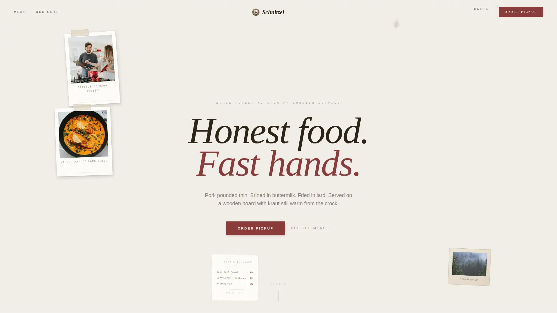
- A collage-style scrapbook header with overlapping Polaroids, a receipt-paper specials fragment, and a handwritten headline
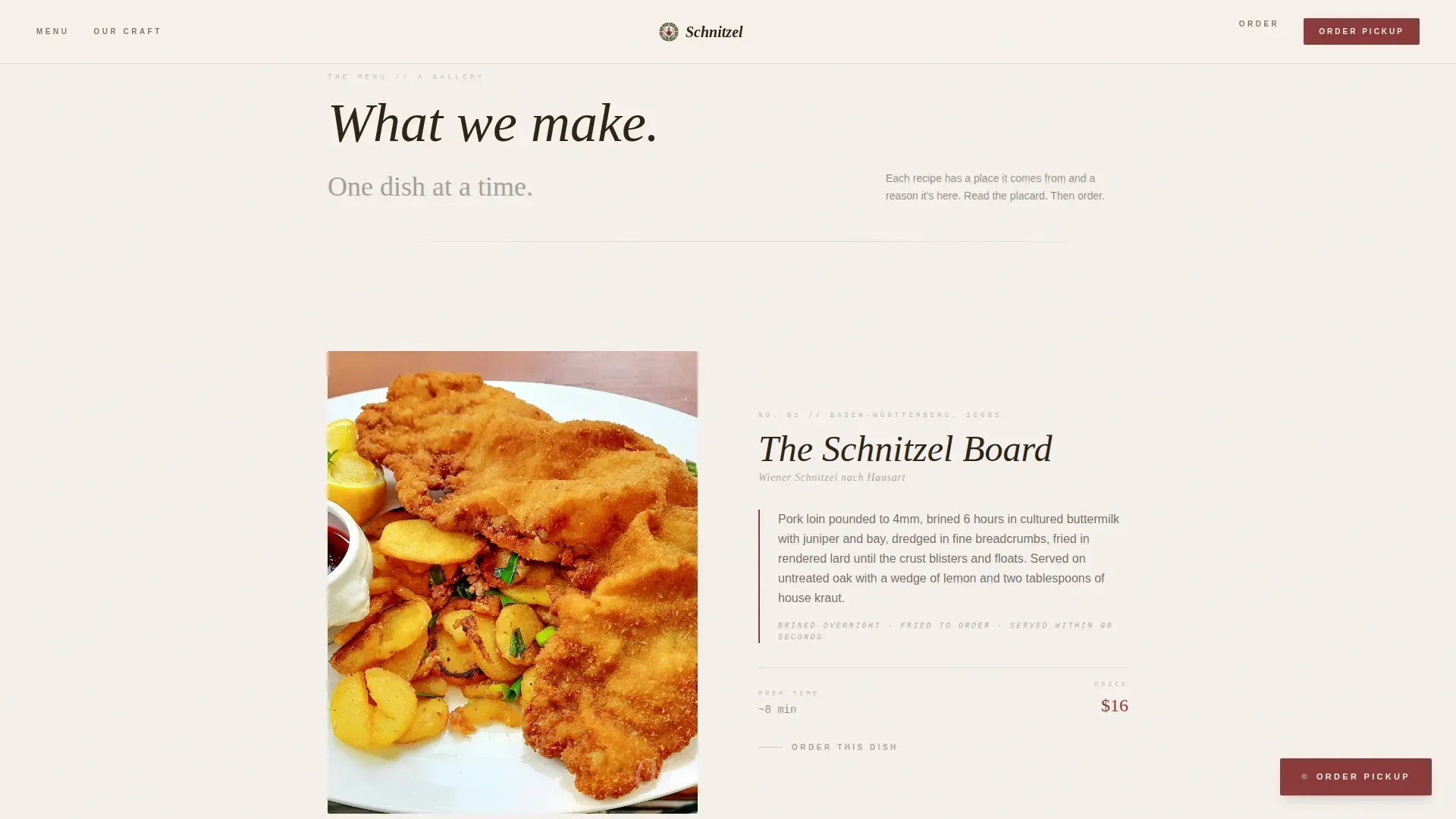
- A full-viewport Gallery Walk section with one dish per frame and origin-story captions beside each photograph
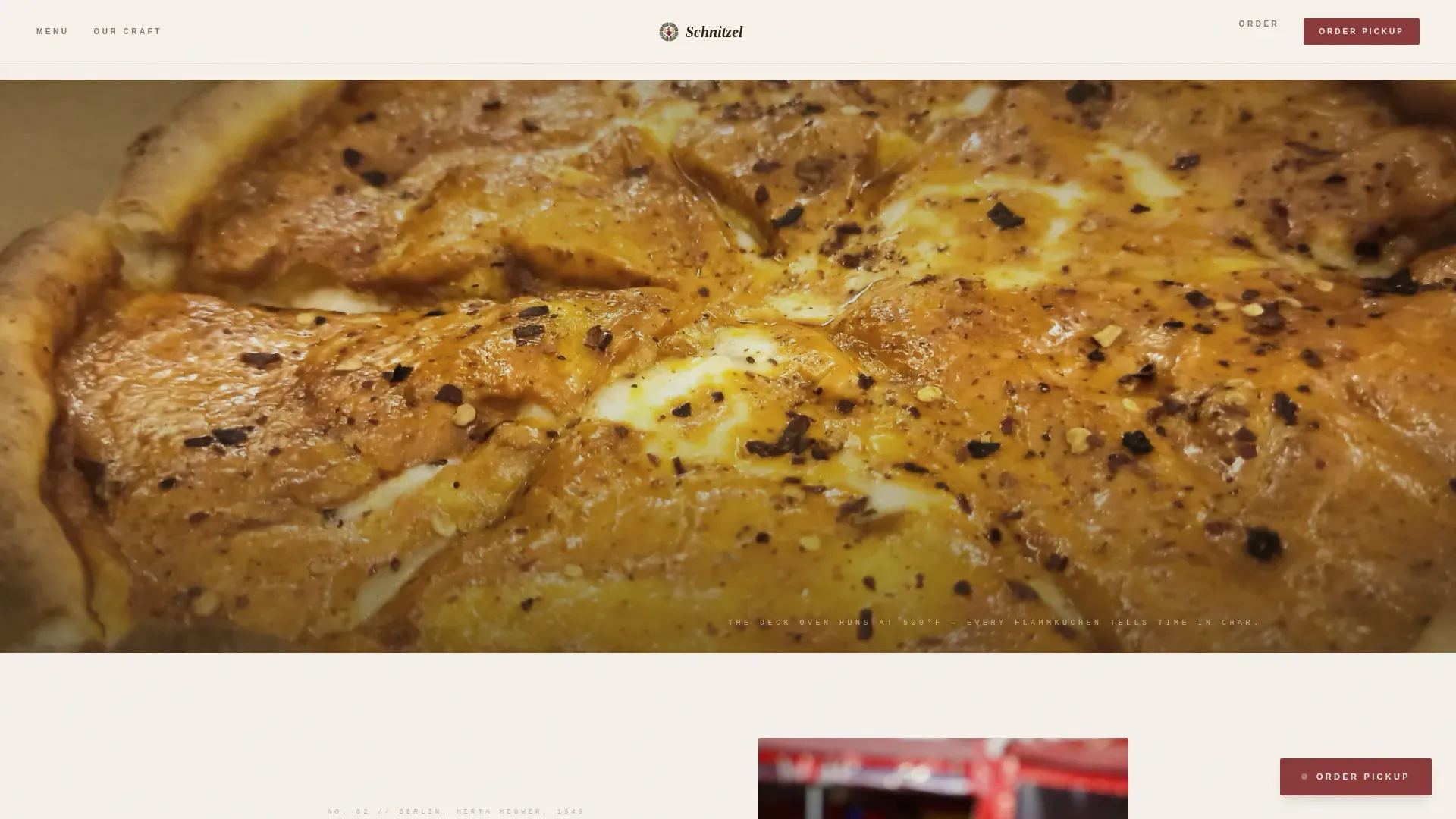
- Full-bleed textural interludes between dish frames, close-up shots of bubbling cheese, condensation on a pilsner glass, and pretzel crosshatch scoring
- A sticky beet-tone "Order Pickup" button that fades in after the header clears, plus a secondary "See Full Menu as PDF" text link
- A Provenance and Craft section that tells the Black Forest origin story and sourcing narrative
- A linear-pattern footer
Feature list
This template is built around a focused set of features that work together to move visitors from curiosity to a confirmed pickup order.
Collage Scrapbook Header
The header opens with overlapping Polaroid snapshots pinned to a linen-textured bulletin board. A torn-edge photo of market cabbages, a typewriter-font receipt showing the day's specials, and a Schwarzwald postcard all sit beneath visible tape and thumbtack shadows. The headline reads "Honest food. Fast hands." in a confident handwritten script. The composition communicates warmth, craft, and speed before a visitor reads a single menu item.
Gallery Walk Dish Frames
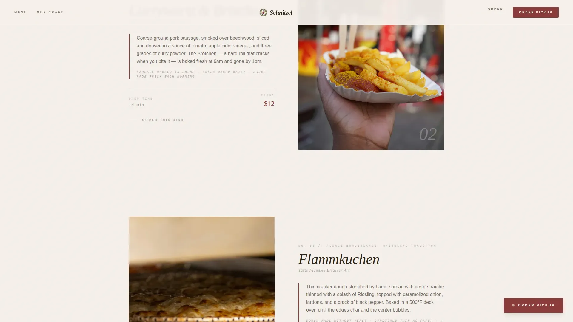
Each dish gets its own full-viewport frame with generous white space and a museum-placard caption alongside the photograph. The caption describes where the recipe originates, what makes it different, and how long it takes to prepare. This pacing slows the visitor down deliberately, so they taste the food visually before they ever reach the order button. It is one of the most effective ways to build appetite and trust at the same time.
Full-Bleed Textural Interludes
Between dish frames, the layout cuts to close-up photography of food textures and drink condensation. A bubbling cheese surface on a Flammkuchen, a cold pilsner glass, and the crosshatch scoring on a pretzel all appear as full-bleed images that break the rhythm of the gallery and reinforce the sensory experience. These interludes make the scroll feel like a walk through the kitchen line, not a static page view.
Sticky Order Call-to-Action
The primary call-to-action button appears in the pickled beet tone after the header section clears the viewport. It stays fixed so the visitor can act at any moment during the scroll. A second anchor beneath the full menu gallery repeats the prompt. A lighter secondary text link, "See Full Menu as PDF," catches browsers who are not yet ready to commit. This two-tier approach captures both decisive and still-deciding visitors.
Provenance and Craft Section
This section tells the sourcing story behind the food. It explains the Black Forest techniques at the core of the menu, pork brined in buttermilk and fried in lard, house-fermented kraut served warm from the crock, and Brötchen baked to crack on the first bite. The narrative gives expats a reason to feel at home and gives curious newcomers a reason to trust the kitchen. Craft detail builds the kind of credibility that no promotional copy can manufacture.
Scroll Animation System
GSAP ScrollTrigger powers image reveals and parallax movement across the page. Dish frames animate in as the visitor scrolls, the sticky button fades in smoothly after the hero clears, and textural interludes move at a slightly different speed from the surrounding content. Hover states on dish cards activate in the wasabi-mustard tone. The result is a page that feels alive without ever feeling distracting.
Page sections overview
| Section | Purpose |
|---|---|
| Hero Header | Collage bulletin board with overlapping Polaroids, receipt specials fragment, and handwritten headline |
| Gallery Walk | Full-viewport dish frames with museum-placard origin captions and scroll-triggered reveals |
| Textural Interludes | Full-bleed close-up photography between dishes to sustain sensory momentum |
| Provenance and Craft | Black Forest origin story, sourcing narrative, and kitchen technique detail |
| Order Call-to-Action | Sticky beet button plus secondary PDF menu link anchored beneath the gallery |
| Footer | Linear-pattern footer with essential restaurant contact information |
Design & branding system
The visual identity follows an Agrarian Root theme interpreted through a restrained, warm palette. Every color has a job, and nothing competes for attention without earning it.
- Stone white (#F5F0EB) and deep loam (#2C2416) handle all backgrounds and body text, creating high contrast without harshness
- Pickled beet (#8B3A3A) appears only on prices, daily specials, and the "Order Pickup" button, directing the eye exactly where action should happen
- Wasabi-mustard (#A3956B) activates on hover states and highlighted text, adding warmth without pulling focus from the primary calls to action
- Fraunces serif handles display headings; DM Sans handles body text, creating a pairing that feels both editorial and approachable
- The linen texture, thumbtack shadows, and slightly angled Polaroid overlaps in the header give the page a deliberately imperfect, handcrafted quality that mirrors the food itself
Mobile & speed optimization
The template is built desktop-first to serve the primary audience of lunch-hour office workers browsing on a work computer. It scales fully to mobile for visitors arriving from social links or search.
- Dish frames reflow to single-column stacks on smaller screens, keeping photographs large and captions readable without horizontal scrolling
- The sticky "Order Pickup" button remains accessible on mobile viewports throughout the scroll, so the order path is never more than one tap away
- Server Components handle static sections to keep the initial load lean; Client Components manage scroll animations separately, so interactivity does not block content delivery
How this template helps you convert
Every layout decision points toward one outcome: a visitor who taps "Order Pickup" before they reach the footer. The page earns that click through appetite, not pressure.
- The Gallery Walk creates menu familiarity before the visitor reaches a checkout flow. By the time the order button appears at the bottom, most visitors have already decided what they want. The button just confirms the choice.
- The sticky call-to-action means a visitor who becomes ready to order at any point in the scroll, whether after the first dish frame or the last textural interlude, can act immediately without scrolling back to the top.
- The "See Full Menu as PDF" secondary link retains browsers who prefer to review the complete menu before committing. It keeps them engaged with the restaurant rather than sending them to a competitor.
Other information about this template
This section covers additional context that helps restaurant owners and designers understand the full scope of what this template communicates and how it fits into the broader German fast casual landscape.
- Schnitzel is a symbol of German culinary identity. Each region across Germany has its own interpretation of the dish, from the austrian-influenced Wiener Schnitzel made from veal and fried in clarified butter, to the pork cutlet varieties common across central Germany. The template's description format, one caption per dish, gives every menu item the space to carry that regional story.
- The classic breading method, flour, beaten egg, and fine breadcrumbs, produces a crust that is crisp without being heavy. The template's visual language, close-up photography and textural interludes, communicates that finesse without requiring a word of explanation.
- German fast casual dining readily spans a wide menu range. Alongside schnitzel, a German restaurant menu might include Currywurst served with fries or chips, Flammkuchen with cream and bacon, hearty dumplings in a warm broth, pork-forward dishes with gravy and mashed potatoes, and refreshing beer options from a pilsner to a Radler. The gallery format can display all of these with equal visual weight.
- Sides like potato salad, pickles, and fresh salad are a popular choice alongside schnitzel. A well-executed plate communicates quality through contrast, the rich, golden meat against the lighter, acidic sides.
- The template preserves German dish names throughout, so Brötchen, Spätzle, Flammkuchen, and Currywurst appear in their correct form rather than anglicized substitutes. This detail matters enormously to expat visitors and to customers who are searching for authentic German food rather than a generic imitation.
- The menu also has room for chicken schnitzel and beef options, giving the kitchen flexibility to season the offering by day or by season without rebuilding the page layout.
- The receipt-paper specials fragment in the header is a natural place to call out a daily celebration dish, a limited stein of craft beer, or a weekend family meal deal. These touches keep the page feeling current without requiring a full redesign.
- The page design draws on tradition while staying practical for a modern counter-service restaurant. Warm color palettes, wooden-texture visual references, and a cozy aesthetic reflect the heritage of German food design without feeling like a costume. The result is a restaurant landing page that earns trust from visitors who know the food and draws in visitors who are discovering it for the first time.
- This is the schnitzel artisan german fast casual landing page template built specifically for German fast casual operations that want their online presence to match the quality of their kitchen.
- Across europe and in countries where German cuisine has a strong following, fast casual restaurants use visual storytelling to differentiate themselves. This template gives any German dining concept a ready-to-use framework for doing exactly that.
- The pickled beet call-to-action tone is a key design decision. It protects the hierarchy of the page by reserving high-contrast color for one purpose only: driving the order.
Theme
Agrarian Root
Creative direction
Gallery Walk
Color system
Japanese Zen
Style
Gallery + Detail
Direction
Click-Through
Page Sections
Collage Scrapbook Hero Header
Full-viewport Gallery Walk
Textural Interlude Photography
Sticky Beet-tone Order Button
Provenance and Craft Narrative
GSAP Scroll Animation System
Related questions
What type of restaurant is this template designed for?
Can the Gallery Walk section display a full menu with multiple dish types?
Does the template include a sticky order button on mobile screens?
How does the collage header communicate the restaurant's identity?
Is this template suitable for a German restaurant that also highlights beer and drinks?