Precision Deep Cleaning Service Landing Page Template
Scour is a gallery-plus-detail landing page template built for precision deep cleaning services. It opens with a cinematic before-and-after header, then walks visitors room by room through annotated evidence of the work. The Engineering Blueprint visual style and lead-generation structure guide restaurant owners, property managers, and facilities directors toward booking a site assessment.
by Rocket studio
Quick summary
Scour is a single-page template designed for professional deep cleaning crews who work in high-stakes environments. It combines before-and-after photography, blueprint-style room walkthroughs, and a sequenced lead-capture form into one cohesive, evidence-driven layout. The result is a page that earns trust before it asks for anything.
Who this template is for
This template is built for deep cleaning businesses that serve clients with real compliance pressure. It works best when the work itself is the most convincing sales tool.
- Restaurant owners managing inspection deadlines and hygiene audit requirements
- Property managers handling residential or commercial tenancy turnovers
- Facilities directors preparing operating theatres, cleanrooms, or regulated spaces for recertification
What problem this template solves
Most cleaning service pages tell visitors they are thorough. This template shows it. The challenge for deep cleaning businesses is that the work is invisible once it is done, and prospects struggle to trust what they cannot see. Scour solves that by making evidence the architecture of the page itself.
- Prospects cannot verify quality from a list of services or a short paragraph
- Generic layouts fail to communicate the technical rigour required for medical and industrial environments
- Standard contact forms arrive too early, before the visitor has enough proof to act
What you get with this template
Scour delivers a full gallery-plus-detail landing page structure built around the specific workflow of a precision deep cleaning service. Every section has a purpose tied directly to the buyer journey.
- A full-viewport before-and-after header with a typed reveal line that opens the case immediately
- An interactive room-by-room gallery with blueprint callout annotations and expandable detail cards
- A sequenced lead-capture form in a slide-out panel, plus a secondary gated download for comparison-phase prospects
Feature list
A single cohesive layout powers the entire page. Each feature below is part of the template as described in the source brief.
Split-Frame Before and After Header
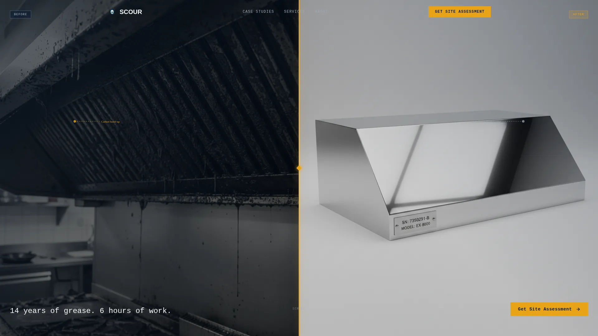
The header fills the entire viewport with a split photograph. The left panel shows a grease-blackened commercial extraction hood; the right shows the same hood polished to bare steel. An amber divider line separates the two halves. A single typed line appears over the left panel after a brief pause, leading with specificity rather than a generic headline.
Room-by-Room Annotated Gallery
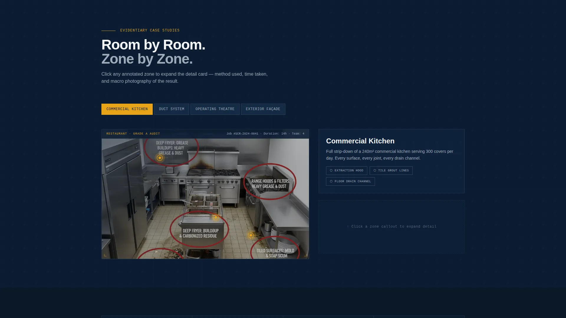
Each scroll section represents a distinct space: kitchen, bathroom, duct system, exterior facade. Every room opens with a wide architectural or overhead shot. Blueprint-style callout lines point to specific problem zones within the photograph. Clicking any zone expands a detail card showing macro photography, the cleaning method applied, and the time the task required.
Slide-Out Lead Capture Form
The primary call to action is a sticky amber button labelled "Get Your Site Assessment." It appears after the second room section and remains accessible as the visitor continues scrolling. Clicking it opens a slide-out panel with three sequential questions: property type, approximate square footage via a slider, and preferred assessment date.
Gated Specification Sheet Download
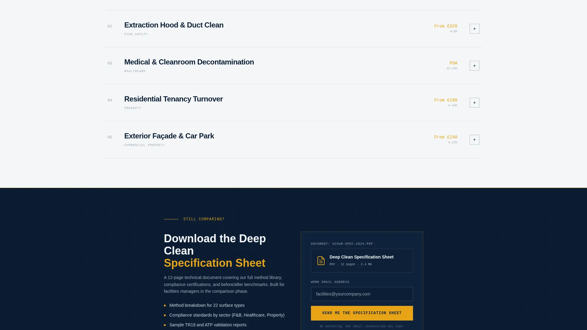
Below the final case study section, a secondary conversion path offers a downloadable document titled "Deep Clean Specification Sheet." Visitors enter an email address to receive it. This path is designed for facilities managers who are still comparing providers and need documentation before committing.
Engineering Blueprint Visual System
The layout uses a structured visual language built from a Navy Authority color palette. Deep navy covers backgrounds and dividers. Precision white opens space around photography. Gridline silver carries secondary text and diagram lines. Hazard-grade amber fires only on calls to action and callout badges, ensuring the eye always lands where it should.
Spatial and Architectural Scroll Structure
The page is structured like a building. Visitors move through rooms in sequence, with each section escalating in complexity. This progression builds an evidence case that accumulates across the scroll, so by the time the primary call to action appears, the visitor has already seen the proof across multiple environments.
Page sections overview
| Section | Purpose |
|---|---|
| Before and After Header | Opens with split-frame proof and a typed reveal line |
| Kitchen Room Section | First annotated room with callout zones and detail cards |
| Bathroom Room Section | Second room escalating the evidence sequence |
| Duct System Section | Third room showing hidden and technical cleaning scope |
| Exterior Facade Section | Final room completing the full-building walkthrough |
| Sticky call to action Button | Persistent "Get Your Site Assessment" button after room two |
| Slide-Out Lead Form | Three-question sequential form in a panel overlay |
| Final Case Study | Closing evidence block before the secondary conversion path |
| Specification Sheet Gate | Email-gated download for comparison-phase visitors |
Design & branding system
The visual identity follows an Engineering Blueprint theme. Every color choice is functional, not decorative, and the layout feels like a laminated spec sheet on an industrial clipboard.
- Navy (#0B1D33) dominates backgrounds and section dividers, setting an authoritative, technical tone
- Precision white (#F4F6F8) opens breathing room around before-and-after photography throughout the gallery
- Gridline silver (#9EAAB8) structures secondary text, diagram lines, and callout annotations
- Hazard-grade amber (#E8A317) appears exclusively on calls to action, sticky buttons, the header divider line, and callout badges
Mobile & speed optimization
The template is designed with a mobile-first layout philosophy so the room-by-room scroll and interactive gallery components remain usable on smaller screens.
- Split-frame header and annotated room images are structured to reflow cleanly on portrait mobile viewports
- The slide-out lead capture panel and sequential form questions are sized for thumb-friendly interaction
- Sticky call-to-action placement is maintained across screen sizes so the primary action is always reachable
How this template helps you convert
The page is built around a lead-generation objective. Every structural decision supports the move from scepticism to action.
- The before-and-after header and room-by-room gallery present evidence first, so the visitor arrives at the call to action already persuaded rather than still uncertain.
- The sticky "Get Your Site Assessment" button appears only after enough evidence has accumulated, and the three-question form removes friction by asking only what is needed to arrange an assessment.
- The gated specification sheet creates a second conversion path for prospects who are not yet ready to book, capturing facilities managers and procurement contacts during the comparison phase.
Other information about this template
This template sits within the Construction and Home category under the Cleaning Service subcategory, with a specific focus on the deep cleaning service niche. It is well suited to any business that handles high-compliance environments where visual proof and structured credibility matter more than marketing language.
- The Gallery plus Detail template style makes it equally effective for showcasing commercial kitchen deep cleans, industrial duct cleaning, and medical-grade facility preparation
- The Case Study Before and After header concept is one of the strongest trust-building formats available for service businesses where photographic evidence is the primary differentiator
- The Spatial and Architectural creative direction and Lead Generation page direction work together to keep visitors engaged across a long scroll while funnelling them toward a specific action
- This template can support any deep cleaning brand that wants to position itself as a technical, audit-ready operation rather than a general household cleaning service
Theme
Engineering Blueprint
Creative direction
Spatial & Architectural
Color system
Navy Authority
Style
Gallery + Detail
Direction
Lead Generation
Page Sections
Split-frame Before and After Header
Room-by-room Annotated Gallery
Slide-out Sequential Lead Form
Gated Specification Sheet Download
Engineering Blueprint Visual System
Spatial and Architectural Scroll Structure
Related questions
Who is this landing page template designed for?
What does the lead capture form collect from visitors?
Can the room sections be adapted to different cleaning environments?
What is the purpose of the gated specification sheet?
Do I need professional photography to use this template effectively?



