Cinematic Healthcare Video Agency Landing Page
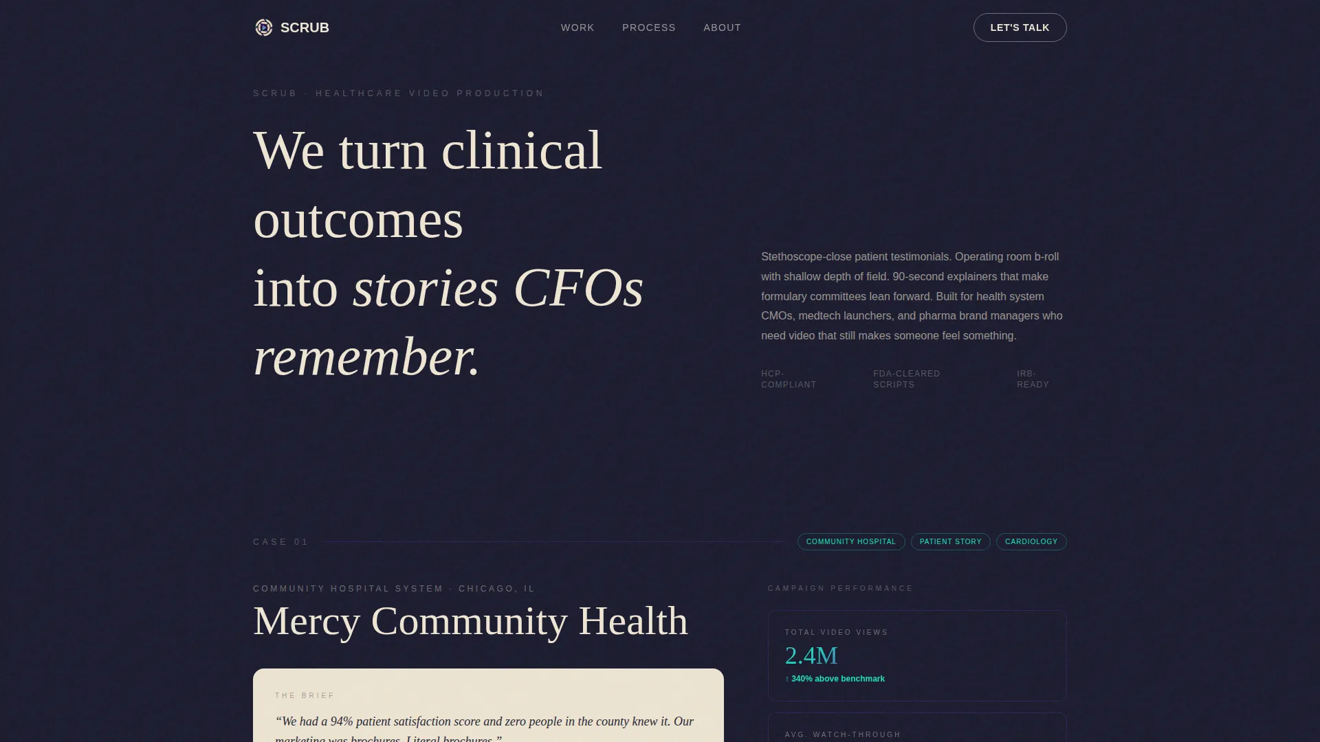
Scrub is a cinematic healthcare landing page template built for video production agencies serving health systems, medtech startups, and pharma brand managers. It uses a scroll-jacked header, asymmetric 60/40 case study grid, and an Ink & Paper visual identity with iridescent accents to turn clinical proof points into a compelling B2B partnership pitch.
by Rocket studio
Quick summary
Scrub is a single-page template designed for healthcare video production agencies. It opens with a dramatic scroll-jacked animation, walks visitors through three escalating client case studies on an asymmetric grid, and closes with a qualifying lead-capture form. The design blends handcrafted Ink & Paper aesthetics with iridescent interactive accents.
Who this template is for
This template suits agencies and production studios that sell video storytelling services to healthcare and life sciences organizations. It speaks directly to buyers who need proof before they commit.
- Healthcare video marketing agencies pitching health system CMOs and pharma brand managers
- Medtech and digital health production studios launching FDA-cleared device campaigns
- Agency founders and creative directors who want a portfolio that earns B2B trust on the first visit
What problem this template solves
Most agency landing pages list services and hope the visitor connects the dots. In healthcare, that is not enough. Buyers carry heavy compliance concerns, high stakes, and internal skepticism. They need evidence, not promises.
- No clear proof of clinical storytelling range across community, regional, and national clients
- Weak calls to action that fail to qualify serious B2B buyers from casual browsers
- Generic portfolio layouts that do not reflect the craft and deliberateness healthcare clients expect
What you get with this template
You get a fully structured, single-page layout that guides a healthcare buyer from first impression to qualified inquiry. Every section is mapped to a specific moment in that decision journey.
- A scroll-jacked opening sequence that communicates your agency's core value before the visitor scrolls once
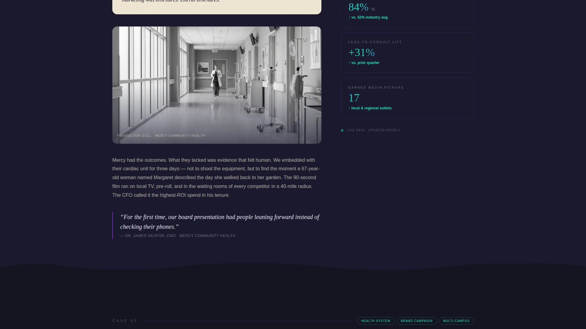
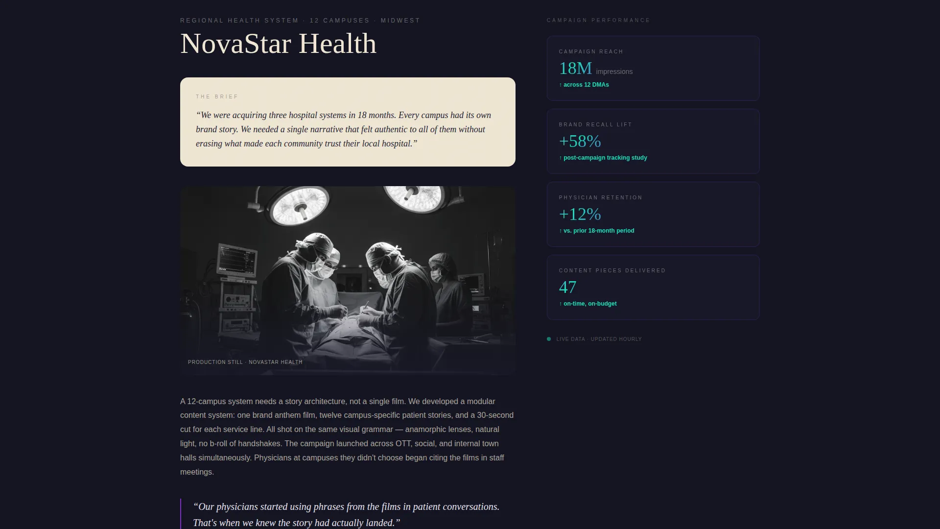
- Three client case study blocks laid out on a 60/40 asymmetric grid, each with story copy, production stills, video embeds, and live-updating outcome metrics
- A two-path conversion section with a slide-out qualification form and a gated reel download option
Feature list
This template ships with purpose-built components aligned to the healthcare B2B sales context. Each one is designed to do specific persuasive work.
Scroll-Jacked Opening Header
The viewport locks on load while the word "OUTCOMES" renders letter by letter in a hand-drawn ink stroke animation on a parchment texture. Each letter then dissolves into a patient's face mid-interview, forming a mosaic that pulls back to reveal a video play button. Navigation stays hidden until the sequence releases, ensuring the visitor experiences the message before anything else competes for attention.
Asymmetric 60/40 Case Study Grid
Each case study section uses a 60/40 column split. The wider left column carries the narrative: the client's challenge brief in their own words, a mid-production still, and the final video embed. The narrower right column displays live-updating metrics in iridescent type, including view counts, watch-through percentage, lead-to-consult conversion lift, and earned media pickups.
Paper-Tear Section Transitions
Case studies are separated by paper-tear animations that mimic turning pages in a production journal. The visual metaphor reinforces the Ink & Paper theme and signals deliberate storytelling craft to any visitor paying attention.
Escalating Proof Sequence
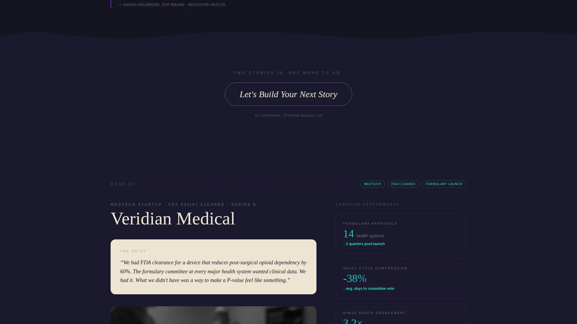
The three case studies are ordered by scope: community clinic, regional health system, and national pharma launch. This sequencing builds credibility incrementally and demonstrates range across the full healthcare vertical spectrum before the form ever appears.
Dual-Path Lead Capture
The closing section offers two conversion routes. The primary path opens a slide-out panel with three qualifying questions: healthcare vertical, annual video project volume, and an open field labeled "What story isn't being told yet?" The secondary path gates a healthcare reel download behind a business email field, qualifying casual visitors without losing them entirely.
Persistent Ghost Button call to action
After the second case study, a ghost button labeled "Let's Build Your Next Story" appears and follows the visitor down the page. At the closing section it solidifies into a full iridescent-gradient bar, reinforcing the invitation at exactly the moment a convinced buyer is ready to act.
Page sections overview
| Section | Purpose |
|---|---|
| Scroll-Jacked Header | Delivers the agency's core value through animation before a single scroll |
| Case Study One | Community clinic engagement with narrative copy, stills, embed, and metrics |
| Case Study Two | Regional health system story with escalated scope and outcome data |
| Case Study Three | National pharma launch proving full-range healthcare video capability |
| Ghost Button call to action | Persistent partnership prompt that appears after the second case study |
| Closing Conversion Bar | Iridescent call to action bar anchoring both lead capture paths |
| Slide-Out Form Panel | Three-question qualifier separating serious buyers from browsers |
| Reel Download Gate | Email-gated secondary path capturing lighter-touch leads |
Design & branding system
The visual identity is built on an Ink & Paper theme interpreted through an AI Iridescent color system. The result feels like a handwritten production notebook left open under ultraviolet light: analog craft meeting computational shimmer.
- Core palette: deep manuscript black (#1A1A2E) dominates reading surfaces; warm parchment (#F0E6D3) holds case study text blocks; soft iridescent pearl (#E8E4F0) marks section dividers
- Prismatic violet (#7B2FBE) is the base accent color, shifting to holographic teal (#16E0BD) on hover states to signal interactivity
- Iridescent accents are used sparingly, appearing only on interactive elements and data callouts so they feel like intelligence humming beneath the page rather than decoration
Mobile & speed optimization
The layout is designed to translate its cinematic experience to smaller screens without losing the deliberate pacing that makes it persuasive.
- The asymmetric 60/40 grid stacks vertically on mobile so case study narratives and metric columns read in logical sequence
- Scroll-jacked animations and paper-tear transitions are structured as discrete sections, keeping the experience navigable on touch devices
How this template helps you convert
The page is engineered so a CMO or medtech procurement lead arrives at the form already convinced. Conversion is built into the sequence, not bolted on at the end.
- The scroll-jacked header locks attention immediately and communicates the agency's premise before a visitor can bounce, creating a strong first-impression anchor that reduces drop-off at the top of the page.
- Three proof-of-concept case studies with real outcome metrics build cumulative evidence across the full scroll, so by the time the primary call to action solidifies into the iridescent gradient bar, the business case has already been made.
- The slide-out form's three-question sequence qualifies buyers by vertical, project volume, and story intent, giving the agency actionable context on every inbound lead before a single conversation starts.
Other information about this template
This template is designed for agencies that already have strong visual assets and clinical outcome data to populate each case study block. The layout rewards rich content.
- The template is built as a single-page asymmetric grid landing page, not a multi-page site
- The "What story isn't being told yet?" free-text prompt is intentional: it surfaces insight about the prospect's unmet need before any sales conversation begins
- The reel download secondary path is useful for prospects who are early in the buying process but not yet ready for a direct partnership conversation
- The parchment and black color pairing is chosen for legibility across long-form case study text, keeping reading comfortable even in the darker sections of the page
Theme
Ink & Paper
Creative direction
Case Study Narrative
Color system
AI Iridescent
Style
Asymmetric Grid (60/40)
Direction
Partnership/B2B
Page Sections
Scroll-jacked Opening Header
Asymmetric 60/40 Case Study Grid
Paper-tear Section Transitions
Escalating Proof Sequence
Dual-path Lead Capture
Persistent Ghost Button Call to Action
Related questions
Who is this template designed for?
What content do I need to fill in this template?
Does the template include the scroll animation and paper-tear transitions?
Can I use this template with fewer than three case studies?
Is this template suitable for a pharma or medtech agency specifically?



