Home Office Cleaning Specialist Landing Page Template
Scrub is a single-page landing page template built for home office cleaning specialists. It uses a zigzag alternating layout, a raw Industrial aesthetic, and a Problem→Solution visual arc to turn first-time visitors into booked clients. The design pairs visceral before-and-after imagery with bold amber calls-to-action, making the pitch immediate and hard to ignore.
by Rocket studio
Quick summary
Scrub is a bold, single-page landing page template designed for a home office cleaning specialist. It uses a zigzag alternating layout to walk visitors through specific, relatable grime problems and their clean counterparts. Every design choice, from the charcoal backgrounds to the amber call-to-action buttons, is built to prompt one action: booking a cleaning slot.
Who this template is for
This template is built for a one-person home office cleaning operation targeting remote workers. The typical client base includes people whose workspace and living space have fully merged, and who have stopped noticing the slow buildup of dust, grime, and cable chaos around them.
- Freelance home office cleaning specialists who work solo and need a credible online presence
- Service providers targeting remote software engineers, freelance designers, and startup founders working from home
- Cleaning professionals who want a no-form, click-through landing page that routes visitors straight to a scheduling tool
What problem this template solves
Most cleaning service pages look interchangeable. They lead with stock photos of mops and generic reassurances, then bury the call to action under a long contact form. This template solves a different problem: it makes the visitor see their own mess before it sells them the solution.
- Home office workers are desensitized to their own clutter, so the template uses close-up before imagery to trigger recognition
- Generic service pages fail to communicate scope, so a detailed checklist section anchors skeptics who need specifics before committing
- Long contact forms create friction, so this template skips the form entirely and routes all traffic to an external scheduling page
What you get with this template
This template delivers a complete, ready-to-customize single-page layout. Every section is pre-structured around the Problem→Solution Arc creative direction, so the narrative flow is already doing the heavy lifting.
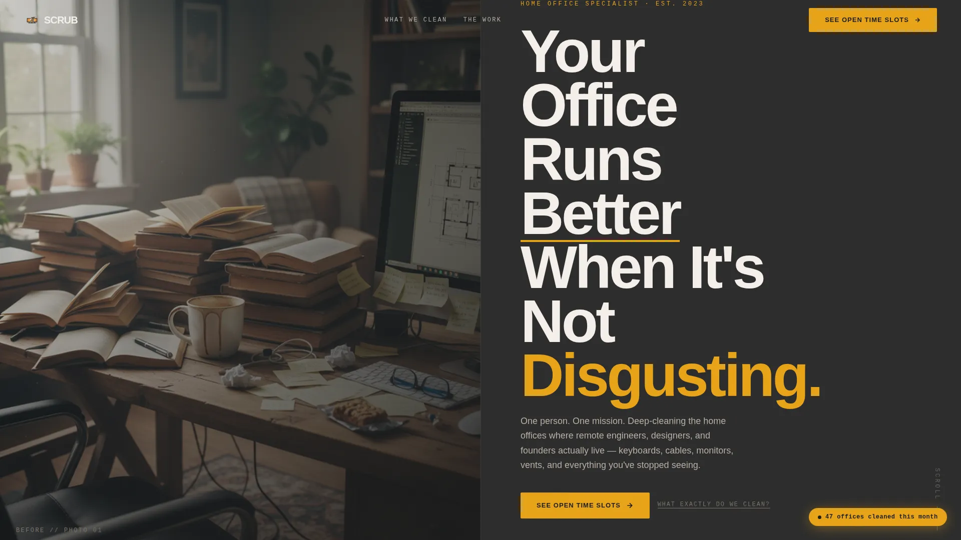
- A half-page photo-and-text split header with a bold condensed headline and an amber-accented call-to-action button
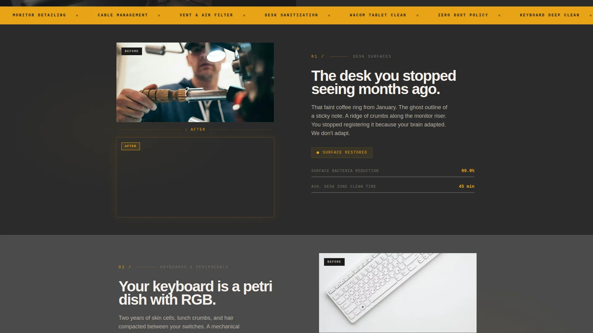
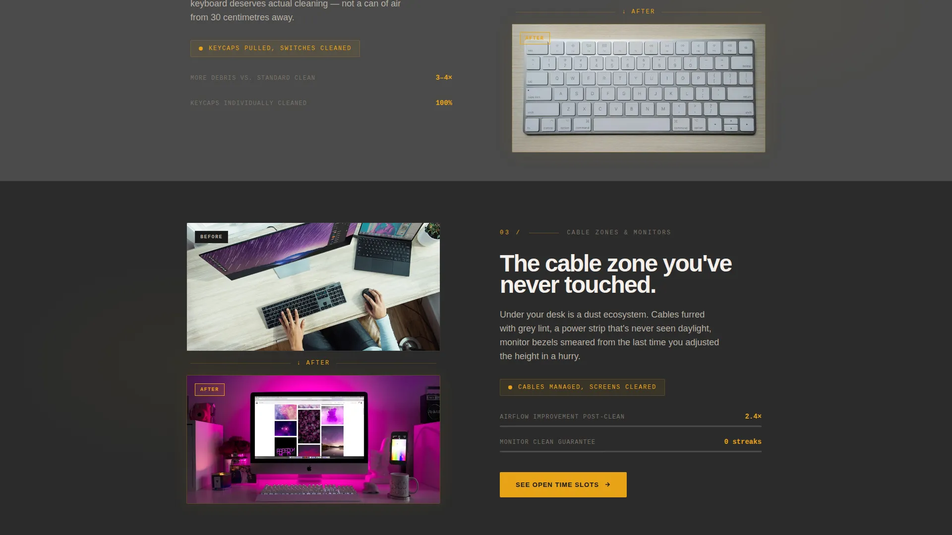
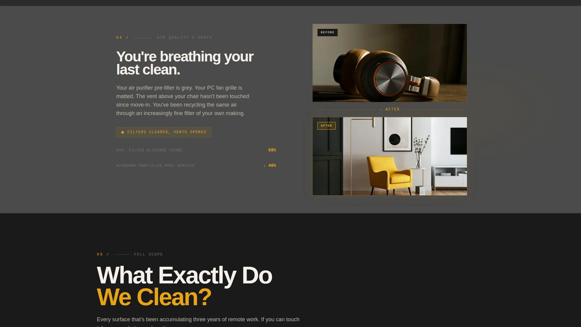
- A zigzag alternating content layout with paired before-and-after visual blocks covering desk surfaces, cable zones, and air quality sections
- A fixed amber badge in the bottom corner for a running count of local offices cleaned this month, plus a secondary anchor link to a detailed cleaning checklist section
Feature list
This section breaks down the key functional and design features built into this template.
Half-Page Split Header
The header divides the screen into two halves. The left side holds a high-contrast desk-level photograph showing monitor glare, tangled cables, sticky notes, and a dried coffee ring. The right side is stark charcoal with a heavy condensed headline. An amber underline animates once beneath a key word, then holds still.
Zigzag Alternating Section Layout
Each content section alternates left and right placement. One side shows a visceral close-up of a specific problem: dust packed between keyboard keys, a gray-matted vent filter, or smeared monitor bezels. The other side shows the same subject, immaculate. The layout physically bounces the eye and escalates the narrative from surface dirt to hidden neglect.
Repeating Amber Call-to-Action
The primary call-to-action button, labeled "See Open Time Slots," appears in amber at the header and repeats at every third section. There is no form on the page. Every button routes visitors directly to a scheduling page, keeping the conversion path short and frictionless.
Fixed Social Proof Badge
A persistent amber badge sits in the bottom corner of the page. It displays a running count of local offices cleaned this month. The badge stays visible as the visitor scrolls, providing a low-effort trust signal without interrupting the reading flow.
Detailed Cleaning Checklist Section
A secondary text link, "What Exactly Do We Clean?", anchors visitors down to a detailed checklist section near the bottom of the page. This section is designed for skeptics who want to verify the scope of the service before clicking through to book.
Industrial Raw Visual Theme
The entire page uses a strict four-color system: deep charcoal for the primary background, smudged graphite for section alternation, warm amber for highlights and calls-to-action, and bone white for body text. The palette is utilitarian and intentional, designed to feel like a workshop lamp cutting through a dim space.
Page sections overview
| Section | Purpose |
|---|---|
| Split Header | Introduce the service with a confrontational before image and a bold headline |
| Desk Surface Block | Show the problem and solution for desk-level grime and coffee rings |
| Keyboard Close-Up | Highlight dust buildup between keys as a specific, relatable pain point |
| Cable Management Zone | Address tangled cables and the neglected under-desk area |
| Air Vent Section | Escalate to hidden neglect with matted vent filters and allergen buildup |
| Monitor Bezel Block | Show fingerprint smears and their clean counterpart side by side |
| Cleaning Checklist | Anchor skeptics with a detailed scope of what the service covers |
| Repeat call to action Section | Reinforce the booking action with another amber "See Open Time Slots" button |
| Fixed Corner Badge | Display the running monthly office count as a persistent trust signal |
Design & branding system
The visual identity follows an Industrial Raw theme. The palette is deliberately heavy and utilitarian, with a single warm accent color doing all the directional work.
- Primary background in deep workshop charcoal (#2B2B2B), with smudged graphite (#4A4A4A) used for alternating sections to create visual rhythm without distraction
- Warm amber (#E8A317) reserved exclusively for calls-to-action, highlights, the fixed badge, and the animated headline underline, drawing the eye precisely where action is needed
- Body text set in clean bone white (#F5F0EB) against dark backgrounds, with headlines using a heavy condensed typeface to maximize contrast and urgency
Mobile & speed optimization
The zigzag layout is built to reflow cleanly on smaller screens. On mobile, alternating left-right blocks stack vertically while maintaining the before-and-after pairing so the narrative arc stays intact.
- The fixed amber badge repositions for mobile viewports so it does not obstruct body content
- Large before-and-after images are the visual backbone of this template, so image sizing and placement are handled to preserve clarity across screen sizes
How this template helps you convert
This template is designed around a single conversion goal: getting visitors to click through to a scheduling page. Every layout decision supports that goal.
- The header places the primary call-to-action immediately in view, so visitors can act before they even begin to scroll
- The Problem→Solution Arc escalates emotional recognition section by section, building urgency naturally as the visitor scrolls deeper into content they recognize from their own desk
- The detailed checklist section near the bottom captures late-stage skeptics who need scope confirmation before committing, so no informed buyer leaves the page without a clear path to book
Other information about this template
This template is purpose-built for a single-niche use case. A few additional details worth noting before you customize it.
- The template is categorized under Construction & Home, with a subcategory focus on home office renovation and home office cleaning
- The scheduling integration destination is left open for the operator to connect to their preferred booking tool, as no specific platform is hardcoded into the template
- The running office count in the fixed badge is a placeholder field intended to be updated manually or dynamically depending on your setup
- This template does not include a contact form by design; the click-through architecture is intentional and core to the conversion strategy
Theme
Industrial Raw
Creative direction
Problem→Solution Arc
Color system
Charcoal & Amber
Style
Zigzag/Alternating
Direction
Click-Through
Page Sections
Half-page Split Header
Zigzag Alternating Layout
Repeating Amber Call-to-action
Fixed Social Proof Badge
Detailed Cleaning Checklist Section
Related questions
Is this template suitable for a solo cleaning operator with no team?
Does this template include a contact form?
Can I replace the before-and-after images with my own photos?
How do I update the office count in the fixed corner badge?
Can I change where the call-to-action button links?



