Veterinarian Profile Professional Website Template
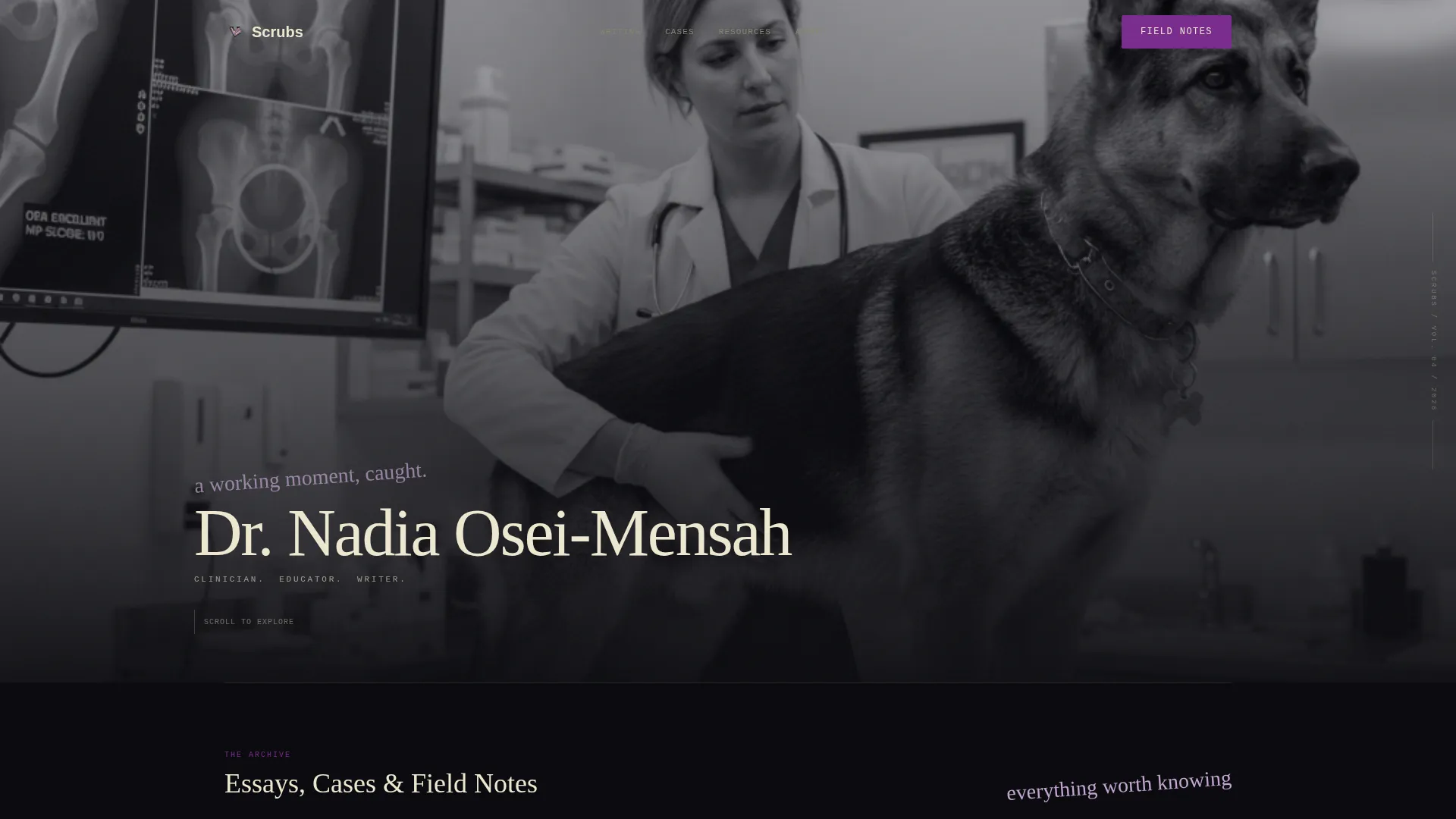
Scrubs is a masonry-style personal brand landing page built for veterinarians who create content. It pairs a chiaroscuro clinic photo header with an irregular card grid of essays, case breakdowns, videos, and downloadable guides. The Ink and Paper design system and a newsletter signup with a vet-or-pet-owner toggle make it easy to build a segmented, trusted audience from day one.
by Rocket studio
Quick summary
Scrubs is a single-page content hub designed for veterinarian educators and writers. It opens with a full-bleed clinic photo, then rolls into a masonry grid of articles, case breakdowns, podcast cards, and downloadable guides. Three cards are fully readable without any gate, proving depth before asking for an email. A segmented newsletter signup closes the loop.
Who this template is for
This template fits veterinarians who do more than treat patients. If you write, teach, record, or publish, this page gives your work the editorial weight it deserves.
- Newly graduated DVMs (Doctor of Veterinary Medicine) who want to build a mentorship-driven content brand online
- Seasoned practitioners looking to share continuing education resources that feel less like a slide deck
- Devoted pet owners seeking medically grounded content that respects their intelligence
What problem this template solves
Most veterinarians who create content online have no dedicated space that matches the seriousness of their work. A generic blog or a social media profile undersells clinical expertise. This template closes that gap.
- It gives clinical writing and case content a home that looks and reads like a curated archive, not a corporate blog
- It segments your audience from signup, separating fellow vets from pet owners without extra friction
- It earns trust before asking for anything, showing three full ungated pieces before the newsletter prompt appears
What you get with this template
You get a complete, single-page content hub built around the masonry grid layout. Every section is included and ready to customize with your own work.
- A full-bleed chiaroscuro header with editorial serif typography and a one-line descriptor beneath your name
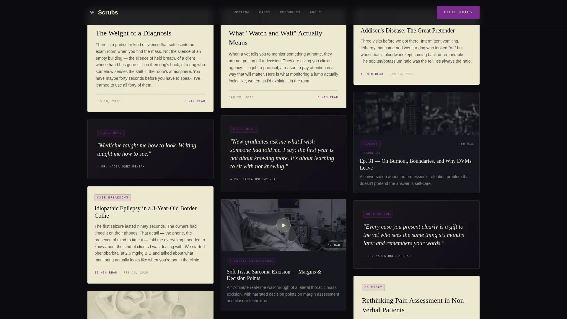
- A masonry content grid with varied card heights carrying essays, quote tiles, surgical walkthrough video thumbnails, podcast episode cards, and downloadable PDF guide cards
- A newsletter call-to-action section with an email field and a single toggle to segment subscribers as vets or pet owners
Feature list
This template ships with a set of purpose-built components, each tied directly to how a veterinarian-educator presents and monetizes their expertise.
Masonry Content Grid with Mixed Card Types
The grid uses irregular card heights to carry essays, case breakdowns, anatomy sketch illustrations, pull-quote tiles, podcast cards, and video thumbnails. Content-type tags appear in surgical violet on each card, so readers can scan by format at a glance.
Full-Width Featured Piece Breaker
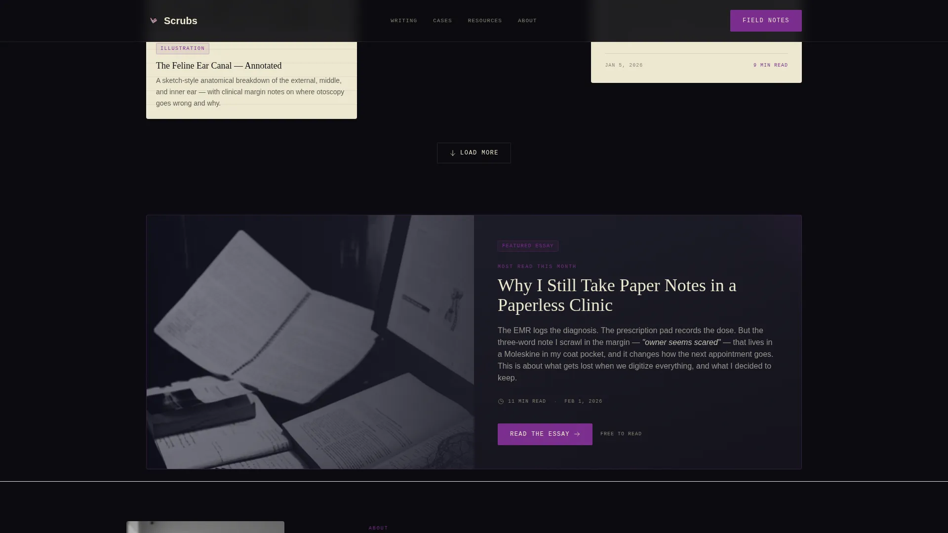
Every few rows, a full-width card interrupts the masonry pattern. It carries a deeper excerpt and a clear call to action, giving your most important work a moment of visual gravity that shorter cards cannot match.
Three Ungated Preview Cards
The first three content cards are fully readable without any email prompt. This deliberate design choice lets the quality of your work do the selling, so readers arrive at the signup already convinced.
Segmented Newsletter Signup
The email capture includes a single toggle asking visitors to identify as a vet or a pet owner. This one field segments your list from day one without adding form complexity or friction.
Persistent Mobile Call-to-Action Bar
On mobile screens, the newsletter call to action anchors as a persistent bottom bar. On desktop, it appears as a sidebar signup. Neither placement interrupts reading, but neither lets visitors leave without noticing the offer.
Resource Hub Cards with Download Actions
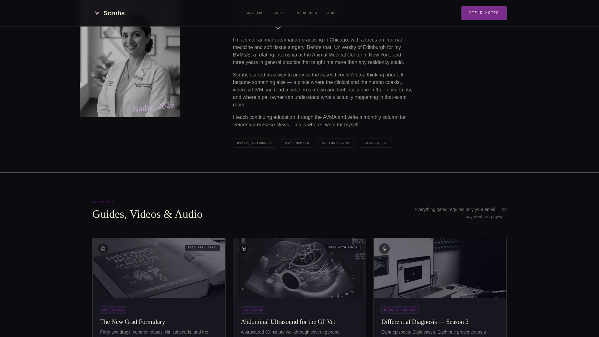
Podcast episodes, video walkthroughs, and PDF guide cards each carry a secondary download or listen button gated behind the same email capture. The gate is light and consistent across all resource types.
Page sections overview
| Section | Purpose |
|---|---|
| Full-Bleed Header | Establish editorial identity with a clinic photo and name descriptor |
| Masonry Content Grid | Display essays, quotes, and case cards in an irregular, browsable layout |
| Full-Width Featured Piece | Spotlight the single most important piece of content per session |
| Resource Hub Cards | Surface podcast, video, and PDF guide content with download actions |
| Newsletter Call to Action | Capture email and segment subscribers with a vet or pet owner toggle |
| Footer | Close the page with horizontal flow navigation and contact links |
Design & branding system
The Ink and Paper visual identity uses four deliberate colors. Void black dominates the negative space between masonry cards. Aged parchment fills the cards themselves. Surgical violet marks links, author bylines, and content-type tags. Muted lavender appears only on card hover states and pull-quote backgrounds, rewarding curiosity without demanding attention.
- Typography pairing: DM Serif Display for headings, IBM Plex Mono for tags and metadata, and Manrope for body text
- Hover animations reveal grayscale-to-color transitions on card images, with scroll entrance animations as cards load into view
- The overall aesthetic reads like a handwritten prescription pad under a UV sterilization lamp, clinical and dark with unexpected warmth in every parchment card
Mobile & speed optimization
The template is designed desktop-first for the masonry experience, with deliberate mobile adaptations that preserve the brand feel on smaller screens.
- Card images use lazy loading so the grid does not wait on off-screen assets before becoming interactive
- The newsletter call to action switches from a desktop sidebar to a persistent mobile bottom bar, keeping the signup visible without covering the content
- Server Components handle the static grid structure, reducing the client-side work needed to render the initial card layout
How this template helps you convert
Every structural decision in this template points toward one outcome: a visitor who trusts you enough to share their email address and self-identify as a vet or a pet owner.
- Three fully ungated cards let readers experience the content depth before any ask appears, building trust through proof rather than promises.
- The persistent call-to-action placement on mobile and the sidebar signup on desktop keep the newsletter offer continuously visible without interrupting the reading flow.
- The vet or pet owner toggle on the signup form segments your list automatically, so every email you send reaches an audience that already told you who they are.
Other information about this template
This template is built specifically for the veterinarian personal brand niche, where the gap between clinical credibility and online presence is wide. A few additional details worth noting before you get started:
- The masonry layout is Pinterest-style with varied card heights, designed to reward browsing rather than linear reading
- The chiaroscuro header photo direction avoids portrait energy entirely, framing a working clinical moment instead
- Social proof is woven into the masonry grid as embedded quote tiles, and a subscriber count appears in the newsletter call-to-action section
- The footer follows a horizontal flow pattern, consistent with the editorial aesthetic across the rest of the page
- This template suits a dual audience model out of the box, serving both professional peers and informed pet owners from one unified content hub
Theme
Ink & Paper
Creative direction
Creator Spotlight
Color system
Void & Violet
Style
Masonry/Pinterest
Direction
Content/Resource
Page Sections
Masonry Grid with Mixed Card Types
Full-width Featured Piece Breaker
Three Ungated Preview Cards
Segmented Newsletter Signup Form
Resource Hub with Download Actions
Chiaroscuro Full-bleed Header
Related questions
Can I use this template without a large content library yet?
Does the newsletter toggle actually split my list automatically?
Can this page serve both veterinary professionals and pet owners at the same time?
Is this template designed for a solo practitioner or can a small team use it?
How much setup is needed before the page looks complete?



