Hair Salon Cost Calculator Website Template
Shear is a bold brutalist salon case study landing page built for hair salon owners and stylists who need proof, not promises. It leads with a live revenue calculator, stacks hard before-and-after metrics in a modular card grid, and drives visitors toward a paid strategy resource through high contrast design, raw typography, and a magenta-pulsed call to action.
by Rocket studio
Quick summary
Shear is a single-page brutalist landing page template built around one real salon's eleven-month growth story. The design strips away every decorative element and puts raw numbers front and center. Visitors punch their own figures into a live calculator and instantly see a projected revenue gap. The page stacks proof card by card, earning the click before asking for it.
Who this template is for
This landing page speaks directly to people in the beauty industry who are tired of vague marketing advice. It is built for users who need hard data and a clear path forward.
- Solo stylists scaling from one chair to a full team, looking for a proven growth framework
- Salon owners losing ground to mobile barbers and struggling to retain a steady client base
- Beauty school graduates with empty appointment books who need a strategic starting point
What problem this template solves
Most salon marketing pages hide behind lifestyle photography and soft copy. They look polished but they do not answer the one question every struggling stylist actually has: did the math work? This brutalist landing page solves that directly.
- Visitors leave too quickly when pages fail to deliver specific, credible proof up front
- Solo operators cannot afford to guess at a growth process when chairs sit empty mid-week
- New stylists have no reference point for what realistic client growth looks like in early days
What you get with this template
This template gives you a complete, focused landing page structure built to showcase one case study with maximum impact. Every section serves the same goal: make the visitor feel the gap between their current numbers and what is possible.
- A live brutalist revenue calculator that outputs personalized monthly projections in real time
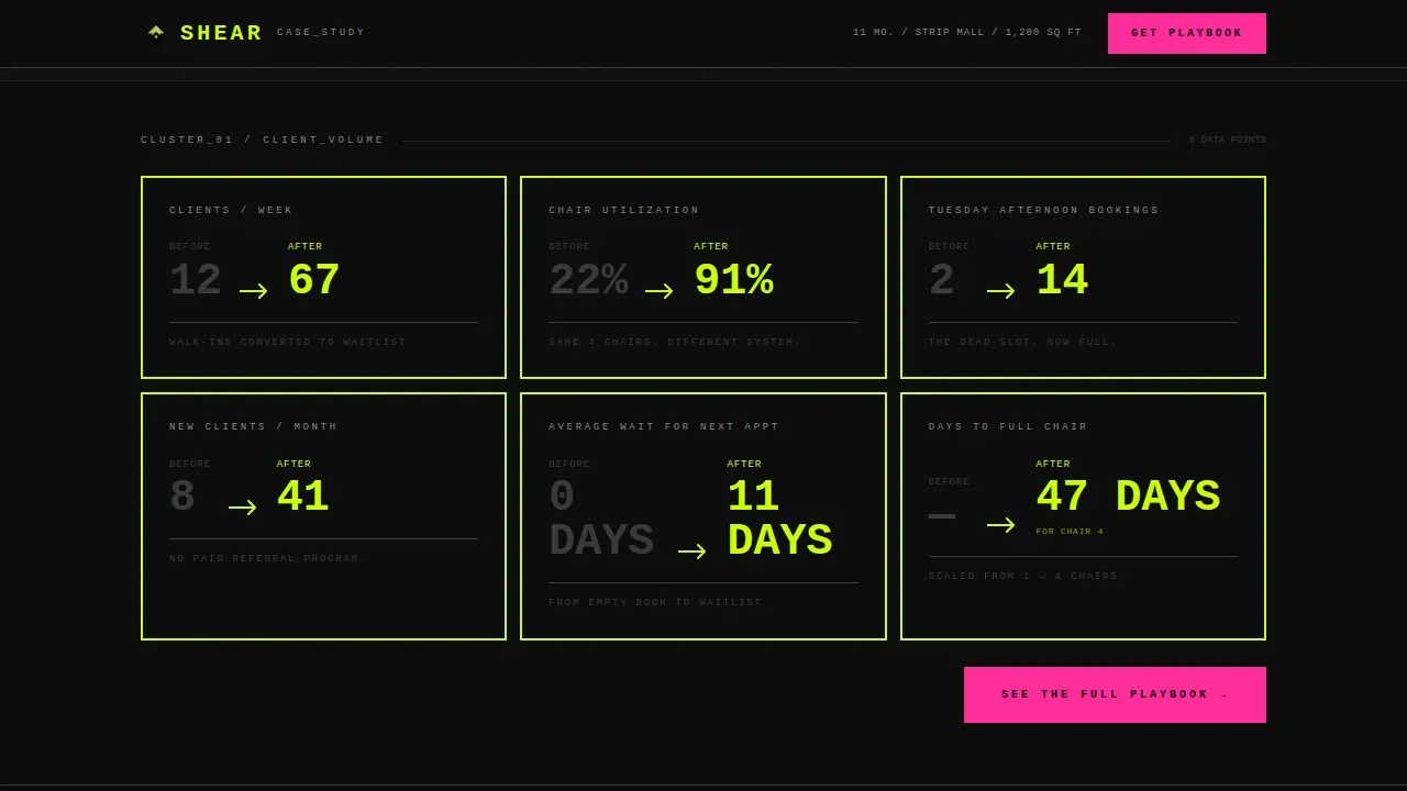
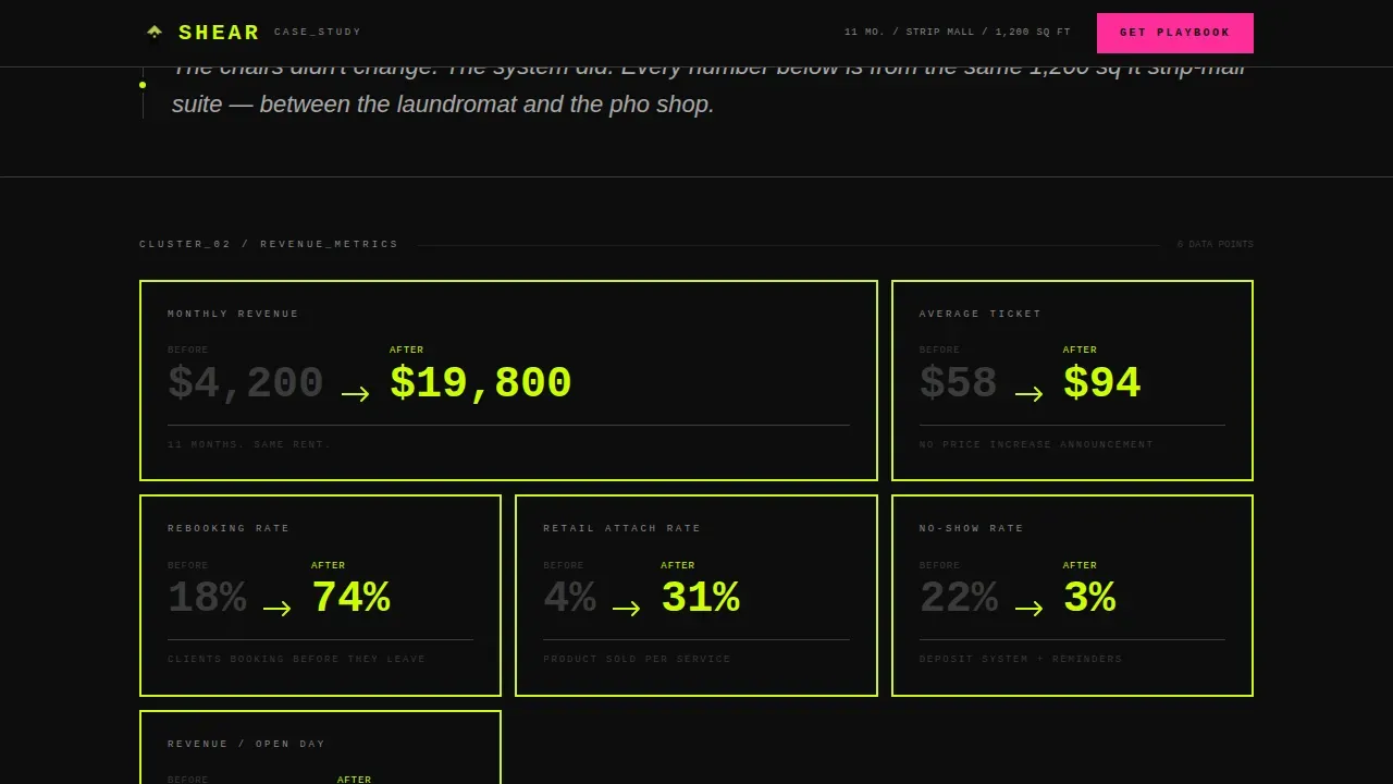
- A full modular card grid of before-and-after spec blocks with chartreuse borders and oversized metric typography
- Full-width narrative break cards, an audience segment section, a final call-to-action block, and a sticky mobile bottom bar
Feature list
This template includes a tight set of purpose-built features. Each one is focused on converting a skeptical visitor into a motivated buyer without relying on decoration or filler.
Live Revenue Calculator Module
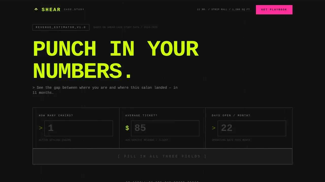
The landing page opens with a brutalist input module in monospaced type on a void-black field. Visitors enter their chair count, average ticket value, and days open per week. The calculator outputs a projected monthly revenue figure using the same growth curve documented in the case study. Chartreuse digits tick upward in real time, making the gap between current and potential revenue immediately visible.
Modular Before-and-After Card Grid
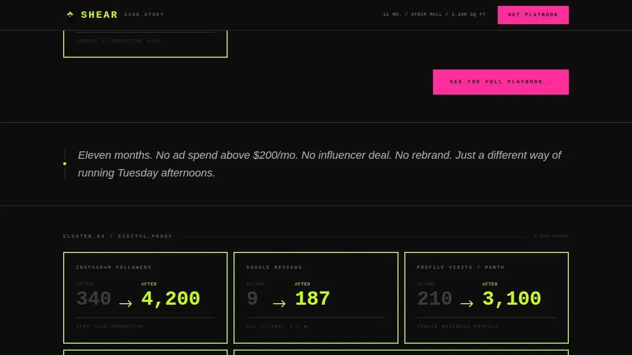
Below the calculator, the layout delivers evidence in uniform spec-block cards. Each card presents a single data point: clients per week, rebooking rate, review count, social media platforms follower growth. Cards are grid-locked with thick chartreuse borders and bold oversized numbers. The structure stacks proof without narrative padding, keeping visitors focused on the data rather than the story around it.
Full-Width Narrative Break Cards
Between clusters of metric cards, full-width break cards inject a single sentence of context in scanner-white italic on black. These breaks create rhythm in the layout and give the next cluster of numbers more weight. They are extremely simplistic by design, adding just enough words to make the data land harder without slowing the scroll.
Audience Segment Targeting Section
A dedicated section asks "Is this you?" and surfaces three distinct reader profiles. This segment card block uses the same raw design language as the rest of the page. It helps visitors self-identify quickly, reducing bounce rate by confirming the page is relevant to their specific situation before they reach the call to action.
Magenta Call-to-Action System
Every card grid section ends with a magenta-pulsed button reading "See the Full Playbook." The color appears nowhere else on the page, which makes every interactive element feel like a warning light. Brutalist design incorporates jarring accent colors exactly this way, using neon or harsh-contrast hues to draw full attention to the conversion point.
Sticky Mobile Bottom Bar
On mobile, a persistent bottom bar repeats the primary call to action alongside the visitor's own calculator output. The bar reads "Your salon could add $X/month, See How," keeping the personalized number visible throughout the entire scroll. This feature is critical for mobile users who might otherwise lose context between the calculator and the final click.
Page sections overview
| Section | Purpose |
|---|---|
| Hero Calculator Block | Deliver personalized revenue projections instantly |
| Metric Card Grid | Stack before-and-after proof in bold spec blocks |
| Narrative Break Cards | Add context between data clusters |
| Audience Segment Cards | Help visitors self-identify with the case study |
| Final call to action Block | Drive the click to the paid strategy resource |
| Sticky Mobile Bar | Reinforce personalized call to action throughout scroll |
| Footer Row | Close the page with a clean linear single-row layout |
Design & branding system
The design follows a Bold Brutalist theme driven by an Acid Digital color system. Every choice in this system is intentional and unapologetic. The aesthetic draws inspiration from brutalist buildings and brutalist architecture, translating the raw, exposed structures of mid-20th century construction into a digital format. Web brutalism in this template means high contrast, minimal styling, and type that does the visual heavy lifting.
- Void black (#0D0D0D) covers every background; electric chartreuse (#CCFF00) owns all headlines, metric numbers, and card borders; scanner-bed white (#EAEAEA) handles body text
- Data-bleed magenta (#FF2D9B) is reserved exclusively for hover states and call-to-action pulses, making every clickable element visible and unmistakable
- Typography uses JetBrains Mono for all numbers and calculator inputs, and Plus Jakarta Sans for body copy, combining bold typography with a utilitarian, monospaced precision
Mobile & speed optimization
The template is built mobile-first. The sticky bottom bar is a core feature, not an afterthought. On any device, the layout adapts without losing the high contrast impact or the grid structure that makes the data readable.
- Card stagger reveals and counter tick-up animations are handled at medium intensity, keeping smooth animations present without adding unnecessary weight to the page
- Static sections use server-side rendering patterns while the live calculator runs as a client component, balancing interactivity with efficient page delivery
- The layout is designed to load quickly by avoiding high resolution images entirely; raw numbers and typography carry the visual work instead
How this template helps you convert
This brutalist landing page is engineered around a specificity gap strategy. Visitors see exactly what happened to the Shear salon but not how it happened. That gap creates pressure that only one action resolves.
- The calculator personalizes the stakes immediately, showing each visitor their own projected revenue number before they read a single line of case study copy, which pulls them deeper into the page
- The card grid stacks undeniable before-and-after proof across multiple metrics, building cumulative trust without requiring the visitor to read long paragraphs or evaluate subjective claims
- The magenta call-to-action button appears only after enough evidence has landed, so when visitors finally see it, the click feels earned rather than forced
Other information about this template
This template sits within the neo-brutalism movement that has grown prominently across web design in 2024 and 2025. It is a strong fit for experimental campaigns and creative industry projects where a brand's unique identity needs to make an instant impression. Brutalist web design like this works best when the audience values authenticity over polish, and that is exactly the context this template was built for.
- The shear bold brutalist salon case study landing page template is categorized under neo-brutalism and is suited for edgy, modern salon brands that want to stand out in a saturated digital market
- Developers can customize the color tokens, card grid layout, and typography scale directly in the code without restructuring the full page; the template supports a redesign of individual sections without breaking the overall structure
- Feedback from users in similar projects suggests that front-loading hard metrics reduces drop-off significantly; this template's card-first layout is built on that principle
- The page does not rely on a portfolio of images to make its case; it uses data as the portfolio, which keeps the page fast and the message focused
- Tools like Google Analytics can be connected independently to track visitor behavior, card engagement depth, and call-to-action click rates across the page
Theme
Bold Brutalist
Creative direction
Spec Sheet
Color system
Acid Digital
Style
Card Grid (Modular)
Direction
Click-Through
Page Sections
Live Brutalist Revenue Calculator
Modular Before-and-after Card Grid
Full-width Narrative Break Cards
Audience Segment Targeting Section
Magenta Call-to-action Pulse System
Sticky Mobile Bottom Bar
Related questions
Does this template require coding knowledge to set up?
Can I use this template for a salon without an existing case study?
Is the revenue calculator editable?
How does the sticky mobile bottom bar work?
Who is this landing page template best suited for?