Culinary School Landing Page Template | Corporate Precision
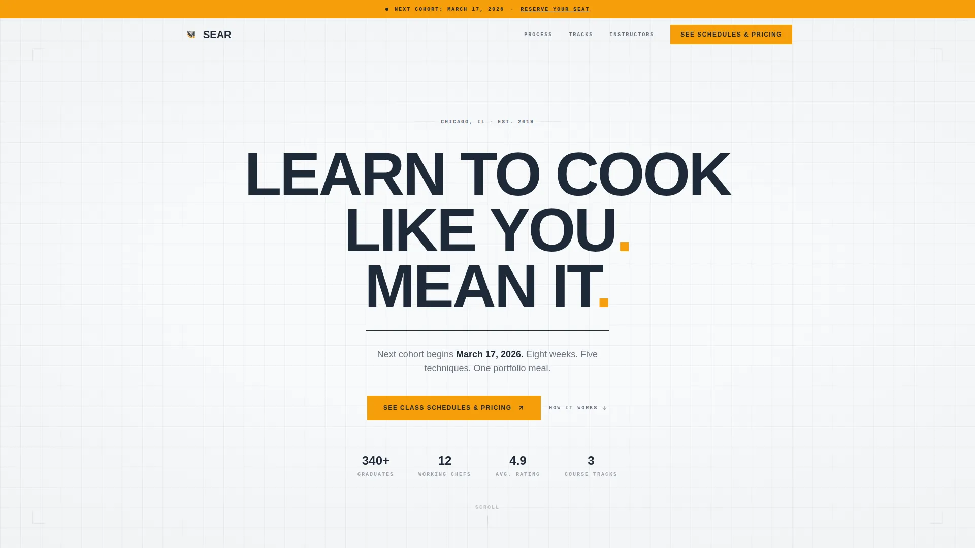
Sear is a split-screen landing page template built for teaching kitchens and culinary schools. It pairs a clinical, precision-driven layout with warm kitchen photography to communicate credibility and craft. With a sticky urgency bar, a transparent step-by-step process, and a clear saffron-accented call to action, the page guides every visitor toward booking a class.
by Rocket studio
Quick summary
Sear is a 50/50 split-screen landing page template designed for cooking schools that need to look as disciplined as the chefs they feature. The layout balances structured process diagrams against real kitchen photography, and every design choice reinforces a single message: this school is organized, skilled, and worth your time.
Who this template is for
This template was built for culinary educators who want a page that earns trust before asking for a click. It suits schools with real instructors, structured curricula, and multiple audience types to serve.
- Cooking schools and teaching kitchens offering professional-grade instruction
- Corporate event planners and team-build coordinators looking for culinary experiences
- Career-changers and ambitious home cooks researching structured culinary programs
What problem this template solves
Most cooking school pages look either too casual or too generic. They fail to communicate instructor credibility, curriculum depth, or the specific value of booking. Visitors leave without understanding what they will actually learn or who will teach them.
- No visible process means visitors cannot picture the experience before they commit
- Missing instructor credentials make it hard to justify the price of professional tuition
- Vague calls to action leave interested visitors with no clear next step
What you get with this template
You get a fully structured, single-page layout with every section pre-built and purposefully sequenced. The design system, copy structure, and visual hierarchy are all ready to adapt for your school.
- A 50/50 split-screen layout pairing typographic process steps with kitchen photography slots
- A sticky top bar showing the next available class start date for ambient urgency
- Three strategically placed saffron-yellow call-to-action buttons linking to a scheduling page
Feature list
This template includes six purposefully designed features, each grounded in the needs of a culinary school selling structured instruction to a discerning audience.
Giant Centered Headline Block
The header opens with a single bold statement in heavy, tracked-out sans-serif type against pure white. No imagery competes on first load. After a brief beat, a thin charcoal rule animates in and a single line of body copy fades up with the next class date.
Transparent Process Section
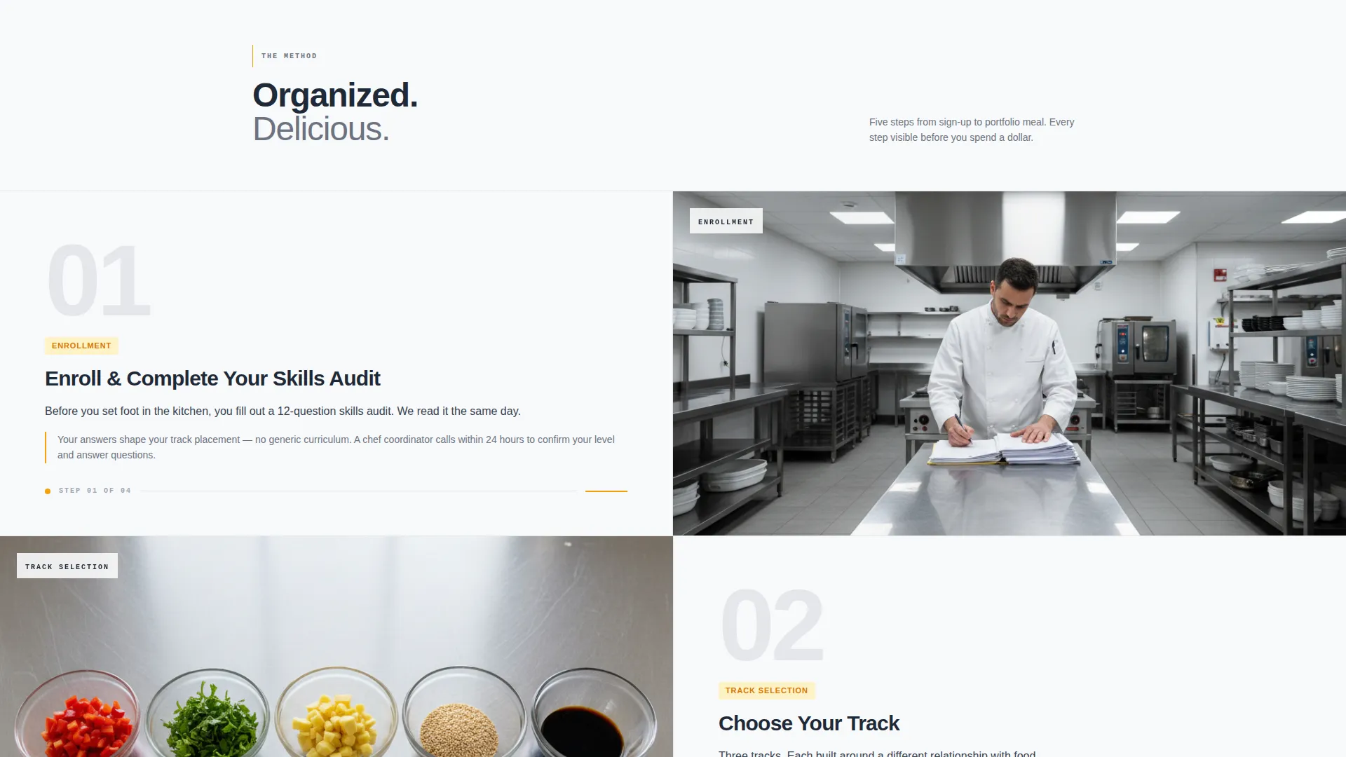
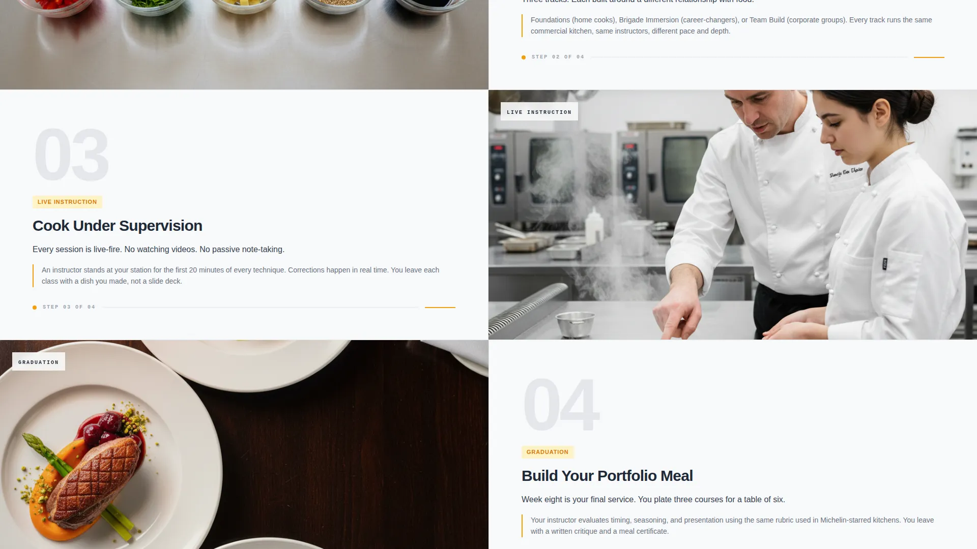
Five numbered steps run down the left panel of the split screen. Each step, from enrollment through a final portfolio meal, sits beside a corresponding kitchen photograph on the right. The contrast between diagrammatic instruction and warm sensory imagery is the visual engine of the page.
Sticky Urgency Bar
A persistent top bar displays the next available class start date throughout the scroll. It keeps time-sensitive information visible without resorting to countdown timers or high-pressure copy.
Instructor Bio Blocks
Each instructor profile includes brigade-level credentials drawn from real hotel kitchen experience. The bios build authority through specificity, letting the instructors' professional histories do the convincing.
Curriculum Breakdown Display
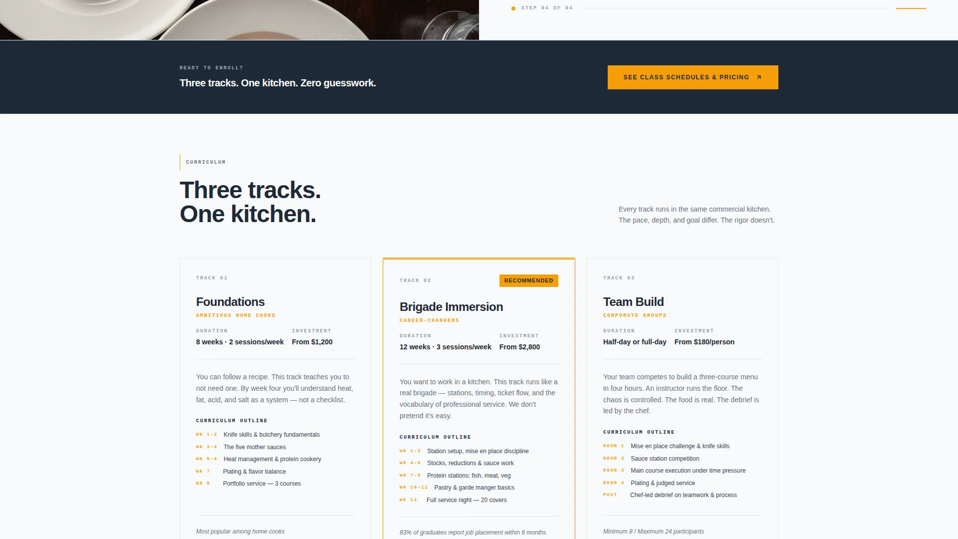
Visible course outlines show exactly what students learn across knife skills, mother sauces, and plating technique. Transparency at this level removes the hesitation that typically stalls sign-ups.
Facility Walkthrough Embed Slot
A dedicated section supports a filmed walkthrough of the kitchen facility. Visitors can see the space before they book, which reduces uncertainty and increases confidence in the school's setup.
Page sections overview
| Section | Purpose |
|---|---|
| Sticky Urgency Bar | Shows next class date persistently |
| Giant Headline Block | Opens with bold school statement |
| Process Steps Split | Maps enrollment to graduation visually |
| Curriculum Breakdown | Displays course content transparently |
| Instructor Bio Blocks | Establishes chef credentials clearly |
| Facility Walkthrough | Builds trust through kitchen preview |
| Footer Call to Action | Closes with final scheduling prompt |
Design & branding system
The design system follows a Corporate Precision theme built around an Arctic White color palette. Every color choice reinforces the feeling of a spotless commercial kitchen under halogen light.
- Clinical white (#F8F9FA) and brushed stainless (#D1D5DB) form the base, with charcoal apron black (#1F2937) for type and structure
- Saffron yellow (#F59E0B) appears exclusively on buttons and progress indicators as the single warm accent
- Heavy tracked-out sans-serif type carries the headline, while the body uses clean, readable weight for process and curriculum copy
Mobile & speed optimization
The split-screen layout is structured to restack cleanly on smaller screens, so the process steps and photography remain legible without zooming or horizontal scrolling.
- The sticky urgency bar remains visible on mobile, keeping the next class date accessible throughout the scroll
- Photography slots and text panels are sized to preserve readability and visual balance at every common screen width
How this template helps you convert
The page is built around a click-through conversion model. There is no form to fill in before the click. Trust is built through visible proof, and the action is simple: see the schedules and pricing.
- The saffron call-to-action button appears three times, beneath the header, after the process section, and in the footer, so the invitation is always within reach without feeling aggressive
- Transparent curriculum outlines and real instructor credentials answer the hardest objections before visitors reach the first button
- The sticky top bar maintains ambient urgency by keeping the next available start date in view throughout the entire scroll
Other information about this template
This template is part of a precision-focused collection designed for professional service providers who need to communicate authority quickly. It is especially well suited for cooking school Google Ads landing page campaigns, where visitors arrive with high intent and need fast, clear confirmation that the school is legitimate.
- The template works as a standalone cooking school marketing asset, requiring no additional pages to complete the pre-click experience
- The click-through structure sends qualified visitors to a separate scheduling page, keeping this landing page clean and focused
- Color, type, and layout customization can be applied to match any culinary school's existing visual identity
Theme
Corporate Precision
Creative direction
Transparent Process
Color system
Arctic White
Style
Split Screen (50/50)
Direction
Click-Through
Page Sections
Giant Centered Headline Block
Transparent Process Split Screen
Sticky Next-class Urgency Bar
Instructor Bio with Brigade Credits
Visible Curriculum Breakdown
Facility Walkthrough Embed Slot
Related questions
Who is this landing page template designed for?
Does this template include a booking form?
Can I adapt the instructor bios and curriculum sections to match my school?
What makes the split-screen layout effective for a cooking school?
Is the saffron accent color the only way to highlight calls to action?



