Premium Iberian Kitchen Landing Page Template
Plancha is a masonry-grid landing page template built for Spanish fast-casual restaurants. It pairs a warm Haute Craft visual identity with a Before/After Reveal mechanic that builds appetite before asking for the click. Three conversion paths run in parallel: pickup ordering, catering inquiries, and a rotating weekly special, all sitting downstream of food-first storytelling.
by Rocket studio
Quick summary
Plancha is a single-page template designed to make visitors taste the food before they commit to an order. The masonry layout pairs raw ingredients with finished dishes in a crossfade reveal. A sticky order bar, an inline catering form, and a weekly special tile bring three conversion goals together without competing for attention.
Who this template is for
This template is built for operators who know their food is good enough to sell itself, they just need the right stage. The design targets counter-service Spanish restaurants that want to feel sharper than fast casual without crossing into fine dining.
- Downtown restaurant owners targeting the lunch crowd and the dinner-date market
- Catering managers who need a polished spot to field event inquiries
- Restaurant founders ready to launch a mobile-first ordering experience quickly
What problem this template solves
Most fast-casual restaurant pages rush the visitor straight to a menu list before appetite is earned. That approach kills conversion because the visitor has not yet tasted anything. This template solves that by making desire do the work first.
- Visitors scroll through ingredient-to-dish reveals before they ever face a call to action
- Multiple conversion goals, pickup, catering, weekly special, are separated cleanly so no path blocks another
- The mobile-first layout keeps the ordering flow fast during the lunch rush, when seconds matter
What you get with this template
You get a complete, ready-to-customize landing page with a strong editorial identity and three distinct conversion pathways built in. Every section has a clear job, and the visual system holds together from the hero image down to the footer.
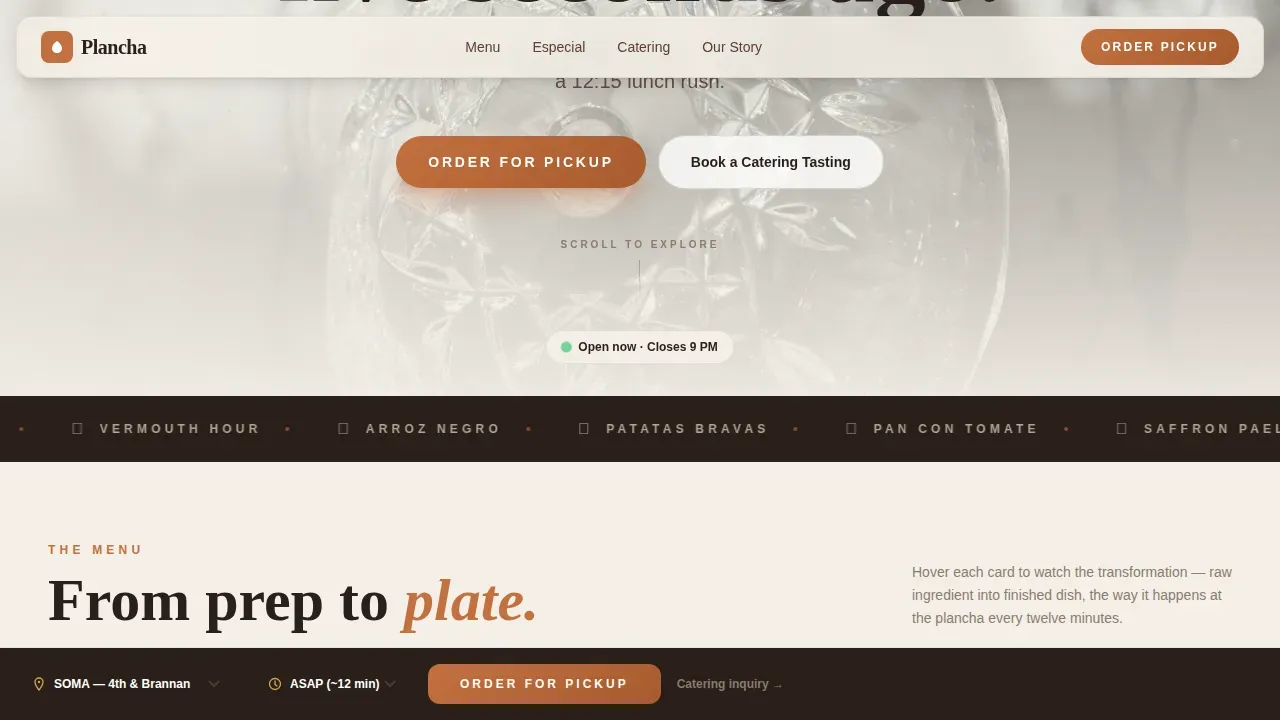
- A masonry Before/After grid with hover crossfade reveals, a sticky order bar with location selector and time slot, and an inline catering inquiry form
- Fraunces serif headlines paired with DM Sans body type across a Warm Stone color palette
- A Counter Story strip for social proof numbers and a single-row footer layout
Feature list
The template ships with a set of carefully considered components. Each one serves a specific role in moving the visitor from browsing to ordering.
Masonry Before/After Reveal Grid
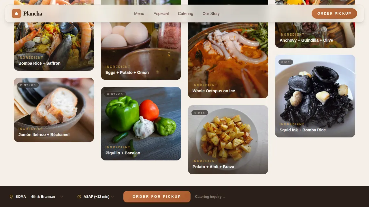
Each card in the grid pairs a raw ingredient with its finished dish. A crossfade on hover shows the transformation, whole fish on ice becoming a plated dish, a mound of bomba rice turning into paella. As the visitor scrolls, the grid moves from cold prep through the hot line to dessert, building appetite row by row. This is the narrative engine of the page.
Sticky Pickup Order Bar
A persistent bar anchors to the bottom of the screen at all times. It carries a location selector and a time slot picker so the visitor can place a pickup order without scrolling back to the top. On mobile, this is the primary conversion surface during the lunch rush.
Inline Catering Inquiry Form
A dedicated section opens a form requesting event date, headcount, and dietary notes, no redirect, no new tab. Catering managers sourcing tapas spreads for agency events can fill it out without leaving the page. The form sits downstream of enough food reveals to have already made the case.
Weekly Especial Tile
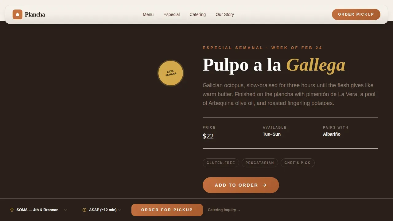
A rotating tile inside the masonry grid highlights the current weekly special. It carries its own "Add to Order" button and can be updated each week to keep the page feeling fresh. This is a good way to reward repeat visitors and drive incremental orders.
Editorial Hero Section
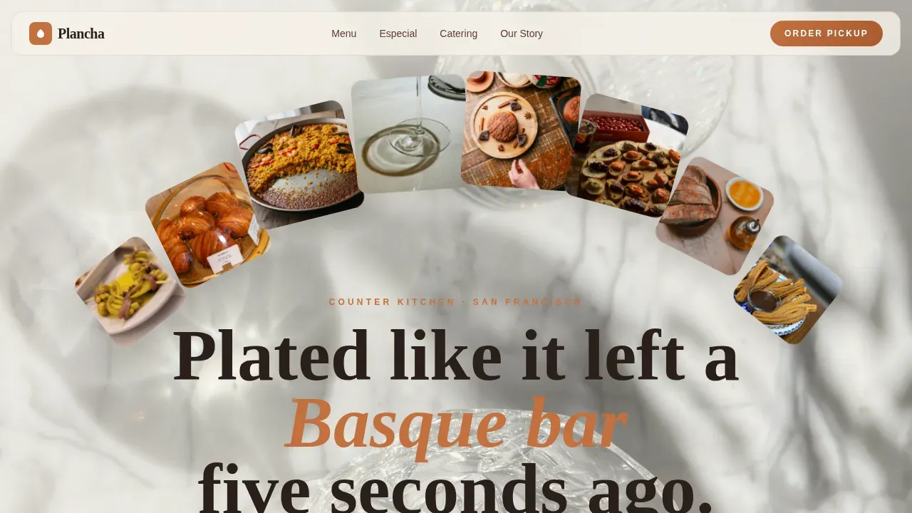
The hero is styled like a food editorial overhead shot, a marble counter scattered with small plates mid-meal, natural light raking in from one side. No logos interrupt the frame. The composition communicates quality and a certain kind of relaxed confidence before a single word is read.
Counter Story Social Proof Strip
A horizontal strip displays brand numbers alongside press quote callouts. Dish count, catering events served, and short testimonials give the visitor the social proof they need to feel good about ordering. Vibe coding principles are at work here: emotional connection is built through design and real data, not just imagery.
Page sections overview
| Section | Purpose |
|---|---|
| Hero editorial shot | Open with appetite-earning overhead lifestyle imagery |
| Masonry reveal grid | Build desire through ingredient-to-dish crossfade pairs |
| Especial Semanal tile | Showcase the rotating weekly special with direct order action |
| Catering inquiry form | Capture event date, headcount, and dietary notes inline |
| Counter Story strip | Display social proof numbers and press quotes |
| Single-row footer | Provide location, hours, and navigation in a clean linear row |
Design & branding system
The Warm Stone palette is the foundation of this template. Every color is drawn from the physical world of a traditional Spanish bodega, surfaces worn smooth by time, walls that hold afternoon heat. The result feels warm without sweetness and earthy without dullness.
- Colors: limewashed plaster white (#F5F0E8) as background, terracotta clay (#C4703F) as primary, aged oak (#5C4033) as dark text, and Manchego rind gold (#D4A94B) sparking across hover states and call-to-action buttons
- Typography: Fraunces serif for headlines to bring editorial weight, DM Sans for body copy and interface elements to keep the experience easy to read and fast to scan
- The branding combines raw textures with modern minimalist typography, which is consistent with the current trend of emphasizing haute craft in fast-casual restaurant concepts
Mobile & speed optimization
The template is built mobile-first because most pickup orders start on a phone. The sticky order bar is especially important on smaller screens, where the visitor needs to find the order action in under thirty seconds.
- The layout uses GPU-accelerated transforms, lazy image loading, and scroll-linked parallax that stays smooth on mobile hardware
- Clip-path reveal animations and staggered grid entries are structured so they do not block the main thread during fast scrolling
- Server Components handle the static sections, keeping the interactive elements lean and the overall experience ready in minutes rather than after a long load
How this template helps you convert
The conversion strategy here is patience before pressure. The template earns the click by making the visitor eat with their eyes across multiple reveals before presenting any call to action. That sequence is not accidental, it is the architecture of the page.
- Three conversion paths (pickup order, catering inquiry, weekly special) are separated so each visitor finds the action most relevant to them, reducing decision fatigue and increasing the chance they complete at least one action
- The sticky bar keeps the pickup option visible at all times, so a visitor who started browsing at lunch and got pulled away can return and order in seconds without retracing their steps
- Social proof in the Counter Story strip, dish count, events served, press quotes, gives a first-time visitor good reason to trust the restaurant before the first order
Other information about this template
This section covers additional context that helps you understand the broader value of choosing this template for your restaurant project.
The Plancha Haute Craft Spanish Fast Casual Landing Page Template is designed with the importance of emotional connection in mind. Vibe coding as a design method focuses on building that connection through visuals, layout pacing, and storytelling, not just color choices. Engaging restaurant websites that apply these principles continue to see stronger traffic and more repeat visits, and this template started from that insight.
The concept of showcasing an open kitchen as performance art is baked into the editorial photography direction. Visitors get closer to the cooking process through the Before/After grid, which recently has become one of the more effective ways to communicate food quality without a video budget.
No-code and AI-powered tools can help you launch a site like this quickly and efficiently, even without traditional programming skills. This template is structured to work alongside those tools, making the build process easy for non-technical restaurant owners.
The template is also relevant beyond a single city. While the creative direction draws from a San Francisco downtown context, the layout and conversion structure translate well to any high-footfall urban location. Restaurant projects in cities ranging from a compact neighborhood spot to a multi-location brand will find the template adaptable.
The week-by-week Especial tile keeps the page feeling alive months after launch. Updating it is straightforward and does not require rebuilding any block of the layout.
Additional context worth noting:
- Fast casual dining continues to incorporate global flavors; the Spanish culinary elements here tap into that trend with a specific, credible point of view rather than a generic world-food concept
- Social media integration is a natural post-launch step; the grid layout and editorial imagery are designed to share well and to bring new visitors back to the page
- The template supports a bag-ready pickup mindset: the visitor arrives, browses, and leaves with an order confirmed, not a tab open full of unanswered questions
- Health-conscious and sustainability-minded guests will find the fresh ingredient photography and provenance-forward copy style familiar and trustworthy
- The ham, fish, bread, and onion-forward Spanish pantry imagery that runs through the masonry grid communicates a specific culinary identity, not generic Mediterranean, but distinctly Iberian
Theme
Haute Craft
Creative direction
Before/After Reveal
Color system
Warm Stone
Style
Masonry/Pinterest
Direction
Marketplace/Multi
Page Sections
Masonry Before/after Reveal Grid
Sticky Pickup Order Bar
Inline Catering Inquiry Form
Weekly Especial Semanal Tile
Editorial Hero Section
Counter Story Social Proof Strip
Related questions
Can I update the weekly special tile on my own?
Does the template support more than one location?
Is the catering form connected to a backend system?
How customizable is the color palette?
Who is this template best suited for?



