Carnivore Diet Food & Dining Reviews Website Template
Sear is a masonry-style carnivore meal kit subscription landing page built to convert through sensory storytelling. It opens with a hand-drawn mesa illustration, drops visitors into a flavor-word card grid, and progressively reveals sourcing credentials, macronutrient transparency, and lab-panel testimonials before asking for the click. Every scroll depth earns the next reveal.
by Rocket studio
Quick summary
Sear is a single-page, click-through landing page template for a carnivore meal kit subscription. It uses a masonry card grid, a custom illustrated hero, and a progressive proof structure to build desire before driving visitors toward the subscription builder. The page earns every click rather than asking for it upfront.
Who this template is for
This template fits founders and marketers running a direct-to-consumer carnivore meat subscription. It suits brands selling grass-finished beef, marrow bones, organ meats, and specialty cuts to a health-conscious audience that distrusts industrial sourcing.
- Carnivore and ketogenic meal kit brands selling meats directly to consumers
- Butchery business operators moving into online subscription models
- Health-focused food brands targeting elimination-diet and zero-carb audiences
What problem this template solves
Most landing pages for meats lead with a product grid. That approach fails for a strict carnivore audience that has already rejected the conventional market. Visitors need to feel the product before they trust the brand.
- Generic website designs do not communicate sourcing credibility or sensory richness
- Flat product listings fail to separate premium meats from commodity options
- No clear progressive proof means visitors leave before the subscription ask lands
What you get with this template
This template delivers a fully structured, single-page layout designed to move a visitor from first impression to subscription click. Every section has a defined role in the conversion sequence.
- A custom SVG mesa illustration hero with a floating "Build Your Box" call to action
- A masonry sensory grid with flavor-word cards for beef, chicken, pork, and specialty cuts
- A sourcing map section, macronutrient transparency panel, and testimonial strip
Feature list
This template is expertly designed around a single conversion goal: getting the visitor to click through to the subscription builder. Each built-in section contributes a distinct layer of trust or desire.
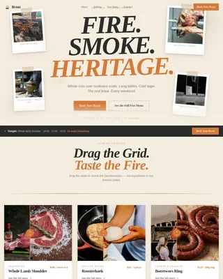
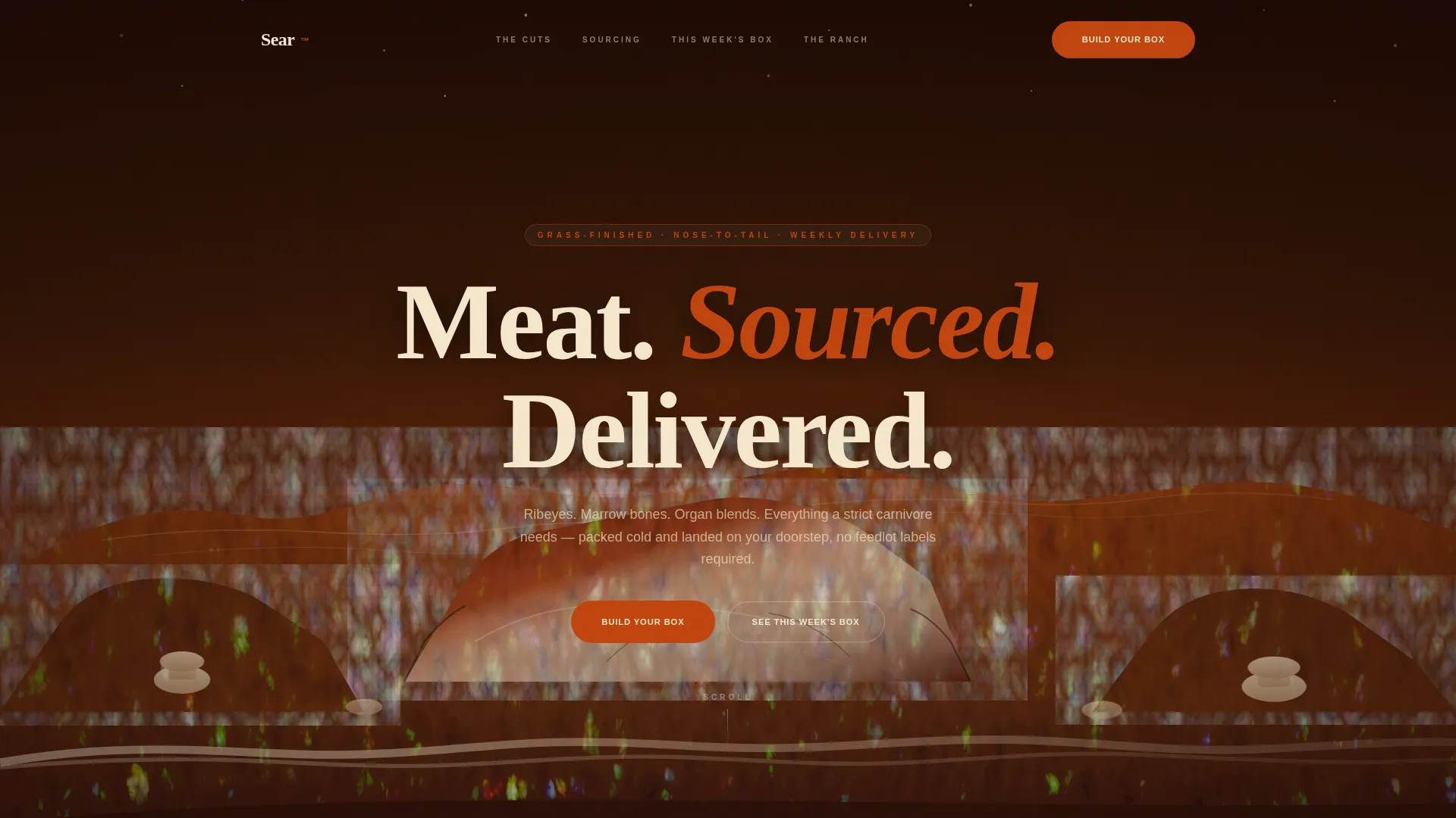
Illustrated Hero with Sticky Call to Action
The hero features a hand-drawn ink-and-watercolor mesa panorama. A bone-white headline sits in the sky above the landscape. The "Build Your Box" button floats over the illustration and then pins to the page after two scroll-depths, keeping the primary action always in reach.
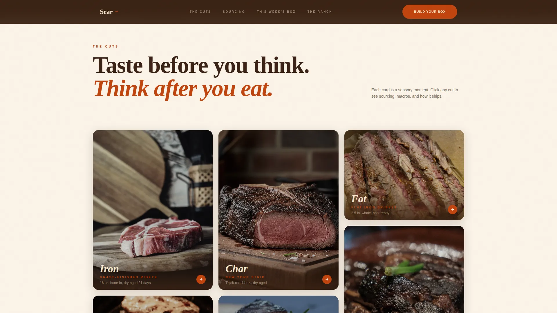
Sensory Masonry Card Grid
The masonry grid displays close-up cut photography cards, each carrying a single flavor word such as Smoke, Iron, Char, or Umami. Clicking any card opens the cut detail. This layout builds appetite and curiosity before any subscription details are displayed.
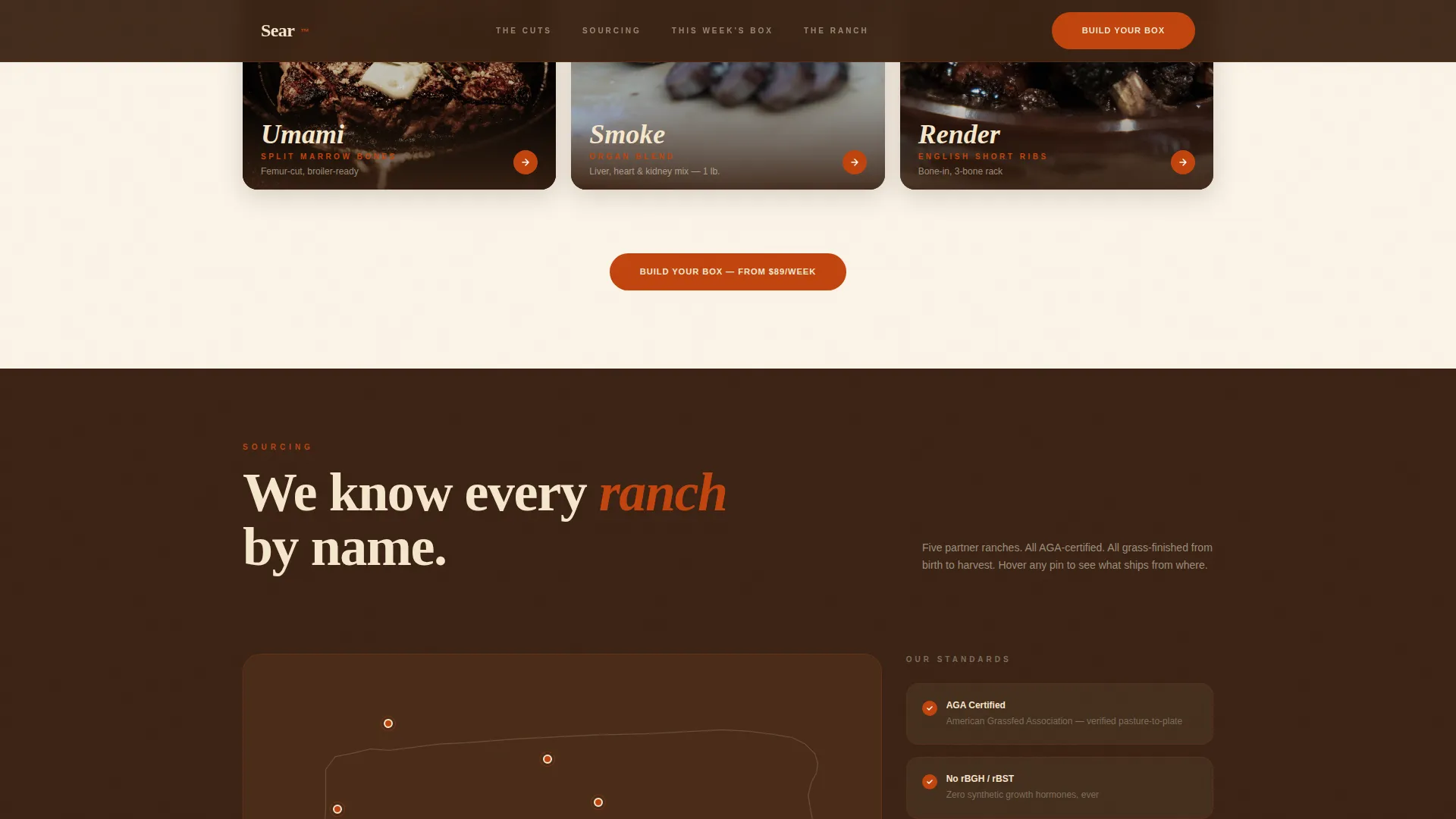
Sourcing Map and Credentials Panel
A visual partner ranch map shows where the meats originate. The credentials panel sits alongside it, communicating grass-finished standards, non-GMO sourcing, and antibiotic-free practices for beef, chicken, and other proteins. Visitors can acknowledge the sourcing story at their own pace.
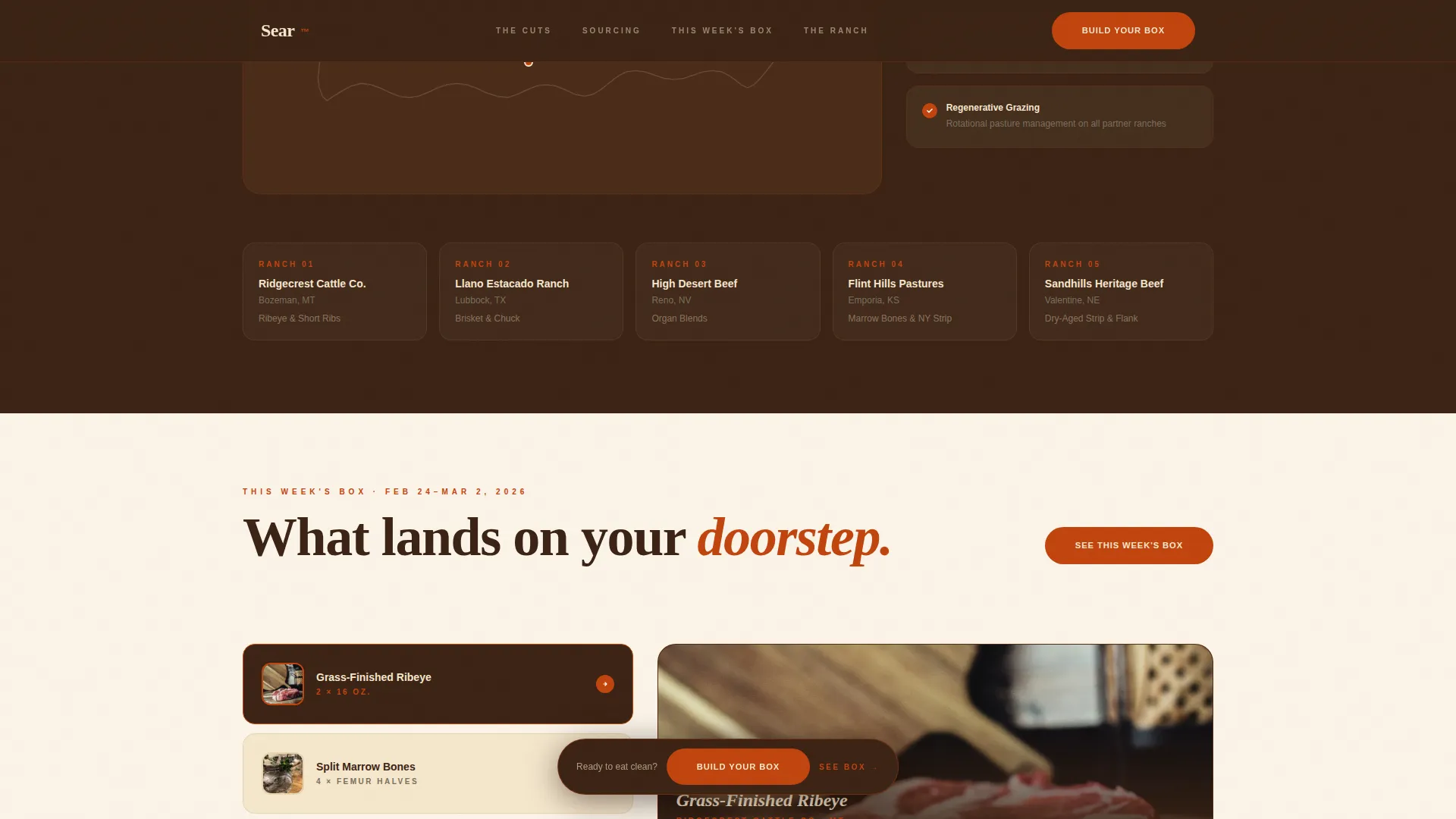
Macronutrient Transparency Panel
Each cut in the weekly box is displayed alongside its macronutrient breakdown. This panel speaks directly to carnivore and ketogenic buyers who manage their protein and fat intake carefully. No guesswork, no waiting for a nutrition label in the mail.
Testimonial Strip with Lab Panel Aesthetic
The social proof section showcases before-and-after inflammation marker results in a lab panel visual style. This format resonates with the elimination-diet audience and builds confidence that the product delivers measurable results, not just good flavor.
Page sections overview
| Section | Purpose |
|---|---|
| Hero Illustration | Establish brand mythology and float primary call to action |
| Sensory Masonry Grid | Build appetite through flavor-word cut cards |
| Sourcing Map | Display ranch partners and grass-finished credentials |
| Box Contents Panel | Show this week's cuts with macro transparency |
| Testimonial Strip | Prove outcomes with lab-panel social proof |
| Footer | Single-row linear navigation and sign links |
Design & branding system
The visual identity follows an Organic Flow theme built on the Sunset Mesa color palette. Every color has a defined role, creating a coherent desert-table aesthetic across the entire page.
- Scorched terracotta (#C1440E) drives hover states and call-to-action buttons
- Sunbleached bone (#F5E6CC) opens card backgrounds; deep bison brown (#3B2314) anchors headlines
- Dried sagebrush (#7A6F5D) handles secondary text, dividers, and label typography in DM Sans; Fraunces serif sets the headline tone
Mobile & speed optimization
Carnivore's responsive design ensures the masonry grid, hero illustration, and sticky call-to-action button all adapt cleanly across screen sizes. Food content performs on both desktop and mobile, and this template is built with that reality in mind.
- Desktop-first layout with fully considered mobile reflow for the masonry card grid
- Server Components handle static sections; Client Components manage GSAP ScrollTrigger animations and sticky navigation
- Clip-path reveals, parallax scrolling, and a marquee ticker are scoped to client rendering to protect static load performance
How this template helps you convert
A clear page hierarchy builds trust progressively so visitors feel informed and hungry before they ever see a price. This structure removes friction at every stage.
- Desire is established first through the sensory masonry grid before any subscription details are shown, reducing early drop-off
- Progressive proof layers, including the sourcing map, macro panel, and lab testimonials, build confidence so the "Build Your Box" click feels earned rather than forced
- A secondary path, "See This Week's Box," captures visitors not ready to commit, keeping them in the funnel without pressure
Other information about this template
This page is part of a broader ecosystem of meat-focused web templates built for the carnivore market. Introducing Carnivore as an Elementor template kit, it is worth knowing that the carnivore template kit sits within a family of 23 templates designed specifically for meat shops and butcheries. The butchery Elementor template kit and ultimate Elementor template kit variants give butchery business operators a scalable starting point. Carnivore makes it straightforward to create a professional online presence without building from a generic website shell.
- The carnivore template kit supports WooCommerce, letting operators easily set up an online store to manage product listings, process orders, and handle inventory and process orders at scale
- Carnivore's responsive design ensures websites look great on any device; carnivore's support for the drag-and-drop Elementor interface means customizing pages requires no code
- Kit requires an Elementor Pro upgrade to access the full template kit; once active, operators can start selling steaks, sausages, mutton, wagyu, and seafood including meat shops selling fish
- Choose carnivore meat shop pages to showcase a curated box of weekly cuts, from flash frozen ribeyes shipped in dry ice packaging to fresh account single products displayed in the online store
- The carnivore meat shop pages include pricing tables, landing pages for specific cuts, and a user friendly interface for managing a subscription; carnivore makes it easy to sign up, manage delivery cadence, and protect the customer account forever
Theme
Organic Flow
Creative direction
Taste & Aroma
Color system
Sunset Mesa
Style
Masonry/Pinterest
Direction
Click-Through
Page Sections
Illustrated Hero with Sticky Call to Action
Sensory Masonry Card Grid
Sourcing Map and Credentials Panel
Macronutrient Transparency Panel
Lab Panel Testimonial Strip
Progressive Scroll Reveal Structure
Related questions
What proteins and cuts does this template showcase?
Does the landing page include a form or checkout?
Who is the target audience for this template?
What social proof elements are included in the template?
Can this template communicate flexible subscription options?