Affordable Life Insurance Landing Page Template
The Underwrite Data Command Life Insurance landing page template is a single-column, data-driven design built for life insurance companies that need to turn visitor anxiety into qualified leads. It combines a cold, authoritative Monochrome Steel palette with interactive tools, a progressive lead-capture form, and a Problem-to-Solution scroll arc that earns every click before asking for it.
by Rocket studio
Quick summary
Underwrite is a single-column life insurance landing page template built around the Data Command theme. It uses a Monochrome Steel color system and a Problem-to-Solution Arc to guide visitors from financial anxiety toward a clear, confident action. Every section serves one clear goal: demonstrate analytical authority and convert visitors into qualified leads through a gated Coverage Blueprint download.
Who this template is for
This template is designed for life insurance companies, independent insurance providers, and insurance businesses that serve financially motivated buyers. It fits teams that want a landing page that feels less like a brochure and more like a briefing document.
- Life insurance companies targeting new parents, sole breadwinners, and small business partners needing key-person coverage
- Insurance providers who want a landing page that communicates actuarial competence through data visuals and interactive tools
- Designers and developers who want to quickly create a high-impact insurance landing page without building from scratch
What problem this template solves
Most insurance landing pages either overwhelm visitors with too many insurance options or undersell the urgency of acting now. Potential customers stall because the page fails to make the cost of waiting concrete and personal. A good insurance landing page must answer one question above all others: what happens if I wait?
- Visitors leave without converting because the landing page lacks a clear goal and a persuasive sequence of evidence
- Insurance companies lose more leads when forms ask for too much too soon, creating friction before trust is built
- A weak hero section with no strong headline or data-driven hook fails to keep users engaged past the first scroll
What you get with this template
This template delivers a fully structured, single-column insurance landing page with six distinct sections, each engineered to escalate urgency and resolve it with a tool or resource. Every element works toward conversion, including clear messaging, a strong call to action, and interactive data components that build trust before asking for a single form field.
- A hero section with a catchy headline, a real-time age-based premium ticker, and a minimal Logo Bar header
- An interactive age slider, a term-versus-whole life comparison table, a coverage gap infographic section, and a three-step progressive lead capture form
- A single-row footer and an inline free quote estimator that lets visitors self-qualify before reaching the primary call to action
Feature list
This insurance landing page template includes purpose-built features that serve a specific target audience. Each feature is designed to convert visitors who are ready to act but need the right sequence of information and tools.
Real-Time Premium Ticker and Hero Section
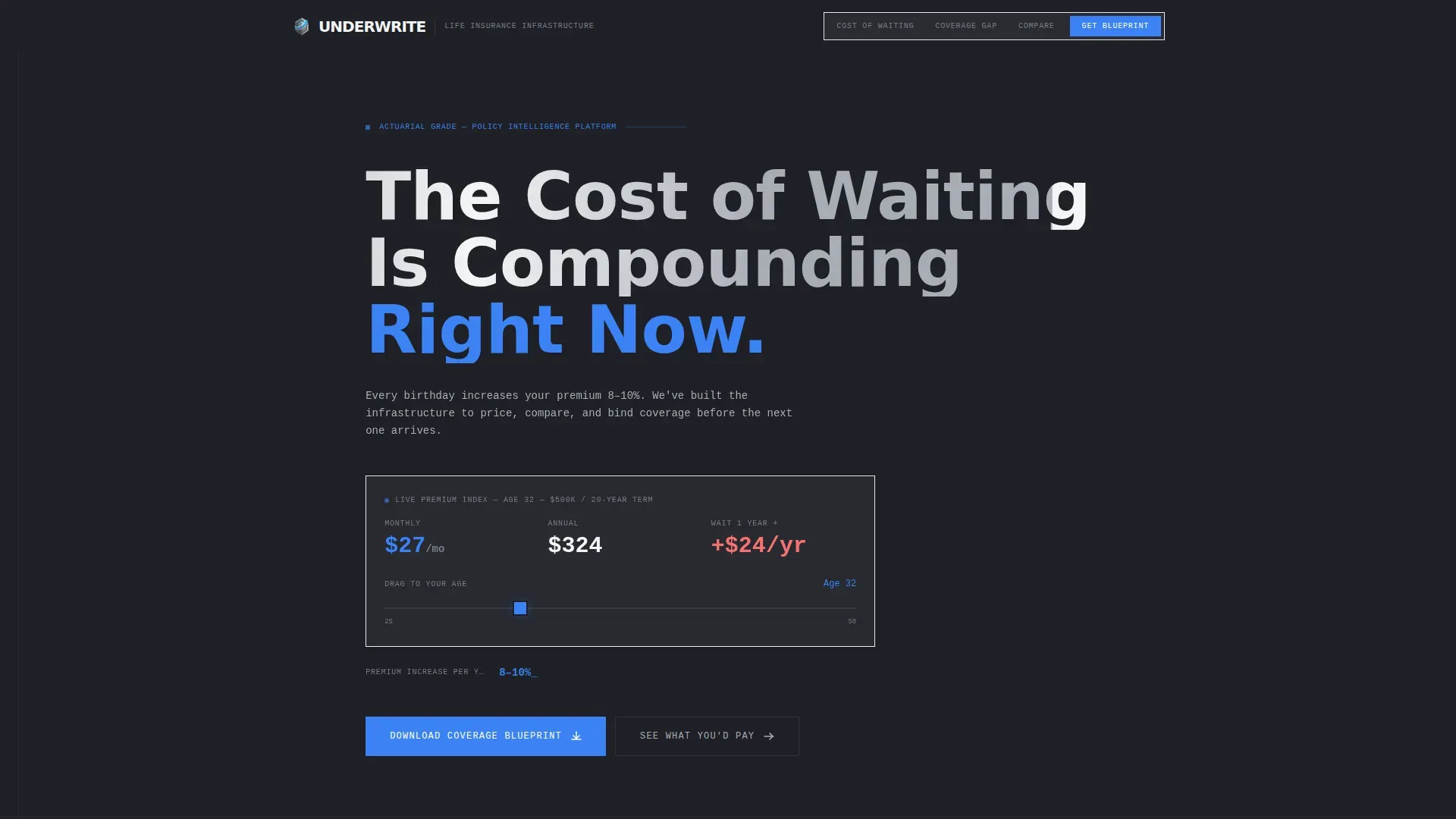
The hero section opens with an oversized condensed headline in DM Sans: "The Cost of Waiting Is Compounding Right Now." Beneath it, a live premium ticker updates as the visitor watches, making the cost of delay immediately visible. There is no hero image or illustration. The restraint is intentional, and the data does the work.
Interactive Age Slider for Premium Visualization
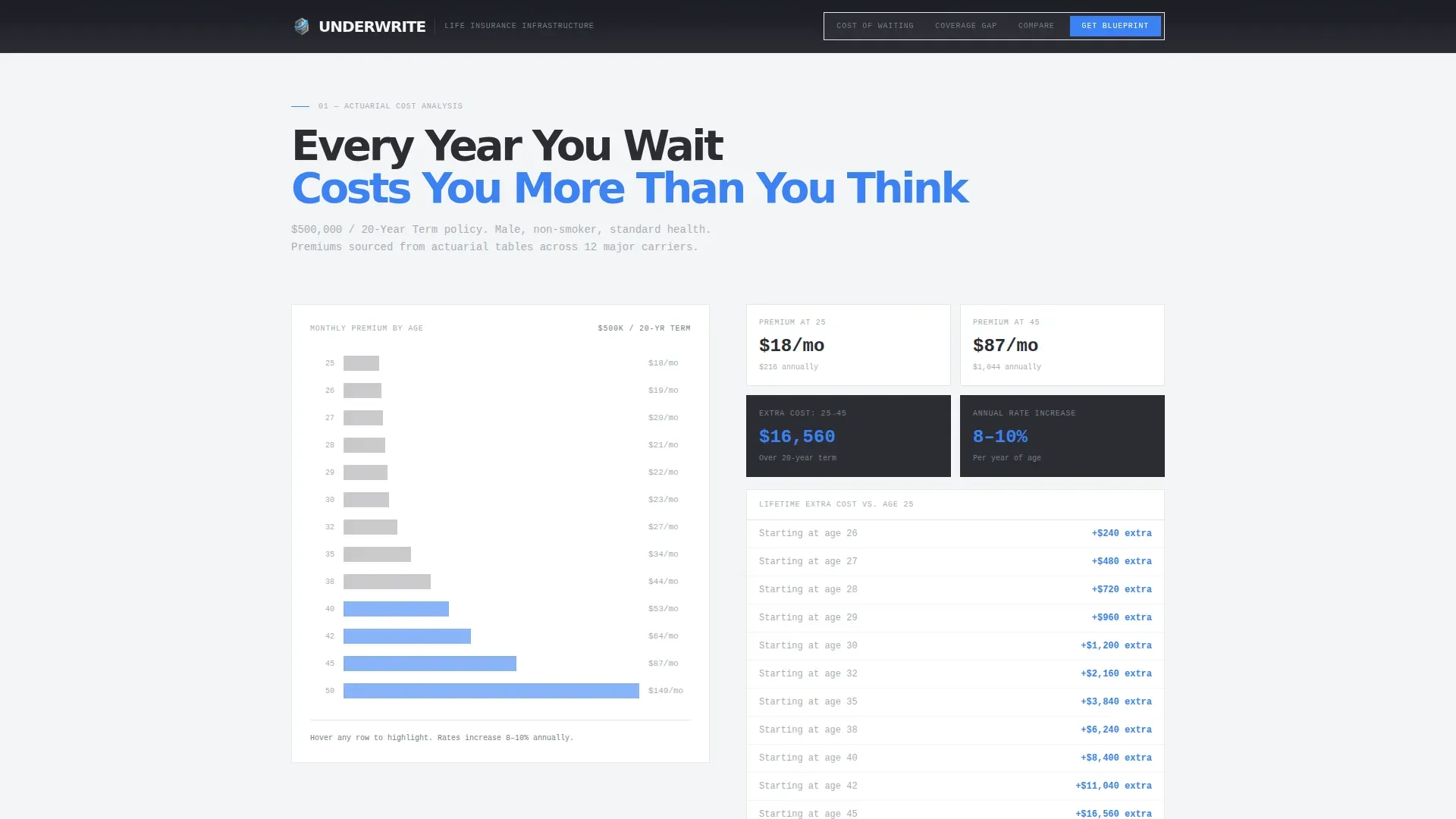
An animated data column shows how premiums increase 8 to 10 percent per year of age. A draggable age slider lets visitors make the cost personal. This section converts abstract actuarial math into a number that belongs to the visitor specifically, creating urgency without aggressive sales language.
Coverage Gap Infographic Section
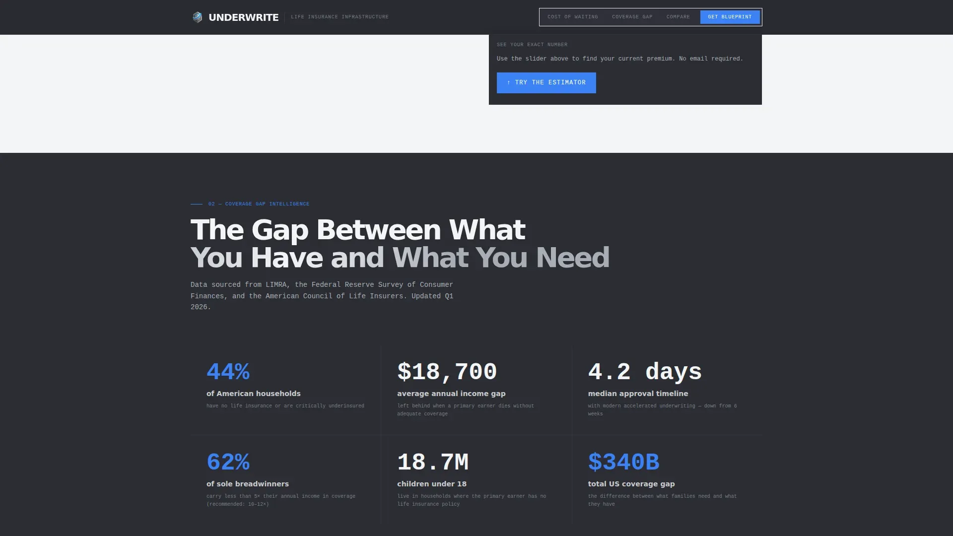
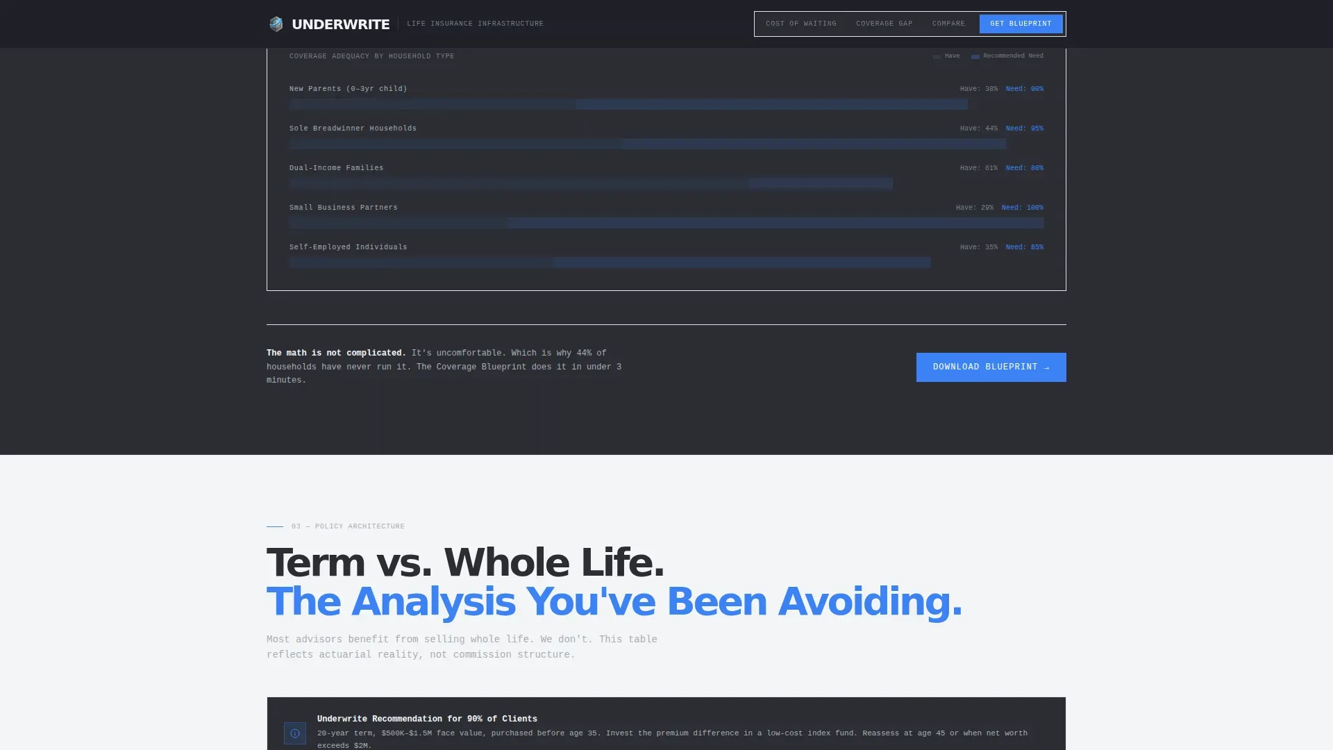
Steel-on-white infographic panels display coverage gap statistics as stark visual elements. The section uses the alternating gunmetal-and-clinical-white background rhythm to create breathing room down the scroll. Each panel presents a data point that escalates the stakes before the next section offers a resolution.
Term versus. Whole Life Comparison Table
A side-by-side comparison table simplifies the difference between term and whole life insurance policies without being patronizing. Signal-blue highlights draw attention to key benefits and decision points. This section helps visitors understand their insurance options clearly, so they feel confident moving forward.
Three-Step Progressive Lead Capture Form
The primary call to action is a gated "Download Your Coverage Blueprint" form. It opens with a single field asking for age range, then expands to household income band, then email. This multiple-steps approach reduces perceived friction and keeps conversion rate high by asking for commitment gradually rather than all at once.
Inline Free Quote Estimator
An ungated instant quote estimator sits mid-page, capturing no data but building enough specificity that visitors self-qualify before they reach the primary form. This secondary conversion path allows visitors to get a free quote experience without commitment, which builds enough trust to make the gated download feel like privileged access rather than a marketing exchange.
Page sections overview
| Section | Purpose |
|---|---|
| Logo Bar Header | Establish authority, minimal distraction |
| Hero Headline Ticker | Communicate urgency via live premium data |
| Age Slider Visualizer | Make premium cost personal and immediate |
| Coverage Gap Infographics | Escalate stakes with stark data panels |
| Term versus. Whole Table | Simplify insurance options with clear comparison |
| Progressive Form Download | Gate the Coverage Blueprint behind a low-friction form |
| Inline Quote Estimator | Offer ungated self-qualification tool mid-page |
| Single-Row Footer | Close with clean, linear navigation row |
Design & branding system
The visual identity follows a Data Command theme with a Monochrome Steel palette. The design feels like the interior of a bank vault: no warmth, no apology, just the quiet authority of numbers that have been triple-checked. Contrasting colors are used with discipline, never decoration.
- Gunmetal base (#2B2D33) and clinical white (#F4F5F7) alternate as section backgrounds to create scroll rhythm; brushed aluminum (#A8ADB5) carries body text on dark fields; signal blue (#3B82F6) appears only on interactive elements and data highlights
- Typography uses DM Sans in condensed weight for headings and IBM Plex Mono for all data and numerical displays, reinforcing the cold precision of the brand voice
- White space is used deliberately throughout to keep clear focus on each section's single job, preventing visual clutter from overwhelming visitors
Mobile & speed optimization
The template is built desktop-first, reflecting the reality that financial decisions are typically made at a desk. It remains fully responsive so visitors on any device get a seamless experience. Animations are GPU-accelerated via CSS, and scroll reveals use Intersection Observer to trigger only when needed.
- Shimmer text effects, beam paths, scroll reveals, ticker counters, and the age slider are all handled through CSS animations designed to load fast without heavy JavaScript dependencies
- The progressive form expands in stages using lightweight client-side logic, keeping the landing page responsive and smooth across screen sizes
- A landing page that loads fast keeps users engaged longer, which directly supports higher conversion rate on financial services pages
How this template helps you convert
This insurance landing page template is a great example of a Problem-to-Solution Arc applied to a high-stakes financial product. An insurance landing page is designed to convert visitors into leads by focusing on a single action at each scroll stage. Companies using landing pages generate 55 percent more leads than those that do not, and this template is structured to capture that advantage fully.
- The landing page opens with a catchy headline and live data that make the cost of inaction immediate, then uses the age slider to make it personal, so visitors arrive at the comparison table already primed to act. Trust signals, social proof through coverage gap statistics, and a clear visual structure guide visitors toward the primary call to action without overwhelming visitors with too many choices at once.
- The three-step progressive form reduces friction by asking only for essential information in stages, following best practices for good insurance landing pages: short form fields, a single clear action per step, and a value proposition strong enough to justify the final email entry. The result is a landing page where every element earns the next click and the primary call to action feels like a logical conclusion rather than a sales demand.
Other information about this template
This template can support a wide range of insurance businesses beyond life insurance. The layout and section logic apply equally well to other insurance products, making it easy to adapt the core structure to different coverage contexts.
- The comparison table section can easily adapt to other insurance products such as health insurance, travel insurance, or auto insurance policies, with straightforward copy updates
- The landing page is built to encourage visitors to self-qualify through the inline estimator before reaching the gated form, which reduces wasted follow up effort on unqualified leads and helps insurance companies focus on potential clients who are already engaged
- Trust signals such as star ratings, industry awards, and security indicators can be placed in the coverage gap section or near the progressive form to reinforce building credibility with potential customers at the moment of highest decision intent
- The template supports the use of Google Analytics event tracking placeholders within the interactive components, such as slider movement, estimator engagement, and form field progression, giving teams useful user behavior signals without requiring a custom build
- Using bullet points in the comparison and infographic sections keeps insurance options scannable so visitors understand key features and benefits without needing to read dense paragraphs
- A good insurance landing page must build trust before it asks for data. This template is a good insurance landing page by design: social proof, clear messaging, and a faq section are all included in the scroll flow to reassure potential customers before the primary call to action appears
- The Underwrite Data Command life insurance landing page template is listed in the Finance and Insurance category, under the Insurance Company and Life Insurance Company subcategories, and is ready to use on any compatible landing page builder that supports HTML and CSS templates
- Insurance providers building a health insurance landing page or a health insurance landing flow can reuse this template's section structure by updating copy, colors, and data inputs to match their insurance products
Theme
Data Command
Creative direction
Problem→Solution Arc
Color system
Monochrome Steel
Style
Single Column Flow
Direction
Content/Resource
Page Sections
Real-time Premium Ticker Hero Section
Draggable Age Slider Visualizer
Term Versus. Whole Life Comparison Table
Three-step Progressive Lead Capture Form
Ungated Inline Quote Estimator
Coverage Gap Infographic Panels
Related questions
Who is this landing page template built for?
Can I use this template for insurance products other than life insurance?
What makes this a good insurance landing page for lead generation?
Does this template include both the inline estimator and the progressive form?
How does the alternating background design help the landing page?



