Holistic Single-Parent Coverage Landing Page Template
Shield is a single-column health insurance advisory landing page built exclusively for single-parent households. It combines an authoritative Industry Report design with a freemium coverage analysis model. The page walks visitors through real coverage gap data, then earns their email through a three-step progressive form that delivers a personalized insurance comparison report.
by Rocket studio
Quick summary
Shield is a health insurance advisory landing page tailored for single parents navigating marketplace plans, COBRA deadlines, and pediatric coverage gaps. Its clinical Executive Suite design and data-driven scroll structure help visitors find clarity fast. The page converts through a free "Run My Coverage Analysis" form that feels like a logical next step, not a sales push.
Who this template is for
This landing page is built to help insurance advisory businesses and independent brokers reach single-parent households during open enrollment and life transitions. It serves advisors who want a document-quality web presence that matches the seriousness of their services.
- Divorced, widowed, or newly single parents comparing marketplace insurance plans
- Insurance advisory companies and brokers serving single-income family households
- Social workers and family law professionals who refer clients to coverage services
What problem this template solves
Single parents face high-stress, time-sensitive insurance decisions with no co-signer, no backup income, and no room for a coverage mistake. Most insurance landing page designs feel generic and condescending. This template fixes that. It uses the specific language and data that single parents actually need to find the right plan.
- Eliminates tedious guesswork by presenting real coverage gap figures and plan comparisons
- Helps visitors quickly understand where their current insurance falls short
- Gives advisory businesses a landing page design that commands trust from the first scroll
What you get with this template
You get a single-column flow landing page structured like a white paper. Every section builds on the last. The design is clinical and authoritative. The copy architecture moves visitors from problem awareness to plan comparison without pressure.
- Hero section with oversized charcoal headline and a bold policy-blue insurance statistic
- Three interactive diagnosis sections with bar charts showing coverage gap data
- A pivot section, plan architecture cards, a three-step progressive form, and a linear footer
Feature list
This landing page includes the following built-in features.
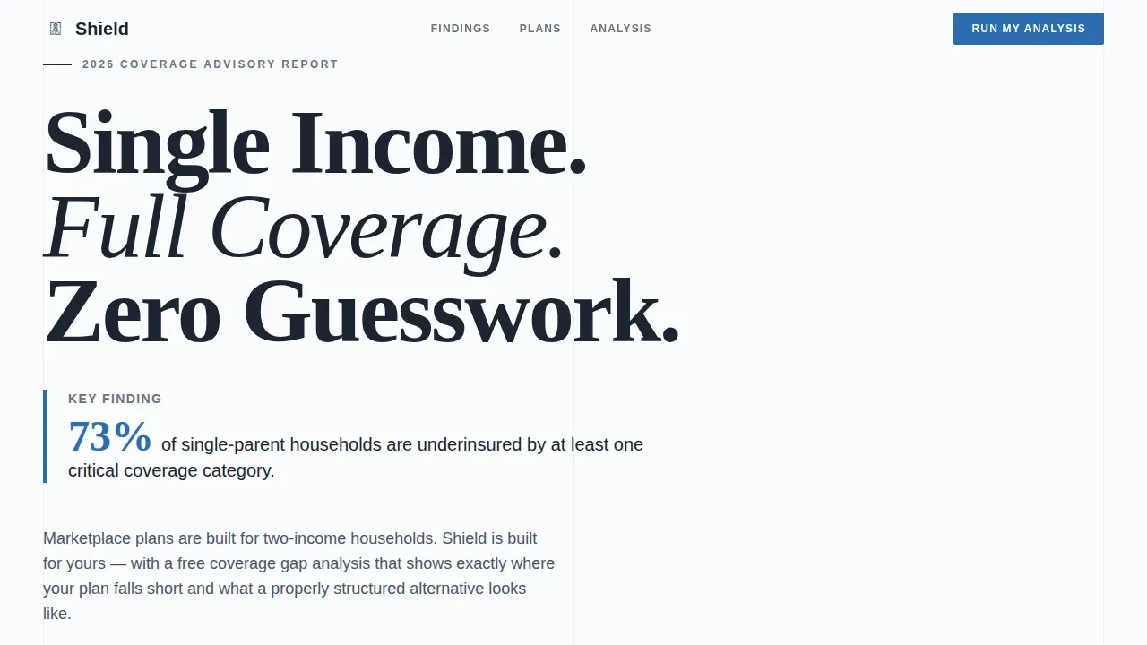
Giant Headline Hero Section
The hero uses a stark Arctic White viewport with a large Fraunces serif headline and a single policy-blue statistic. There are no stock images or illustrations. The empty space creates document authority on day one of deployment.
Animated Statistics Marquee
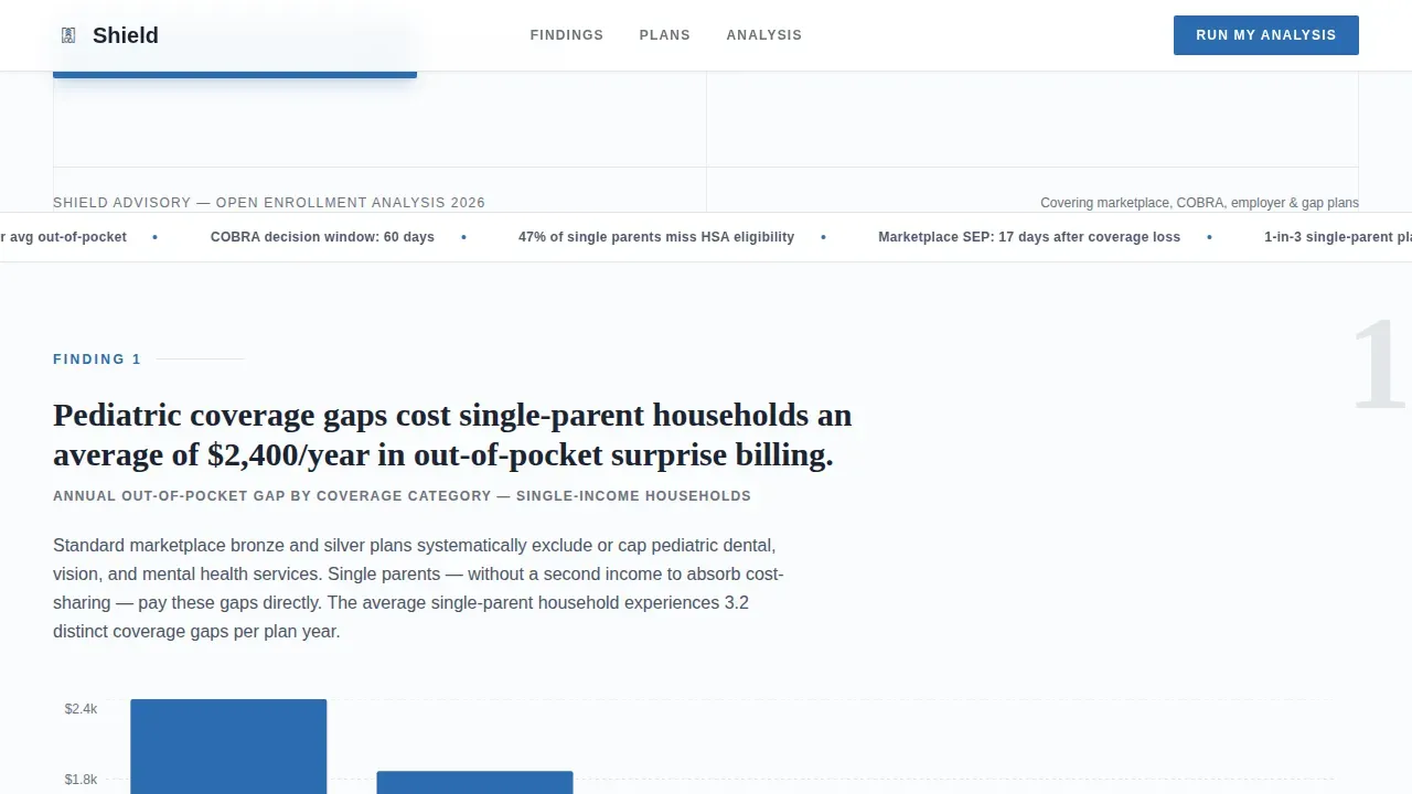
An animated strip below the hero scrolls key insurance figures continuously. It keeps visitors oriented in the data before the diagnosis sections begin. The design ensures the page never feels static during the opening scroll.
Interactive Diagnosis Sections
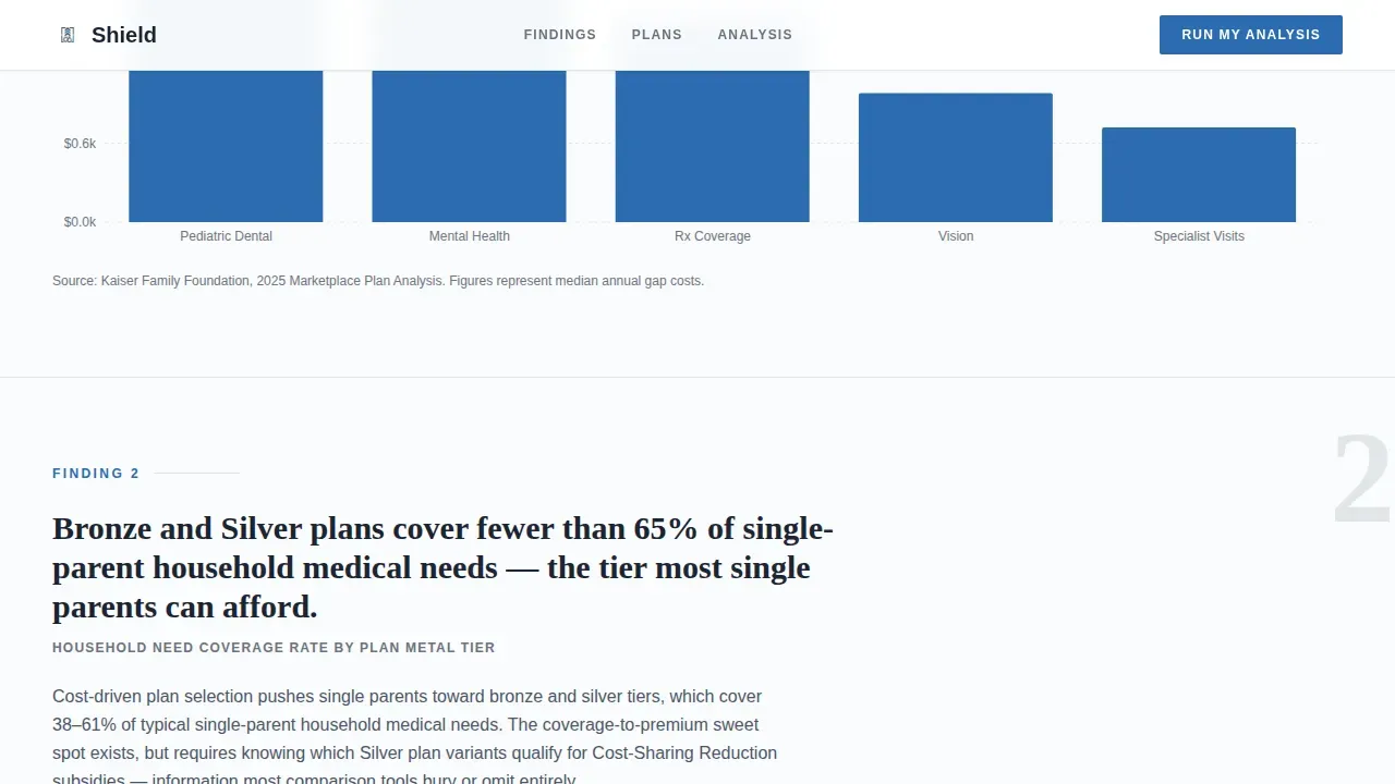
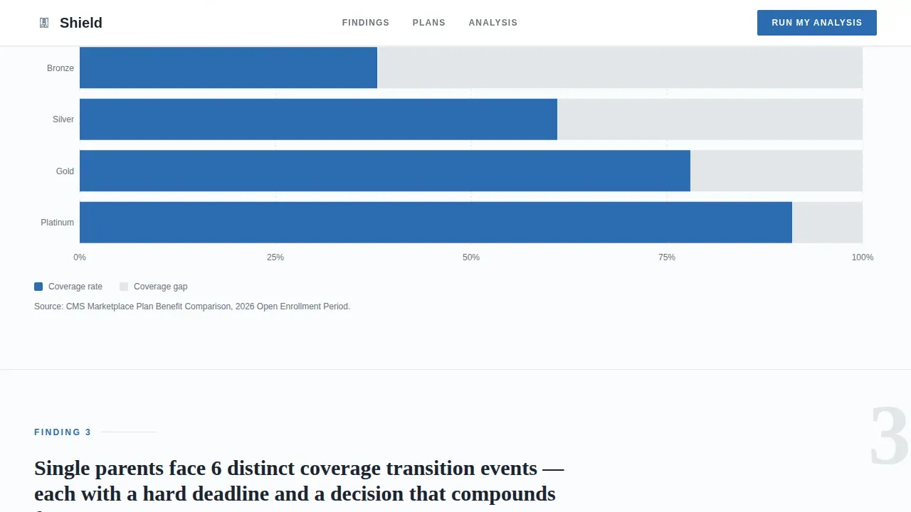
Three "Finding" blocks each open with a bolded coverage gap figure and a short explanatory paragraph. Recharts bar charts display plan comparison data with hover tooltips. Each chart helps visitors learn something specific about single-parent insurance risk.
Pivot Section with Primary Call to Action
A horizontal rule and a single declarative line separate the problem from the solution. The "Run My Coverage Analysis" call-to-action button appears here first. This placement rewards visitors who read the data and are ready to sign up for their free report.
Three-Step Progressive Form
The form collects household size, children's ages, current coverage status, income range, and email address across three focused steps. Limiting form fields at each step keeps the process easy and reduces friction. The free output is a personalized coverage gap analysis comparing the visitor's current plan against three alternatives.
Plan Architecture Cards
A horizontal-scroll card section maps insurance coverage structures to specific household types. Visitors can identify the plan model that fits their situation without reading a policy document. The tab interface makes comparison simple and fast.
Page sections overview
| Section | Purpose |
|---|---|
| Hero Headline | Establish authority with bold typography and a key insurance statistic |
| Statistics Marquee | Display animated coverage gap figures to orient the visitor |
| Diagnosis Block One | Present finding one with an interactive bar chart |
| Diagnosis Block Two | Present finding two with coverage gap data visualization |
| Diagnosis Block Three | Present finding three with out-of-pocket cost comparison |
| Pivot and call to action | Signal the solution shift and pin the primary call-to-action |
| Plan Architecture Cards | Map insurance plan types to household scenarios |
| Coverage Analysis Form | Collect visitor data across three progressive form steps |
| Linear Footer | Provide navigation links and secondary contact support |
Design & branding system
The design follows an Executive Suite theme built on an Arctic White color system. Typography uses Fraunces for headlines and DM Sans for body text. The palette feels like a freshly printed benefits summary: authoritative, clinical, and precise.
- Arctic White (#FAFBFC) background, Deep Charcoal (#1B2432) for all text, Surgical Gray (#E2E6EA) for section dividers and data tables
- Policy Blue (#2B6CB0) reserved exclusively for calls-to-action, linked figures, and interactive chart elements
- High-contrast color pairing and readable serif fonts support easy consumption even during distracted viewing
Mobile & speed optimization
The landing page is built desktop-first to match how single parents research insurance during open enrollment. Full mobile support ensures visitors can reach the form and review coverage data on any device.
- Responsive single-column layout that reflows cleanly across screen sizes
- Interactive chart components and the three-step form are built as client components to keep static sections fast
- Server-rendered static sections help the page load key document content without delay
How this template helps you convert
This landing page is engineered to create a sense of earned value before the call-to-action appears. Visitors feel informed, not sold. That trust turns into form completions.
- The Industry Report scroll structure makes each section feel like a finding in a coverage document, so visitors stay engaged and reach the pivot call-to-action with high intent.
- The three-step progressive form limits questions at each stage, making it easy to sign up and reducing abandonment before the email step.
- The free coverage gap analysis output gives visitors a concrete reason to provide their information, turning the form into a logical next research step rather than a lead capture.
Other information about this template
The Shield single parent full coverage advisory landing page template is built for insurance advisory companies, brokers, and fintech businesses that create services for single-income households. It uses a freemium model where the free coverage report drives email capture and advisory engagement.
- Insurance businesses and brokers can download the template and change the coverage data, pin their own plan architecture cards, and update form steps without writing code from scratch
- AI-powered no-code tools can help teams deploy and optimize this landing page quickly, making it easy to reach their target audience with a production-ready design
- The template is designed to cater to a specific niche, support referral traffic from family law professionals, and document the advisory company's value proposition in a format visitors already trust
Theme
Executive Suite
Creative direction
Industry Report
Color system
Arctic White
Style
Single Column Flow
Direction
Freemium/Trial
Page Sections
Giant Headline Hero with Stat Block
Animated Statistics Marquee
Interactive Diagnosis Sections
Three-step Progressive Coverage Form
Plan Architecture Cards
Pivot Section and Primary Call to Action
Related questions
Who is this landing page template designed for?
What forms does the template include?
Can I change the coverage data and plan architecture cards?
Do visitors pay to receive the coverage analysis?
Does the template support mobile devices?



