Secure — Next-Gen Insurtech Landing Page Template
Underwrite is a single-page landing page template built for insurtech startups at the growth stage. It combines a live-coded header, animated comparison tables, and a sticky install bar to show engineering teams exactly why building on a policy-binding API beats every alternative. The design is precision-dark, terminal-inspired, and built to convert technical decision-makers fast.
by Rocket studio
Quick summary
Underwrite is a comparison table landing page template designed for growth-stage insurtech platforms. It opens with a syntax-highlighted API code block that animates character by character, then walks technical buyers through stacked feature matrices that make the build-versus-buy decision obvious before they reach the bottom of the page.
Who this template is for
This template speaks directly to the people rebuilding insurance infrastructure from scratch. It is built for teams who already understand the complexity and want proof that a better path exists.
- Engineering leads at Series B insurtech companies evaluating SDK adoption
- Product managers replacing legacy quoting engines with modern API-first tooling
- CTOs who have spent heavily on middleware that still cannot bind a policy programmatically
What problem this template solves
Legacy insurance infrastructure is slow, expensive, and hard to replace. Most platforms struggle to communicate their technical advantage in a way that earns trust from developers and engineering leaders who have been burned before.
- Comparison tables are missing or buried, making build-versus-buy math unclear
- Technical calls to action like SDK installs get no context, so conversion stalls before it starts
- The tone feels too sales-forward for an audience that reads code before marketing copy
What you get with this template
This template delivers a complete, single-page layout structured to move a skeptical technical buyer from first scroll to install command. Every section is purpose-built for the insurtech developer audience.
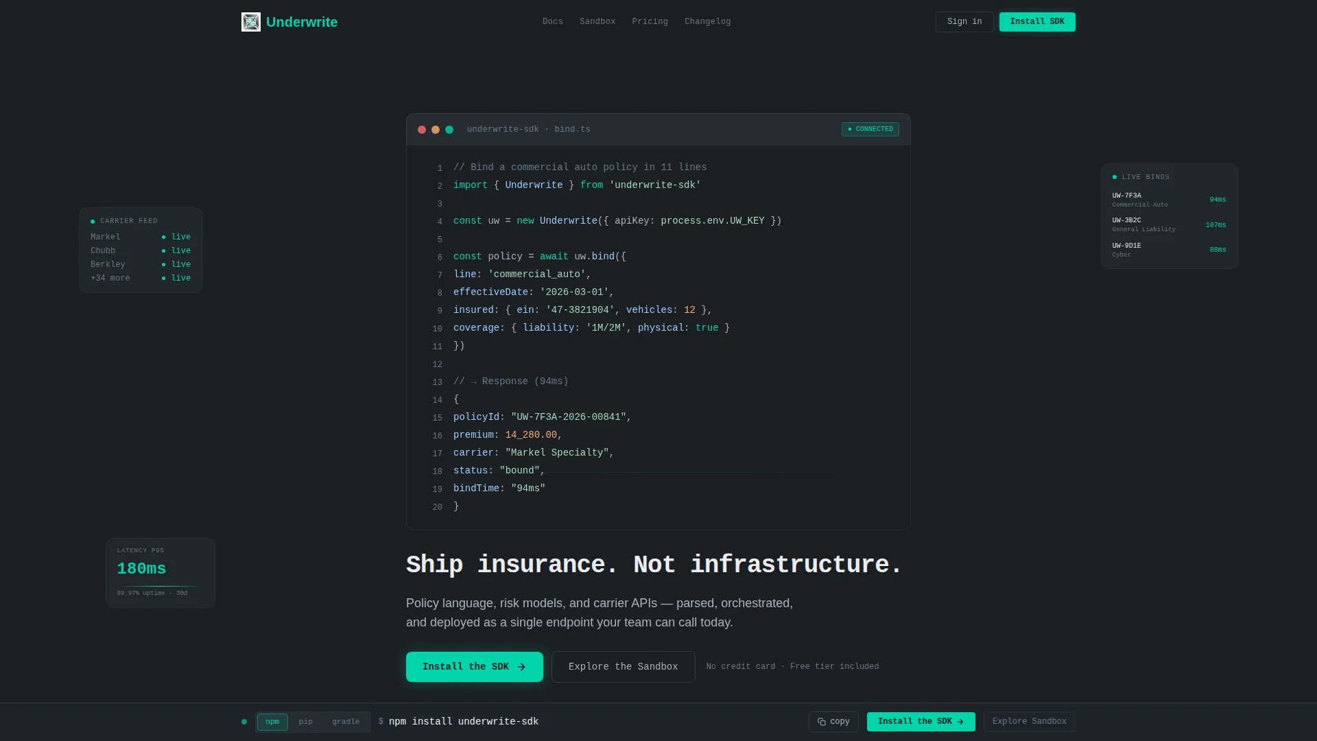
- A full-viewport animated code header showing a real commercial auto policy bind in eleven lines
- Three escalating comparison tables covering quoting, multi-carrier orchestration, and compliance automation
- A sticky bottom bar with a pre-filled install command and a one-tap copy interaction
- A platform toggle for npm, pip, and gradle with a secondary sandbox path for teams not ready to commit
Feature list
This template ships a tightly sequenced set of components. Each one is designed to reduce friction for a technical buyer and build trust through evidence rather than assertion.
Animated Terminal Header
The header fills the full viewport with a syntax-highlighted API request. It animates character by character like a live terminal session. The response object displays a bound policy identifier, premium amount, and carrier assignment. A blinking cursor precedes the headline: "Ship insurance. Not infrastructure."
Escalating Comparison Tables
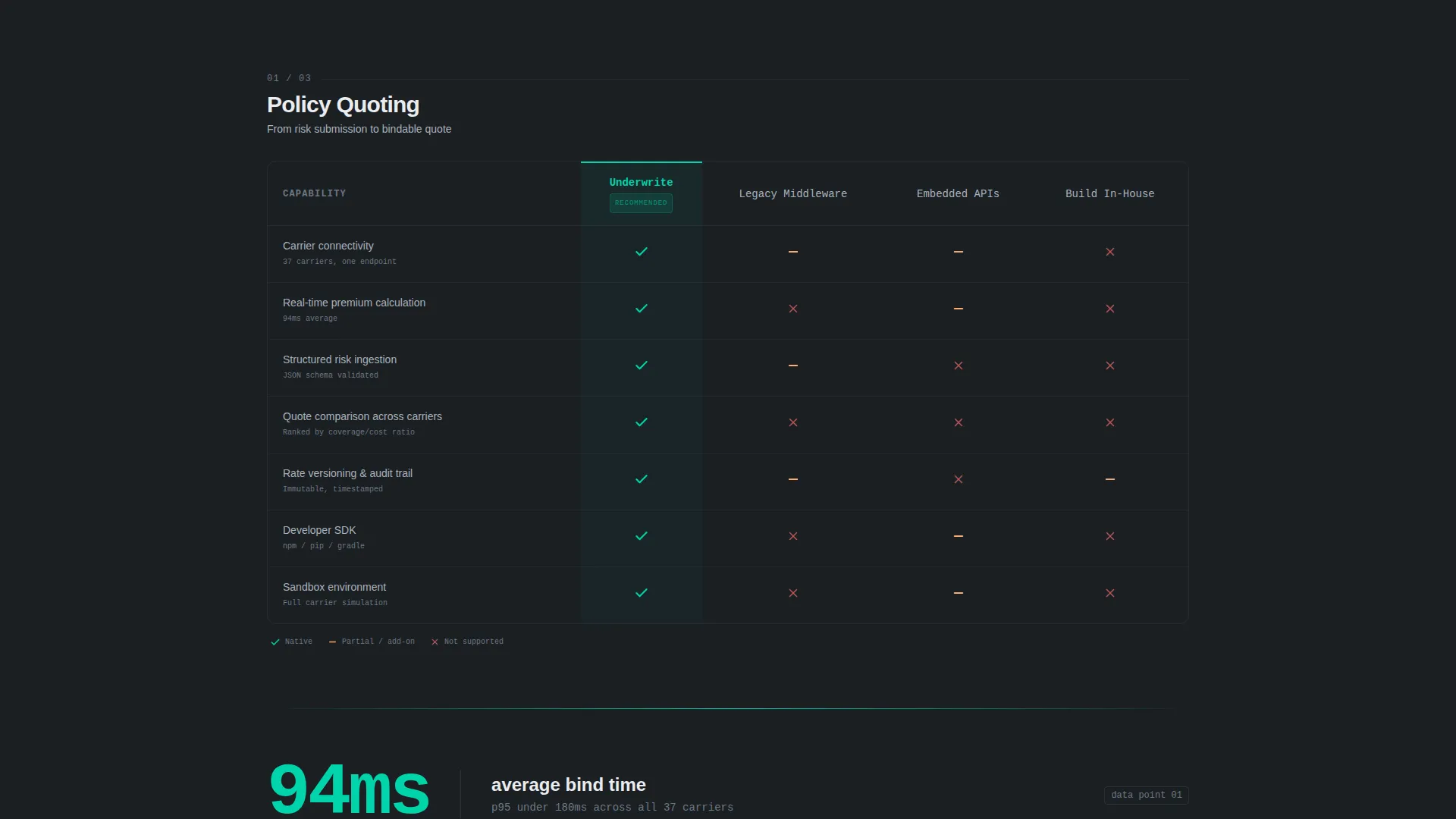
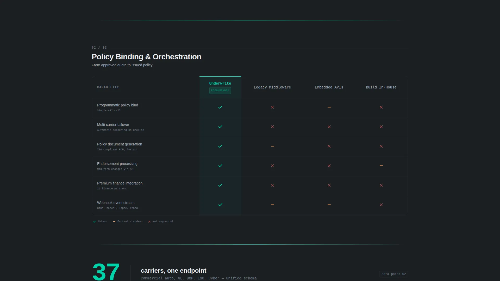
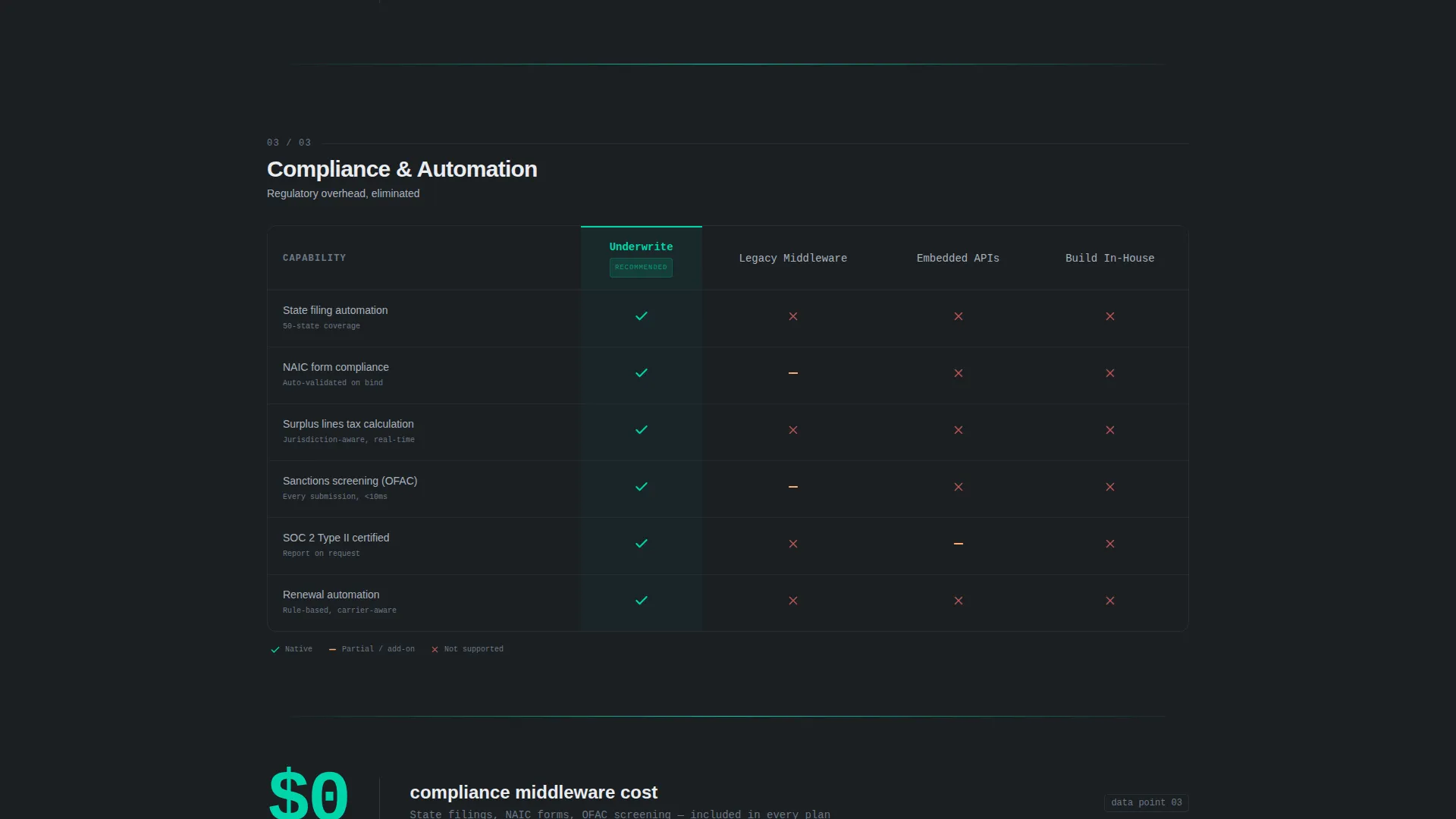
Three stacked feature matrices pit the platform against legacy middleware, embedded insurance APIs, and in-house builds. Columns animate into view with staggered motion. Checkmarks and cross-marks snap into cells with micro-bounce easing. The narrative moves from basic quoting to multi-carrier orchestration to compliance automation.
Percussive Stat Callouts
Between each comparison table, a single-stat slide-in callout keeps the reading rhythm sharp. Examples from the brief include "94ms average bind time" and "37 carriers, one endpoint." These callouts reinforce the evidence without interrupting the table flow.
SDK Install call to action Block
The primary call to action reads "Install the SDK" with a platform toggle for npm, pip, and gradle. A secondary path offers "Explore the Sandbox" for teams evaluating before committing. This dual-path structure respects different levels of buyer readiness.
Sticky Install Bar
After the visitor scrolls past the second comparison table, a sticky bottom bar surfaces. It displays the install command pre-filled and ready to copy with a single tap. This keeps the conversion action always visible without blocking the reading experience.
Monochrome Steel Visual System
Every surface follows the Monochrome Steel color system. The palette uses deep gunmetal, brushed chromium, and cold white as structural tones. A single electric accent color is reserved exclusively for interactive states, active table cells, and the download call to action.
Page sections overview
| Section | Purpose |
|---|---|
| Animated Code Header | Opens with a live API bind sequence and types the core headline beneath the terminal output |
| Stat Callout One | Delivers the first percussive evidence point between the header and the first comparison table |
| Quoting Comparison Table | Contrasts basic quoting capabilities against legacy middleware and embedded API alternatives |
| Stat Callout Two | Reinforces momentum with a single hard metric before the second table loads |
| Multi-Carrier Orchestration Table | Escalates the comparison to carrier routing and endpoint consolidation |
| Stat Callout Three | Closes the evidence sequence with a final metric before the compliance table |
| Compliance Automation Table | Proves the widest moat by comparing programmatic compliance handling across all three alternatives |
| SDK Install Block | Presents the primary call to action with platform toggle and a secondary sandbox exploration path |
| Sticky Install Bar | Surfaces after the second table scroll with a pre-filled install command ready to copy |
Design & branding system
The visual identity follows the Dynamic Motion theme built on the Monochrome Steel color system. The aesthetic is deliberately cold and structural, referencing the interior logic of server infrastructure rather than consumer product warmth.
- Color palette: deep gunmetal (#1B1F23) for backgrounds, brushed chromium (#A8B2BD) for secondary text, cold white (#EAECEF) for primary text, and electric accent (#00D4AA) reserved for interactive states and the primary call to action only
- Typography: monospaced font throughout the header and code sections, reinforcing the terminal aesthetic at the top of the page
- Motion language: staggered column entrance animations, micro-bounce easing on table cell icons, and slide-in stat callouts create a rhythm that feels percussive and precise
Mobile & speed optimization
The layout is designed so that technical buyers on any device can read the comparison tables and reach the install bar without friction. The sticky bottom bar is especially useful on smaller screens where the primary call to action block scrolls out of view.
- Comparison table columns are structured for responsive reflow so the feature matrix stays readable at narrower widths
- The sticky install bar remains accessible throughout the scroll journey, keeping the conversion action one tap away at all times
How this template helps you convert
The template is built around a single conversion logic: prove the build-versus-buy math before the visitor reaches the call to action. Every section earns the next click rather than asking for it up front.
- The animated code header establishes technical credibility in the first three seconds, signaling to developers that the platform is real and production-ready before any marketing copy appears.
- The escalating comparison tables make the cost of alternatives concrete and visible, so by the time a visitor reaches the SDK install block, the decision feels inevitable rather than persuaded.
- The sticky install bar and dual-path call to action remove the last point of hesitation by letting ready teams install immediately and cautious teams explore the sandbox without pressure.
Other information about this template
This template is categorized under Startup and Launch, with a specific focus on the InsurTech Growth Stage Startup niche. It is built for single-page deployment with a clear app download conversion goal.
- Template style: Comparison Table layout with Feature Matrix creative direction
- Header concept: Code Snippet with character-by-character terminal animation
- Theme: Dynamic Motion, using entrance animations and micro-bounce easing throughout
- Landing page direction: App Download, with SDK install as the primary conversion action and sandbox exploration as the secondary path
- Suitable for product launches, developer acquisition campaigns, and investor-facing technical demos
Theme
Dynamic Motion
Creative direction
Feature Matrix
Color system
Monochrome Steel
Style
Comparison Table
Direction
App Download
Page Sections
Animated Terminal Code Header
Escalating Comparison Table Sequence
Percussive Stat Callouts
SDK Install Call to Action with Platform Toggle
Sticky Install Bar
Monochrome Steel Design System
Related questions
Who is this landing page template designed for?
Can I adapt the comparison table content to match my own platform?
What conversion path does this template support?
Do I need design experience to customize this template?
Is the animated code header customizable?



