Newlywed Insurance Professional Website Template
Shield is a single-page disability insurance landing page built for newlyweds navigating shared finances for the first time. It combines a zigzag audit layout with a five-question interactive assessment that calculates a personalized coverage gap score. The template targets dual-income couples who have recently merged debts and income, converting awareness into specialist consultations through structured, pressure-building design.
by Rocket studio
Quick summary
Shield is a disability insurance landing page template designed specifically for newlyweds. It uses a checklist-and-audit structure to walk couples through their shared financial vulnerabilities. A built-in five-step quiz delivers a personalized coverage gap score. The result is a focused, conversion-ready page that moves financially aware but insurance-naive couples toward a specialist consultation.
Who this template is for
This template is built for insurance professionals, independent brokers, and financial advisors who serve newlywed clients. It speaks directly to couples who have recently merged incomes, signed a mortgage together, and have not yet reviewed their disability coverage. It also works well for InsurTech platforms targeting the newlywed niche.
- Dual-income newlyweds aged roughly 27 to 34 who carry a shared mortgage and joint financial obligations
- Independent insurance agents or brokers offering disability coverage consultations to newly married clients
- Financial advisors who refer recently married clients to disability insurance specialists
What problem this template solves
Most newlyweds focus on life insurance and skip disability coverage entirely. Yet a six-month income disruption can unravel a mortgage, a car payment, and a joint savings plan simultaneously. This template makes that risk visible and personal before asking for a single minute of the visitor's time.
- Couples do not instinctively calculate what one missing paycheck means for shared fixed expenses
- Standard insurance pages do not speak to the specific financial structure of a newly merged household
- Without a guided audit, visitors leave without understanding the real size of their coverage gap
What you get with this template
You get a fully structured, single-page layout with a clear visual hierarchy and high interactivity baked in from the start. Every section serves a specific purpose in the conversion journey, from the opening headline through the quiz results card.
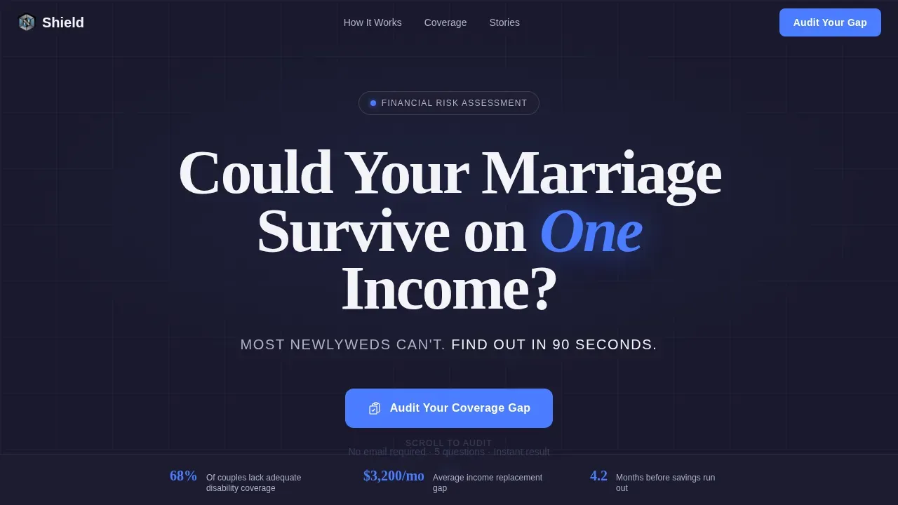
- A hero section with a giant centered headline and a signal-blue accent word, plus a pulsing scroll chevron
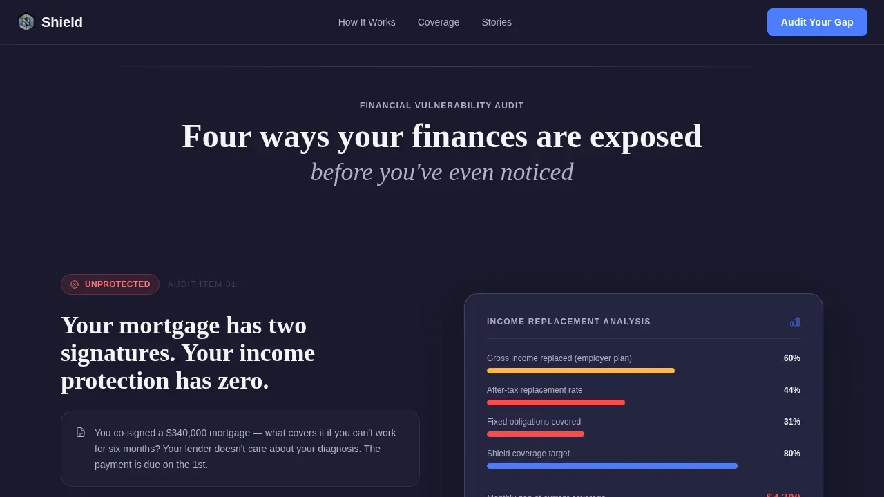
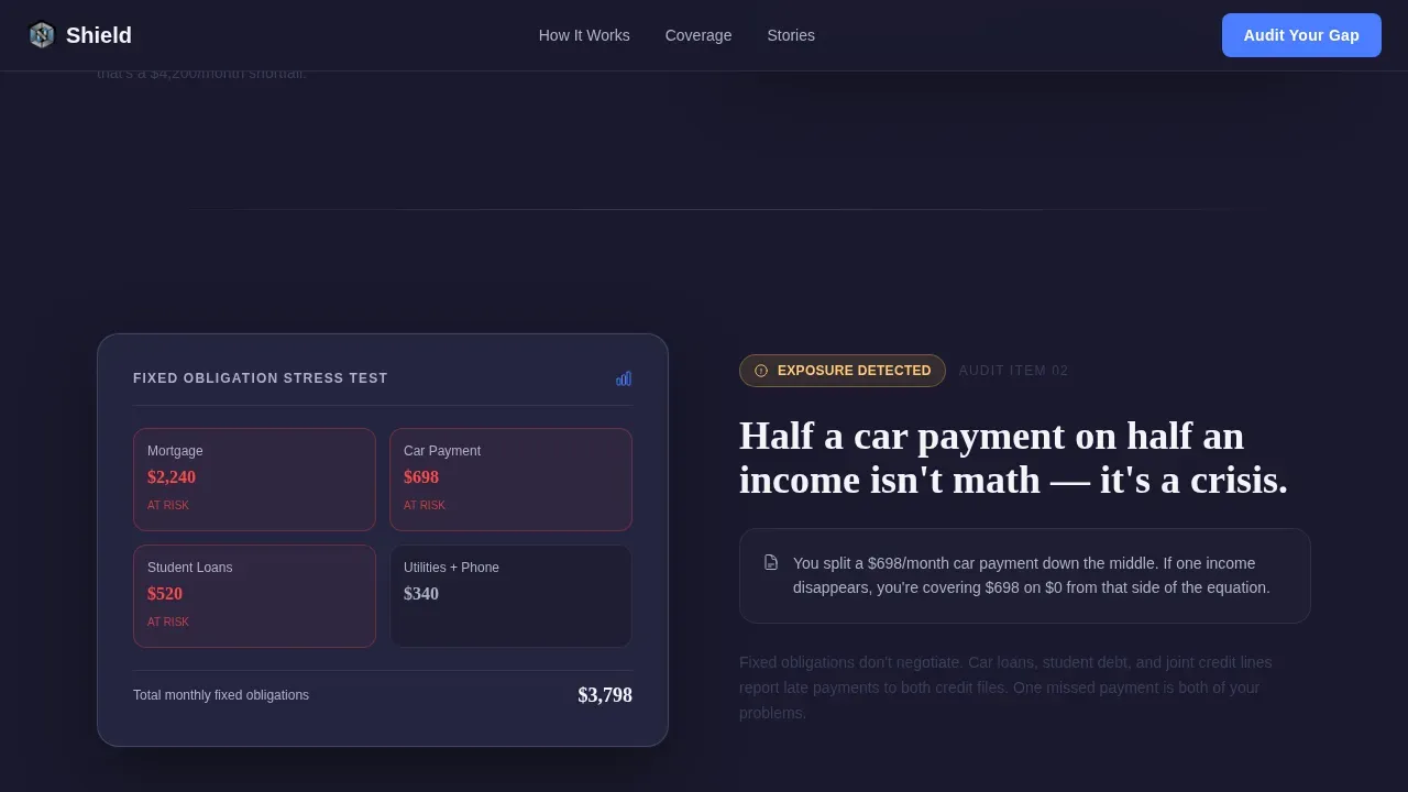
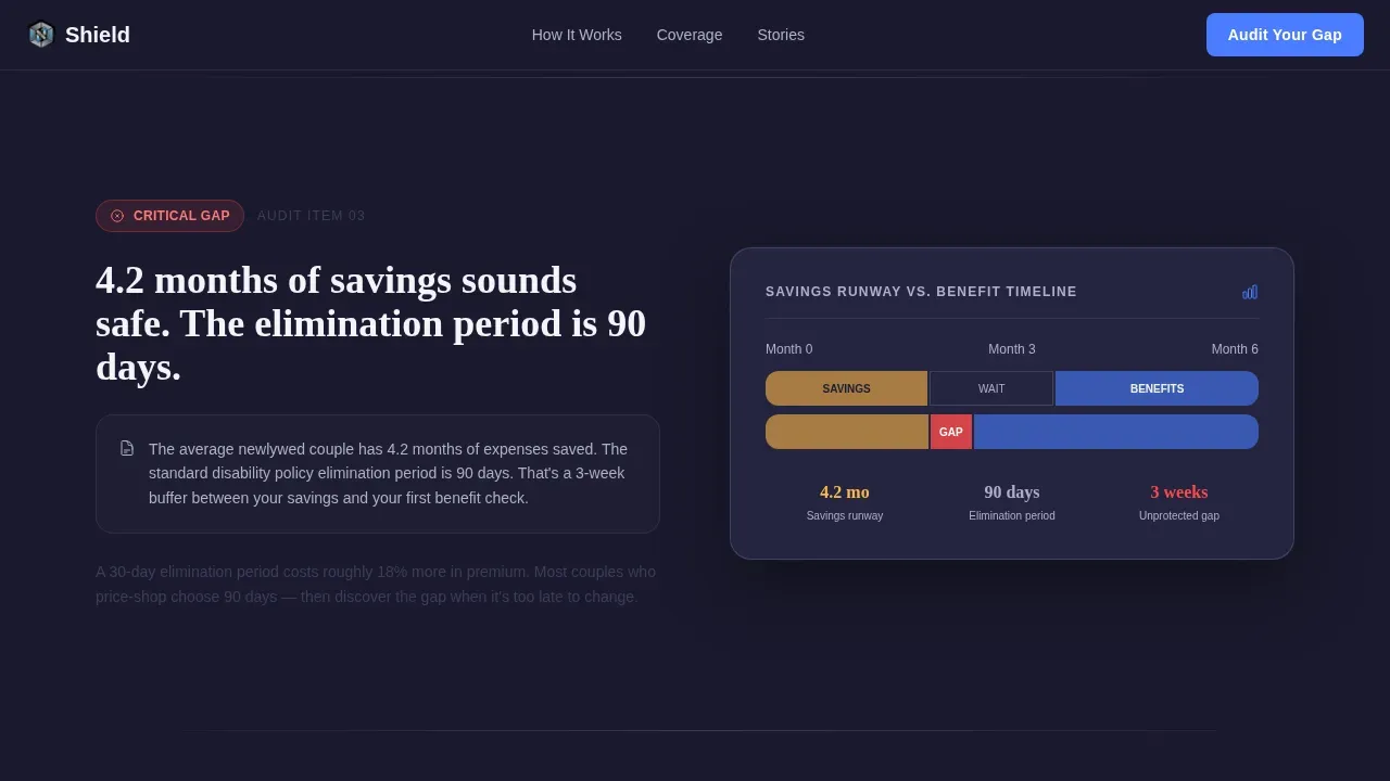
- Four alternating zigzag audit sections, each presenting a financial risk scenario and a corresponding data visualization
- A five-question progressive quiz modal that outputs a personalized coverage gap score on a dashboard-style results card
- A coverage mechanics section explaining how the insurance product works, with a benefit timeline visualization
- A social proof section featuring couple testimonials that reference specific dollar amounts and coverage gap scores
- A linear single-row footer
Feature list
This template ships with a set of purpose-built components designed for the disability insurance consultation funnel.
Giant Headline Hero Section
The hero opens with stark white Fraunces serif display type on a forge-black background. The word "One" renders in signal blue to anchor attention. A subline beneath the headline reads "Most newlyweds can't. Find out in 90 seconds." A pulsing downward chevron cues the scroll. No images or illustrations appear here. Typography does all the work.
Zigzag Audit Trail Layout
Four alternating sections build financial pressure in sequence. Left-side panels present plain-language risk scenarios tied to real mortgage and income figures. Right-side panels show dashboard-style data visualizations including income replacement percentages, benefit period timelines, and elimination period comparisons. A scroll-linked sidebar checklist follows the visitor down the page, accumulating unchecked audit items as they read.
Five-Step Coverage Gap Quiz
Clicking "Audit Your Coverage Gap" launches a progressive five-question modal. Questions cover combined household income range, monthly fixed obligations, existing employer benefits, savings runway in months, and which spouse earns more. The quiz processes responses and returns a personalized coverage gap score displayed on a steel-toned dashboard card with a red, yellow, or green rating.
Coverage Gap Score Dashboard Card
The results card presents the visitor's score in a clean dashboard layout using the Monochrome Steel color system. A color-coded rating makes the risk level immediately legible. A follow-up call-to-action button labeled "Talk to a Specialist" opens a calendar booking widget directly from the results view.
Social Proof with Specific Scenarios
The testimonial section uses real couple scenarios with named financial figures such as specific coverage gap scores and dollar amounts. This specificity builds the kind of trust that generic quote blocks cannot achieve. Each testimonial is framed around a financial situation that mirrors the target visitor's own circumstances.
Recurring call to action Placement
The primary call-to-action button labeled "Audit Your Coverage Gap" appears first beneath the hero headline, then resurfaces after every third zigzag section. This cadence keeps the conversion opportunity present without overwhelming the reading experience.
Page sections overview
| Section | Purpose |
|---|---|
| Hero Headline | Opens with financial urgency, introduces the audit concept |
| Audit Trail Zigzag | Presents four risk scenarios with alternating data panels |
| Scroll Sidebar Checklist | Tracks unchecked vulnerabilities as visitor scrolls |
| Quiz Assessment Modal | Collects five inputs to calculate a coverage gap score |
| Gap Score Card | Delivers personalized rating and prompts specialist booking |
| Coverage Mechanics | Explains how the disability coverage product works |
| Benefit Timeline Visual | Shows benefit period and elimination period side by side |
| Social Proof Section | Displays couple testimonials with specific financial figures |
| Linear Footer | Single-row footer with essential links and contact details |
Design & branding system
The visual identity follows the Dashboard Pro theme built on a Monochrome Steel color system. Every color choice reinforces the cold authority of a financial interface. There is no warmth and no decorative imagery. The typography pairing of Fraunces for display headings and DM Sans for body copy balances gravitas with readability.
- Core palette: forge-black (#1A1A2E) as the primary background, brushed gunmetal (#3D3D5C) for secondary surfaces, polished chrome (#B0B0C8) for supporting text, and clean linen white (#F4F4F8) for content backgrounds
- Single accent color: signal blue (#4A7CFF) is reserved exclusively for interactive elements, progress indicators, and call-to-action buttons
- Typography system: Fraunces serif display for headlines tracked tight at large scale, paired with DM Sans for body copy to maintain clarity at reading size
Mobile & speed optimization
The template is built desktop-first to reflect the financial decision-making context of its audience. However, it is fully responsive and adapts cleanly to smaller screens without losing the audit flow or quiz functionality.
- Staggered section reveals and scroll-linked sidebar animations are designed to run smoothly as the visitor moves through the page
- The five-step quiz modal and progress indicators are implemented as interactive client components, keeping the rest of the static layout lightweight
- The zigzag layout reflows gracefully on tablet and mobile, preserving the risk-and-data pairing in a stacked single-column format
How this template helps you convert
Every structural decision in this template is designed to move a financially curious visitor toward booking a consultation. The audit format builds personal relevance before asking for anything.
- The scroll-linked checklist makes each unresolved financial vulnerability feel owned and personal, so by the time the visitor reaches the quiz, they already feel exposed and motivated to act.
- The five-question assessment is short enough to complete in 90 seconds but specific enough to return a result that feels genuinely calculated, earning the trust needed to prompt a calendar booking.
- The recurring "Audit Your Coverage Gap" button placement ensures the conversion entry point is always one scroll away, reducing friction for visitors who decide to act mid-page rather than at the end.
Other information about this template
This template is part of the Shield product series, positioned for the newlywed disability insurance niche within the broader Finance and Insurance category. It sits at the intersection of InsurTech product design and personal finance conversion strategy.
- The template uses accordion-style FAQ functionality at the page level, supporting an interactive reading experience for visitors who have detailed questions before committing to the quiz
- Animation level is high throughout, including scroll-linked sidebar state changes, staggered reveal timing for audit sections, a pulsing chevron in the hero, and a quiz state machine that tracks progress across all five steps
- The calendar booking widget opens directly from the gap score results card, removing unnecessary steps between score delivery and specialist contact
- Localization defaults are set for the United States market, using USD currency formatting, MM/DD/YYYY date format, and American mortgage and income norms
Theme
Dashboard Pro
Creative direction
Checklist & Audit
Color system
Monochrome Steel
Style
Zigzag/Alternating
Direction
Quiz/Assessment
Page Sections
Giant Headline Hero with Signal Blue Accent
Zigzag Audit Trail with Sidebar Checklist
Five-step Coverage Gap Assessment Quiz
Gap Score Results Card with Booking Call to Action
Recurring Contextual Call to Action Placement
Couple-specific Social Proof Section
Related questions
Who is this landing page template designed for?
Can I customize the quiz questions and scoring logic?
What makes this template different from a standard insurance landing page?
Does the template include social proof components?
What happens after a visitor completes the quiz?



