Specialist Anesthesiologist Appointment Booking Website Template
Sedate is a sidebar companion landing page built for anesthesiologists welcoming new patients. It walks anxious visitors through their fears, explains every major anesthesia type in plain language, and guides them to a five-question personalized assessment. The result is a calm, trust-building experience that turns pre-surgery worry into informed confidence before the first appointment.
by Rocket studio
Quick summary
Sedate is a single-page anesthesiologist new patient welcome experience. It pairs a fixed sidebar progress tracker with a Problem to Solution scroll arc, moving visitors from honest fear acknowledgment through clear education to a personalized pre-appointment guide delivered via a five-question embedded assessment.
Who this template is for
This template is built for anesthesiology practices that want to meet patients with empathy before the procedure room. It works best when the practice serves a mix of patient types who carry very different anxieties into their first visit.
- Adults preparing for their first major surgery who have over-researched worst-case outcomes online
- Parents of children scheduled for procedures under general anesthesia who need child-specific reassurance
- Chronic pain patients weighing epidural or nerve-block options and looking for clear, judgment-free guidance
What problem this template solves
Most anesthesia information online is either too clinical or too alarming. Patients arrive at appointments already exhausted by fear, and a plain brochure page does nothing to address that. This template replaces passive information delivery with a structured, empathetic scroll experience that meets each fear before resolving it.
- Patients who cannot find calm, plain-language answers to questions like "Will I wake up during surgery?" or "Is anesthesia safe for my child?"
- Practices that lose patient trust because their online presence feels cold, rushed, or image-heavy in ways that heighten anxiety
- New patients who need a clear next step but do not know what questions to bring to their appointment
What you get with this template
The template delivers a fully structured, section-led landing page with distinct content zones, a persistent sidebar, an interactive multi-step assessment, and a secondary download path. Every component is scoped to reduce patient anxiety and drive a single meaningful action.
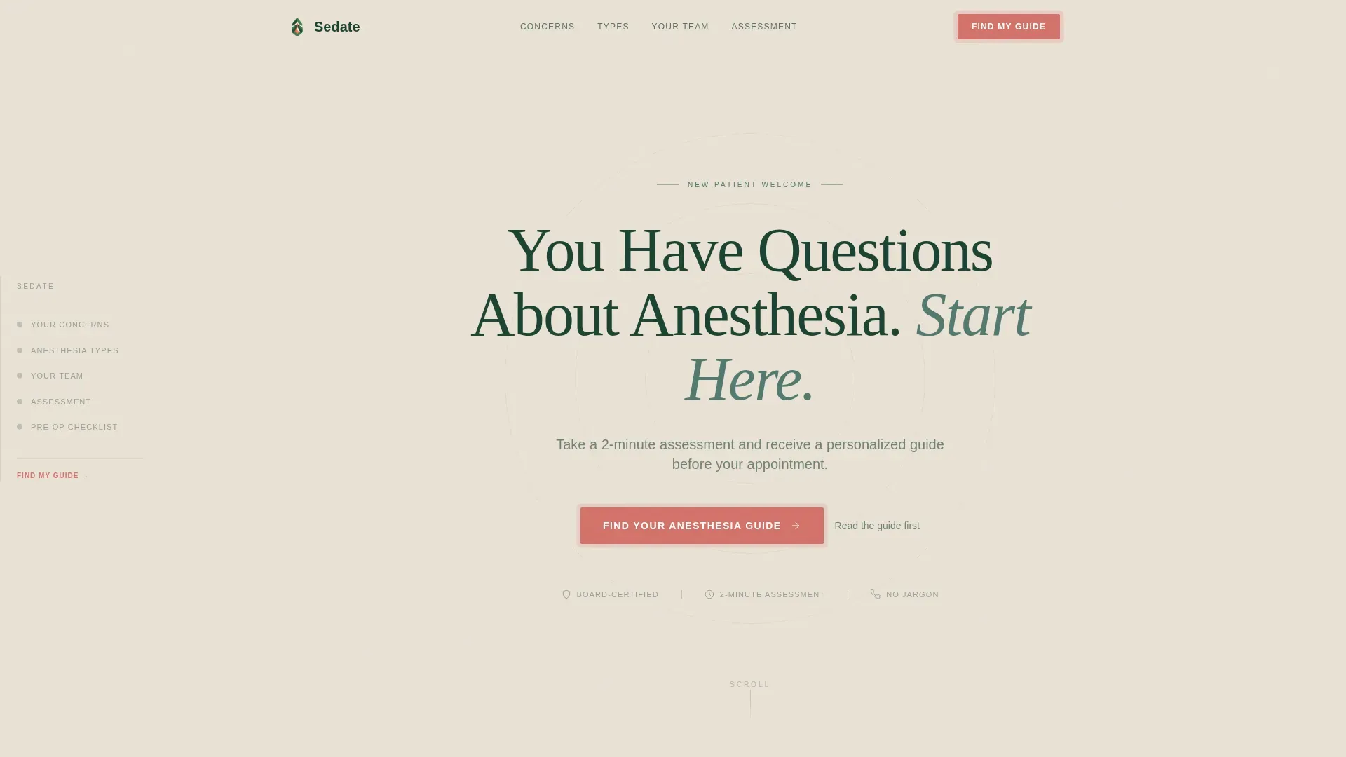
- A hero section with a centered serif headline, scroll cue, and assessment call to action
- Judgment-free fear cards, anesthesia type explainers, team role cards, and an embedded five-question assessment
- A secondary conversion path that offers a downloadable pre-operation checklist for visitors who are not yet ready for the full assessment
Feature list
This template includes a focused set of interactive and editorial components designed specifically for patient education and pre-appointment preparation.
Fixed Sidebar Progress Tracker
A persistent sidebar stays visible throughout the entire scroll. It displays five named checkpoints: Fears, Types, Your Team, What to Expect, and Your Assessment. Visitors can tap any checkpoint to jump directly to that section, so no one feels lost regardless of where they enter the page.
Judgment-Free Fear Cards
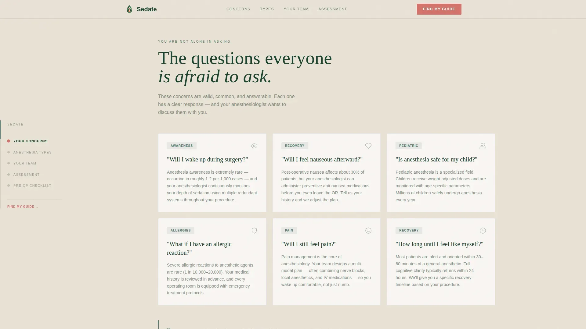
A dedicated section presents common patient anxieties as honest, clearly worded cards. Questions like "Will I feel nauseous after?" and "Is anesthesia safe for my child?" appear without clinical framing. Cards are arranged in a responsive grid on desktop and a horizontal scroll layout on mobile, with staggered reveal animations as each card enters the viewport.
Interactive Five-Question Assessment
An embedded multi-step assessment sits at the page's natural resting point. It asks five questions: procedure type, previous anesthesia experience, top concern, age bracket, and preferred learning format. On completion, the visitor receives a personalized pre-appointment guide by email, creating a meaningful value exchange rather than a standard lead form.
Anesthesia Type Explainers
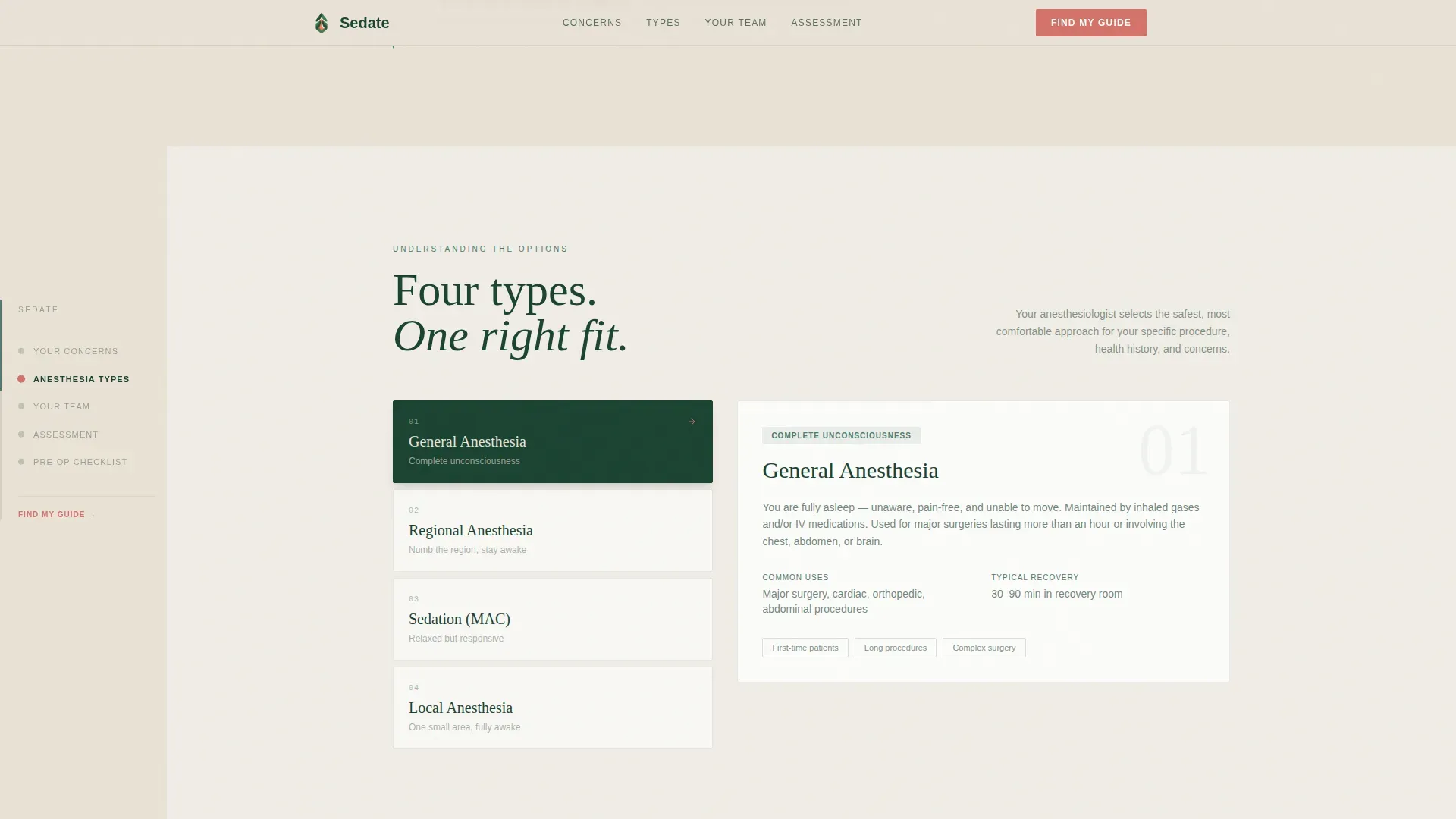
An asymmetric split layout presents each major anesthesia type with micro-animations that reveal how it works step by step. The language stays jargon-free throughout, making technical distinctions accessible to patients with no medical background.
Secondary Checklist Download Path
A secondary call to action captures visitors who scroll but are not ready for the full assessment. It asks only for an email address and surgery date in exchange for a downloadable pre-operation checklist, offering a lower-commitment entry point without abandoning the conversion goal.
Problem to Solution Scroll Arc
The page is structured so the scroll journey begins inside the visitor's anxiety and resolves it section by section. Each content zone addresses one fear before introducing the next topic, building cumulative trust rather than relying on a single persuasive push at the end.
Page sections overview
| Section | Purpose |
|---|---|
| Hero Headline | Introduces the page with a calm centered serif headline and assessment call to action |
| Fear Cards Grid | Presents common patient anxieties as judgment-free cards with reveal animations |
| Anesthesia Types | Explains each anesthesia type using an asymmetric layout with step-by-step micro-animations |
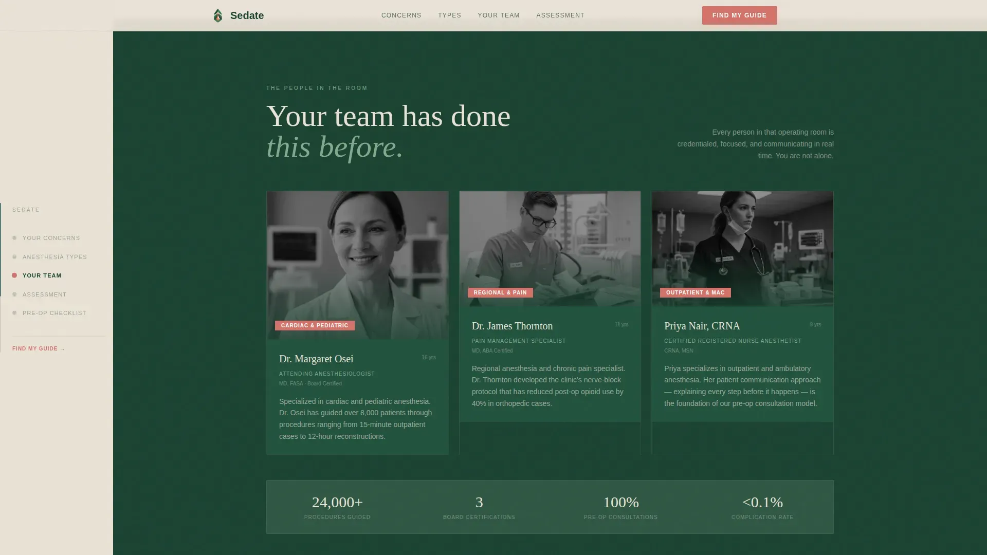
| Your Care Team | Introduces team roles through editorial photo cards with brief role descriptions |
| Assessment Embed | Hosts the five-question interactive quiz and delivers a personalized guide on completion |
| Sidebar Navigator | Tracks scroll progress and lets visitors jump to any section at any point |
| Footer Row | Presents credential badges, trust indicators, and a linear single-row footer pattern |
Design & branding system
The visual identity follows an Educational Guide theme built around a Forest Trust color system. The palette draws from old-growth woodland tones to create a grounded, unhurried atmosphere that feels unlike typical clinical web design.
- Evergreen (#1B4332) anchors the persistent sidebar and typographic headers; fern (#52796F) washes section backgrounds to signal safe, readable territory
- Birch-bark cream (#EAE2D6) holds body text in generous white space; heartbeat coral (#D4726A) appears only on interactive highlights and call-to-action pulses
- Typography pairs Fraunces serif for display headlines with DM Sans for body copy, reinforcing the calm editorial tone throughout
Mobile & speed optimization
This template is designed mobile-first, reflecting the reality that patients often research anesthesia on their phones in waiting rooms or at home the night before surgery. The layout adapts thoughtfully at every breakpoint without sacrificing the sidebar companion experience on larger screens.
- Fear cards shift from a desktop grid to a horizontal scroll on mobile, keeping the emotional flow intact on smaller screens
- Scroll reveal animations use IntersectionObserver to trigger only when sections enter view, avoiding unnecessary processing before the visitor reaches them
- CSS smooth scroll handles section navigation without requiring heavy third-party libraries, keeping the interaction light and responsive
How this template helps you convert
The page is built around two conversion paths, each matched to a different level of visitor readiness. Neither path feels transactional because both deliver something genuinely useful.
- The primary path guides visitors through the five-question assessment and delivers a personalized pre-appointment guide by email, turning anxiety into preparation and positioning the practice as a trusted resource before the first in-person interaction.
- The secondary path offers the pre-operation checklist download for visitors who are not ready for the full assessment, capturing intent with a minimal ask and keeping the practice present in the patient's preparation process.
Other information about this template
This template is categorized under Health and Medical as an Anesthesiologist Website template. It is suited to practices that prioritize patient communication and want a digital presence that reflects the same care and clarity their clinical team delivers in person.
- The header deliberately avoids clinical imagery such as masks, intravenous lines, and operating lights; the calm is an intentional design choice, not a production gap
- Social proof elements including credential badges, patient reassurance statistics, and trust indicators are included in the template layout to reinforce practice authority
- The footer follows a linear single-row pattern, keeping the page's closing moment clean and focused rather than visually cluttered
- The template is built in English for the United States market with no currency display required
Theme
Educational Guide
Creative direction
Problem→Solution Arc
Color system
Forest Trust
Style
Sidebar Companion
Direction
Quiz/Assessment
Page Sections
Fixed Sidebar Progress Tracker
Judgment-free Fear Cards
Five-question Embedded Assessment
Anesthesia Type Explainers
Secondary Checklist Download Path
Problem to Solution Scroll Arc
Related questions
Who should use this template?
How does the five-question assessment work?
Does the template include a secondary option for undecided visitors?
Can I customize the fear card questions?
What makes this different from a standard medical information page?



