Artisan Farm-to-Door Landing Page Template
Seedling is a masonry-style landing page template built for a youth-founded micro-farm selling small-batch preserves, herb bundles, and seasonal produce boxes. It combines a price-anchored header, a scrollable Before/After card grid, and a five-question visual quiz to match visitors with the right farm box. The result is a page that earns trust through honest storytelling and converts through personalization.
by Rocket studio
Quick summary
Seedling is a single-page landing page template designed for a teenage-founded micro-farm. It leads with three tiered product prices, guides visitors through a masonry grid of raw-to-finished farm moments, and closes with a personalized box quiz. Every section works together to turn a visitor's curiosity into a confirmed order.
Who this template is for
This template was built for a very specific kind of seller: a young founder with a real product, a real story, and customers who care about both. It suits founders who sell direct to local households and want their page to reflect genuine craft rather than corporate polish.
- Youth-founded farms and small food producers shipping within a defined local radius
- Micro-farm operators selling produce boxes, preserves, or bundled herb products
- Teen entrepreneurs who want a page that communicates trust without looking generic
What problem this template solves
Most food-seller templates look like grocery-store flyers. They show products but never show the person or the process behind them. For a youth-founded farm, that gap destroys credibility before a visitor even reads the price.
- Visitors can't tell whether a small farm is real or reliable without visual proof of labor
- Generic product grids don't communicate the founder's story or seasonal freshness
- Customers have no way to self-select the right box, so they hesitate and leave
What you get with this template
You get a complete, section-led landing page designed around the Seedling micro-farm concept. Each section has a specific job: anchor value, build trust, and close with personalization.
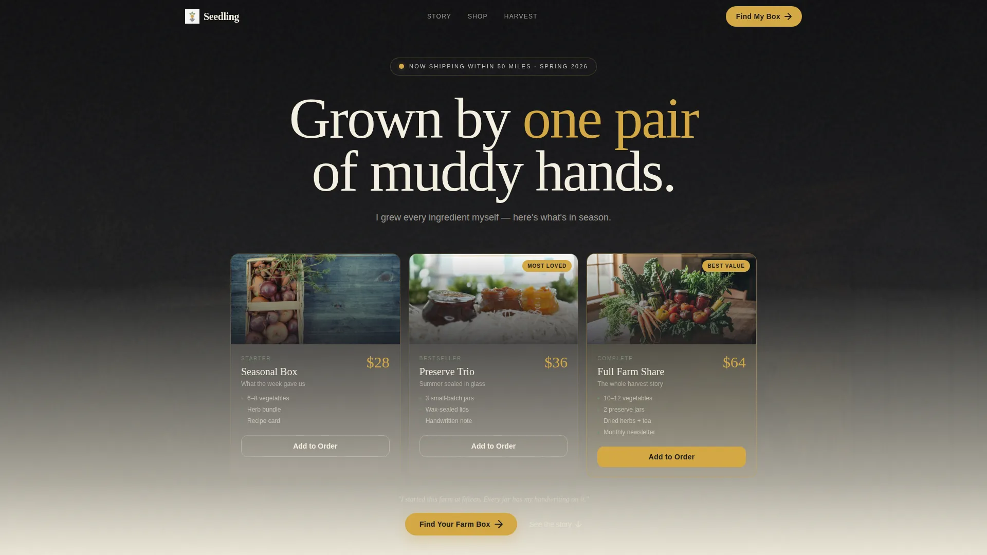
- A price-anchored header showing three product tiers at $28, $36, and $64 with product photography
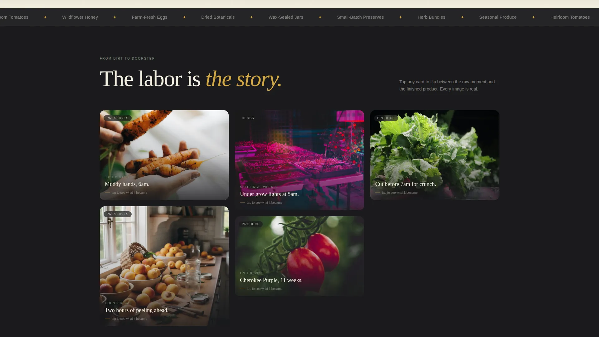
- A masonry Before/After card grid that flips between raw farm moments and finished packaged products
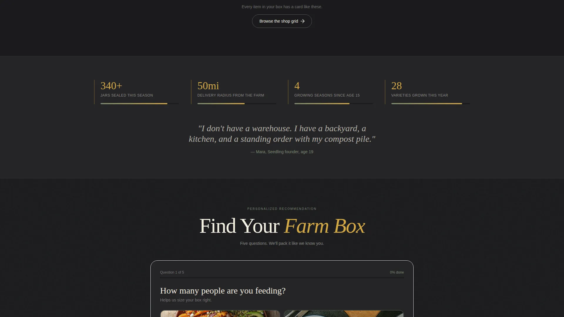
- A five-question visual quiz labeled "Find Your Farm Box" that recommends a specific box based on household answers
Feature list
This template is built around a small number of high-impact features. Each one serves the core goal of converting local food buyers who care about authenticity.
Price-Anchored Header with Three Tiers
The header places three product tiers side by side on a soft gradient wash. A seasonal produce box at $28, a preserve trio at $36, and a full farm share at $64 each appear with an overhead product photograph and the founder's own words below. The layout is designed so the farm share feels like the natural choice.
Masonry Before/After Card Grid
The masonry grid is the heart of the page. Each card flips between a raw farm moment, such as muddy hands pulling a carrot or a counter covered in unpeeled peaches, and the finished product, such as a labeled jar or a twine-tied herb bundle. The scroll progression builds trust card by card as visitors see the full journey from soil to shelf.
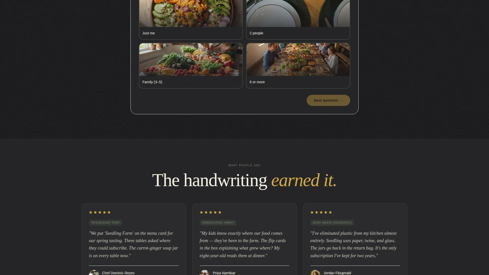
Five-Question Visual Quiz
The "Find Your Farm Box" quiz walks visitors through five tappable questions covering household size, cooking style, flavor preference, vegetable adventurousness, and delivery frequency. Each answer card is styled in sage and gold. The result page recommends a specific box with a personalized note tied to current-harvest items.
Founder Voice Messaging
A single line written in the founder's own voice appears below the header prices. This small detail, "I grew every ingredient myself, here's what's in season," anchors the page in authenticity. It signals that a real person, not a brand team, packed this box.
Secondary Shop Grid Path
Visitors who prefer to skip the quiz can navigate directly to the shop grid. This secondary path keeps the experience open without forcing a single funnel. Both paths lead to the same conversion goal.
Page sections overview
| Section | Purpose |
|---|---|
| Gradient Header | Anchor price tiers and showcase product photography |
| Founder Voice Line | Establish personal trust below the header prices |
| Before/After Masonry Grid | Show farm labor and finished products card by card |
| Farm Box Quiz | Match visitors to a specific box through five visual questions |
| Quiz Result Page | Deliver a personalized box recommendation with harvest context |
| Secondary Shop Grid | Provide a direct browse path for visitors skipping the quiz |
Design & branding system
The visual identity is built on a Soft Gradient theme using four colors that feel like a leather-bound recipe journal left beside a jar of honeycomb. Every color carries a specific role across the page.
- Deep loam black (#1B1B1E) grounds the header and darker sections like turned soil
- Warm harvest gold (#D4A843) highlights prices, buttons, and quiz answer cards
- Sun-bleached parchment (#F5F0E1) fills card backgrounds with a clean, market-chalkboard feel
- Muted sage (#7A8B6F) traces borders and dividers like herb rows between garden beds
Mobile & speed optimization
The masonry layout and card-flip interactions are structured to work at smaller screen sizes without losing their visual impact. The quiz is built with tappable image cards, which makes it natural to use on a phone.
- Tappable quiz answer cards are sized for comfortable finger use on mobile screens
- The masonry grid reflows cleanly so card pairs remain readable on narrow viewports
- Overhead product photography in the header is framed to stay clear at reduced sizes
How this template helps you convert
The page is designed so each section removes a specific reason a visitor might hesitate. By the time a visitor reaches the quiz result, the farm already feels familiar and trustworthy.
- The price-anchored header removes uncertainty by showing exact costs and real product photos before a visitor scrolls, making the farm share feel like the obvious value choice.
- The Before/After masonry grid turns scrolling into a trust-building exercise, proving through repeated visual evidence that a teenager's hands did this work from soil to jar.
- The personalized quiz result creates a direct connection between the visitor's household and a specific box, replacing hesitation with a recommendation that feels made for them.
Other information about this template
This template sits inside the Retail & E-Commerce category with a Youth-Founded Business subcategory focus. It was built for local direct-to-consumer food sellers who need a page that works as hard as their founder does.
- The template style follows a Bento Grid and masonry layout approach for flexible card arrangement
- The creative direction is a Before/After Reveal, which is a deliberate choice to show process alongside product
- The landing page direction supports a marketplace and multi-product context, so multiple box SKUs can sit naturally within the same page structure
- This template is suited to founders selling within a defined delivery radius, not a national fulfillment model
- The quiz-first conversion path is designed to outperform a plain shop grid by making the recommendation feel personal
Theme
Soft Gradient
Creative direction
Before/After Reveal
Color system
Dopamine Pop
Style
Bento Grid
Direction
Marketplace/Multi
Page Sections
Price-anchored Three-tier Header
Masonry Before/after Card Grid
Five-question Visual Farm Box Quiz
Personalized Quiz Result Page
Secondary Direct Shop Grid
Founder Voice Messaging Layer
Related questions
Can I change the product prices and tier names?
Do I need a third-party tool to run the 'Find Your Farm Box' quiz?
Is this template only suited to teen founders?
Can I remove the quiz and rely on the shop grid instead?
How many products can I display in the masonry grid?



