D2C Seed Stage Startup Landing Page Template
Seedling is a high-converting, single-page landing page template built for seed-stage direct-to-consumer founders. It combines a live-looking growth dashboard header, a scroll-driven comparison table, a week-by-week engagement timeline, and a frictionless click-through call-to-action flow, all styled in a dark-mode, iridescent command-center aesthetic that feels clinical, modern, and energizing.
by Rocket studio
Quick summary
Seedling is a comparison table landing page template designed for seed-stage direct-to-consumer brand accelerator services. It opens with an animated dashboard mockup showing fictional but believable growth metrics, walks visitors through a side-by-side pain comparison, and closes with a single-tap call-to-action. The design runs on a dark-mode iridescent palette that feels like a futuristic command center.
Who this template is for
This template is built for service providers and accelerators targeting early-stage direct-to-consumer founders. It works best when the offer bundles multiple services into one retainer and needs to justify that value quickly and visually.
- Solo founders with a prototype but no revenue, looking for a structured path to their first paying customers
- Ex-corporate operators who have closed a pre-seed round and need to prove traction fast
- Kickstarter creators moving from one-time backer fulfillment into sustainable recurring commerce
What problem this template solves
Early-stage founders often face a coordination problem. They need brand design, ad creative, e-commerce setup, and subscription logistics handled at once, but managing seven separate freelancers is slow, expensive, and mentally exhausting.
- There is no clear visual way to show a founder what working with you looks like versus going it alone
- Generic service pages bury the value and send curious visitors away before they ever book a call
- Most templates ask for form submissions too early, creating friction before trust is established
What you get with this template
You get a complete, single-page layout structured to take a skeptical founder from first impression to qualified booking in one scroll. Every section is purposeful and sequenced.
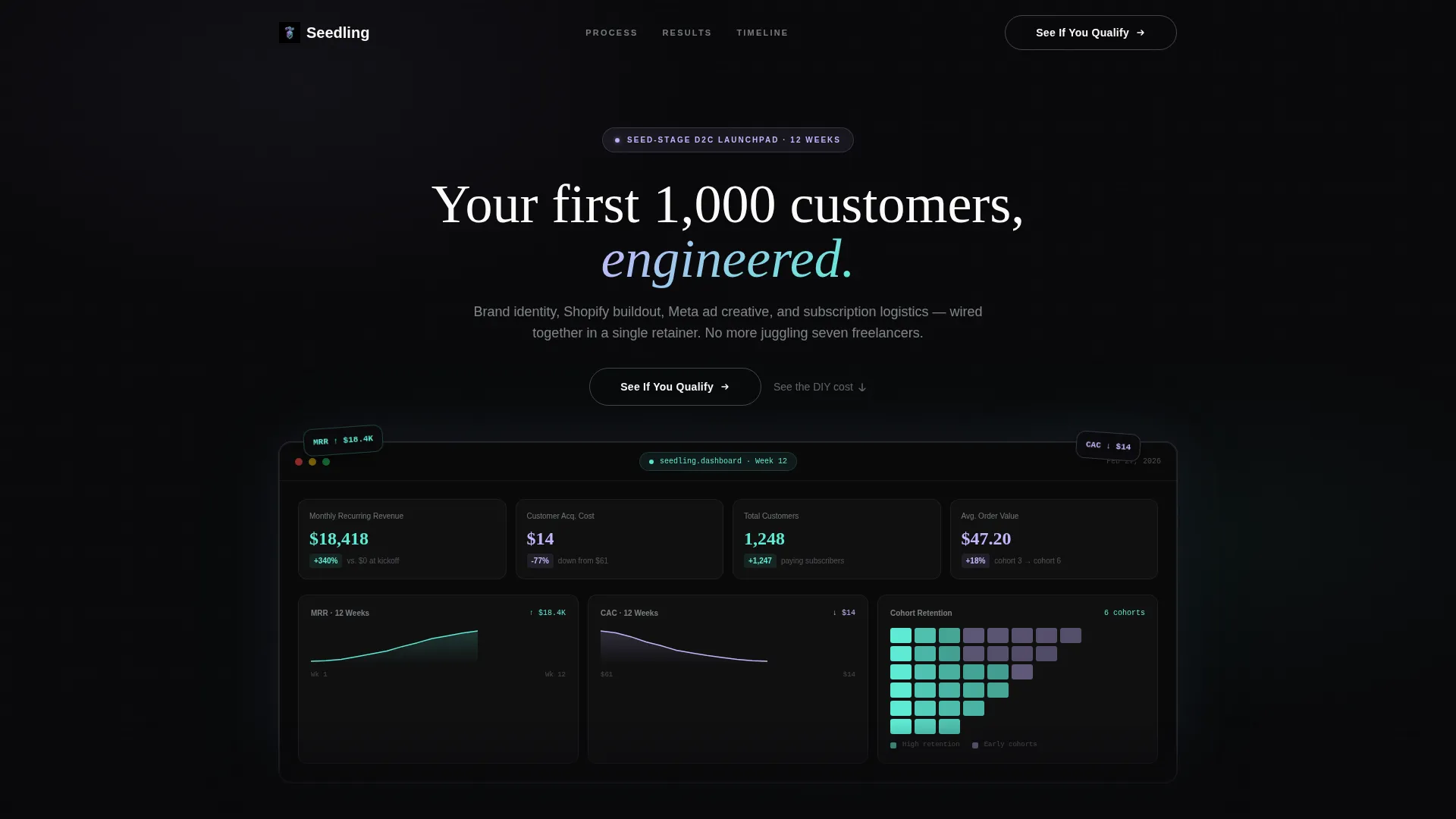
- An animated dashboard header mockup showing fictional growth metrics, including monthly recurring revenue climbing from zero to $18.4K over twelve weeks
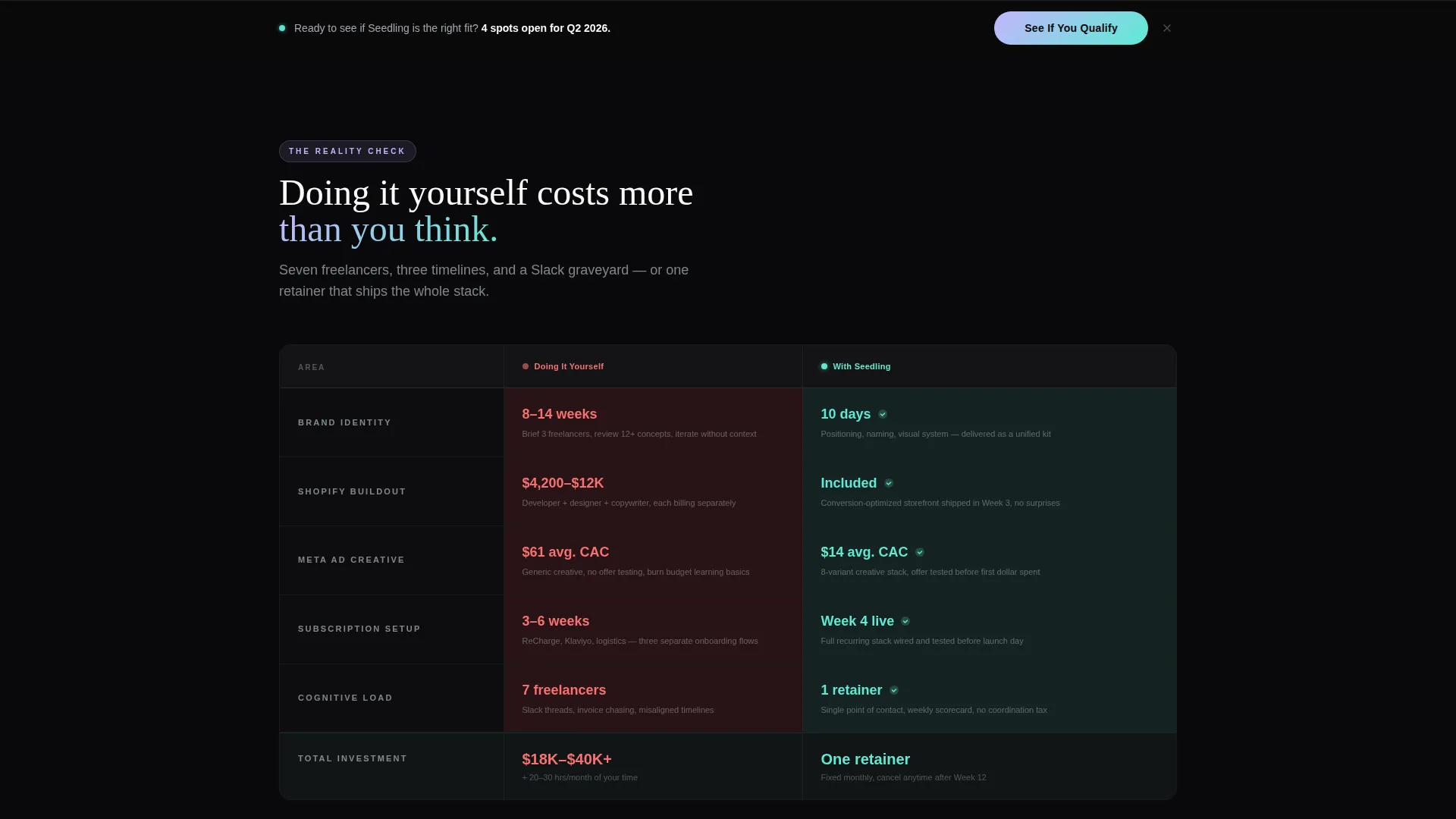
- A three-row animated comparison table contrasting the do-it-yourself path against the accelerated retainer path across brand design, ad deployment, and fulfillment setup
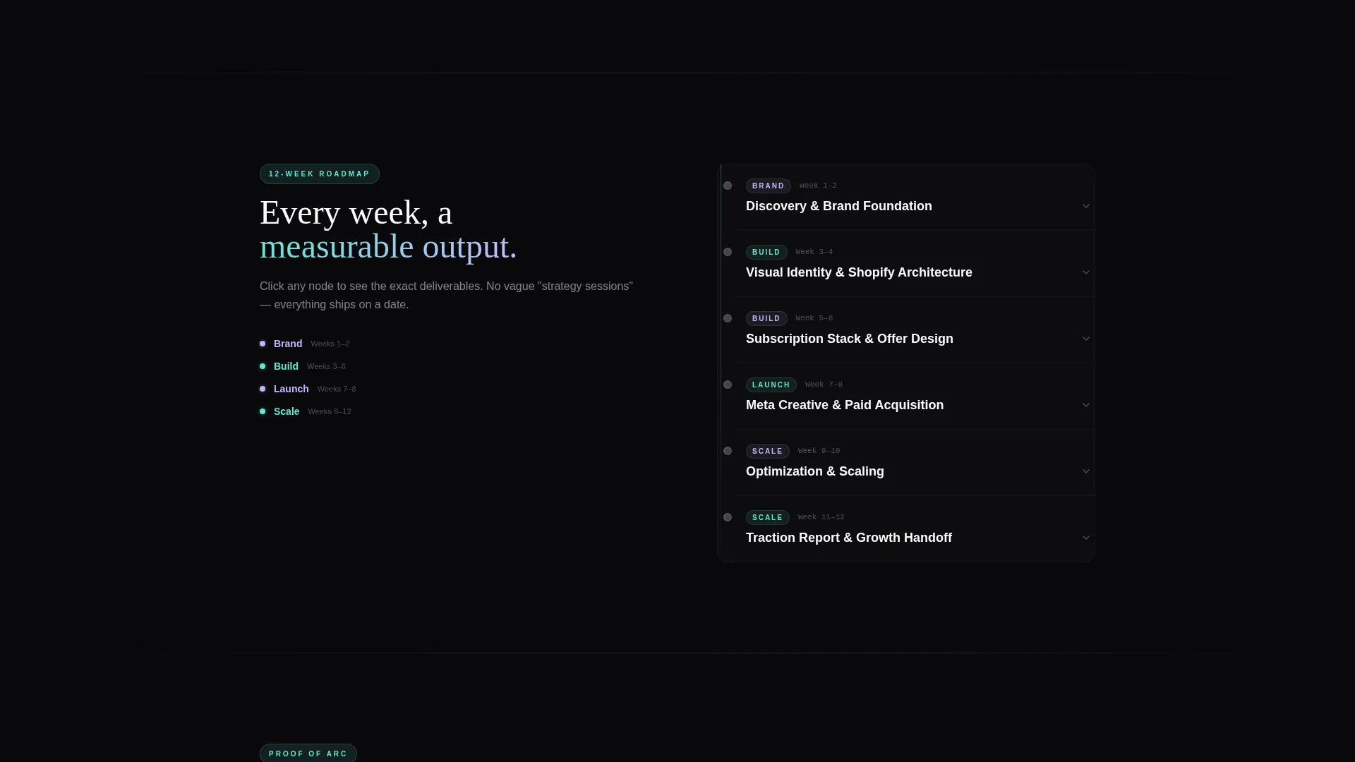
- A clickable twelve-week vertical timeline with expandable nodes, three mini case study blocks, and a full-width closing call-to-action section with a sticky bottom bar
Feature list
This section describes the core interactive and structural components included in the Seedling landing page template.
Animated Growth Dashboard Header
The header fills the full viewport width with a pixel-perfect fictional founder dashboard. Key metrics tick upward in real time like a stock ticker: monthly recurring revenue climbs from $0 to $18,400 across twelve weeks, customer acquisition cost drops from $61 to $14, and a cohort retention heatmap glows teal in the later columns. A single headline fades in over the dashboard: "Your first 1,000 customers, engineered."
Scroll-Triggered Comparison Table
A three-row table sits immediately below the fold. Column A is labeled "Doing It Yourself" and Column B is labeled "With Seedling." Rows compare timelines, costs, and cognitive load across brand design, ad deployment, and fulfillment setup. As the visitor scrolls into view, each row animates a red-to-green gradient swap, making the contrast between options immediate and visceral.
Twelve-Week Clickable Timeline
Below the comparison table, a vertical timeline maps the full engagement week by week. Each node expands on click to reveal that week's specific deliverables. The layout lets visitors watch the entire transformation unfold like a product roadmap, building confidence in the process before committing.
Mini Case Study Blocks
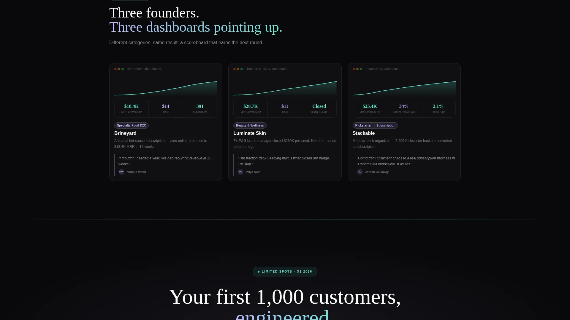
Three case study blocks sit at the base of the narrative arc. Each block shows a dashboard screenshot with a real-looking revenue curve. They serve as proof that the arc resolves, giving visitors concrete visual evidence before reaching the final call-to-action.
Frictionless Click-Through Call-to-Action System
The primary call-to-action, "See If You Qualify," appears three times: first as a ghost button overlaying the dashboard header, then as a sticky bottom bar that surfaces after the comparison table, and finally as a dominant full-width closing section. No form fields appear anywhere on the page. The entire conversion flow reduces to a single tap to a strategy call booking page.
Page sections overview
| Section | Purpose |
|---|---|
| Dashboard Header | Hooks visitors with animated fictional growth metrics and the primary ghost-button call-to-action |
| Comparison Table | Visualizes the cost of going solo versus using the retainer across three key dimensions |
| Week-by-Week Timeline | Breaks down the twelve-week engagement into clickable, deliverable-revealing milestones |
| Mini Case Studies | Provides social proof through revenue-curve dashboard screenshots |
| Sticky Bottom Bar | Resurfaces the call-to-action persistently after the comparison table without interrupting scroll |
| Closing Call-to-Action | Delivers the final full-width "See If You Qualify" prompt to drive booking-page clicks |
Design & branding system
The visual identity follows a Dashboard Pro theme using an iridescent color palette that feels like a dark-mode command center catching light from a holographic surface. Every color has a defined role, and the overall effect is clinical and futuristic while remaining approachable.
- Void black (#09090B) anchors every background; holographic lilac (#C4B5FD) and plasma teal (#5EEAD4) trade off as accent gradients on hover states and progress indicators
- Soft chrome (#E2E8F0) carries secondary text and supporting labels, while signal white (#FAFAFA) lifts card containers just enough to float above the dark field
- No stock photography and no founder headshots appear anywhere; the visual language is entirely data-driven, using dashboard mockups and metric displays as the primary imagery
Mobile & speed optimization
The template is structured for clean rendering across screen sizes. The dashboard header scales to full viewport width at any breakpoint, and the comparison table and timeline stack gracefully on smaller screens.
- Sticky bottom bar behavior is designed to remain visible on mobile without obscuring key content
- The click-through conversion model, with no form fields on the page, reduces interaction complexity on touch devices
- Card surfaces using signal white on void black maintain strong contrast across display types and lighting conditions
How this template helps you convert
The page is engineered as a click-through landing page, meaning every design decision exists to earn a single qualifying tap toward a strategy call booking page. The persuasion sequence is deliberate.
- The animated dashboard header creates an aspirational visual outcome before any copy makes a claim, anchoring desire in real-looking data
- The scroll-triggered comparison table quantifies the pain of the alternative, making the retainer feel like the obvious rational choice by the time the visitor reads row three
- The week-by-week timeline and case study blocks resolve remaining doubt, so the visitor arrives at the final call-to-action already mentally enrolled and only needing the calendar to confirm
Other information about this template
This template is categorized under Startup and Launch, with a specific focus on direct-to-consumer brand startup and seed-stage niche positioning. It is built as a single-page, section-led layout with a clear scroll narrative rather than a multi-page site structure.
- The template style is a Comparison Table layout, paired with a Problem-to-Solution Arc creative direction that guides the visitor through awareness, contrast, and resolution
- The header concept is a Dashboard Preview, and the landing page direction is Click-Through, optimized for routing qualified visitors to an external booking flow such as a Calendly-style scheduling page
- The color system is classified as AI Iridescent, and the theme is Dashboard Pro, giving teams a defined starting point for customizing accent gradients, card surfaces, and hover states to match their brand
Theme
Dashboard Pro
Creative direction
Problem→Solution Arc
Color system
AI Iridescent
Style
Comparison Table
Direction
Click-Through
Page Sections
Animated Growth Dashboard Header
Scroll-triggered Comparison Table
Twelve-week Clickable Timeline
Mini Case Study Revenue Blocks
Frictionless Click-through Call-to-action
Related questions
Does this template include actual live data or real metrics?
How does the call-to-action work without any form fields?
Can I edit the comparison table rows to fit my service?
Is this template only for retainer-style services?
Who is this landing page template best suited for?



