Cancer Recovery Care Professional Website Template
Sentinel is a split-screen landing page template built for a cancer recovery wearable monitor. It pairs real-time biosensor metrics with an emotional, human-centered design. A scroll-driven checklist audit and a five-question inline assessment guide survivors and caregivers from curiosity to confidence, making clinical data feel personal and purposeful.
by Rocket studio
Quick summary
Sentinel is a single-page template designed for a wrist-worn biosensor that tracks fatigue scores, heart rate variability (HRV), sleep architecture, and white blood cell estimates. It serves post-treatment cancer survivors and their caregivers. The page pairs honest data with warm Alpine visuals to create a monitoring experience that feels like clarity after a long, uncertain silence.
Who this template is for
This template is built for health technology teams and medical device brands that need to connect meaningfully with cancer survivors navigating recovery. It speaks directly to people who feel caught between appointments, unsure whether what their body is telling them matters.
- Post-treatment survivors in the 0 to 18-month recovery window who want to track daily biosensor signals with confidence
- Caregiving family members who currently store symptom information in notebooks or basic apps and need a better tool
- Health tech founders who want to create a landing page that earns trust fast and drives assessment completions
What problem this template solves
Survivors leave treatment carrying real biological threats but very little daily visibility. The gap between chemo cycles and the next oncologist visit can stretch for months. During that time, concerning events occur with no structured way to identify them early or resolve them quickly.
- Patients cannot view fatigue trends, sleep fragmentation, or immune signals in one place without clinical resources
- Caregivers feel powerless because the information they store is scattered and hard to share with care teams
- Health tech brands struggle to communicate clinical-grade monitoring value without feeling cold or alarming to anxious users
What you get with this template
This template gives you a full single-page layout built to educate, reassure, and convert. Every section is designed to enhance trust at each scroll step, from the first metric on screen to the final assessment card.
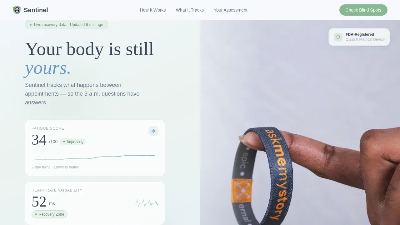
- A split-screen hero with live-styled metrics on the left and an honest wrist photograph on the right, set against an Alpine Fresh color palette
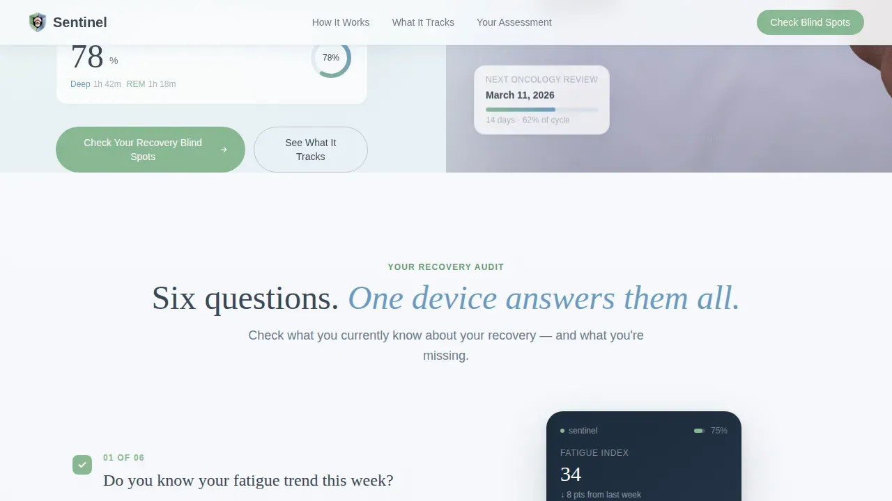
- A six-step checklist audit that visually accumulates green checkmarks as visitors scroll, surfacing the full power of the device progressively
- A five-question inline quiz that helps visitors identify their recovery blind spots and receive a personalized monitoring score
Feature list
This template is built around a purposeful set of interactive and visual components. Each one supports a specific moment in the visitor's decision journey.
Split-Screen Metrics Hero
The hero section fills the view with three real-time-styled biosensor readings on the left: a fatigue score with a downward trend arrow, an HRV reading labeled "Recovery Zone," and a sleep quality ring. The right side shows a quiet wrist photograph in early morning light. Together, they set the tone for a platform built on honest data, not stock imagery.
Scroll-Triggered Checklist Audit
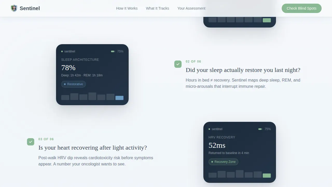
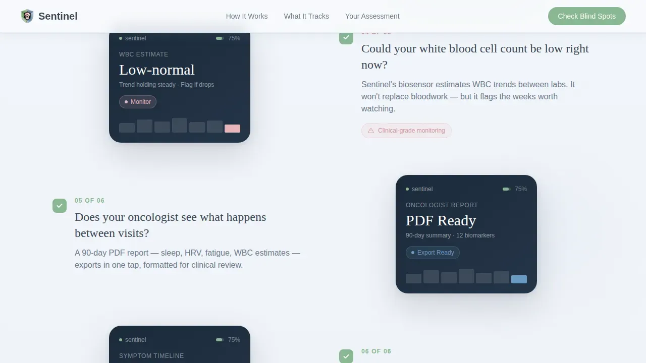
Six recovery questions scroll into view one at a time. Each question is paired with a device screen capture that answers it directly. As visitors progress, the left column fills with green checkmarks, helping them view a complete picture of what the biosensor monitors. Early items cover comfort metrics; later items surface clinical data sharing, which gently escalates the stakes and communicates the tool's full depth.
Inline Five-Question Assessment
The primary call to action opens a quiz asking visitors to identify their treatment phase, biggest daily uncertainty, current tracking habits, oncologist data-sharing practice, and comfort level with wearables. Each question appears on a soft gradient card with a progress bar filling in meadow green. AI-powered logic then delivers a personalized recovery monitoring score, giving visitors actionable insights before they ever click a purchase button.
Care Navigator Soft Call to Action
A secondary section offers a fifteen-minute call with a Care Navigator for visitors not ready to purchase. This low-friction service option supports customers at every stage of the decision process, ensuring no one leaves the page without a clear next step.
Alpine Fresh Color and Typography System
The design uses a carefully curated set of colors: snow-melt white (#F7F9FC), high-meadow green (#88B892), distant-ridge blue (#6B9AC4), and dawn-blush pink (#E8B4B8) reserved for alerts and interactive moments. DM Sans handles body text; Fraunces carries emotional display moments. Together they create a visual identity that feels clinical enough to trust and warm enough to comfort.
Survivor Testimonials and Trust Indicators
The page includes dedicated space for survivor testimonials, oncologist endorsement statistics, and clinical accuracy figures. These trust indicators protect the brand's credibility by grounding claims in real human experience rather than marketing language alone.
Page sections overview
| Section | Purpose |
|---|---|
| Split-screen hero | Display live biosensor metrics and wrist photo |
| Checklist audit | Progressive recovery questions with device answers |
| Clinical bridge | Oncologist data sharing proof and stats |
| Inline quiz assessment | Five-question blind-spot finder with personalized score |
| Care Navigator call to action | Soft action path for non-purchase-ready visitors |
| Footer | Horizontal flow with key links and information |
Design & branding system
The visual identity follows a Soft Gradient theme built on the Alpine Fresh color system. Every design choice is meant to reduce anxiety and enhance clarity for users who are already navigating emotionally charged scenarios.
- Colors drift between snow-melt white and a faint green-to-blue gradient; slate (#3B4856) anchors all body text at readable contrast
- Buttons carry meadow green with a gentle blush-pink hover state, as if the interface itself is breathing; alerts use dawn-blush pink to draw attention without alarm
- DM Sans keeps body information clean and fast to read; Fraunces adds emotional weight at key display moments throughout the page
Mobile & speed optimization
The template is built desktop-first to support the split-screen hero layout, with a fully responsive mobile fallback. Mobile layouts are engineered to preserve the emotional clarity of the desktop experience without sacrificing usability.
- Touch targets across interactive elements are sized at 48 pixels or larger, ensuring buttons are easy to click on smaller screens
- Server components power static sections while client-side rendering handles quiz transitions, checklist animations, and metric counter events, keeping the page fast and focused
- Scroll-triggered animations are medium in intensity, ensuring they enhance the experience rather than slow it down across device locations and connection types
How this template helps you convert
This landing page is engineered around a clear conversion architecture. Each section moves the visitor one step closer to action without pressure or clinical coldness.
- The checklist audit accumulates visual proof of value as visitors scroll, so that by the time they reach the quiz, they have already found six reasons to trust the platform and start their assessment
- The inline quiz creates a personalized experience that gives visitors something of immediate value, a recovery monitoring score, in exchange for a small investment of time, which dramatically lowers the barrier to the next step
- The Care Navigator section resolves hesitation by offering a human service touchpoint, protecting conversion rates among visitors who need support before they feel ready to purchase
Other information about this template
This template can support a variety of monitoring use cases beyond initial launch. Teams can use the checklist and quiz architecture to scale the page's message as the product's feature set grows over time.
- The no-code-friendly layout structure means teams can create and launch variations quickly, reducing costs and development time across future campaigns
- Security and compliance information, such as accreditation badges for standards like ISO 27001 and HIPAA, can be stored in the trust section to strengthen the platform's credibility with both customers and oncology partners
- The sentinel smart recovery monitoring landing page template is well-suited to teams who want a cloud-hosted, AI-assisted monitoring platform that delivers 24/7 visibility into recovery signals, sends real-time alerts when thresholds are crossed, and helps organizations protect patient outcomes at scale
- Rights management and data privacy resources can be set within the footer or clinical bridge section, ensuring visitors know their rights before they share any personal health information
- The template's offline-awareness design means that even if cloud connectivity is disrupted at certain locations, the static sections remain fully viewable and the brand's service message stays intact
Theme
Soft Gradient
Creative direction
Checklist & Audit
Color system
Alpine Fresh
Style
Split Screen (50/50)
Direction
Quiz/Assessment
Page Sections
Split-screen Biosensor Metrics Hero
Scroll-triggered Checklist Audit
Inline Five-question Recovery Quiz
Care Navigator Conversion Path
Alpine Fresh Visual Identity System
Survivor Testimonials and Trust Section
Related questions
Who is this landing page template designed for?
Can I customize the checklist questions and quiz steps?
Does the template include the inline quiz logic?
How does the Care Navigator section work?
Is this template suitable for mobile users?



