Advanced Psychologist Appointment Booking Website Template
Clarity is a quiet psychologist appointment booking landing page template built for private practice professionals who want to turn hesitant visitors into booked therapy sessions. It pairs a calming Arctic White color system with a split-screen layout, emotionally resonant copy structure, and a three-step booking flow that removes friction at every point in the process.
by Rocket studio
Quick summary
Clarity is a single-page, split-screen landing page template designed specifically for psychologists and mental health professionals running a private practice. The template follows a Problem to Solution Arc, guiding visitors gently from recognizing their pain to booking their first session. Clean typography, generous whitespace, and a soft palette of Arctic White, sage, and warm stone create a welcoming environment before a single word is read.
Who this template is for
Clarity is built for practitioners who understand that their therapy website is often the first point of contact with someone who is already exhausted. The template suits psychologists and therapists who want a professional online presence without a cluttered, clinical feel.
- Mental health professionals running a solo or small-group private practice
- New therapists building their first professional psychologist website
- Established practitioners updating their online presence to better support potential clients dealing with anxiety, relationship challenges, or life transitions
What problem this template solves
Most therapy website templates either feel too corporate or too vague. They create cognitive load at exactly the moment a visitor needs calm. Clarity solves this by treating the page itself as the first therapeutic gesture, creating spaces where hesitant visitors can breathe before they decide.
- Anxious potential clients abandon booking forms that feel long, clinical, or cold
- A cluttered page mimics internal mental chaos, pushing visitors away before they find services they need
- Counseling services often go unbooked because the site fails to build trust quickly enough
What you get with this template
You get a fully structured, single-page landing page that does the emotional and practical work of converting a curious visitor into a booked client. Every section has a clear purpose, and the copy direction is baked into the layout itself.
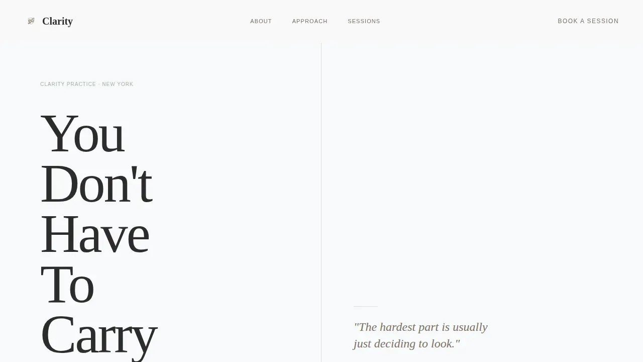
- A 50/50 split-screen hero with a Stacked Type Tower header and a whispered call-to-action on the right
- A five-section page flow covering pain recognition, psychologist introduction, session details, a three-step booking flow, and a footer
- Anonymized client quote blocks, soft toggle concern selectors, and a calendar widget for real-time session scheduling
Feature list
This template is built around a small number of decisions made carefully. Each design element and functional component reflects what actually moves a hesitant visitor toward booking.
Stacked Type Tower Hero
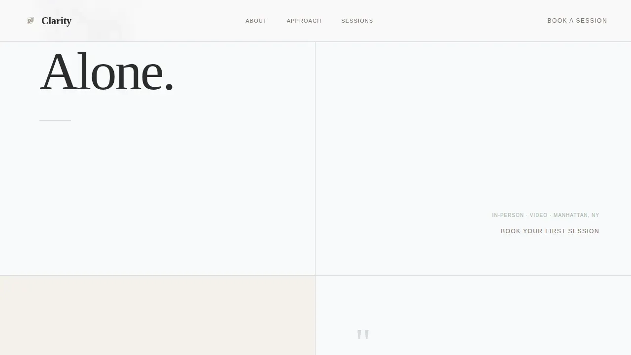
The left half of the viewport fills with enormous, quietly weighted serif words stacked vertically. The right half holds only Arctic White space and a small "Book Your First Session" link. Negative space does the emotional work. Visitors feel the weight of the words before they process them. This approach reflects best practice for therapy website design: a clear value proposition delivered without noise.
Problem to Solution Arc Layout
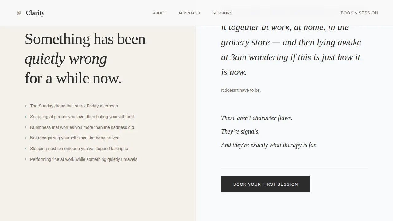
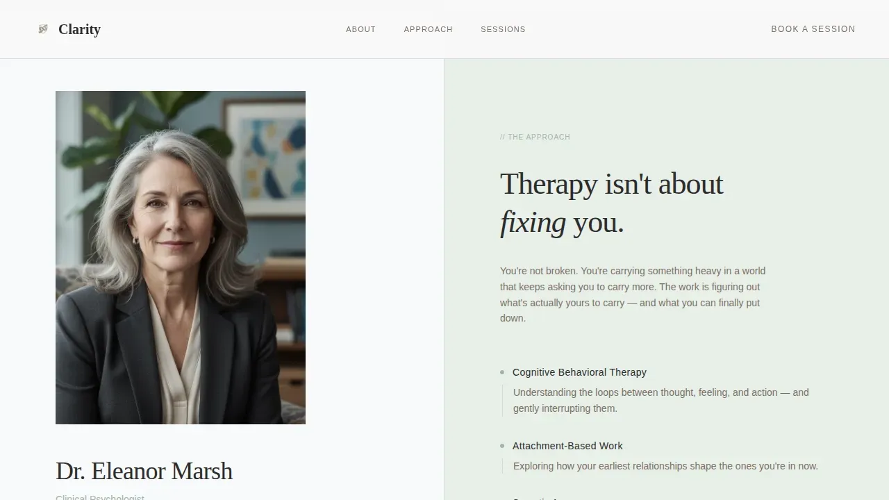
Each scroll section shifts the visitor from recognizing their own experience to feeling genuinely understood. The left panel carries the emotional narrative. The right panel introduces the psychologist, their method, and the session structure. By the midpoint, visitors stop feeling examined and start feeling met. This arc mirrors the therapeutic process itself and is a great example of clinical empathy translated into website design.
Three-Step Zero-Friction Booking Flow
The booking process asks only three things in sequence. First, visitors choose their preferred format: in-person or video. Then they select a concern area from soft toggles, with options including anxiety, relationships, life transitions, grief, and "not sure yet." Finally, a calendar widget shows available slots for the current week. Limiting choices to three guided steps reduces decision fatigue and reflects how user friendly booking flows convert more potential clients than long intake forms.
Session Walkthrough Section
A dedicated section walks visitors through exactly what their first session looks like, minute by minute. Clear session details and honest answers to common questions, including what happens if you cry, remove the fear of the unknown. Providing detailed information about the process is one of the most effective ways to build trust with people who are on the edge of booking.
Secondary Inquiry Path
Not everyone is ready to book on the first visit. A secondary call-to-action, "Not Ready to Book? Send a Question," offers a single open text field. This lower-commitment option keeps hesitant visitors engaged and gives them a personal connection point with the practice before committing to a session.
Anonymized Client Quote Blocks
Short, honest felt-experience quotes from past clients appear at natural breathing points in the scroll. These function as customer testimonials without violating confidentiality. Fostering trust through real human voices helps visitors see themselves in others' experiences and feel confident moving forward.
Page sections overview
| Section | Purpose |
|---|---|
| Hero Split Screen | Stacked type tower with whispered booking call-to-action |
| Pain Recognition | Honest symptom naming to create emotional resonance |
| The Psychologist | Credentials, method, warmth, and office atmosphere |
| First Session Walkthrough | Minute-by-minute session details and common questions |
| Booking Flow | Three-step calendar and concern-selector widget |
| Footer | Contact details and secondary inquiry path |
Design & branding system
The visual identity follows an Organic Flow theme. Every design choice supports the same goal: helping visitors feel calm enough to take a step they have been avoiding. Therapist websites that use soft colors and generous spacing communicate compassion before the copy does.
- Arctic White (#F8F9FA) primary background, soft birch gray (#D6DAE0) for dividers, muted sage (#A3B5A6) for secondary accents, and warm stone (#7C6F64) for body text and grounding elements
- Fraunces serif for emotional headline weight, paired with DM Sans for clean, readable body copy; natural textures and soft pastels throughout keep the palette grounded and human
- Scroll-linked reveal animations, staggered entrance effects, and subtle parallax motion add depth without competing for attention
Mobile & speed optimization
A good therapy website must work for clients who are sitting in a parked car, scrolling on their phone, trying to find the courage to book. Responsive design ensures that the split-screen layout, booking flow, and session details all translate cleanly across screen sizes without losing the emotional tone.
- The booking toggle, calendar widget, and secondary inquiry form are all built as interactive client components, keeping the static sections fast and the functional sections fully responsive
- The multi-step booking flow uses a wizard-style sequence rather than a single long form, reducing anxiety on smaller screens where long forms feel especially overwhelming
- Responsive design ensures the site renders clearly on desktops, tablets, and smartphones, supporting the diverse range of contexts in which potential clients explore mental health services
How this template helps you convert
Clarity is designed around one core truth: the hardest part for your potential clients was deciding to look at this page. Everything after that should feel easy. The template removes barriers at every stage of the process.
- The hero section delivers the value proposition within three seconds of landing, with a clear call-to-action visible immediately and the booking link repeated at three natural breathing points throughout the scroll
- The three-step booking flow strips away intake forms and insurance fields upfront, replacing them with soft toggles and a live calendar widget that gives users a sense of real availability and momentum
- Anonymized client quotes, clear session details, and an open secondary inquiry path work together to build trust with visitors who are not yet ready to commit, giving them a low-friction way to stay connected to the practice
Other information about this template
The clarity quiet psychologist appointment booking landing page template is designed for English-language practices operating in USD markets. It supports a desktop-first experience while delivering full mobile functionality. Below are additional details that may help you decide if this template fits your practice and your target audience.
- The template supports social media integration by providing a footer structure where links to professional profiles can be added alongside prominently displayed contact information
- Educational articles and blog content are not part of the single-page structure, but the template's service details and session walkthrough sections serve a similar trust-building function by giving visitors detailed information before they book
- The mission statement and service offerings sections can be customized to reflect your unique style, your specialties, and the tailored approaches you bring to your clinical work
- Mental health websites built on this template can incorporate relevant keywords naturally through the copy fields, supporting the site's online presence and helping potential clients find services through search
- The template's professional website design reflects the principle that professionalism and emotional warmth are not opposites; practitioners across various client needs will find the structure adaptable to their practice
- Therapist websites built on this framework give new therapists a credible, functional starting point and give established psychologists a clean structure for refreshing their online presence
- The page is a great example of how website design built around mental well being principles, such as reduced cognitive load, soft palette choices, and user friendly navigation, can enhance credibility and foster genuine personal connection with visitors before the first session begins
Theme
Organic Flow
Creative direction
Problem→Solution Arc
Color system
Arctic White
Style
Split Screen (50/50)
Direction
Booking/Scheduling
Page Sections
Stacked Type Tower Split-screen Hero
Problem to Solution Arc Scroll Flow
Three-step Zero-friction Booking Flow
First Session Walkthrough
Anonymized Client Quote Blocks
Low-commitment Secondary Inquiry Path
Related questions
Can I customize the copy and session details to match my practice?
Is the booking flow connected to a live calendar system?
Does this template work for therapists who offer both in-person and video sessions?
How does this template support hesitant visitors who are not ready to book?
Is this template suitable for a practice that focuses on a specific concern area?



