Therapeutic Mental Health Coaching Landing Page Template
Breathe is a single-page depression digital therapy landing page template built for mental health professionals and healthcare app creators. It guides visitors through a calm, trust-first scroll using a Problem→Solution Arc, a structured comparison table, gentle app walkthrough sections, and earned calls to action. The Healing Space theme and Slate & Sky color system create a tranquil atmosphere without clinical coldness.
by Rocket studio
Quick summary
Breathe is a therapy landing page template designed for mental health and healthcare teams launching a depression-focused digital therapy app. The page earns trust before asking for anything, moving visitors through recognition, comparison, and app walkthrough sections in one calm, structured scroll. It is built mobile-first, with soft imagery, minimal animation, and warm amber calls to action placed at moments that feel genuinely earned.
Who this template is for
This template is built for mental health professionals, digital health product teams, and healthcare companies who want to launch a depression care app without starting from scratch. It also suits counselors, life coaches, and therapy practice owners who want a professional mental health website that speaks to people who are struggling but not yet ready to call a therapist.
- Mental health clinic teams and healthcare app builders launching a CBT or mindfulness product
- Counseling services, therapy practices, and wellness brands serving adults experiencing depression
- Life coaches and mental health professionals who want a calm, welcoming space for potential clients online
What problem this template solves
Building a therapy landing page for depression is harder than building one for any other service. Visitors arrive already exhausted. They are not browsing casually. They need to feel seen before they feel safe enough to click. Most generic web design templates miss this entirely, producing pages that feel clinical, rushed, or emotionally hollow.
- Generic landing page templates do not reflect the emotional weight visitors bring to a mental health website
- Therapy website designs often fail to balance professional credibility with genuine human warmth
- Depression-focused healthcare pages rarely provide the calm, intuitive navigation that vulnerable users need most
What you get with this template
You get a complete, single-page landing page layout that moves visitors through every key moment of a trust-building therapy landing experience. The page includes six structured sections, a built-in comparison table, app walkthrough blocks, and two earned call-to-action placements, all wrapped in a sophisticated design system built specifically for mental wellness services.
- A full-page layout with hero, recognition, comparison table, app walkthrough, final call to action, and footer sections
- Fraunces serif headlines paired with DM Sans body text for elegant, readable typography across every device
- A ready-to-customize Slate and Sky color system with deep slate, morning sky, cloud-break white, and dawn amber
Feature list
Empathy-First Hero Section
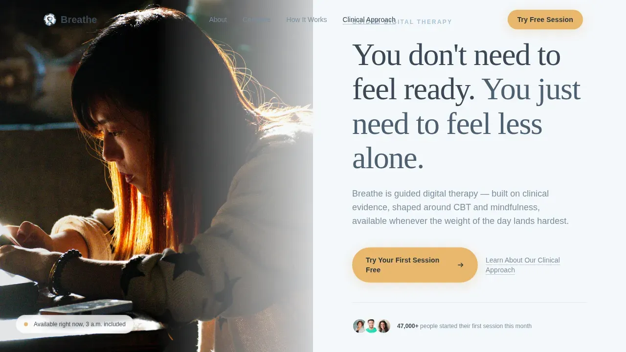
The hero is a half-page split layout. The left side holds a softly lit photograph of a quiet, recognizable moment: a person at a window, morning light, a phone on the sill, a half-finished cup of tea. The right side displays a headline in deep slate on cloud-break white, with a single subline that names exactly what the app is. The primary call to action sits beneath the headline in dawn amber. This section is designed to validate the visitor's experience before anything else is asked of them.
Structured Comparison Table
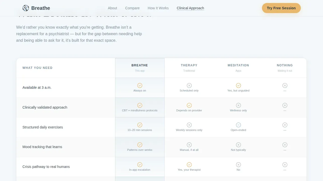
The comparison table places the app against traditional therapy, popular meditation apps, and doing nothing at all. Columns are honest, acknowledging what the app is not (a replacement for a psychiatrist or a mental health clinic) alongside what it genuinely offers (structured daily sessions, mood tracking, and crisis pathways to real humans). The table includes hover states that keep the experience calm and interactive without feeling aggressive. This section gives potential clients the clear, side-by-side context they need to decide with confidence.
App Walkthrough Blocks
Rather than displaying a list of features, the walkthrough section shows the app in context: a breathing exercise mid-panic, a journaling prompt that makes sense at 3 a.m., a weekly mood graph where the line quietly trends upward. Quiet testimonials are woven into this section to provide client stories without pressure. This approach helps visitors picture themselves using the app, which builds far more trust than a feature dump would.
Earned Call-to-Action Placement
The primary call to action, "Try Your First Session Free," appears twice: once beneath the hero and once after the comparison table. Each placement follows a moment of emotional or informational resolution, so the ask feels natural rather than pushy. A secondary text link, "Learn About Our Clinical Approach," routes skeptical visitors toward evidence without pulling them away from the main conversion flow. No form appears on this page; the click carries visitors to a sign-up or app store flow.
Healing Space Color and Typography System
The template uses a precisely defined Slate and Sky palette. Deep therapeutic slate (#3B4856) anchors backgrounds with calm gravity. Morning sky (#A8C4D8) washes across section dividers and illustration fills. Cloud-break white (#F4F7FA) opens breathing room between content blocks. Dawn amber (#E8B86D) appears only on calls to action and moments of warmth, used sparingly so it always feels like encouragement rather than pressure. Fraunces serif headlines and DM Sans body text create a readable, elegant design that reflects clinical credibility without coldness.
Mobile-First Scroll Architecture
Every section is designed for a phone screen first. Scroll reveals and gentle fades guide users through the page without overwhelming them. Minimal JavaScript keeps the page lightweight. The layout adapts cleanly across every device, ensuring that someone reaching the site at 3 a.m. on a phone gets the same calm, seamless navigation as a desktop visitor.
Page sections overview
| Section | Purpose |
|---|---|
| Hero split layout | Validate visitor's experience and present the primary call to action |
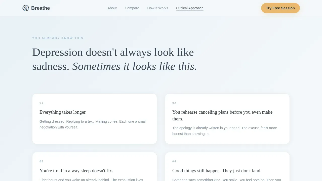
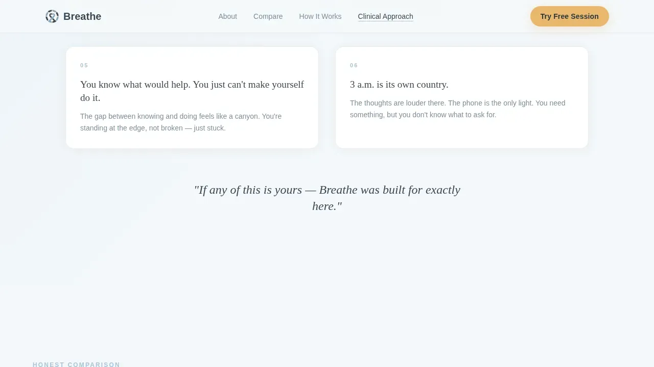
| Recognition content block | Name the physical truths of depression in the visitor's own language |
| Comparison table | Show honest differences between the app, traditional therapy, and meditation apps |
| App walkthrough blocks | Illustrate real in-app moments with woven testimonials |
| Final call-to-action section | Deliver the earned second ask with supporting social proof |
| Footer linear row | Provide essential links and closing calm |
Design & branding system
The design system is built around the Healing Space theme, a visual identity that feels like the first morning after a week of rain. The calming color palette promotes feelings of trust and safety without feeling sterile. The soothing color palette avoids loud gradients, bright urgency cues, and anything that might spike anxiety for a visitor who is already carrying a heavy load.
- Soft blues in the morning sky tone (#A8C4D8) wash across dividers and illustration fills to create a tranquil atmosphere
- Deep slate (#3B4856) and cloud-break white (#F4F7FA) anchor the layout with minimal, sophisticated design that breathes
- Dawn amber (#E8B86D) is reserved strictly for calls to action, creating warmth only where hope is earned
Mobile & speed optimization
This template is built mobile-first because the target visitor is most likely on a phone, possibly in the dark, possibly mid-panic. Mobile responsiveness is not an afterthought here; it shapes every layout decision. The page uses minimal JavaScript, gentle fades, and subtle parallax to keep load times low and the experience calm on any device.
- Scroll reveals and subtle parallax animations are kept low-to-medium intensity, never aggressive or disorienting
- Mobile responsiveness is built into every section, from the hero split to the comparison table column layout
- Minimal JavaScript reduces page weight, helping the site load quickly on slower connections and older devices
How this template helps you convert
A therapy landing page for depression requires a different conversion approach than most healthcare pages. Visitors are emotionally vulnerable and carrying high cognitive load. The template is structured to lower resistance at every scroll point, earning the click rather than demanding it.
- The Problem→Solution Arc builds recognition first, so visitors feel understood before they encounter any call to action, reducing anxiety and building the trust that makes a click feel safe
- The comparison table resolves the most common objections (cost, clinical credibility, commitment) in one clear, honest section, giving potential clients the important information they need without making them feel pressured
- The dual call-to-action placement, each following a resolved moment in the scroll, creates two natural windows for conversion without resorting to popups, countdown timers, or urgency language
Other information about this template
This template is designed for easy customization without requiring advanced technical skills. The structured layout, clear section boundaries, and defined color tokens mean that a therapist or a small healthcare company can adapt the page to reflect their own practice and brand identity quickly. Mental health professionals who want a vibrant website that still feels calm will find the Slate and Sky system provides exactly that balance.
- The template suits several therapists working within a group practice, a mental health clinic, or a counseling services brand, not only solo practitioners
- A Squarespace designer, developer, or no-code builder can adapt the layout without rebuilding it from scratch, since the sections, colors, and typography are all clearly defined
- This is a visually appealing, elegant design that also supports practical web design needs: clear section hierarchy, seamless navigation, and intuitive navigation across the full page
- The template can support videos within the app walkthrough section, such as a brief clip introducing the clinical approach, which helps humanize the service and build trust with visitors who are skeptical
- Providing resources or linking to a mental health resources page is straightforward from the footer and secondary call to action, supporting a broader mental health awareness effort
- The layout reflects a sophisticated design sensibility: minimalistic design elements, ample white space, and a calm visual hierarchy that never overwhelms
- This template is relevant to mental health professionals building any depression-adjacent service, including trauma therapy programs, hypnotherapy practices, or general counseling services that want a calm, professional mental health website
- The page is built to develop trust through every scroll point, making it well-suited for any mental wellness or mental health journey product that needs to earn a click before asking for a commitment
Theme
Healing Space
Creative direction
Problem→Solution Arc
Color system
Slate & Sky
Style
Comparison Table
Direction
Click-Through
Page Sections
Empathy-first Hero with Split Layout
Honest Comparison Table
App Walkthrough with Woven Testimonials
Dual Earned Call-to-action Placement
Healing Space Color and Type System
Mobile-first Scroll Architecture
Related questions
Can I use this template if I am not a developer?
Is this template suitable for a group practice or mental health clinic?
What sections are included in the landing page?
Can this template support trauma therapy or other counseling services?
Is the comparison table included and ready to edit?



