Trusted Anxiety Education Landing Page Template
Calm is a hub-and-spoke anxiety patient education landing page built for newly diagnosed adults, their partners, and therapists seeking reliable clinical resources. It delivers cognitive behavioral therapy frameworks, neuroscience explanations, and treatment comparisons through a structured, section-led layout that converts visitors through a personalized education plan intake form.
by Rocket studio
Quick summary
Calm is a focused anxiety patient education landing page that organizes clinical content into five navigable spoke sections. Each section uses layered disclosure, opening with a plain-language summary before offering deeper neuroscience detail and a downloadable one-page reference. The page closes with a calm intake form that helps visitors build a personalized education plan.
Who this template is for
This template is designed for digital health educators, patient advocacy platforms, and mental health practices that need a trustworthy, structured resource for people navigating an anxiety diagnosis. It is equally suited to therapists who want to share evidence-based materials between sessions.
- Newly diagnosed adults researching their condition after a first psychiatry appointment
- Partners and caregivers looking for clear guidance on supporting someone with generalized anxiety disorder
- Therapists and clinicians seeking a professional, patient-facing education resource they can recommend directly
What problem this template solves
After a first psychiatric appointment, most patients leave with a diagnosis but very few answers. The internet offers an overwhelming mix of forum posts, pharmaceutical ads, and oversimplified explainers. This template creates a structured, unhurried space where clinical information is presented in a logical sequence, building understanding rather than feeding anxiety.
- The absence of a trusted, organized resource leaves newly diagnosed adults feeling more uncertain after seeking help
- Partners and therapists often rely on piecemeal sources that lack clinical rigor or consistent depth
- Generic health pages mix tone, bury key facts, and push visitors toward actions before they feel informed
What you get with this template
You get a fully structured, single-page anxiety education layout with five anchor-navigated content sections and a lead generation intake form. Every section follows the same transparent disclosure pattern: summary first, depth available on demand, and a downloadable reference to take away.
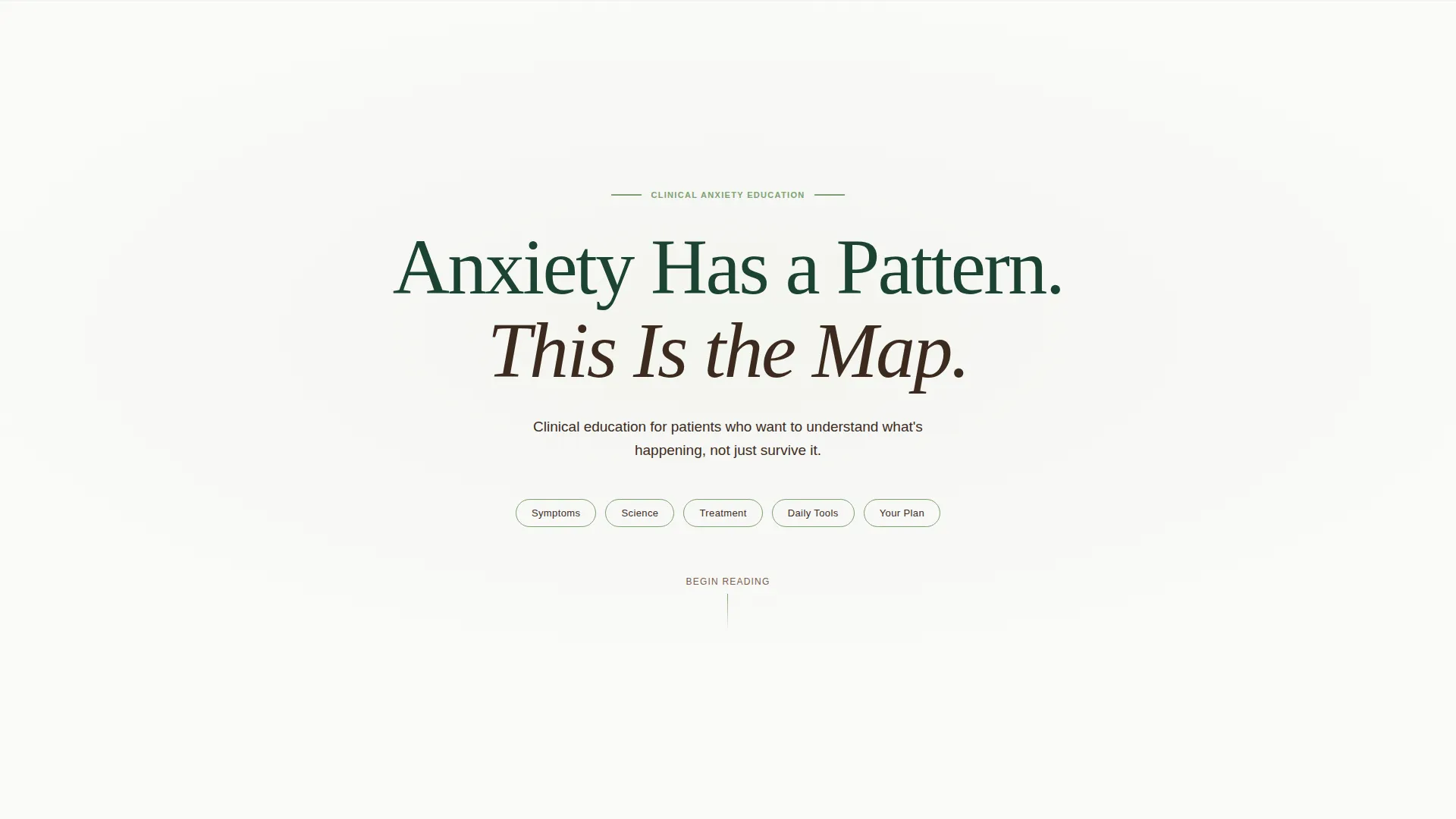
- A hero section with a centered serif headline, fog-white background, and five lichen-green anchor navigation pills
- Five spoke sections covering symptoms, brain science, treatment options, daily practice tools, and a personalized plan form
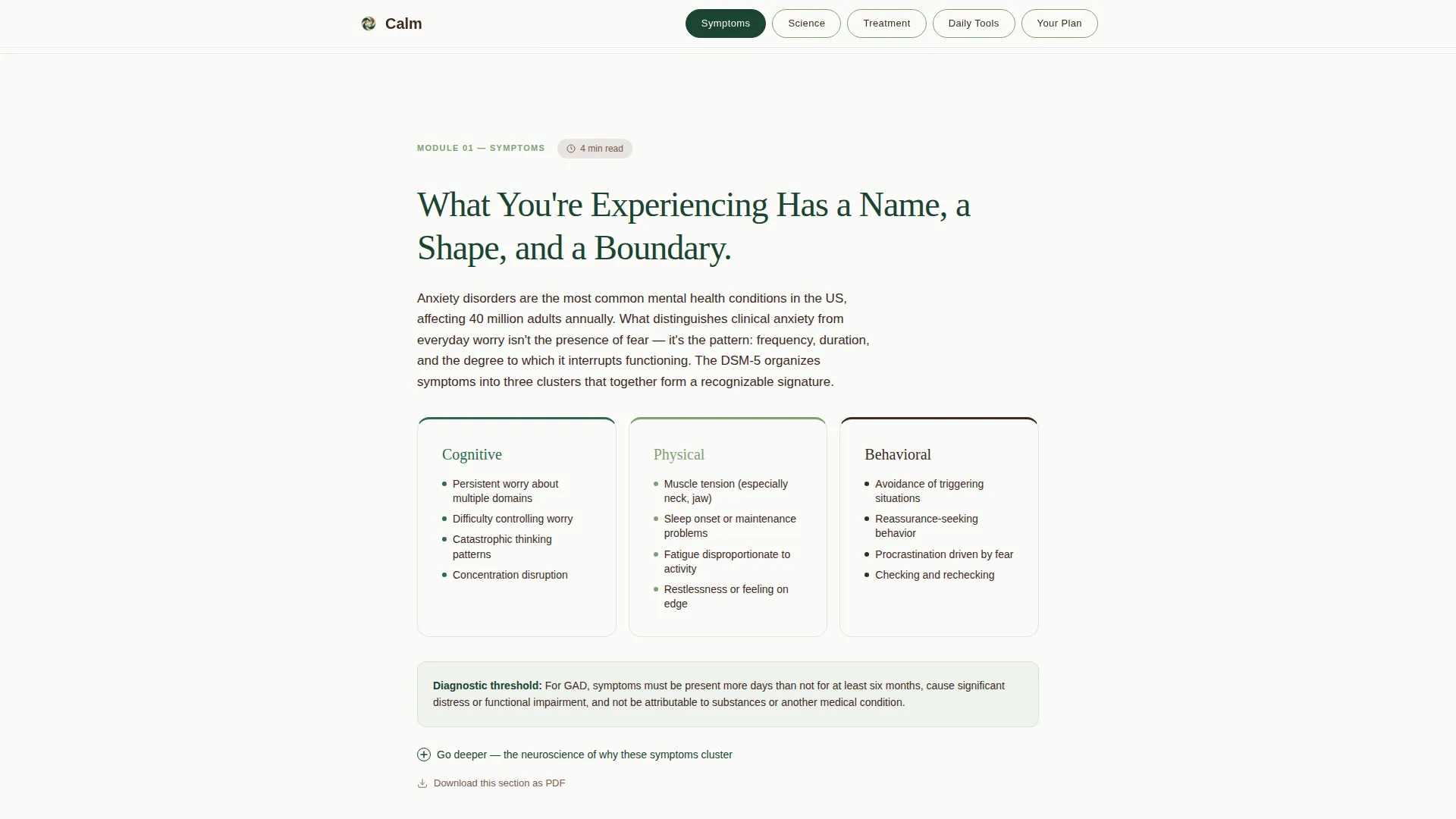
- Expandable "go deeper" panels in each section and subtle per-section PDF download links that support secondary lead capture
Feature list
Anchor Navigation with Active State Tracking
Five anchor navigation pills sit below the hero headline. Each pill links directly to its corresponding spoke section. As users scroll, the active pill updates to reflect their current position on the page, giving a clear sense of progress through the content.
Layered Disclosure Content Panels
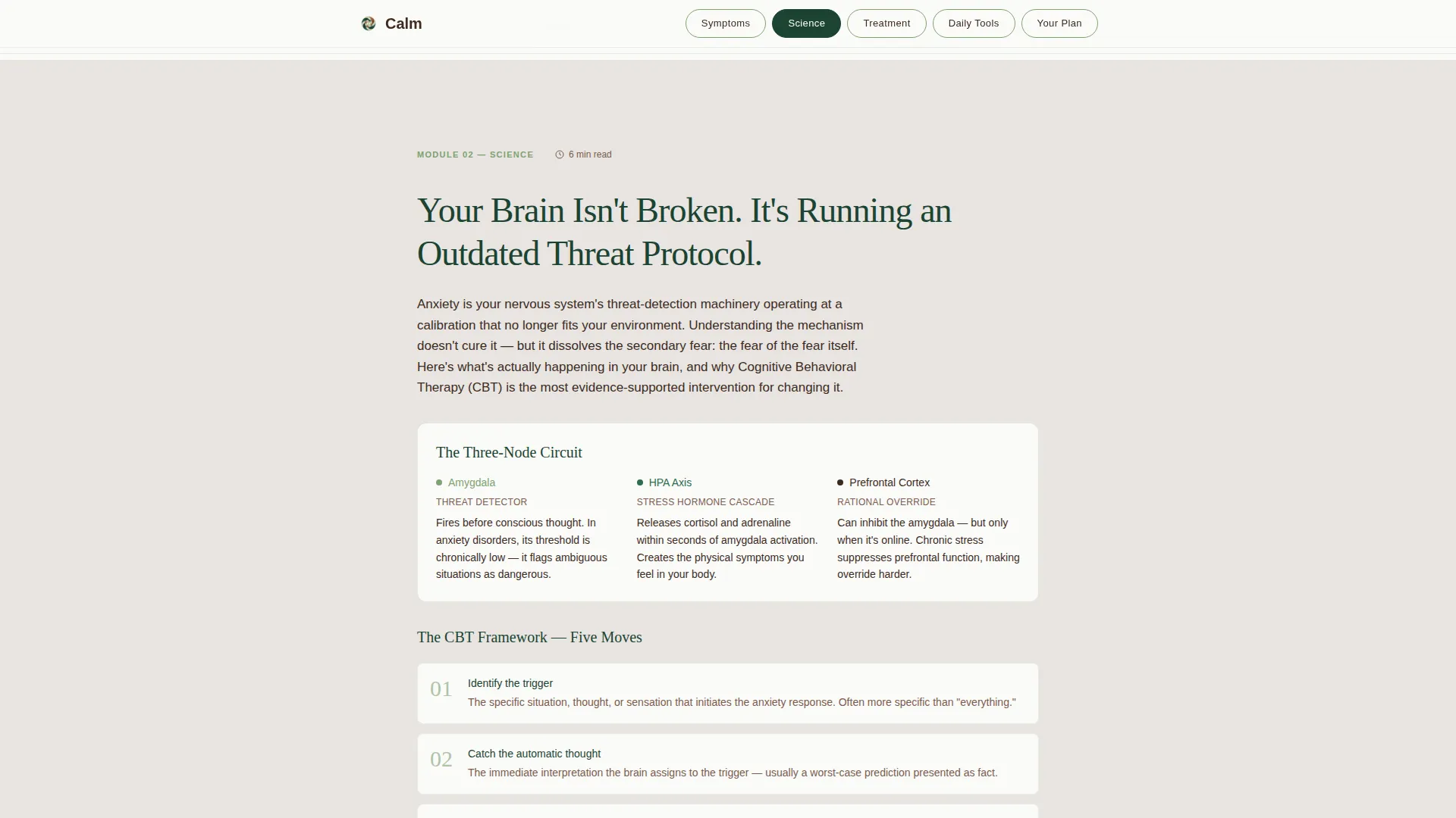
Each spoke section opens with a plain-language summary paragraph. Below it, an expandable panel reveals deeper neuroscience or clinical detail. This accordion-style disclosure lets readers control how much they engage without hiding essential information.
Sequential Lead Capture Intake Form
The final spoke replaces content with a three-question intake form. It asks about anxiety type, current treatment status, and email address in sequence. The call-to-action button reads "Build My Education Plan," framed in lichen green on an evergreen field.
Per-Section PDF Download Links
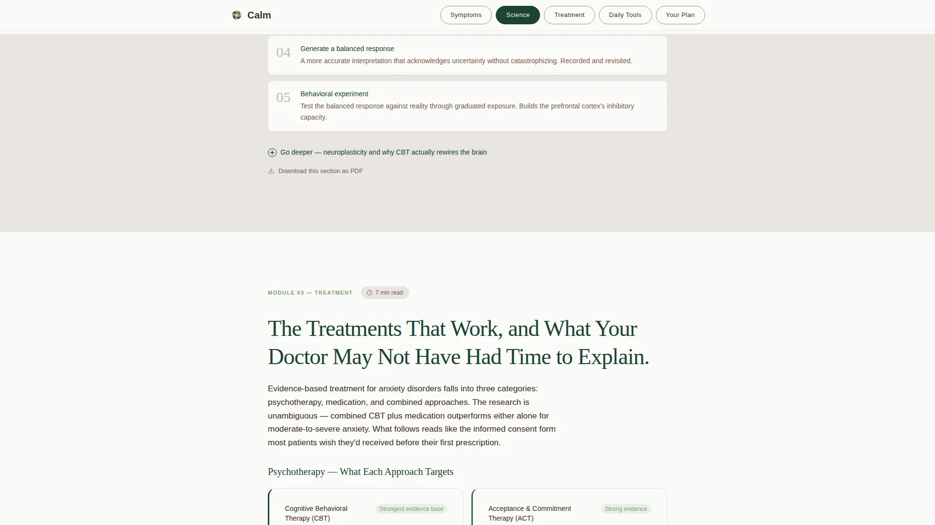
Every spoke section includes a subtle "Download This Section as PDF" link. Clicking it prompts an email capture before delivering the file. This secondary conversion path qualifies leads by topic interest before they reach the main form.
Module Completion Indicators
Progress indicators built into the spoke structure show readers which sections they have visited. These visual markers, rendered in lichen accent, reinforce a sense of forward movement through the education content.
Clinician-Authored Content Badges and Evidence Citations
Each section includes visual badges and inline citations that signal clinical authorship and evidence grounding. These elements build trust quickly, particularly for readers arriving after a medical appointment who need to know the source is credible.
Page sections overview
| Section | Purpose |
|---|---|
| Hero Headline | Anchors tone with a centered serif headline and five anchor nav pills on a fog-white field |
| Symptoms Section | Defines anxiety types using a recognition framework with an expandable neuroscience panel |
| Science Section | Explains brain mechanisms and introduces cognitive behavioral therapy frameworks |
| Treatment Section | Presents medication comparisons and therapy modalities with a downloadable reference chart |
| Daily Tools Section | Offers grounding techniques, worksheets, and practice modules for immediate use |
| Your Plan Form | Collects anxiety type, treatment status, and email through a sequential intake form |
| Minimal Footer | Closes the page with a horizontal flow footer pattern, kept clean and uncluttered |
Design & branding system
The visual identity follows a Corporate Precision theme built on the Forest Trust color system. The palette draws from old-growth forest imagery: deep, grounded tones that feel oxygenated and calm without being clinical or cold. Typography pairs Fraunces, a tall light-weight serif, for headlines with DM Sans for body text.
- Evergreen (#1B4332) dominates navigation bars and section headers; bark brown (#3D2B1F) anchors body text and secondary links; morning fog gray (#E8E4E0) fills generous whitespace between content blocks
- Lichen green (#7EA172) marks active anchor pills, progress indicators, and the primary call-to-action button to guide attention without urgency
- The hero section uses no imagery or illustration; the whitespace itself communicates breathing room and unhurried authority
Mobile & speed optimization
The template is built desktop-first, reflecting the target user behavior of post-appointment research on a laptop or desktop screen. A solid mobile fallback ensures the anchor navigation, expandable panels, and intake form remain fully usable on smaller screens.
- Scroll-reveal animations use IntersectionObserver for staggered section entries, keeping motion purposeful rather than decorative
- Accordion expand and collapse interactions are kept lightweight so the layered disclosure pattern works cleanly across device sizes
- Static-first architecture with server components for all content sections keeps the page lean and fast to load without client-side overhead
How this template helps you convert
Calm is designed around two conversion paths that complement each other without competing. Every design and content decision moves a reader closer to one of these two actions.
- The primary path is the "Your Plan" intake form at the bottom of the page, where visitors self-identify their anxiety type and treatment status before submitting their email, making each lead contextually qualified.
- The secondary path is the per-section PDF download link present in every spoke section, which captures email addresses earlier in the session and signals which topics matter most to each visitor.
Other information about this template
This template is built specifically for the anxiety patient education niche within the broader health and medical category. It aligns with DSM-5 terminology throughout, keeping language consistent with what a patient would hear in a clinical setting. The Transparent Process creative direction is central to the design philosophy: nothing is hidden, everything is labeled, and the reader always knows where they are and what comes next.
- The template uses Fraunces for all serif headline type and DM Sans for body copy, both chosen for legibility and tonal fit with the clinical-calm identity
- Section entry animations rely on IntersectionObserver scroll reveals and staggered timing, giving the page a measured, unhurried pace that mirrors the content tone
- The hub-and-spoke structure means each section can stand alone as a shareable resource, which supports therapist use cases where a single section link is sent between sessions
Theme
Corporate Precision
Creative direction
Transparent Process
Color system
Forest Trust
Style
Hub & Spoke (Anchor Nav)
Direction
Lead Generation
Page Sections
Anchor Navigation with Active State
Layered Disclosure Content Panels
Sequential Lead Capture Intake Form
Per-section PDF Download Links
Clinician-authored Badges and Evidence Citations
Module Completion Progress Indicators
Related questions
Who is this template designed for?
What sections are included in the template?
How does the lead generation work?
Can I customize the color scheme and typography?
Is this template suitable for mobile users?



