Assessment Landing Page Template
A single-page allergist testimonial and review landing page built around a quiz-first engagement funnel. It pairs a dissolving typographic hero with a side-by-side comparison table, a four-stage treatment process walkthrough, layered patient testimonials, and a five-question interactive assessment that delivers a personalized severity snapshot before inviting visitors to book a consultation.
by Rocket studio
Quick summary
This landing page template is designed for allergy clinics that want to move patients from passive symptom-management to active consultation booking. A typographic hero sets the emotional tone, a comparison table contrasts over-the-counter habits with targeted immunotherapy, and a guided quiz earns the click by delivering value before asking for a commitment.
Who this template is for
This template suits allergy and immunotherapy clinics that need a single, high-converting page to communicate their value clearly. It is built for practitioners who want to lead with evidence, not jargon, and for marketing teams that understand their audience has already tried the drugstore aisle.
- Allergists and immunotherapy clinics targeting adult patients with chronic or seasonal symptoms
- Clinic marketers who need a review-led page that builds trust through real patient voices
- Healthcare teams looking for a quiz-driven funnel that qualifies leads before the first phone call
What problem this template solves
Many allergy clinic pages look identical to urgent care sites. They list services, show a stock photo of a smiling doctor, and ask visitors to "call today." That approach fails the patient who has spent years normalizing their symptoms and needs to feel understood before they trust a new provider.
- Visitors arrive skeptical, having already tried multiple over-the-counter options without lasting relief
- Generic clinic pages give no clear reason to choose targeted immunotherapy over another antihistamine refill
- The gap between "I have allergies" and "I will book an appointment" is filled by evidence, not bullet points
What you get with this template
You get a fully structured, single-page layout that guides a first-time visitor from curiosity to consultation in one scroll. Every section is purpose-built around a specific trust-building moment, from the first typographic impression to the personalized quiz output.
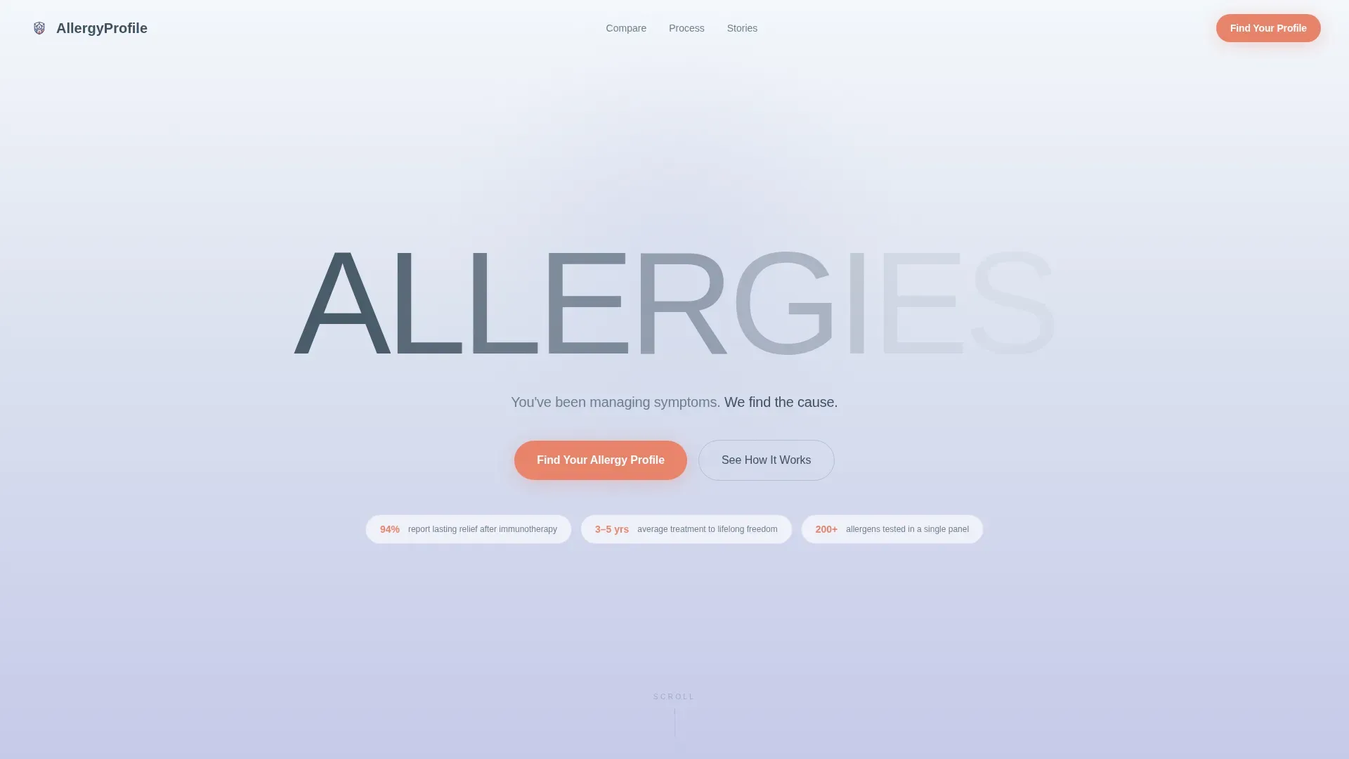
- A hero section with a dissolving ultra-light "ALLERGIES" type tower and a lavender-to-white gradient background
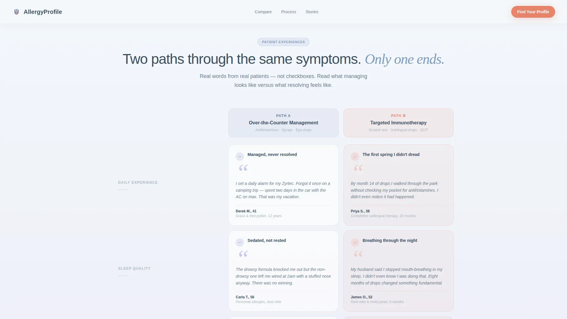
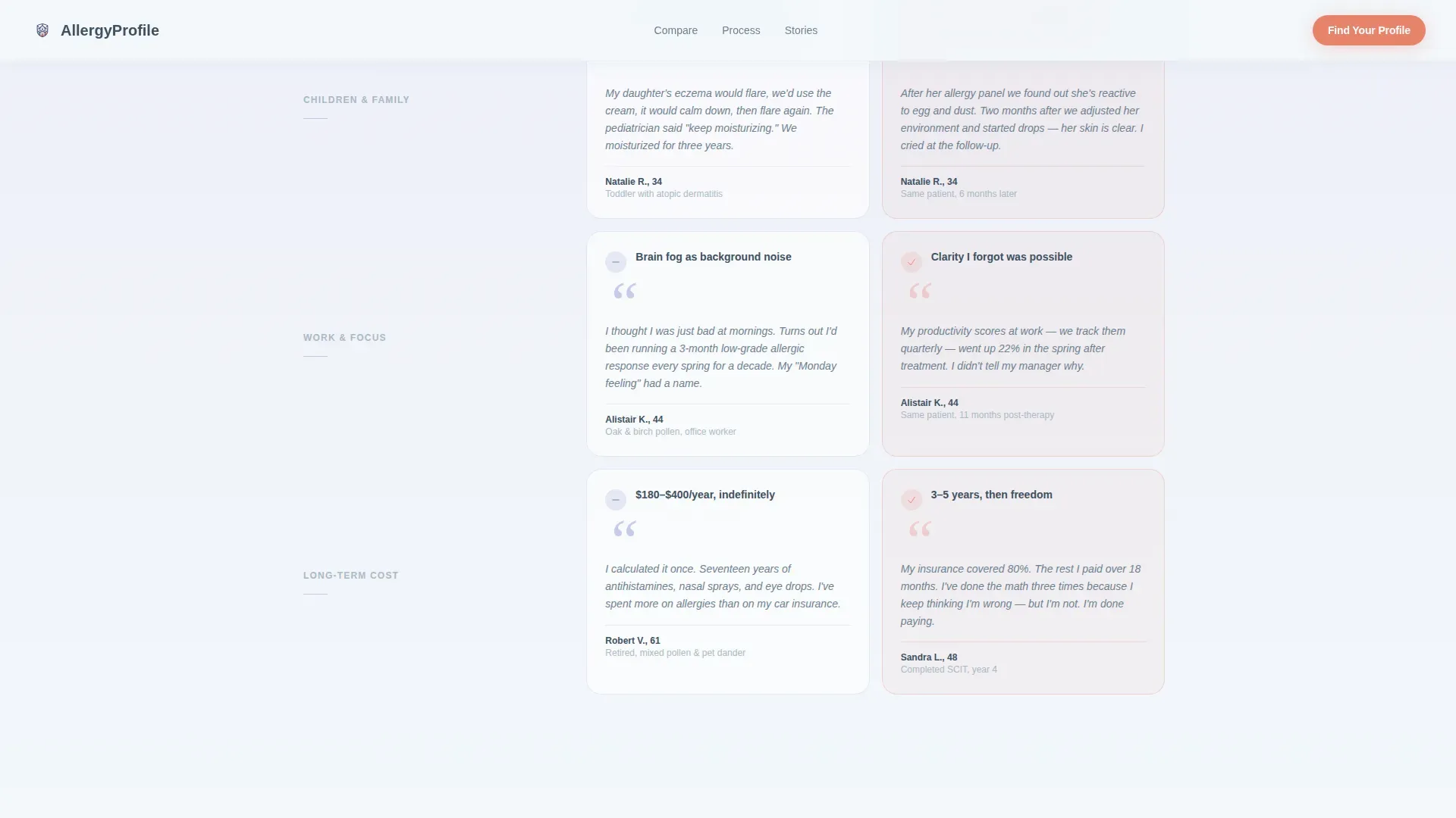
- A two-column comparison table populated with real patient review excerpts contrasting over-the-counter management with targeted immunotherapy
- A four-stage treatment bento grid covering consultation, skin-prick panel, results reading, and therapy planning, each with an embedded patient testimonial
- A five-question interactive quiz with a coral progress bar, one question per gradient card, delivering a personalized severity snapshot on completion
- A linear single-row footer to close the page cleanly
Feature list
This template ships with tightly integrated components that each carry a specific job in the conversion flow.
Stacked Type Tower Hero
The word "ALLERGIES" is set in enormous, ultra-light type across the full viewport. Each letter fades slightly more than the last, dissolving upward against a lavender-to-white vertical gradient. A single subtitle line fades in beneath it. No images are used; the typography carries the full visual weight of the hero.
Side-by-Side Comparison Table
The comparison table places over-the-counter symptom management directly beside targeted immunotherapy. Cells are filled with real patient review excerpts rather than generic checkmarks, letting prospective patients recognize their own experience in the copy.
Four-Stage Treatment Process Grid
A bento-style grid walks visitors through each clinical stage: initial consultation, skin-prick allergy panel, results reading, and therapy plan creation. Each stage card includes a patient testimonial, filmed in the same exam room with different patients, building cumulative trust through repetition.
Five-Question Interactive Assessment
The quiz presents one question at a time on its own gradient card. It covers symptom type, frequency, current medications, family history, and insurance carrier. A coral progress bar fills across the top as the visitor advances. Completion delivers a personalized severity snapshot and a pre-filled consultation booking button.
Scroll-Reveal Testimonial Cards
Patient testimonials are displayed as video-style cards with named patients and condition context. They are distributed across the page rather than grouped, so social proof accumulates steadily as the visitor scrolls rather than arriving all at once.
Page sections overview
| Section | Purpose |
|---|---|
| Hero Type Tower | Open with emotional clarity using dissolving typographic statement |
| Comparison Table | Show patient-reported contrast between OTC management and immunotherapy |
| Treatment Process Grid | Walk through four clinical stages with per-stage patient testimonials |
| Patient Testimonial Cards | Build cumulative trust through named, condition-specific review voices |
| Interactive Quiz Assessment | Qualify and engage visitors with a five-step personalized output flow |
| Single-Row Footer | Close the page with a clean, minimal linear footer pattern |
Design & branding system
The visual identity uses a Cloud Canvas color system built for a clinical-soft feel. Backgrounds drift between diffused sky white and antihistamine lavender in gentle vertical gradients, giving the page a sense of open air without sacrificing medical credibility.
- Color palette: sky white (#F4F7FB) and lavender (#C5CAE9) for backgrounds, calm inhale blue (#7E9BB9) for supporting elements, muted slate (#3D4F5F) for body text, and pulse-point coral (#E8836B) reserved exclusively for calls to action and interactive highlights
- Typography: DM Sans in ultra-light weight for the hero display type, paired with Fraunces serif accents for warmth and editorial contrast
- Coral appears only where a finger should tap, keeping interactive affordances visually distinct from all informational content
Mobile & speed optimization
The quiz flow is designed with thumb navigation in mind. Each question appears on its own full-width gradient card, making it easy to read and tap on a small screen without zooming or horizontal scrolling.
- Mobile-first layout with the five-step quiz optimized for single-thumb interaction on portrait-mode screens
- Static sections built with server components for faster initial load, while the interactive quiz runs as a client component
- High-motion GSAP animations, including the hero letter dissolve, scroll reveals, and quiz card transitions, are scoped to the interactive elements so they do not block content rendering
How this template helps you convert
The page is structured so that value is delivered before a commitment is ever requested. Each section earns a small trust deposit before the next one asks for a little more attention.
- The comparison table shows visitors exactly what they have been experiencing with over-the-counter management, using their own words in the review excerpts, making the case for a better path without a single hard sell
- The four-stage treatment grid removes procedural uncertainty by showing every step of the clinical process alongside a real patient who has been through it, reducing the fear of the unknown that often delays booking
- The quiz delivers a personalized severity snapshot before asking for an appointment, so the visitor arrives at the booking button already holding something useful, making the final click feel like a natural next step rather than a cold conversion
Other information about this template
This template is part of the Health and Medical category under the Allergist Website subcategory, and it is specifically designed for the allergist testimonial and review page niche. Its Intersection Match Score of 13 reflects a tightly focused use case.
- Template style: Comparison Table layout within a Soft Gradient visual theme
- Creative direction: Transparent Process, meaning the page reveals clinical steps openly rather than using abstracted marketing language
- Header concept: Stacked Type Tower, a typographic-only hero approach with no photographic imagery
- Landing page direction: Quiz and Assessment funnel, prioritizing a value-first interactive engagement model
- Localization: English language, United States Dollar pricing context, and United States date format
- Animation level: High, using GSAP for the hero letter dissolve effect, scroll-triggered reveals, and quiz card transitions

Theme
Soft Gradient
Creative direction
Transparent Process
Color system
Cloud Canvas
Style
Comparison Table
Direction
Quiz/Assessment
Page Sections
Stacked Type Tower Hero
Side-by-side Comparison Table
Four-stage Treatment Process Grid
Five-question Interactive Quiz
Scroll-reveal Testimonial Cards
Related questions
Can I replace the quiz questions with different ones?
Does the comparison table require real patient reviews to work?
How does the quiz deliver a personalized output?
Is this template suited to a single clinic location?
What visual style does this template use?



