Bold Brutalist Sunglasses Brand Landing Page Template
Shade is a gallery-style landing page built for an architectural eyewear brand. It pairs a Bold Brutalist design sensibility with a Soft Mist color system to let the product take center stage. The page guides visitors through a curated frame collection, an interactive material toggle, and a clear titanium upgrade path, all rendered in raw concrete aesthetics and sharp graphic detail.
by Rocket studio
Quick Summary
Shade is a bold, gallery-driven landing page for a direct-to-consumer sunglasses brand. The design draws from brutalism, favoring exposed structure, raw concrete tones, and deliberate simplicity over polished decoration. Every section is built to showcase frames as objects of architecture and move the right buyer toward an upgrade decision.
Who This Template Is For
This template is made for eyewear founders, independent brand designers, and creative agency teams who need a page that matches the weight of the product it sells. It fits brands where the frame is the hero and the design has something to say.
- Founders launching a direct-to-consumer sunglasses brand with a premium material story
- Designers and creative agency studios building for fashion-forward or architecture-adjacent clients
- Independent brands ready to move away from generic catalog layouts and create something with real graphic presence
What Problem This Template Solves
Most product pages treat eyewear like inventory. Items stack in a grid, filters shrink the experience, and the design competes with what it is supposed to showcase. Shade solves this by giving each frame room to exist on its own terms.
- Generic layouts flatten the product and remove the sense of craft and material quality
- Upsell moments feel forced when there is no design logic connecting base and premium versions
- Standard web design styles rarely support the bold, high-contrast aesthetics that architectural eyewear brands need
What You Get With This Template
You get a fully structured, single-page layout built around five deliberate sections. Every part of the page serves a specific role in the buyer journey, from first impression to upgrade decision.
- A macro hero section, curated collection gallery, interactive material toggle, craft spotlight, and social proof block with a pinned call to action
- A Soft Mist color system using poured concrete off-white, morning fog gray, graphite shadow, and a muted rose accent for price callouts and upgrade badges
- DM Sans headlines tracked wide with IBM Plex Mono for price and specification display, creating clear typographic hierarchy throughout the layout
Feature List
This template delivers a focused set of built-in capabilities. Each one is grounded in the prompt brief and designed to support the brand's visual and commercial goals.
Macro Close-Up Hero Section
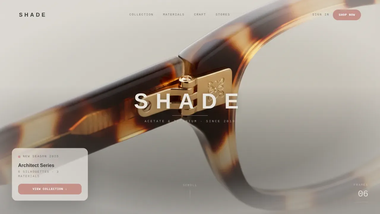
The hero opens with a full-viewport photograph shot at near-microscopic distance on a single titanium hinge. Shallow depth of field dissolves the background into Soft Mist fog. After two seconds, the brand name stamps in, uppercase, tracked wide, graphite on fog, like an engraving appearing on the frame itself.
Curated Collection Gallery
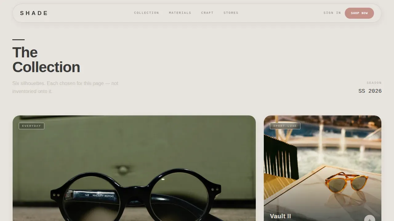
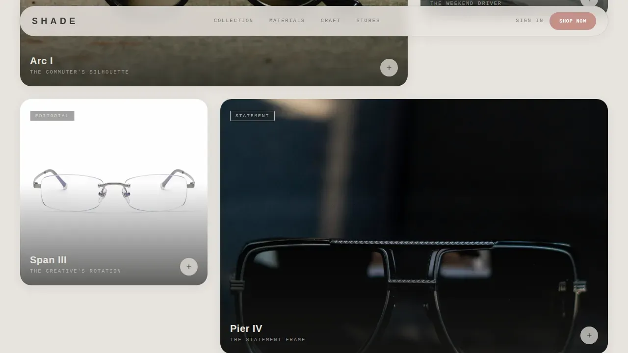
The collection scrolls as a tasting menu of frames, not a catalog dump. Wide gallery rows alternate with intimate single-frame spotlights. Each section isolates one silhouette against raw concrete, then a click or scroll-trigger expands into a detail panel showing lens color options, temple engravings, and a side-by-side of the standard versus the upgraded titanium edition.
Interactive Material Toggle
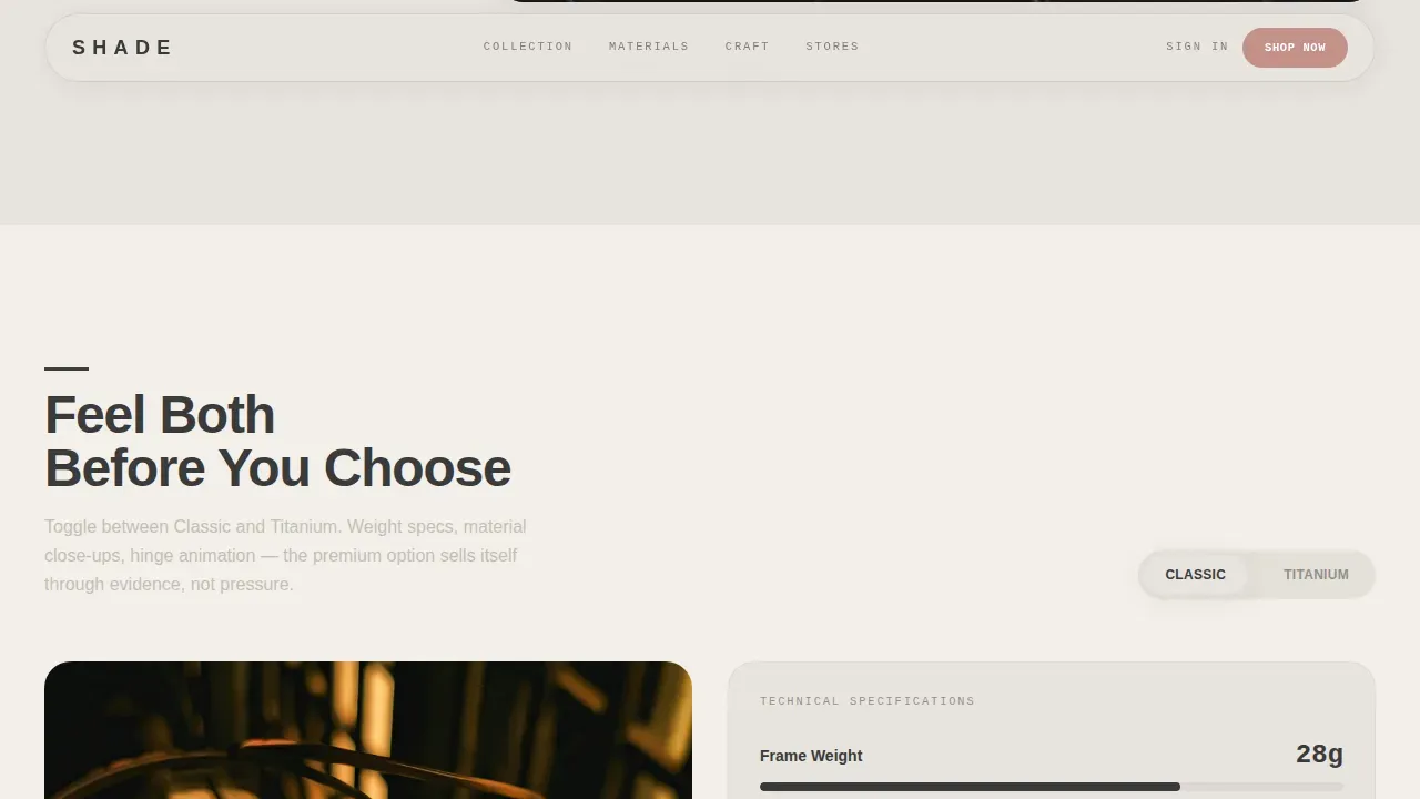
Every frame is shown first in its base model. The upgraded version is revealed through an interactive material toggle. Visitors can compare weight specifications, material close-ups, and a hinge animation before deciding, so the premium option earns the choice through evidence, not pressure.
Upsell-Driven Call to Action
The primary call to action reads "Upgrade to Titanium" in muted rose, pinned to the detail panel beside a price differential shown as a daily cost. A secondary path, "Start with Classic," keeps the base buyer moving. Both options sit within clear graphic structure so neither feels like an afterthought.
Social Proof and Testimonial Block
A dedicated section houses specific customer quotes with occupation and star rating. An upgrade conversion statistic sits alongside the testimonials, reinforcing the titanium path with peer evidence rather than brand assertion.
Craft Spotlight Section
A single-frame close-up section highlights material detail and temple engraving. This section slows the scroll deliberately, asking the user to look closely, mirroring the experience of examining a frame in a physical showroom.
Page Sections Overview
| Section | Purpose |
|---|---|
| Hero Header | Introduces brand identity through a macro hinge photograph and delayed brand stamp |
| Collection Gallery | Showcases frame silhouettes in alternating wide and intimate bento-style rows |
| Material Toggle | Lets users compare base and titanium editions through an interactive specification panel |
| Craft Spotlight | Isolates a single frame to highlight engraving and material texture detail |
| Social Proof | Displays customer testimonials, star ratings, and upgrade conversion evidence |
| Footer Block | Closes the page with horizontal flow navigation and brand contact structure |
Design & Branding System
The design system is rooted in brutalism. The word itself comes from the French phrase béton brut, meaning raw concrete, and that philosophy shapes every visual decision here. Brutalism originated in European architecture in the 1950s, characterized by exposed concrete, large structural forms, and a rejection of unnecessary decorations. Those same principles translate directly into this web design: bare spaces, bold typography, and structural elements that never pretend to be decorative elements.
- Color system: concrete off-white (#E8E4DF), fog gray (#C5BFB6), graphite (#3A3A3A), and muted rose (#C4918A) reserved for upgrade moments
- Typography: DM Sans for wide-tracked headlines using sans serif fonts, IBM Plex Mono for specs and pricing, both sans serif choices that reinforce the graphic clarity of the layout
- Visual rhythm alternates between stark contrast wide-format gallery rows and close, intimate frame spotlights to create a sense of curation over inventory
Mobile & Speed Optimization
The template is desktop-first, designed to deliver the concrete showroom aesthetic at full viewport width. The layout scales responsively to mobile without losing the core brutalist structure. Interactive elements including the material toggle and scroll-triggered reveals are built with performance architecture in mind.
- Server Components handle static sections; Client Components handle the interactive material toggle and GSAP-driven animation sequences
- Scroll-triggered reveals, delayed stamp animation, and hover depth effects are scoped to avoid layout instability on smaller screens
- The alternating gallery rhythm adapts to a single-column mobile layout while keeping frame photography at full visual weight
How This Template Helps You Convert
The page is built around a single commercial idea: show both versions of the frame before asking for a decision. Every design choice supports that goal.
- The material toggle lets users feel the difference between classic and titanium editions through weight specs, close-up imagery, and hinge animation, removing doubt before the click
- The "Upgrade to Titanium" call to action is pinned in muted rose with a price-per-day framing, making the premium choice feel proportionate rather than expensive
- Social proof with real occupations, star ratings, and an upgrade conversion statistic gives the decision external validation at exactly the right moment in the scroll
Other Information About This Template
Brutalism has a well-documented history in both architecture and digital design. It became a popular architectural style in the 1960s and 70s, championed by architects like Alison and Peter Smithson, and was built on the idea that functionality and social responsibility matter more than decoration. Buildings from that era used exposed concrete and raw materials to be honest about what they were made of. That honesty is exactly what makes brutalism resonate in modern web design.
Brutalism in web design emerged as a rebellion against sleek, polished websites. A brutalist website tends to be plain, non-ornamental, and rooted in purpose. Brutalist web design prizes usability above everything, often featuring overlapping elements, irregular color schemes, and bold geometric shapes that reject conventional grid logic. Neo brutalism builds on this by adding more structure and usability, making it a practical design style for brands in creative industries who want to stand out without sacrificing the user experience.
The Shade template sits at the intersection of neo brutalism and gallery-quality graphic design. It follows brutalist principles without becoming hostile: the Soft Mist palette keeps things soft enough for the product to dominate, while the brutalist design elements, raw concrete tones, exposed structural layout, bold typography, give the site its identity. This is a design style that works because it is honest. Nothing on the page is there to fill space.
Well-known examples of brutalist websites include sites by fashion houses and media organizations that use geometric shapes, monochrome color schemes, and large typography to put their content at center stage. The Shade template brings that same editorial seriousness to direct-to-consumer eyewear.
- Brutalism works best for brands that want to emphasize individuality and reject conventional aesthetics, making it a strong fit for an architectural eyewear brand
- The shade bold brutalist sunglasses brand landing page template is a purpose-built starting point for any founder or designer who wants to skip the generic and build something with real graphic presence
- This template supports experimentation within a defined system: the color, type, and layout rules are clear, but the curated collection format allows for a wide range of frame stories and redesign directions
Theme
Bold Brutalist
Creative direction
Curated Collection
Color system
Soft Mist
Direction
Upsell/Upgrade
Page Sections
Macro Close-up Hero with Delayed Brand Stamp
Alternating Curated Collection Gallery
Interactive Material Toggle with Spec Display
Pinned Upsell Call to Action in Muted Rose
Social Proof Block with Conversion Statistic
Craft Spotlight with Material Detail Close-up
Related questions
Who is this template best suited for?
Does the template include the interactive material toggle?
Can I adapt this template for a different product category?
What design style does this template use?
What typography and color system does the template include?