Teen & Tween Advanced Booking Website Template
Shelf is a single-column landing page template built for monthly tween book club subscriptions. It pairs a softly animated photo-wall hero with a scrolling community gallery to let social proof do the persuading. Warm parchment cream backgrounds, violet headlines, and a berry call-to-action button guide parents straight to a plan-selection click.
by Rocket studio
Quick summary
Shelf is a landing page template for a curated book club that mails chapter books and guided reading journals to kids aged eight to twelve. The single-column flow moves visitors through a living scrapbook of real member moments, building quiet longing before the primary call-to-action appears. The design feels like a cozy reading nook, and every section earns the click without a single form field.
Who this template is for
This template is built for subscription box businesses that serve children and families in the eight-to-twelve age range. If your offer blends physical products with a sense of community, this layout fits naturally.
- Parents looking to replace screen time with a shared reading habit for their tween
- Homeschool families, grandparents gifting subscriptions, and school librarians seeding reading groups
- Founders or marketers launching a children's subscription box and needing a conversion-ready landing page fast
What problem this template solves
Selling a children's book subscription online means competing with instant entertainment. A flat product page rarely conveys the warmth and community behind the box. Visitors need to feel the experience before they buy.
- The template replaces dry feature lists with real-kid pull quotes, photo moments, and journal entries that show the club already thriving
- It removes form friction on the landing page entirely, letting the gallery earn trust before asking for any commitment
- It guides warm returning visitors straight to a conversion point with a secondary text link, while giving new visitors the full community story first
What you get with this template
You get a complete, ready-to-adapt single-column landing page with every section already structured and sequenced. The layout handles both new and returning visitors without separate builds.
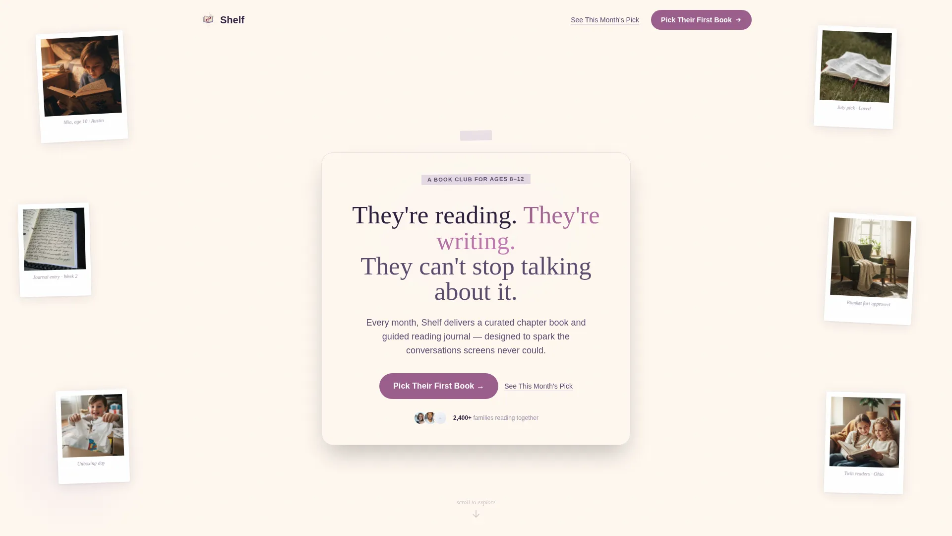
- A softly animated UGC photo-wall hero with a floating hand-lettered headline
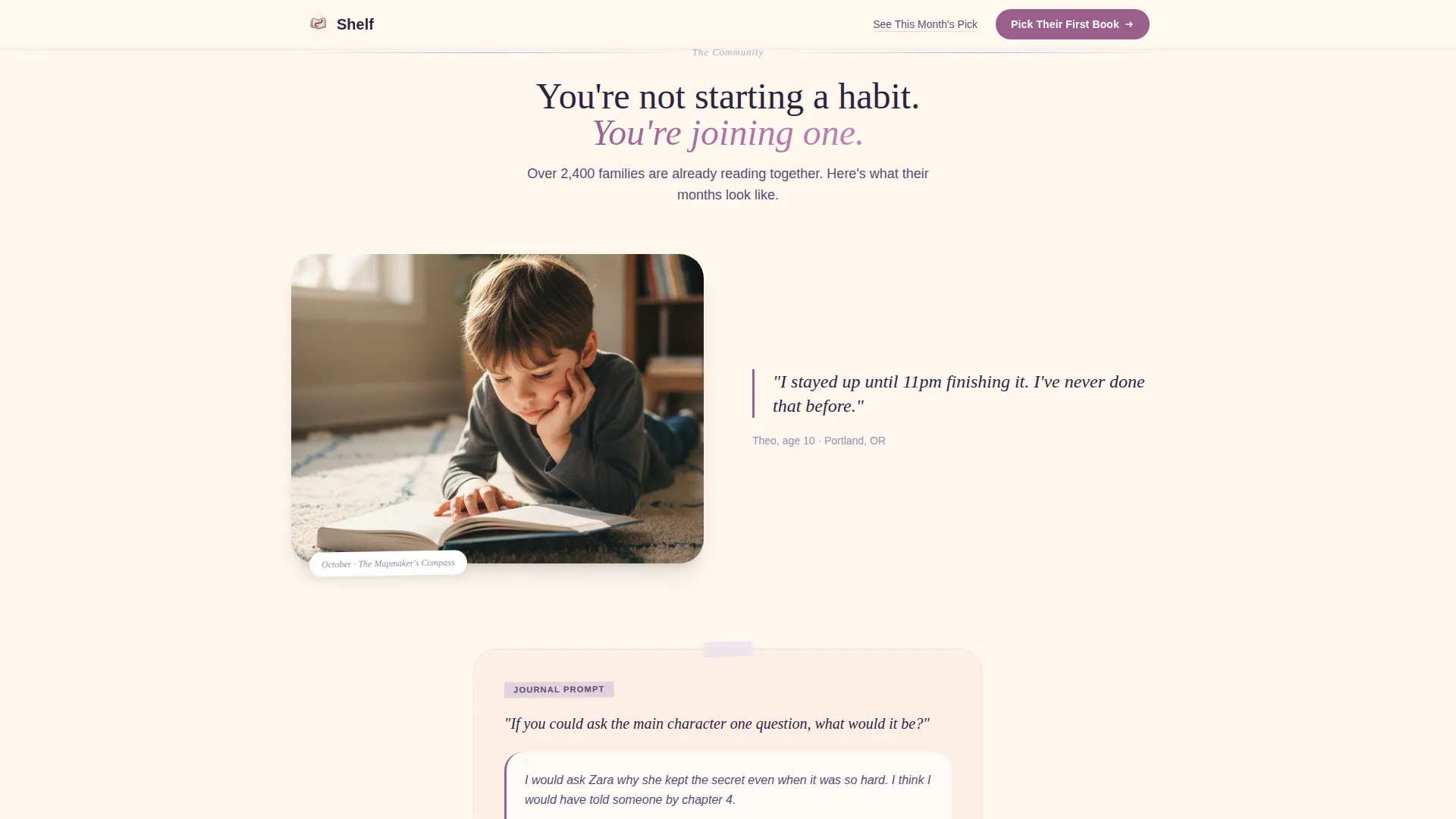
- A scrolling community gallery with pull-quote slots, photo placements, and journal-prompt moments
- A featured book spotlight section, a plan-card call-to-action section, and a sticky mobile call-to-action bar
Feature list
This template ships with six purposefully designed sections and a set of interactive details that work together to build trust and move visitors forward.
Animated UGC Photo Wall Hero
The header is a softly animated mosaic of member photos styled like polaroids pinned to a corkboard. Images drift gently, some tilted, slightly overlapping, so no single photo dominates. A floating headline sits center stage over the collage.
Scrolling Community Gallery
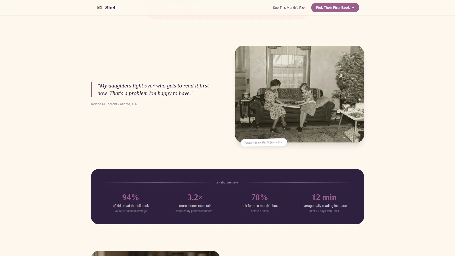
Each gallery section spotlights a different month's book pick alongside real member reactions. Pull-quote slots, sibling photo placements, and journal-prompt moments with handwritten-style answers keep visitors scrolling through proof rather than promises.
Featured Book Spotlight
A dedicated section highlights the current month's pick with a journal prompt and a real child's response shown beneath it. This section works as a preview hook, showing new visitors exactly what lands in the mailbox each month.
Plan-Card Call-to-Action Section
The primary call-to-action, labeled "Pick Their First Book," appears after the third gallery section and again in a sticky bottom bar on mobile. It leads directly to a plan-selection page with no form to fill on the landing page itself.
Secondary Conversion Text Link
A lighter text link labeled "See This Month's Pick" appears early in the page flow. It gives returning visitors a low-friction shortcut to convert without disrupting the story-first experience built for new visitors.
Sticky Mobile Call-to-Action Bar
A persistent bottom bar on mobile keeps the primary call-to-action reachable at all times. Parents browsing on their phones at bedtime never have to scroll back to find the next step.
Page sections overview
| Section | Purpose |
|---|---|
| Hero Photo Wall | Open with community proof and a floating emotional headline |
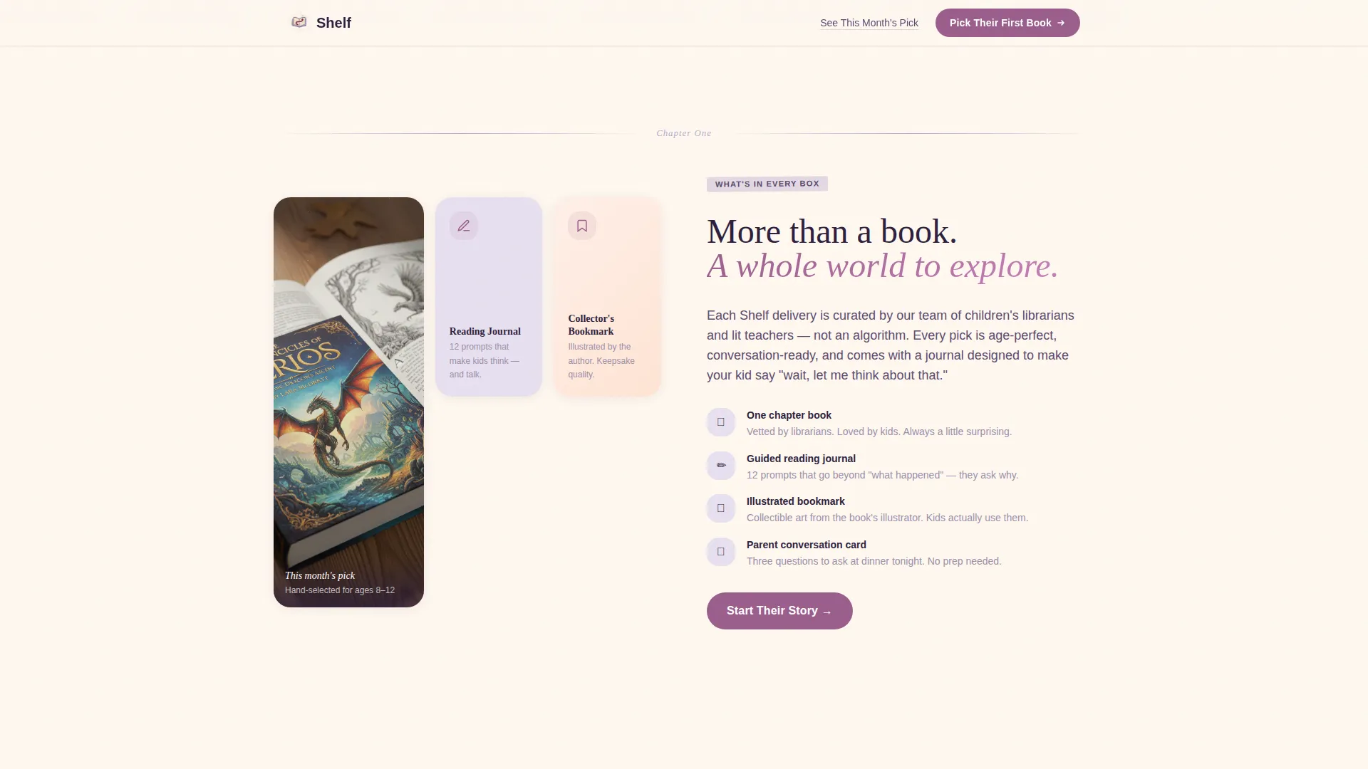
| What's Inside | Show the book, journal, and community in one bento layout |
| Community Gallery | Build trust through real member photos, quotes, and journal entries |
| This Month's Pick | Preview the featured book and a sample journal prompt |
| Plan Cards Call-to-Action | Present subscription options and drive the primary click |
| Footer | Close with navigation and horizontal brand flow |
Design & branding system
The visual identity follows a Nurture and Care theme built on the Lavender Dream color system. Parchment cream dominates backgrounds so the page reads like a journal page itself. Soft violet anchors headlines and section dividers like chapter markers, and a gentle berry accent appears only on buttons and highlighted pull quotes.
- Typography pairs Fraunces serif headlines with DM Sans body text for a warm, readable contrast
- Animations are intentionally gentle: polaroid drift on the hero, scroll reveals on gallery cards, and parallax depth on section transitions
- Hover states on gallery cards and a polaroid tilt effect add tactile interactivity without overwhelming the calm mood
Mobile & speed optimization
The template is built mobile-first because the primary audience, parents, tends to browse on a phone at bedtime. Every section stacks cleanly into a single column on small screens.
- The sticky mobile call-to-action bar keeps "Pick Their First Book" reachable throughout the entire scroll
- Animations use minimal JavaScript alongside server-rendered static components to keep the page feeling light
- Gallery images, polaroid drift, and counter animations are all tuned for smooth performance on mobile connections
How this template helps you convert
The page earns the click by showing a community already thriving rather than asking visitors to imagine one. Persuasion happens through sequence and proof, not pressure.
- The UGC photo wall and community gallery build emotional resonance across the first three sections, so by the time the primary call-to-action appears, visitors feel they are arriving late to something wonderful and the door is still open.
- The secondary "See This Month's Pick" text link surfaces early, giving warm returning traffic a frictionless path to convert without waiting through the full gallery.
- The sticky mobile call-to-action bar removes the need to scroll back up, keeping the conversion point present at every moment of decision.
Other information about this template
This template is a strong starting point for anyone building in the children's subscription box or direct-to-consumer family education market. It is designed as a click-through landing page, meaning there is no embedded sign-up form. The conversion goal is a single click to a separate plan-selection page, keeping the landing page itself clean and story-focused.
- The layout and color system are fully adaptable: swap the Lavender Dream palette for your own brand colors, replace placeholder photos with your community's real moments, and update the featured book spotlight each month
- The footer follows a horizontal flow pattern suited to a minimal brand close, with room for navigation links and brand identity elements
- Content localization is set for English, United States dollar pricing, and United States date formats, making it a natural fit for domestic direct-to-consumer subscription launches
Theme
Nurture & Care
Creative direction
Community Gallery
Color system
Lavender Dream
Style
Single Column Flow
Direction
Click-Through
Page Sections
Animated UGC Photo Wall Hero
Scrolling Community Gallery
Featured Book Spotlight
Plan-card Call-to-action Section
Sticky Mobile Call-to-action Bar
Secondary Conversion Text Link
Related questions
Does this template include a sign-up form?
Can I update the featured book spotlight each month?
Is this template suitable for a gifting use case?
How does the sticky mobile call-to-action bar work?
Can I adapt this template for a different children's subscription box?