Growing Family Insurance Cost Calculator Website Template
Shelter is a dark-themed, interactive landing page template built for growing family renters insurance. It leads with a live coverage calculator, uses a zigzag content layout to alternate data visualizations with insight copy, and converts visitors through utility first. The design feels like a precision cockpit: every number is visible, every section earns its place, and the call to action arrives only after the visitor has already seen their own coverage gap.
by Rocket studio
Quick summary
Shelter is a single-page renters insurance landing page template designed for young families navigating coverage gaps. It opens with a three-question interactive calculator, then walks visitors through real replacement cost data in a zigzag layout. The dark Data Command visual style keeps the focus sharp. By the time the primary call to action appears, the visitor has already used the tool.
Who this template is for
This template is built for insurance brands, independent agents, and InsurTech platforms that serve renters with growing households. It works best when the audience is making real financial decisions under time pressure and needs clarity, not a sales pitch.
- Expecting and new parents between ages 25 and 35 who are discovering their landlord's policy covers nothing inside the unit
- Young couples comparing renters insurance plans late at night on a phone screen
- Growing families moving into larger rentals where the total replacement value of their belongings has quietly increased
What problem this template solves
Renters insurance pages typically present a wall of static text, generic stock imagery, and a quote form that gives nothing back before asking for personal details. For families at a turning point, that approach fails entirely.
- Visitors arrive uncertain about how much coverage they actually need after a life change such as a new baby, a home office, or a bigger apartment
- Most landing pages cannot show a personalized estimate without a full application, leaving high-intent visitors without a reason to stay
- Generic layouts treat every visitor the same, missing the urgency that expecting parents or growing families feel when they realize their current policy is already out of date
What you get with this template
Shelter delivers a complete, single-page layout with interactive components and a zigzag content rhythm. Every section is designed to build confidence before asking for anything in return.
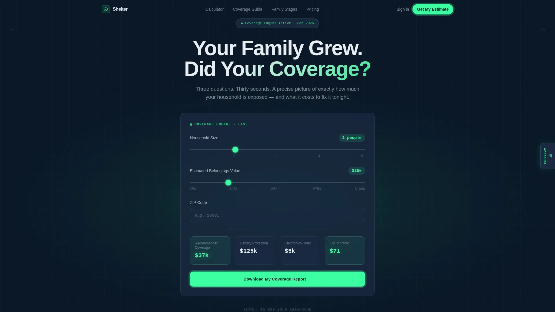
- A dark full-bleed hero section with a live three-question coverage calculator that animates results in real time using phosphor green accents
- A zigzag alternating layout with five distinct content sections, moving from data visualization to social proof to a gated call to action
- A sticky floating estimate bar that updates as visitors scroll, a primary gated PDF download, and a secondary ungated family coverage checklist side tab
Feature list
This section describes the core functional and design capabilities built into this template.
Live Coverage Calculator with Animated Output
The hero section opens with a three-input calculator asking for household size, zip code, and estimated belongings value. As visitors adjust the sliders, coverage estimates animate in real time using phosphor green number displays. The tool earns attention before a single word of copy is read.
Persistent Floating Estimate Bar
A sticky estimate bar floats on screen as the visitor scrolls through every section. It updates continuously as new variables are introduced through each content section, making the page feel like an active tool rather than a static article.
Zigzag Alternating Content Layout
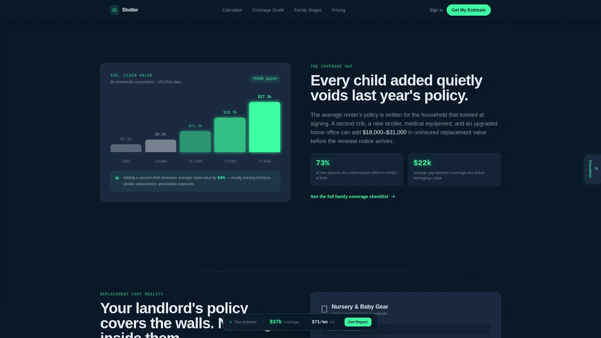
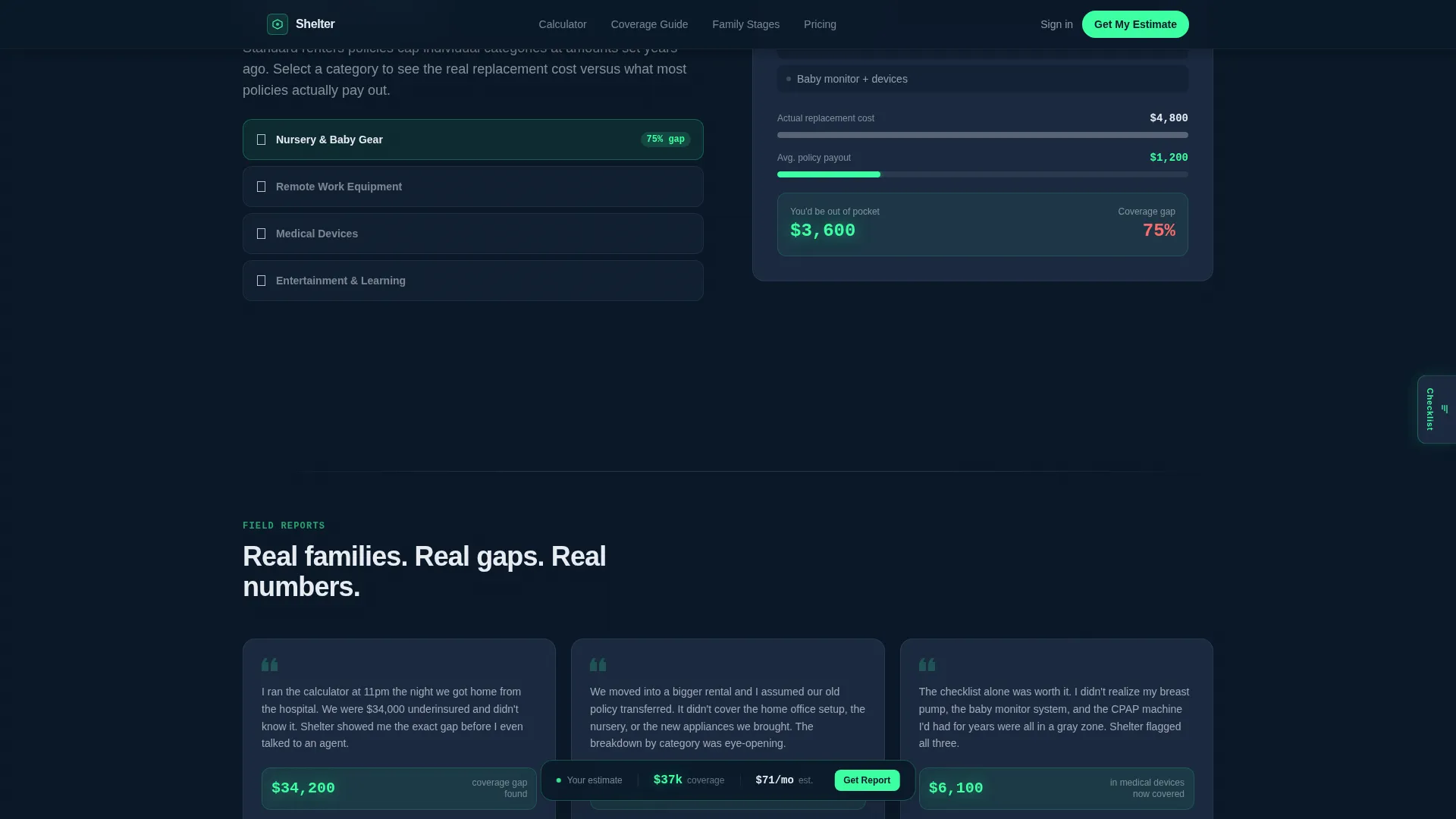
Five sections alternate left and right, pairing animated data visualizations with insight copy. One side shows how average claim costs shift as a household grows. The other side shows category-by-category replacement cost breakdowns for nursery furniture, medical devices, and remote-work equipment.
Gated PDF Report with Lead Segmentation
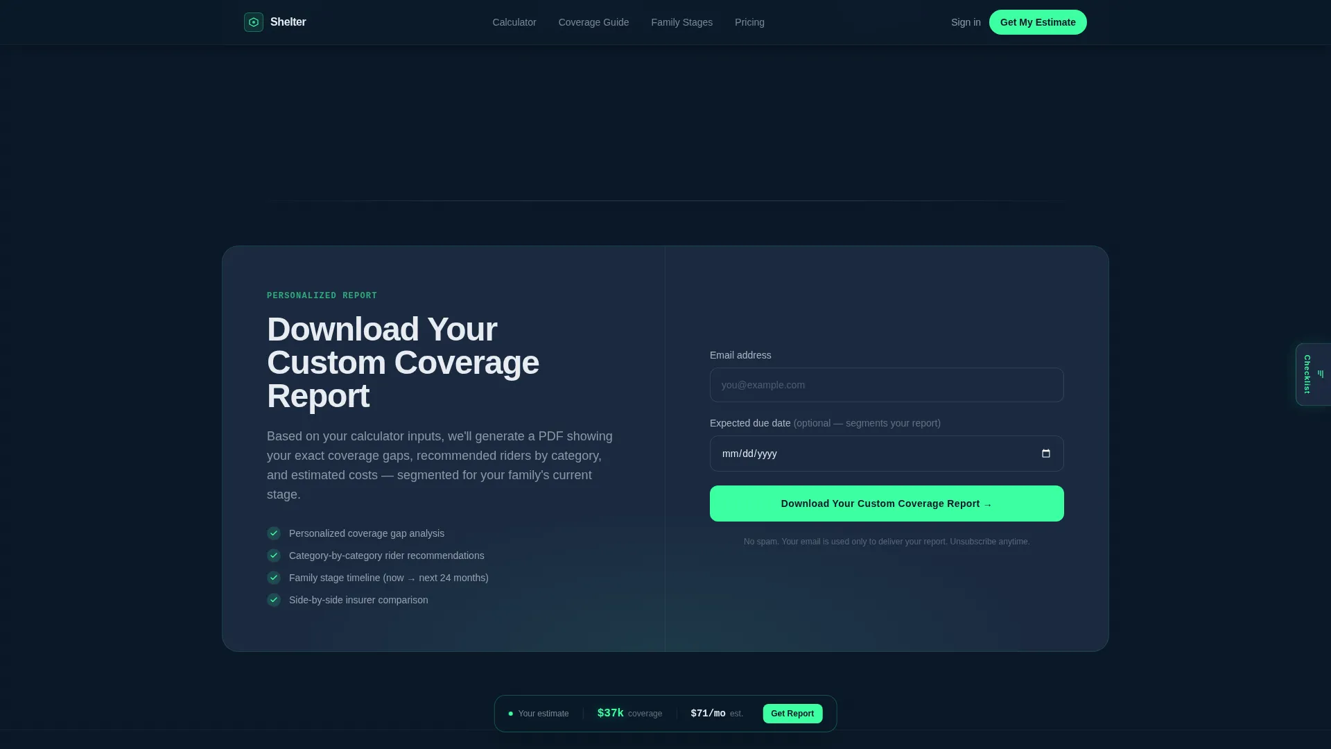
The primary call to action gates a personalized coverage report behind an email address and an expected due-date field. This single input segments leads by urgency, separating expecting parents from general inquirers without adding friction to the form.
Sticky Side Tab for Lighter Intent Visitors
A secondary conversion path sits as a sticky tab on the side of the page. Visitors who are not ready to share their email can still grab a Family Coverage Checklist without going through the gate, giving the page a two-tier conversion structure.
Dark Testimonials Panel with Specific Data
A dedicated social proof section displays testimonials formatted with specific dollar amounts and family stage labels. The dark surface treatment keeps the panel consistent with the overall cockpit visual system while grounding claims in real numbers.
Page sections overview
| Section | Purpose |
|---|---|
| Hero Calculator | Three-question interactive tool with live animated coverage estimate above the fold |
| Coverage Gap Data | Zigzag left panel with animated bar chart showing cost-per-child claim spikes |
| Belongings Breakdown | Zigzag right panel with replacement cost cards by belongings category |
| Social Proof Panel | Dark testimonials with specific dollar figures and family stage labels |
| call to action Report Gate | Email and due-date form gating a personalized PDF coverage report |
| Footer | Linear single-row footer pattern |
Design & branding system
The visual identity follows a Data Command theme built on a Navy Authority color system. The overall aesthetic is a precision cockpit interface: dark surfaces absorb distraction, and critical numbers glow where the eye needs to land.
- Colors: deep command navy (#0B1929) as the primary background, tactical slate (#1B2A41) for surface layers, signal white (#E8ECF1) for body and headline text, and phosphor green (#3DFFA2) reserved exclusively for interactive states, animated outputs, and call-to-action pulses
- Typography: DM Sans for headlines and body copy, JetBrains Mono for all numerical and data display elements, creating a clear visual split between narrative and precision data
Mobile & speed optimization
The template is built mobile-first, designed for couples comparing coverage on a phone screen late at night. Every interactive element and animated output is built to read clearly on small displays in low-light conditions.
- Sliders, number animations, and the floating estimate bar are all structured for touch input and narrow viewports
- Static content sections use server-side rendering while calculator and animation components are handled client-side, keeping the initial page load lean
How this template helps you convert
Shelter converts by delivering value before making any ask. The calculator is the first thing a visitor sees, and it gives back a real number before any form appears.
- The hero calculator gives visitors a personalized coverage estimate immediately, building trust through utility rather than claims, so they are already invested by the time the call to action appears
- The persistent floating estimate bar keeps the visitor's own numbers visible throughout the scroll, creating a continuous reason to stay engaged and eventually download the full report
- The two-tier conversion structure captures both high-intent leads through the gated PDF and lighter-intent visitors through the ungated checklist tab, maximizing conversions across different readiness levels
Other information about this template
This template is part of a broader InsurTech resource hub category. It is suited to campaigns targeting renters in the United States, with formatting and localization aligned to USD and the MM/DD/YYYY date format.
- The template style is Zigzag/Alternating with a Calculator/Tool First creative direction and a Dark Full-Bleed plus glow header concept
- The landing page direction is Content/Resource, meaning the page is designed to earn trust through information and interactivity before any conversion ask
- The theme and color system are referenced in design documentation as Data Command and Navy Authority respectively, useful context when customizing or handing off to a development team
Theme
Data Command
Creative direction
Calculator/Tool First
Color system
Navy Authority
Style
Zigzag/Alternating
Direction
Content/Resource
Page Sections
Live Coverage Calculator with Animated Output
Persistent Floating Estimate Bar
Zigzag Alternating Data Layout
Gated PDF Report with Lead Segmentation
Two-tier Conversion Structure
Dark Social Proof Panel
Related questions
Who is this landing page template designed for?
Can I customize the calculator inputs and output values?
Does this template support two different conversion paths?
What makes this feel different from a standard insurance landing page?
Is this template built for mobile users?



