Police Officer Profile Reviews Website Template
Shield is a masonry-style personal brand landing page built for a police officer creator. It leads with a collage-style header, hand-stamped audience metrics, and a content preview grid. The page is designed to win brand partnerships by presenting verified reach, a completed case study, and a dual-call to action system before asking for any contact information.
by Rocket studio
Quick summary
Shield is a single-page personal brand landing page for a police officer content creator. It uses a scrapbook-style header, index-card audience stats, a masonry content grid, and a partnership case study strip. The page guides potential brand partners from proof of reach to a media kit request, earning trust with real data before asking for the handshake.
Who this template is for
This template is built for a serving or former police officer who has built a public audience and is ready to pitch brand partnerships professionally. It speaks directly to creators whose content spans patrol stories, gear reviews, policy commentary, and first-responder advocacy.
- Officers with an established social following who want to attract paid partnerships
- Creator-cops pitching tactical brands, training platforms, mental health apps, or podcast networks
- Badge-carrying voices who need a professional media kit page without hiring a design agency
What problem this template solves
Most officer-creators pitch partnerships over email with a loose PDF and a screenshot. That approach leaves potential sponsors uncertain about reach, audience quality, and past results. Shield solves that by putting verified proof in front of partners before any ask is made.
- No credible web presence to send sponsors to before a pitch call
- Audience data buried in attachments instead of displayed with authority
- No completed case study to show a brand what working together actually looks like
What you get with this template
You get a fully structured, single-page landing page that functions as a living media kit. Every section is designed to move a brand decision-maker from curiosity to contact form without friction.
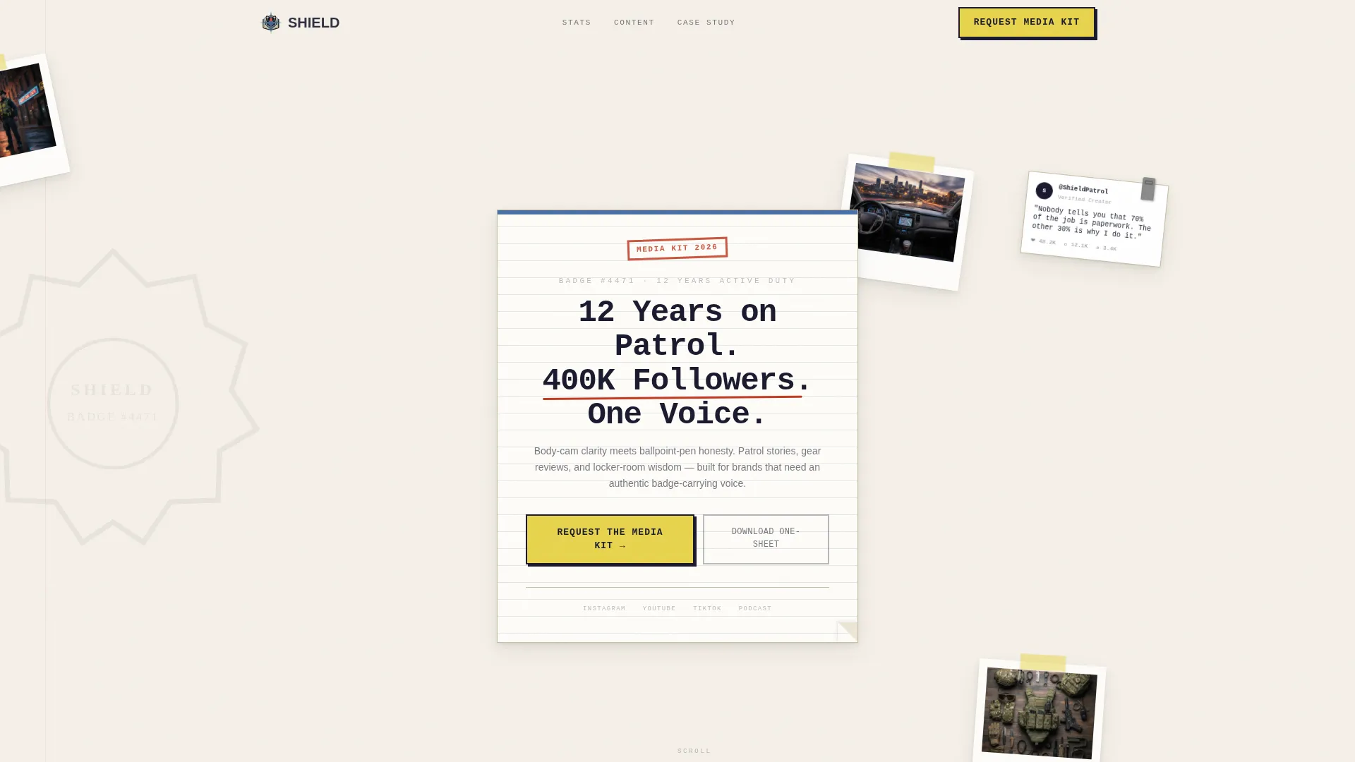
- A collage-style scrapbook header with layered thumbnails, handwritten captions, and a central typed headline
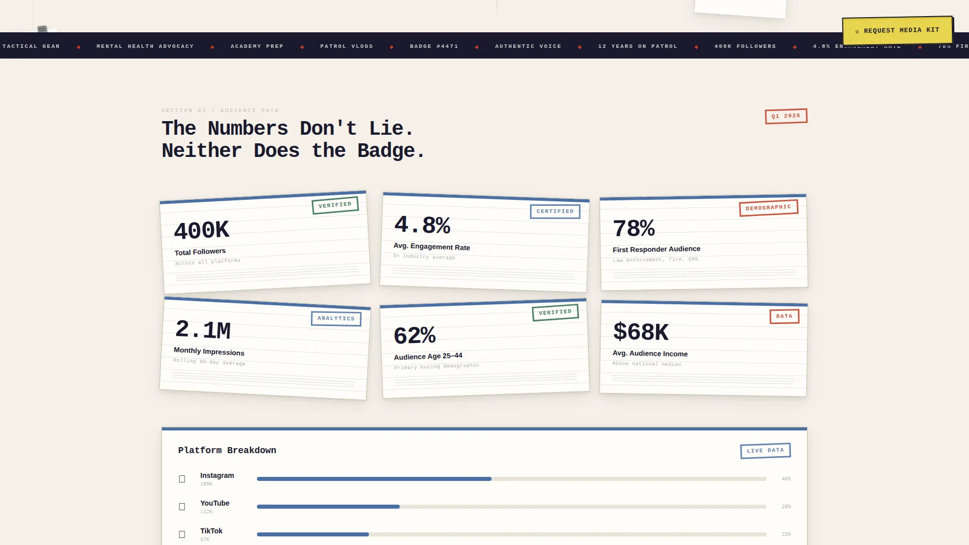
- A metrics strip showing reach, engagement rate, and audience demographics rendered as hand-stamped index cards
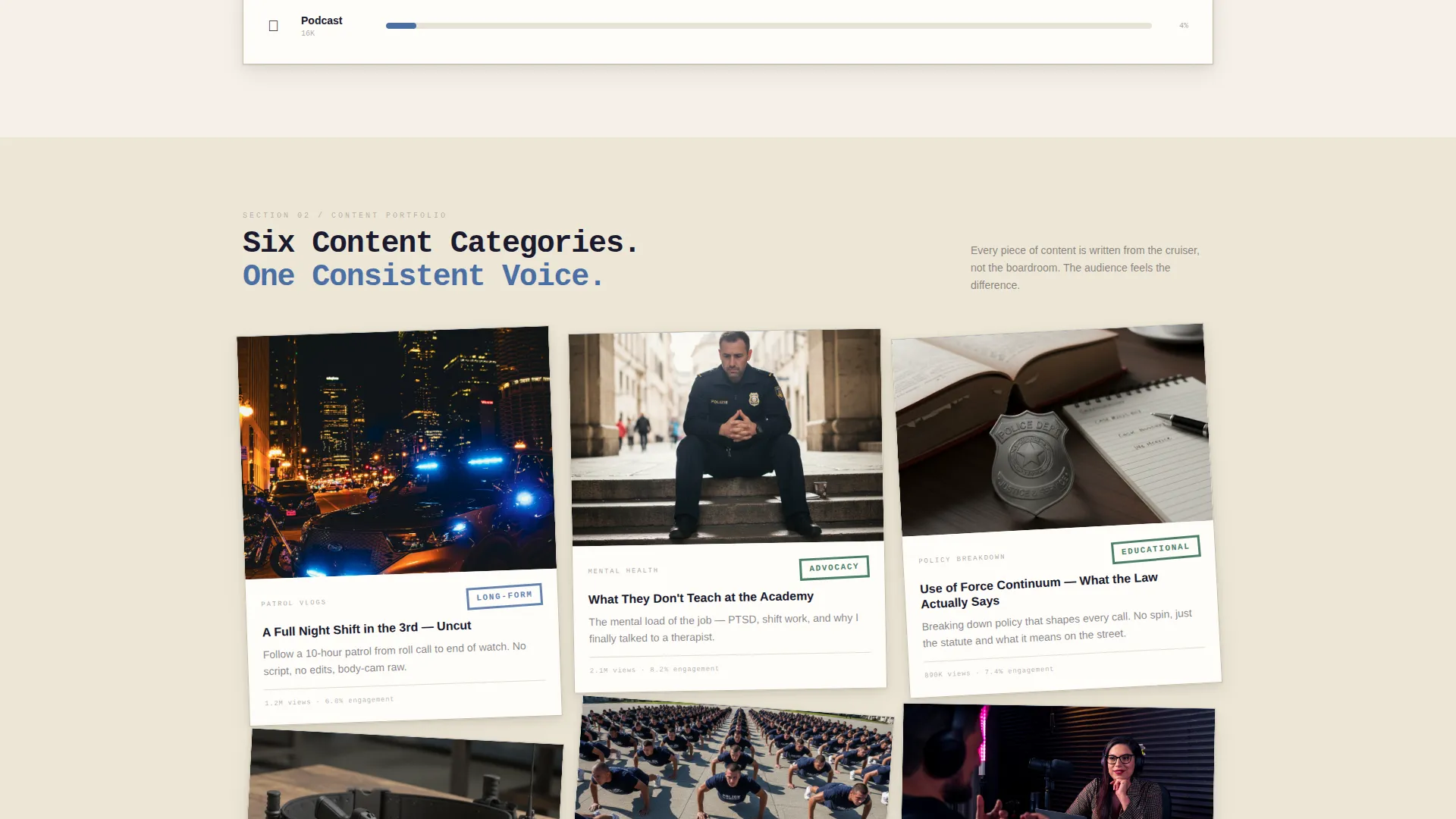
- A masonry content grid with four category tiles, a partnership case study strip, and a dual-call to action conversion system
Feature list
This section walks through the core built-in components that make Shield work as a partnership conversion page.
Collage Scrapbook Header
The header stacks polaroid-style content thumbnails, torn-edge podcast cover art, a badge silhouette watermark, and a viral post screenshot pinned with a binder clip shadow. A single typed headline sits centered on a cream card. The entire composition feels like a detective's evidence board rebuilt as a creator media kit.
Hand-Stamped Metrics Section
Audience reach, engagement rate, and demographic breakdowns by profession are displayed as stats printed on index cards with a hand-stamped visual treatment. This section establishes credibility with real numbers before any pitch begins.
Masonry Content Category Grid
Four content categories sit in a Pinterest-style masonry grid: patrol vlogs, gear reviews, academy preparation, and mental health advocacy. Each tile includes embedded content previews. The grid tightens and loosens as you scroll, giving the layout the feel of live field notes.
Partnership Case Study Strip
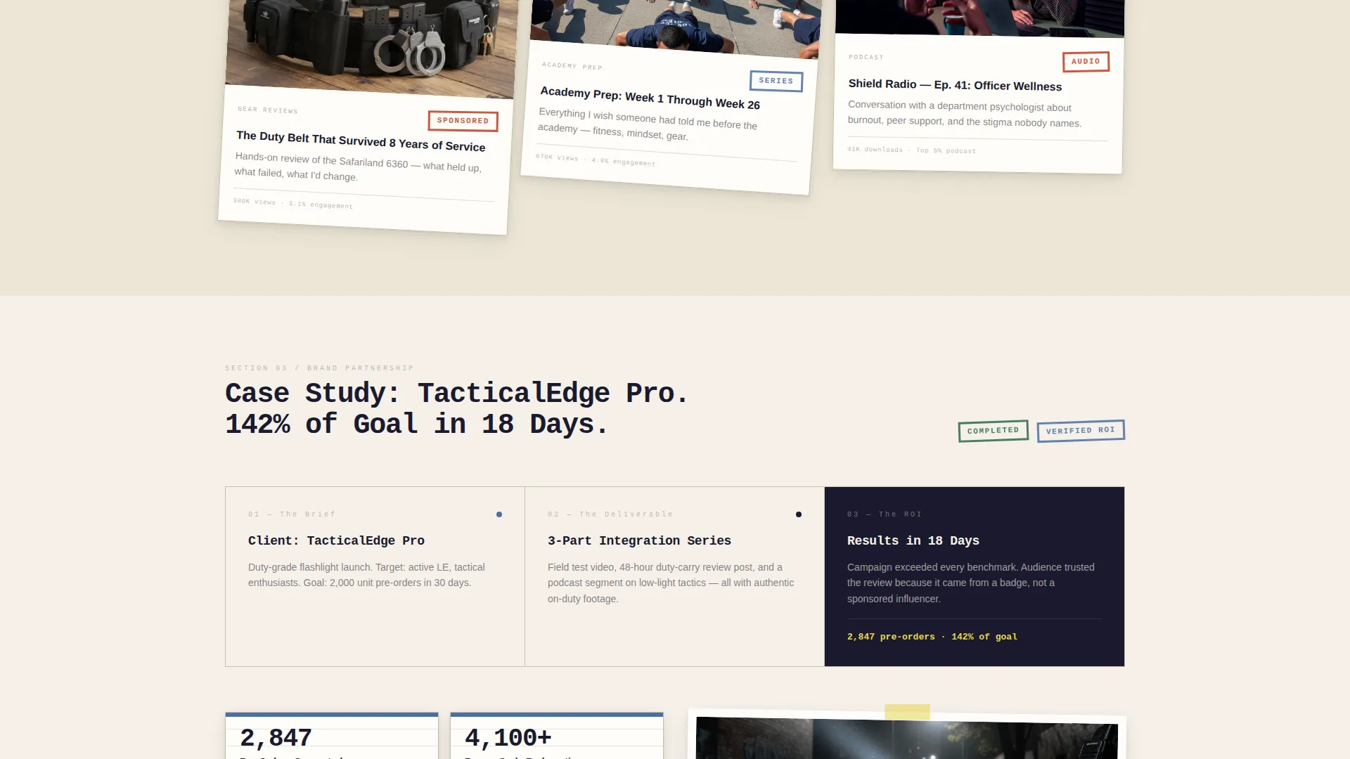
A horizontal strip walks a brand partner through one completed collaboration from brief to deliverable to return on investment. This section answers the most common sponsor question before they have to ask it.
Dual-call to action Conversion System
The primary call to action, "Request the Media Kit," sits on a sticky-note-yellow button that floats after the metrics section. A secondary path offers "Download the One-Sheet" as a gated PDF requiring only a work email. Both paths are designed for different levels of partner readiness.
Partnership Inquiry Form
The contact form captures company name, product category, campaign type (sponsored post, long-form review, or event appearance), and budget range via a sliding scale. It collects everything needed to qualify a lead without requiring a phone call first.
Page sections overview
| Section | Purpose |
|---|---|
| Collage scrapbook header | Establish creator identity and visual authority at first glance |
| Hand-stamped metrics | Display reach, engagement, and audience demographics as proof |
| Masonry content grid | Showcase content categories with embedded previews |
| Case study strip | Demonstrate completed partnership from brief to results |
| Media kit call to action | Prompt qualified partners to request the full media kit |
| One-sheet download | Capture high-intent leads with a low-commitment PDF gate |
| Partnership inquiry form | Collect campaign details and budget range from interested brands |
Design & branding system
The visual identity follows an Ink & Paper theme. Every design choice references the physical world of a duty notebook, a stamped evidence tag, or a form filled out under precinct fluorescent light. The result feels authoritative without being cold, and worn without being sloppy.
- Color palette: blotter black (#1A1A2E) for backgrounds, ruled-line blue (#4A6FA5) for structure, incident-report cream (#F5F0E8) for surfaces, and evidence-tag red (#C23B22) reserved for calls to action and metric callouts
- Typography: monospaced serif fonts for handwritten-style captions and headlines, reinforcing the duty-notebook aesthetic throughout
- Visual texture: soft paper shadows, slight element rotation, overlapping layers, torn edges, and binder clip details bring the scrapbook concept to life across every section
Mobile & speed optimization
The masonry grid and collage header are both designed to reflow cleanly on smaller screens. The floating call-to-action button and gated one-sheet download remain accessible without interference from the layered visual composition.
- Masonry tiles stack vertically on mobile so content category previews stay readable on any screen size
- The floating "Request the Media Kit" button anchors to the viewport, keeping the primary conversion action visible as a visitor scrolls
- The collage header scales without losing its layered evidence-board feel on tablet and phone viewports
How this template helps you convert
Shield is structured around a specific conversion logic. It proves value before asking for anything, then offers two entry points based on how ready a partner is to commit.
- Lead with verified proof: the metrics section and case study strip appear before any contact form, so brand decision-makers see audience data and past results first. This removes the most common objection before it forms.
- Match the ask to the intent: the floating media kit button catches partners who are ready to talk, while the one-sheet download captures brands who are still researching. Both paths feed the same pipeline without pressuring either type of visitor.
Other information about this template
Shield was designed specifically for the police officer personal brand niche, where authenticity is the primary currency. The template supports creators whose audience spans first responders, law enforcement trainees, tactical gear enthusiasts, and civilian followers interested in behind-the-badge perspectives.
- The page style fits creators producing content across patrol vlogs, gear reviews, policy breakdowns, and mental health advocacy
- The Ink & Paper color system and scrapbook aesthetic are intentional signals to brand partners that this creator's voice is distinct, not generic
- The partnership form's sliding budget scale and campaign-type selector make it easy for tactical brands, training academies, mental health app companies, and podcast networks to self-qualify before submitting
- The template is built as a standalone landing page, not a multi-page website, making it fast to launch and easy to update as follower counts and case studies grow
Theme
Ink & Paper
Creative direction
Creator Spotlight
Color system
Ink & Paper
Style
Masonry/Pinterest
Direction
Partnership/B2B
Page Sections
Collage Scrapbook Header
Hand-stamped Audience Metrics
Masonry Content Category Grid
Partnership Case Study Strip
Dual-cta Conversion System
Partnership Inquiry Form
Related questions
Can I update the metrics and case study content myself?
Does the one-sheet download require a third-party email tool?
Is this template suitable if I have not yet run a paid partnership?
Can I change the call-to-action button colors to match my own branding?
Who are the ideal brand partners this page is designed to attract?



