Insurance Company Professional Website Template
Shield is a single-column auto insurance landing page template built for clarity over complexity. It walks visitors through real coverage scenarios using side-by-side comparisons, plain-language explanations, and a data-driven header. The design uses a navy and gold palette that feels institutional but readable. The primary goal is to educate first, then earn the conversion through a friction-free email capture form.
by Rocket studio
Quick summary
Shield is a single-column auto insurance landing page template designed to educate drivers before asking for anything. It opens with an animated cost counter and moves visitors through escalating coverage comparisons. The tone is direct and clear. The layout earns trust through honest information, then captures leads with a one-field email form and a secondary quiz path.
Who this template is for
This template is built for auto insurance publishers, brokers, and educators who want to turn confused drivers into informed leads. It works especially well for content-first strategies where trust has to come before the pitch.
- First-time car buyers researching what full coverage actually includes
- Rideshare drivers balancing personal and commercial policy needs
- Parents adding a teen driver to an existing plan and watching premiums rise
What problem this template solves
Most auto insurance pages either overwhelm visitors with jargon or skip straight to a quote form before the visitor understands what they even need. The result is bounced traffic and low trust. Shield solves this by leading with education and letting the coverage gaps speak for themselves.
- Visitors leave without understanding deductibles, liability limits, or uninsured motorist protection
- Policy language buries critical details in long documents instead of surfacing the decisions that matter
- First-time buyers and rideshare drivers face unique coverage questions that generic pages never address
What you get with this template
Shield delivers a fully structured, single-column landing page ready to receive traffic and convert it. Every section is built around a specific stage of the buyer's understanding, from curiosity to confidence.
- An animated data header with a live-style cost counter and a premium trend graph
- A scrollable comparison journey with stacked scenario cards showing real dollar consequences
- A dual conversion path: a one-field email form for the coverage checklist and a secondary link to an interactive quiz
Feature list
This template is built around a small number of high-impact components. Each one serves the visitor's need to understand auto insurance before making a decision.
Animated Cost Counter Header
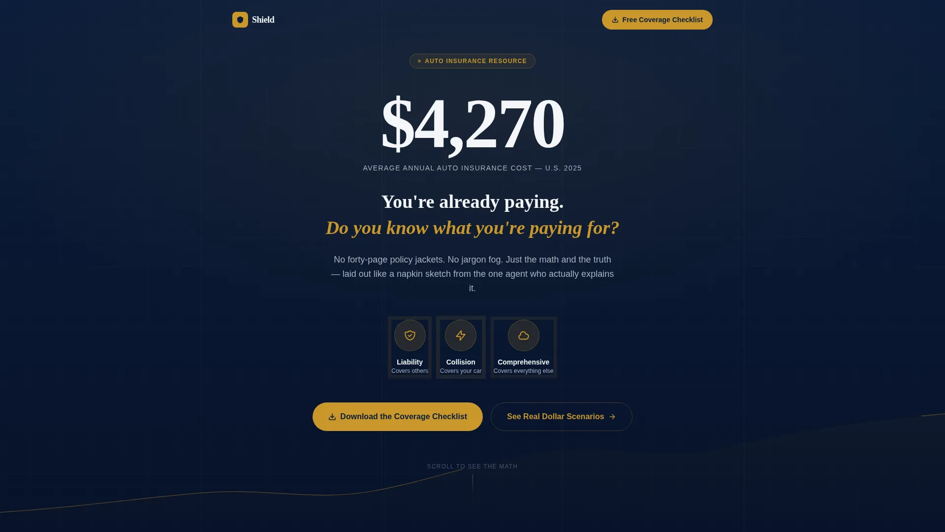
The header opens with a counter that ticks upward from zero to $4,270, the average annual cost of auto insurance in the United States. A thin gold trend line traces behind the number as it rises. Once the counter lands, a headline fades in to prompt the first real question. Three policy icons for liability, collision, and comprehensive coverage pulse gently below to invite the scroll.
Scrollable Comparison Journey
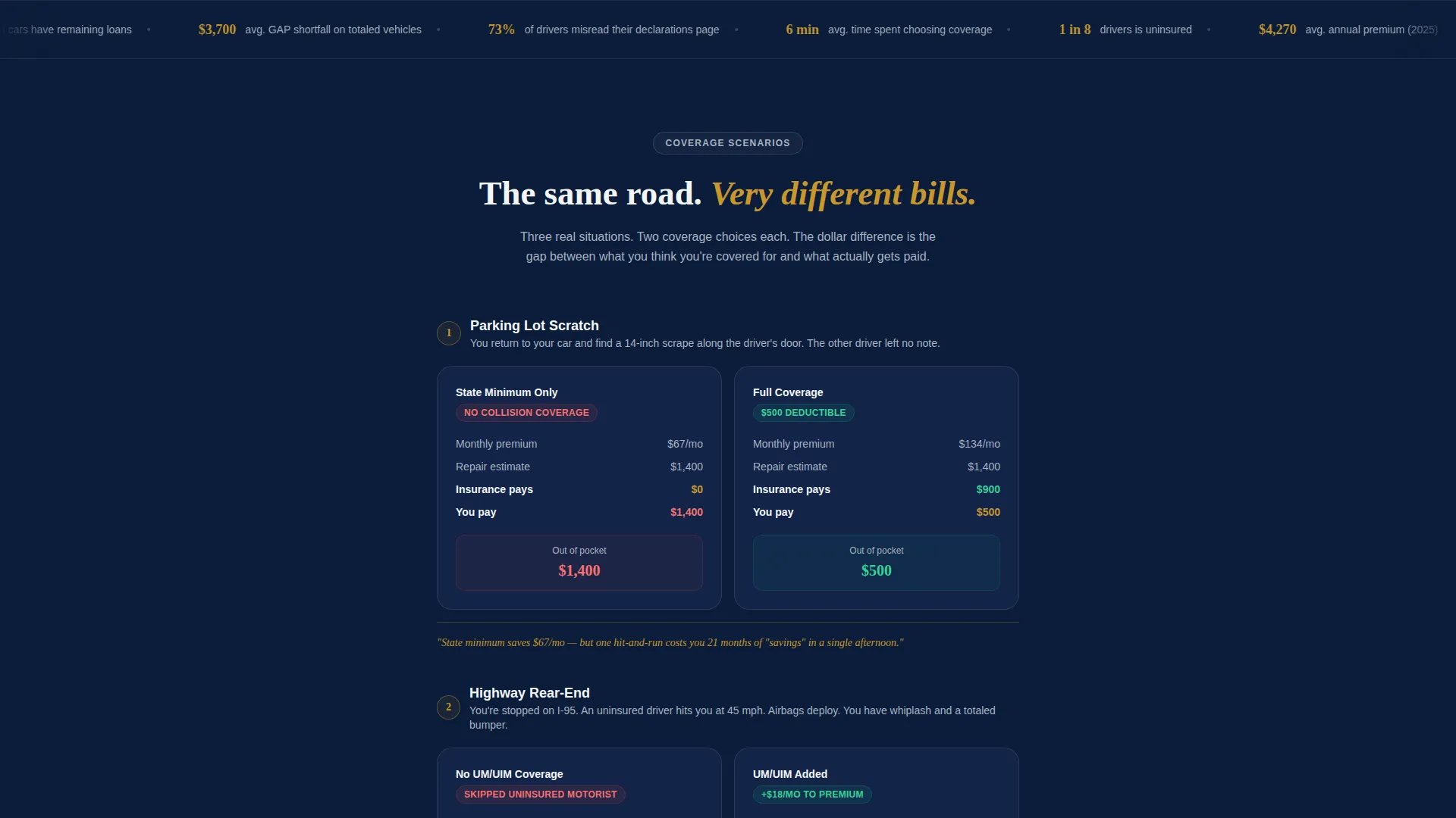
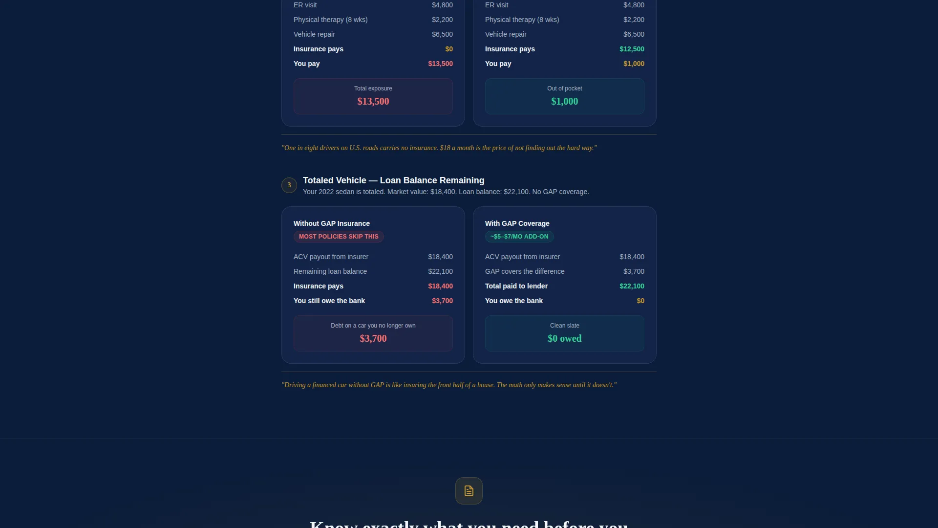
Each scroll section presents two coverage scenarios stacked in a single column. The template covers state minimum versus full coverage, a $500 deductible versus a $1,000 deductible, and the financial impact of skipping uninsured motorist protection. Stakes escalate across scenarios: a parking lot scratch, a highway rear-end collision, and a totaled vehicle with a remaining loan balance. Every scenario closes with a one-line verdict rendered in verdict gold.
Dual Conversion Path
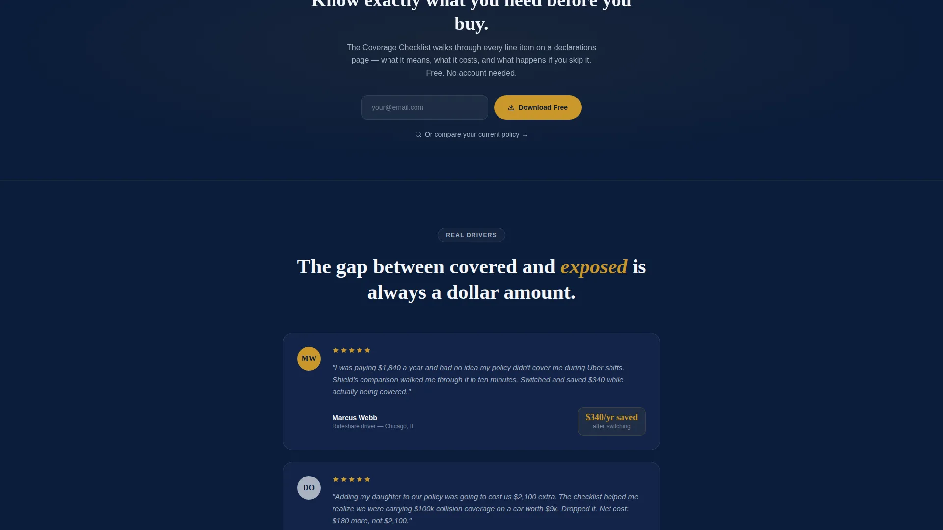
The primary call to action reads "Download the Coverage Checklist" and appears first after the third comparison scenario, then again at the page bottom. The form requires only an email address, keeping friction at its lowest. A secondary path labeled "Compare Your Current Policy" links to an interactive quiz that walks through a declarations page line by line.
Plain-Language Coverage Explanations
Deductibles, liability limits, and uninsured motorist clauses are presented in plain language throughout the comparison cards. No policy jargon, no forty-page documents. The copy style mirrors what a trusted agent would explain on a napkin: the math, the tradeoff, and the real-world outcome.
Verdict Gold Highlight System
Verdict gold (#C9962B) is used exclusively for calls to action, key statistics, and one-line scenario verdicts. This deliberate restraint gives the color meaning every time it appears. When a visitor sees gold, they know something important is being surfaced.
Page sections overview
| Section | Purpose |
|---|---|
| Animated Counter Header | Opens with the $4,270 average annual cost and fades in a headline to prompt scroll |
| Policy Icon Reveal | Introduces liability, collision, and comprehensive icons with a gentle pulse animation |
| Comparison Scenario One | Contrasts state minimum and full coverage using a parking lot scratch scenario |
| Comparison Scenario Two | Shows deductible tradeoffs ($500 versus $1,000) using a highway rear-end collision |
| Comparison Scenario Three | Demonstrates uninsured motorist risk with a totaled vehicle and remaining loan balance |
| Primary call to action Block | Places the checklist download form after the third scenario with a single email field |
| Secondary Quiz Link | Offers a declarations-page quiz as an alternative path for more engaged visitors |
| Bottom call to action Anchor | Repeats the checklist offer at page bottom for visitors who scroll all the way through |
Design & branding system
The palette is called Navy Authority, and every color carries a specific role. The system feels institutional enough to handle serious financial decisions but warm enough to keep visitors reading.
- Deep command navy (#0B1D3A) anchors backgrounds, echoing the weight of a policy binder
- Steel-badge silver (#A8B2C1) handles secondary text and divider lines for visual breathing room
- Courtroom white (#F4F6F9) fills content panels so text stays sharp and readable
- Verdict gold (#C9962B) is reserved strictly for calls to action, key statistics, and scenario verdicts
Mobile & speed optimization
The single-column layout is a natural fit for mobile screens. Stacked cards and a linear scroll flow translate directly from desktop to phone without restructuring. The template is built to perform across devices.
- Stacked comparison cards reflow cleanly on smaller screens without side-by-side breakpoints
- The single-field email form stays thumb-friendly and low-friction on mobile
- Animated elements like the counter and trend line are designed to feel smooth rather than heavy
How this template helps you convert
Shield earns the conversion by giving value first. The visitor learns something real before they ever see a form. By the time the call to action appears, they already feel the gap between what they know and what they are actually covered for.
- The escalating comparison journey creates genuine awareness of coverage risk, making the checklist feel like a useful tool rather than a lead magnet
- The dual conversion path respects different visitor intents: those who want a quick resource can grab the checklist, while more engaged visitors can take the interactive quiz
Other information about this template
Shield sits inside the Finance and Insurance category under the Insurance Company subcategory. It is purpose-built for the auto insurance niche and carries a Legal Shield theme throughout its visual identity.
- The template style is Single Column Flow, keeping the reading experience linear and intentional
- The creative direction is Comparison Journey, meaning every scroll section is structured around a question, a comparison, and a consequence
- The header concept is Data Storytelling, leading with a real number rather than a stock image
- The landing page direction is Content and Resource, meaning the page is designed to educate before it asks for anything
- The color system is Navy Authority, with each of the four palette colors assigned a strict functional role
- This template is well suited to publishers, content marketers, and insurance educators who want a page that builds credibility through transparency rather than promotional claims
Theme
Legal Shield
Creative direction
Comparison Journey
Color system
Navy Authority
Style
Single Column Flow
Direction
Content/Resource
Page Sections
Animated Data Counter Header
Scrollable Comparison Journey
Dual Conversion Path
Plain-language Coverage Cards
Verdict Gold Highlight System
Related questions
What kind of business is this template built for?
Can I use this template for a quote-focused page instead of a resource hub?
What coverage topics does the comparison journey cover?
How many form fields does the email capture require?
What does the animated header actually show?



