Summer Camp Safety & Liability Landing Page Template
Shield is an editorial-style landing page template built for summer camp safety and liability professionals. It walks visitors through incident response protocols, insurance gap analysis, and compliance exposure in a structured, magazine-feature layout. The design pairs authoritative typography with a restrained legal color palette, guiding camp directors, parents, and nonprofit board members toward a clear next step.
by Rocket studio
Quick summary
Shield is a single-page, lead-generation landing page template built around summer camp incident response. It uses an editorial magazine layout to present liability protocols, insurance gap analysis, and case study walkthroughs in a calm, organized visual system. The template is designed to convert worried camp stakeholders into consultation leads or checklist downloads.
Who this template is for
This template is built for professionals operating at the intersection of camp administration and legal or insurance risk. It speaks directly to people who already understand the stakes and need a resource that matches their level of seriousness.
- Camp directors facing county health inspections or active incident reports
- Parents navigating a child injury where permission slips and medical releases are under scrutiny
- Nonprofit board members who have discovered compliance gaps in volunteer background check records
What problem this template solves
When a camp incident happens, the people responsible often have no clear protocol to follow and no single place to turn. The result is panic, scattered paperwork, and preventable liability exposure. This template solves the communication and conversion problem for services that help those people respond decisively.
- Visitors land mid-crisis and need immediate clarity, not a generic homepage
- Most camp safety pages bury the most important information behind generic branding
- The template structures urgency into a readable, trust-building scroll that qualifies leads while informing them
What you get with this template
You get a fully structured, editorial-style landing page with every key section pre-built and logically sequenced. The layout is ready to receive your content and serve a professional audience from the first scroll.
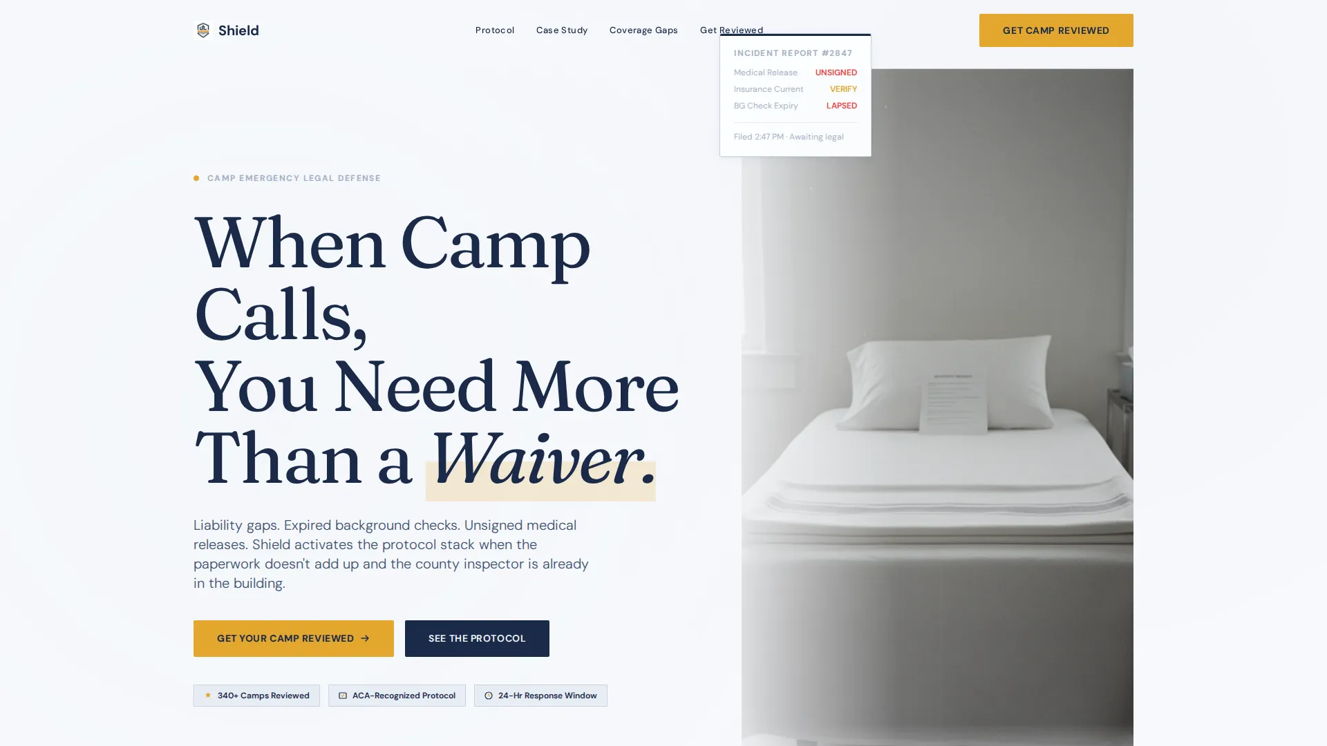
- A giant left-anchored headline section paired with a charged, minimal hero photograph placement
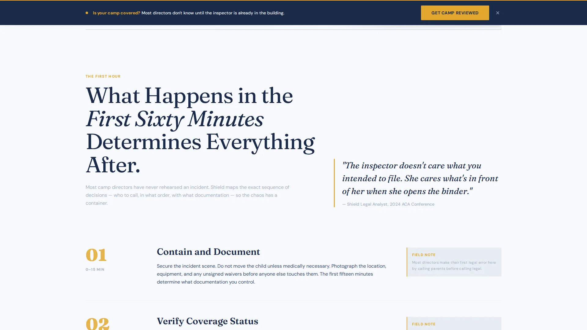
- A persistent bottom-bar call-to-action that activates after the second scroll section, plus a full-width form block after the case study
- A gated secondary conversion path offering a downloadable "Summer Camp Liability Checklist" captured behind a single email field
Feature list
This section breaks down the core functional components built into the Shield template.
Giant Headline Hero Section
The header uses a large, left-anchored serif headline occupying the left two-thirds of the viewport. The right third holds a single muted photograph placement. This layout immediately communicates authority and draws the reader into the content without relying on stock imagery of children or counselors.
Transparent Process Scroll Structure
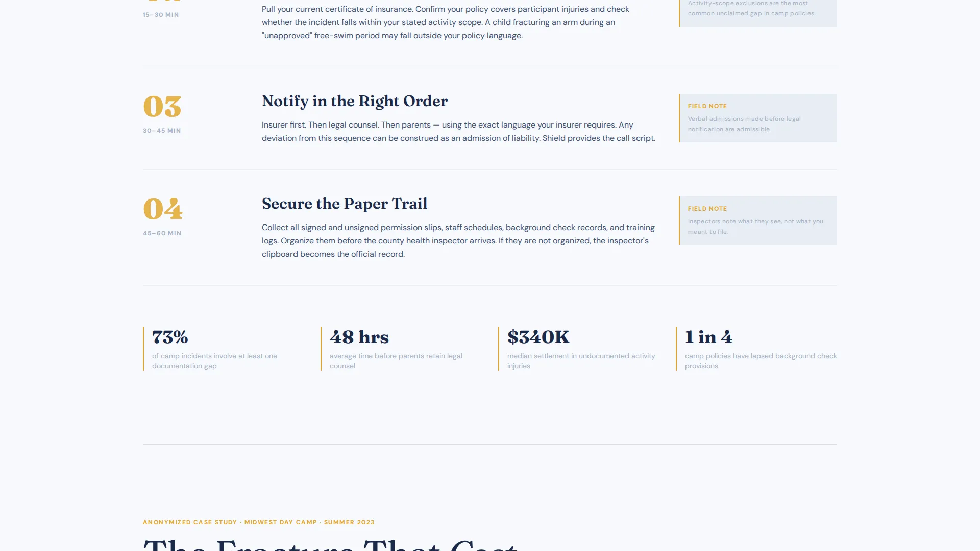
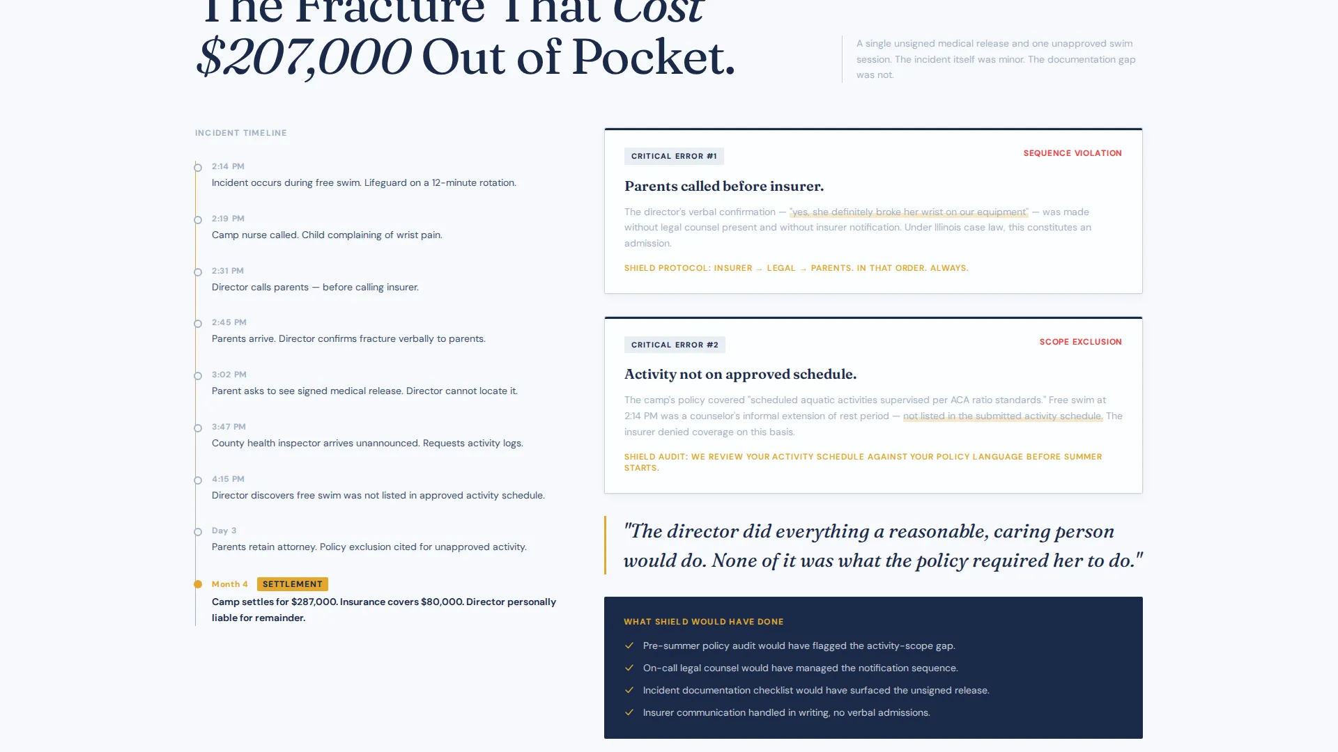
Each scroll section peels back one layer of the emergency response protocol. The first section maps the first sixty minutes after an incident. The next presents an anonymized case study with a left-gutter timeline. A third section breaks down insurance gaps using an annotated, redlined policy document layout. The scroll builds a methodical, evidence-first argument.
Dual Conversion Path System
The primary call-to-action, labeled "Get Your Camp Reviewed," appears as a persistent bottom bar after the second scroll section and again as a full-width form block. The form collects camp name, state, enrollment size, and an open-ended urgency qualifier. A secondary path offers the downloadable checklist gated behind email only.
Pull Quote and Annotation Layout
Editorial pull quotes and marginal annotations are built into the scroll sections. These design elements reinforce key points the way a senior attorney would highlight a contract clause. They keep readers engaged and help surface the most important liability details without overloading body paragraphs.
Amber-Accented call to action System
Emergency amber is used exclusively for calls-to-action and urgent callouts throughout the page. This restraint gives every amber element immediate visual weight. Visitors learn quickly that amber means action, which reinforces conversion clarity without visual noise.
Enrollment-Segmented Lead Form
The consultation form includes a dropdown for number of enrolled campers, segmented as under 50, 50 to 200, and 200 or more. An open field asks what prompted the visit. Together, these fields qualify lead intent and surface urgency in the visitor's own words, giving the service provider richer context before the first conversation.
Page sections overview
| Section | Purpose |
|---|---|
| Hero Headline Block | Anchors authority with serif headline and charged hero image |
| First 60 Minutes | Maps the immediate incident response protocol step by step |
| Anonymized Case Study | Presents a real-world timeline running down the left gutter |
| Insurance Gap Analysis | Breaks down coverage blind spots using annotated policy layout |
| Persistent Bottom Bar | Keeps "Get Your Camp Reviewed" call to action visible after scroll section two |
| Full-Width Lead Form | Collects camp details and open-ended urgency qualifier post-case study |
| Checklist Download Gate | Captures emails from visitors not yet ready for a consultation |
Design & branding system
The visual identity uses a legal brief aesthetic. The palette is intentionally restrained to signal expertise and calm under pressure, with a single warm accent reserved for the moments that require action.
- Colors: open-sky white (#F7F9FC) for backgrounds, soft storm gray (#A3B1C6) for section dividers and supporting elements, deep counsel navy (#1B2A4A) for all body text, and emergency amber (#E2A72E) used only for calls-to-action and urgent callouts
- Typography: large serif type for headlines communicates institutional authority; the scale of the Giant Headline Left treatment is the primary trust signal in the hero section
- Hover states shift interactive elements toward amber warmth, reinforcing the visual hierarchy without adding new colors to the system
Mobile & speed optimization
The editorial layout is built to remain readable and structured across screen sizes. Hierarchy and conversion paths are preserved whether a visitor is reviewing the page on a desktop late at night or on a phone during an active incident.
- The persistent bottom-bar call to action adapts to mobile viewports so the primary conversion path is never lost on smaller screens
- Section dividers use thin storm-gray rules that render cleanly at all sizes without adding visual weight
- The left-gutter timeline in the case study section is designed to reflow gracefully on narrower screens
How this template helps you convert
The Shield template is engineered around the emotional and practical state of its visitor. Every structural decision supports conversion by meeting people where their urgency already is.
- The scroll sequence builds a litigator-style case before the call-to-action appears, so by the time the form is visible the visitor has already internalized their own exposure and is motivated to act
- The dual conversion path catches two distinct intent levels: those ready for a consultation and those who need to start with a resource, keeping neither group without a clear next step
Other information about this template
Shield fits within the Editorial Magazine theme and uses the Cloud Canvas color system, which keeps the page feeling like printed legal reference material rather than a digital sales page. The template follows a Comparison Table structure in its insurance gap section, allowing side-by-side presentation of covered versus uncovered scenarios. The creative direction is grounded in Transparent Process storytelling, which is particularly effective for professional services audiences who are skeptical of surface-level claims.
- The template theme and style are aligned with the intersection category of Summer Camp Marketing within Professional Services
- The header concept draws from a Testimonial Card sensibility, using the weight of real-scenario framing rather than fabricated social proof
- The Click-Through and Lead Generation directions work in parallel here: the checklist download functions as a soft click-through path while the consultation form is a direct lead capture
Theme
Editorial Magazine
Creative direction
Logo Wall Authority
Color system
Cloud Canvas
Style
Comparison Table
Direction
Click-Through
Page Sections
Giant Headline Hero with Charged Image
Transparent Process Scroll Sequence
Dual Conversion Path System
Enrollment-segmented Lead Form
Pull Quote and Annotation Design
Amber-accented Call to Action Hierarchy
Related questions
Who is this landing page template designed for?
Does the template support two different conversion paths?
What information does the lead form collect?
How does the scroll structure guide visitors toward action?
Is this template suitable for a nonprofit camp board?



