Martial Arts School Marketing Professional Website Template
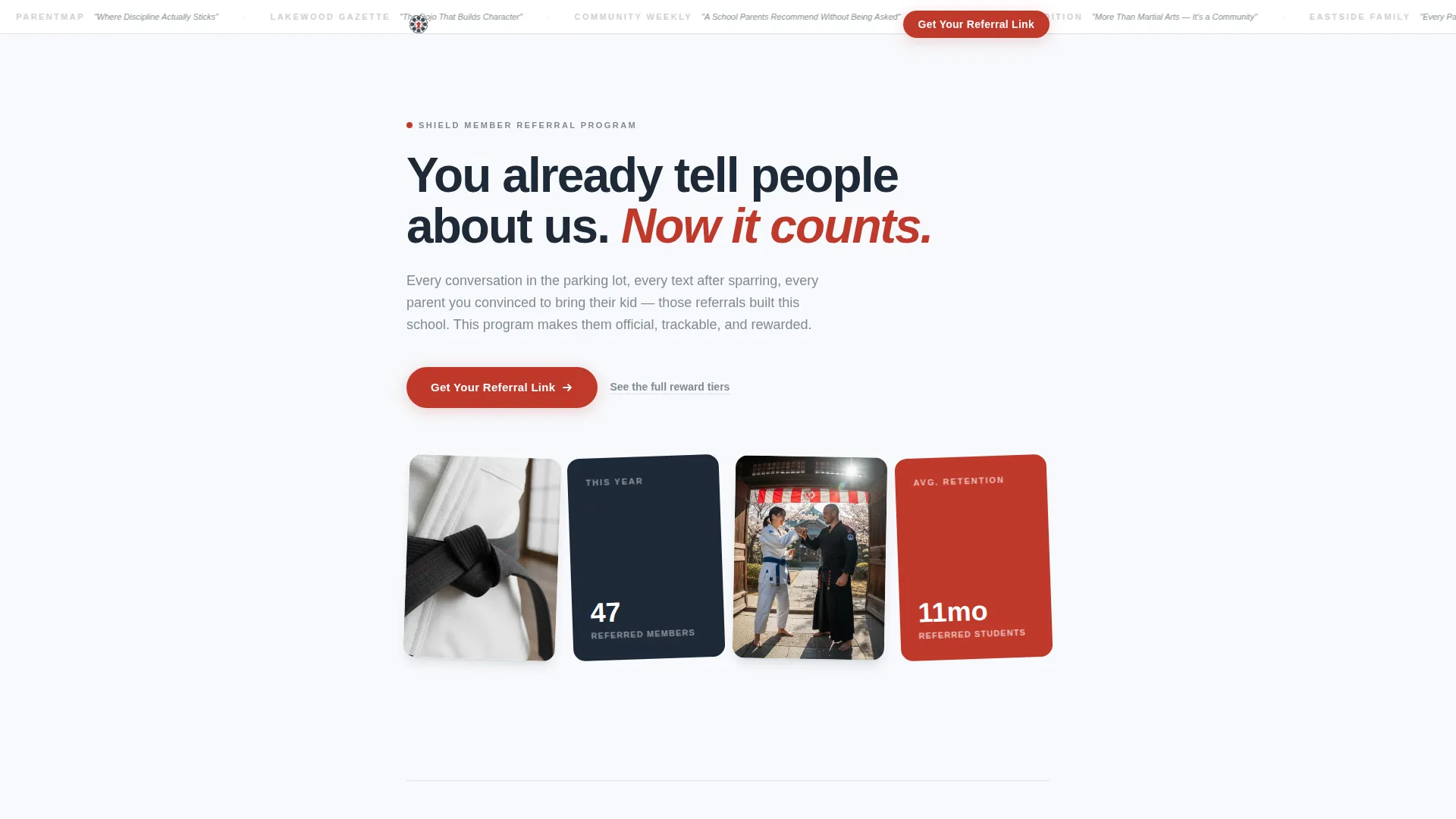
Shield is a single-column referral landing page built for martial arts schools. It targets existing members and turns their natural word-of-mouth into a structured referral program. The page uses press credibility, real member stories, and a near-zero-friction click-through to a referral portal, all wrapped in a clean Arctic White visual identity that feels authoritative and earned.
by Rocket studio
Quick summary
Shield is a focused, single-column landing page for a martial arts school referral program. It is built for current members who already recommend the school and gives that habit an official home. The design is clean, the copy is direct, and the path to action requires almost no effort from the visitor.
Who this template is for
This template is built for martial arts school owners and program directors who want to activate the members they already have. If your school grows through conversations and personal recommendations, this page gives that process a real structure.
- Current members who are natural advocates: parents, adult students, and teens who already talk about the school
- School operators running a referral incentive program with reward tiers and a dedicated portal
- Dojo marketing teams that want a credible, low-friction page to send members directly to
What problem this template solves
Word-of-mouth referrals happen constantly at most martial arts schools, but they often go untracked and unrewarded. Members have no single place to go when they want to share the school officially. This template solves that gap by giving the referral habit a clean, credible destination.
- Members lack a clear starting point, so referral momentum is lost after the conversation
- Without documented stories and visible rewards, referral feels informal rather than meaningful
- A heavy form or cluttered page kills intent before the member ever clicks
What you get with this template
You get a complete, ready-to-customize single-column landing page designed around one goal: getting a member to click and enter the referral portal. Every section earns that click before asking for it.
- A scrolling press mentions banner at the top that establishes school credibility immediately
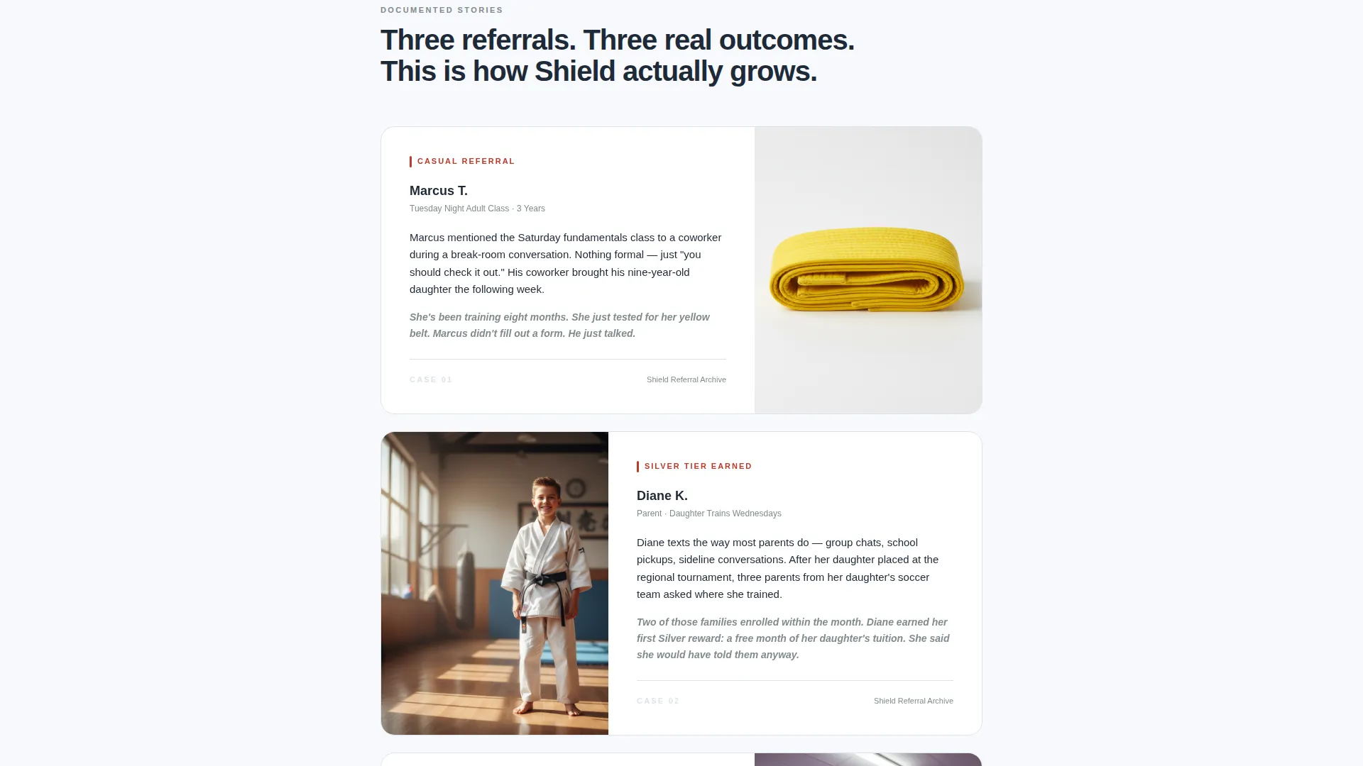
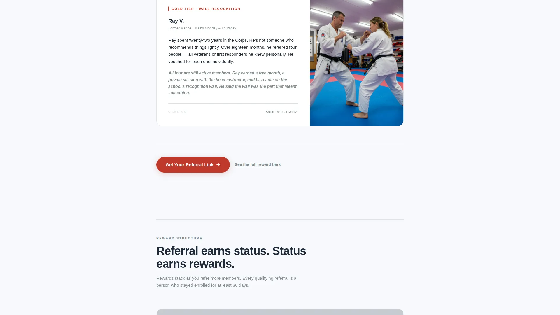
- Three structured case study narrative blocks that document real referral stories with outcome details
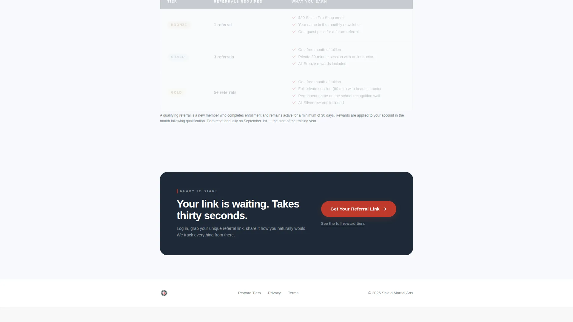
- Three placements of the primary call-to-action button and a reward tier table anchored by secondary text links
Feature list
The following features are built directly into the Shield template layout and visual system.
Scrolling Press Mentions Banner
A horizontal scroll banner sits at the top of the page displaying desaturated logo marks and pull-quote excerpts from local news outlets, parenting blogs, and community publications. The logos render in slate gray to add institutional weight without visual clutter. This component immediately signals that the school has been covered and recognized publicly.
Case Study Narrative Blocks
Three referral stories appear in sequence as the visitor scrolls. Each story follows a three-beat structure: who referred, who joined, and what changed. A small detail photo accompanies each block, showing a belt knot, a signed waiver, or a fist bump at the door. The final case study shows the full reward outcome, including a free month, a private session, and wall recognition.
Triple Call-to-Action Placement
The primary button labeled "Get Your Referral Link" appears three times across the page: directly below the press banner, after the second case study, and as a fixed bottom bar on mobile screens. This placement strategy keeps the action accessible without the page feeling pushy.
Secondary Reward Tier Link
A text link reading "See the full reward tiers" sits below each primary call-to-action button. Each link anchors to a clean table at the bottom of the page that displays bronze, silver, and gold referral levels side by side. This gives curious members a reason to keep reading without interrupting the main conversion flow.
Arctic White Design System
The layout uses a strict four-color palette: clinical frost white for all backgrounds, disciplined charcoal for body copy, belt-stripe red reserved exclusively for calls to action and earned-status indicators, and calm slate for secondary text and divider lines. The result is a page that feels pressed and official, the way a freshly issued credential card feels in your hand.
Click-Through Architecture
There is no form on this page. The entire layout functions as a click-through, pushing members into the school's existing referral dashboard where their unique link and reward tier live. Friction is kept near zero by design, and the page earns the click through layered credibility rather than urgency tactics.
Page sections overview
| Section | Purpose |
|---|---|
| Press Mentions Banner | Opens with scrolling publication logos and pull-quotes to establish school credibility |
| Opening Hook Line | Single charcoal headline anchoring the referral invitation without imagery |
| Case Study One | Documents the first referral story in three beats with a small detail photo |
| Primary call to action Block | First placement of the "Get Your Referral Link" button with secondary tier link |
| Case Study Two | Documents the second referral story, building cumulative social proof |
| Mid-Page call to action Block | Second placement of the primary button after the second case study |
| Case Study Three | Final story showing the full reward outcome for an active referrer |
| Reward Tier Table | Clean bronze, silver, and gold table anchored by secondary text links above |
| Fixed Mobile call to action Bar | Persistent bottom bar on mobile with the primary button always visible |
Design & branding system
The Shield template follows a Legal Shield visual theme built on the Arctic White color system. Every design decision reinforces a single feeling: official, earned, and worth taking seriously. Nothing competes with the content.
- Four-color palette: frost white (#F7F9FC) for backgrounds, disciplined charcoal (#1E2A38) for body copy, belt-stripe red (#C0392B) for calls to action and status markers only, and calm slate (#7F8C8D) for secondary text and dividers
- Red appears sparingly across the page, the way a stripe appears on a belt, only at points of real significance
- No stock photography of fighters, no action imagery; visual interest comes from small documentary detail photos paired with each case study
Mobile & speed optimization
The single-column layout is inherently mobile-friendly and requires no complex reflow across breakpoints. The template is built to perform cleanly on the devices most members use to check messages after class.
- The fixed bottom call-to-action bar on mobile keeps the primary button reachable at all times without scrolling back up
- The press mentions banner is built as a horizontal scroll component that transitions smoothly on touch screens
- Single-column flow means every section stacks naturally, keeping the reading experience consistent on any screen size
How this template helps you convert
Shield converts by removing every reason a willing member might hesitate. The page is designed to feel like a natural continuation of a conversation that already happened in the parking lot or after sparring.
- Credibility is established before the ask: press mentions and real case studies do the heavy lifting before any button appears, so the click feels earned rather than requested.
- The reward structure is visible but not the headline: the tier table lives at the bottom, anchored by subtle text links, so members are drawn to it by curiosity rather than pushed by a sales pitch.
- Near-zero friction closes the gap: with no form on the page and a click-through directly into the referral portal, the gap between intention and action is as small as the template can make it.
Other information about this template
Shield is categorized under Professional Services, specifically Martial Arts School Marketing, with a niche focus on referral program pages for active dojo communities. The template is part of a broader collection of single-column flow pages designed for service businesses where trust and community reputation do the selling.
- The template style is Single Column Flow, making it straightforward to publish, edit, and hand off to a school administrator with no design background
- The theme draws from the Legal Shield visual language, which prioritizes institutional clarity over decorative style
- The click-through direction means the page is designed to work alongside an existing referral portal or member dashboard, not replace it
- This template fits schools that already have a referral reward program in place and need a credible, member-facing entry point for it
Theme
Legal Shield
Creative direction
Case Study Narrative
Color system
Arctic White
Style
Single Column Flow
Direction
Click-Through
Page Sections
Scrolling Press Mentions Banner
Three-beat Case Study Blocks
Triple Call-to-action Placement
Anchored Reward Tier Table
Click-through Architecture
Arctic White Visual System
Related questions
Does this template include the referral portal or member dashboard?
Can I replace the case study stories with real examples from my school?
Is there a form members need to complete on this page?
How does the reward tier table appear in the page layout?
Who is this landing page template best suited for?



