Government Consulting Landing Page Template
Shield is a government consulting landing page template built for compliance and audit remediation firms serving public-sector agencies. It pairs a monumental centered headline with a logo wall, side-by-side comparison tables, and single-stat callouts to communicate authority fast. The design uses a slate, gray, sky-blue, and parchment palette that reads like a federal briefing document, structured, credible, and built to earn the click.
by Rocket studio
Quick summary
Shield is a single-page, click-through landing page template for government operations consultancies. It leads with a bold full-viewport headline, establishes credibility through a logo wall, and builds the case for engagement through structured comparison tables. Every visual and copy element is designed to help agency leaders recognize their own situation and request a capabilities deck.
Who this template is for
Shield is made for consultancies that serve public-sector clients on high-stakes compliance and audit work. If your firm operates behind the scenes before a government agency goes public with a remediation announcement, this template speaks your language.
- Compliance and audit remediation firms working with city, state, or federal agencies
- Government operations consultancies offering policy overhaul and restructuring services
- Newly positioned practices targeting agency directors, city managers, and compliance officers
What problem this template solves
Government consulting firms often struggle to communicate the depth of their experience on a single page. A generic professional services layout does not convey the institutional weight that public-sector buyers expect before they request a meeting.
- Visitors from government agencies need to see pattern recognition, not a features list
- Comparison-based proof is more persuasive than written claims for risk-aware buyers
- The page must earn a qualified click without asking for commitment too early
What you get with this template
Shield delivers a fully structured, single-page layout that guides a government agency leader from first impression to a confident click toward a gated case study library. Every section is mapped to a specific trust-building job.
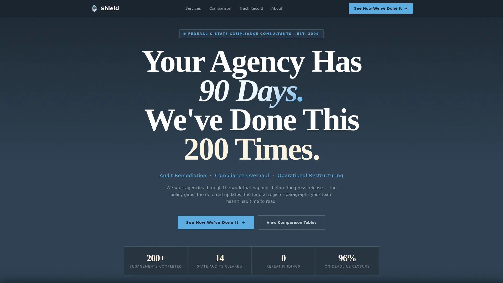
- A full-viewport centered headline block with institutional-weight typography
- A horizontal logo wall band for immediate social proof before any body copy
- Two comparison tables contrasting in-house-only outcomes against outcomes with your firm
- Single-stat callout blocks placed between tables to reinforce track record
- A primary call-to-action button and a fixed bottom call-to-action bar for persistent access
Feature list
Shield brings together purpose-built layout components, each chosen to serve the specific way government agency buyers evaluate outside consultants.
Monumental Centered Headline Block
The header section fills the full viewport with stark white serif type on deep charcoal. The headline "Your Agency Has 90 Days. We've Done This 200 Times." communicates urgency and authority in a single glance. A sky-blue subline beneath it names the three core service pillars.
Horizontal Logo Wall Band
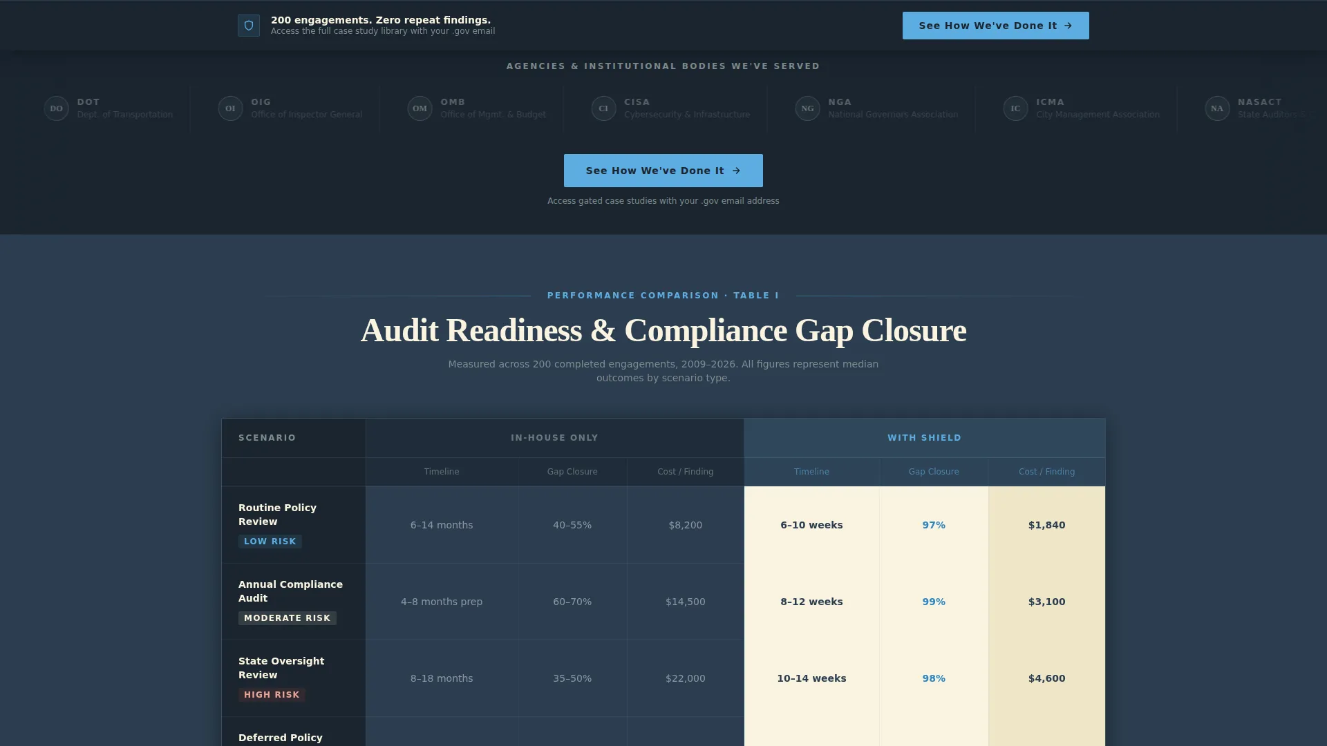
Immediately below the header, a row of government seals, agency acronyms, and institutional logos appears in muted grayscale. This section establishes credibility before a single body claim is made, using institutional recognition as a trust signal.
Side-by-Side Comparison Tables
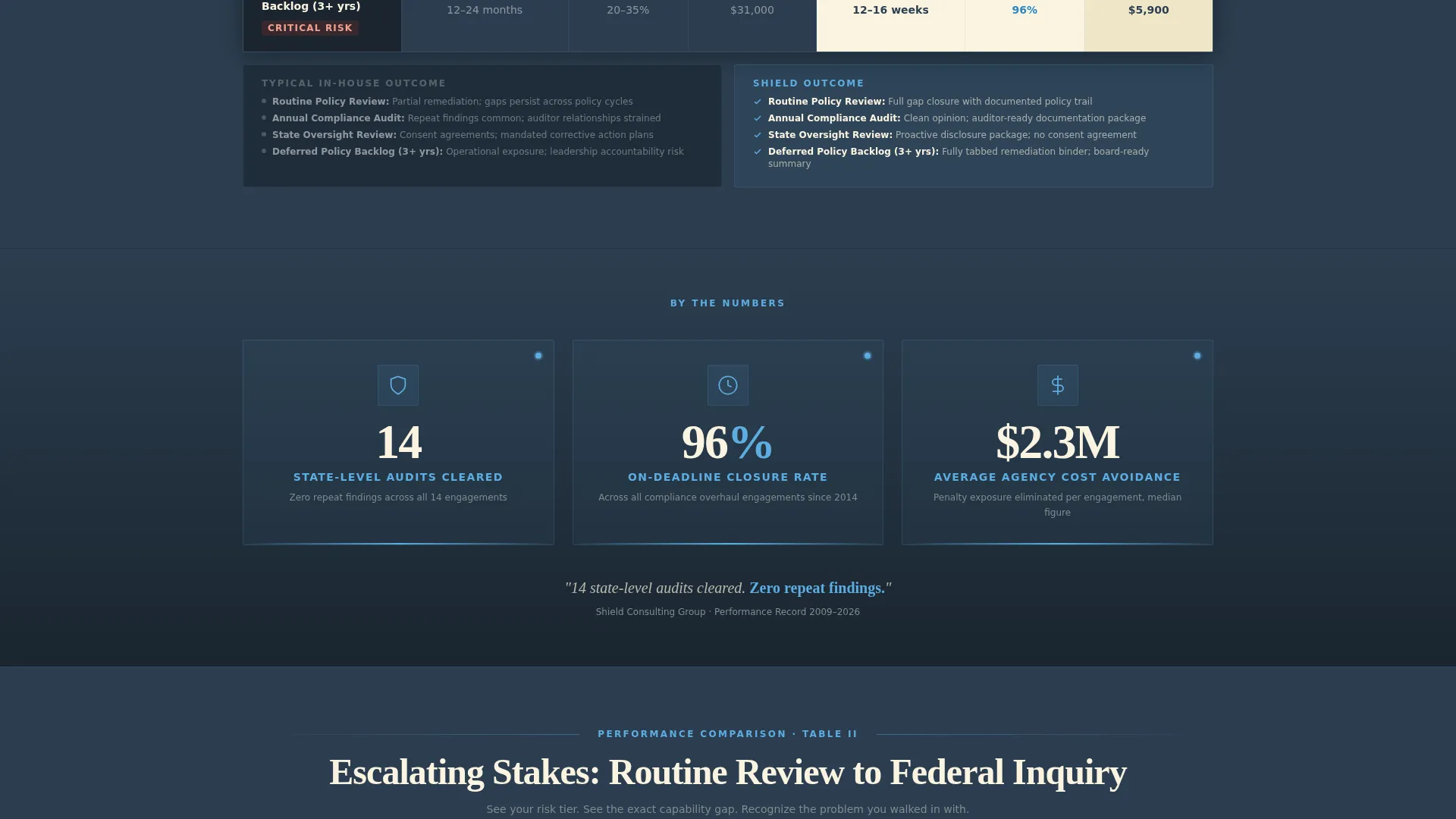
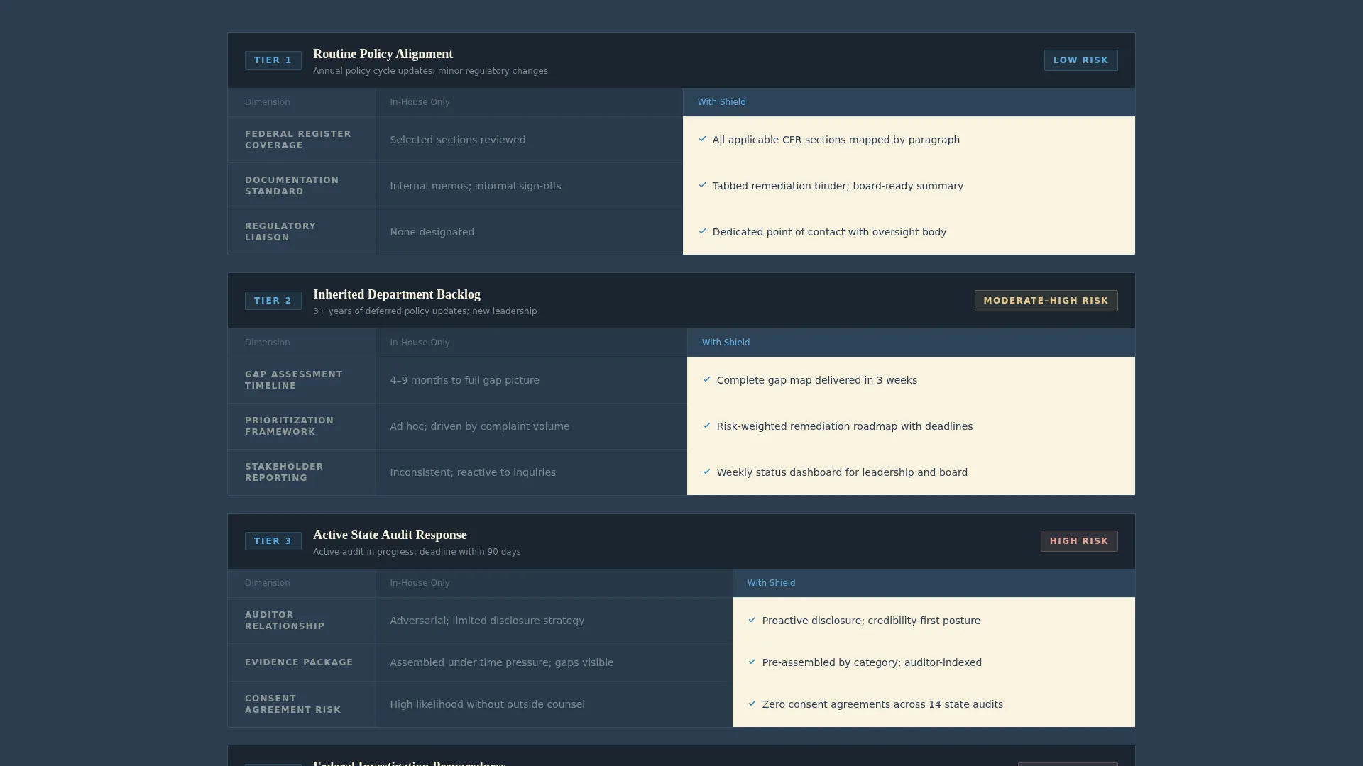
Two structured tables contrast "In-House Only" against "With Shield" across metrics like audit readiness timelines, compliance gap closure rates, and cost-per-finding figures. Each row escalates from routine policy review to federal investigation preparedness, reflecting the visitor's own risk level back at them.
Single-Stat Callout Blocks
Between the comparison tables, individual sky-blue stat blocks surface headline proof points. An example callout reads: "14 state-level audits cleared. Zero repeat findings." These blocks break up the data while reinforcing the firm's track record.
Dual Call-to-Action Placement
The primary call-to-action "See How We've Done It" appears first beneath the logo wall. It reappears as a fixed bottom bar after the second comparison table. This persistent placement keeps the next step visible without interrupting the reading flow.
Gated Case Study Click-Through Path
The template is optimized as a click-through page. There is no form on this page. Both calls-to-action point to a separate gated case study library where the visitor exchanges a government-issued email address for access to detailed documentation.
Page sections overview
| Section | Purpose |
|---|---|
| Full-Viewport Header | Establishes urgency and authority with a monumental centered headline |
| Service Pillars Subline | Names the three core service areas in sky blue beneath the headline |
| Logo Wall Band | Builds institutional credibility through grayscale seals and agency identifiers |
| Primary call to action Button | Moves qualified visitors toward the capabilities deck immediately after the logo wall |
| First Comparison Table | Contrasts in-house-only versus with-Shield outcomes on audit and compliance metrics |
| Mid-Page Stat Callout | Reinforces track record with a single bold proof-point between the two tables |
| Second Comparison Table | Escalates risk scenarios from routine review to federal investigation preparedness |
| Fixed Bottom call to action Bar | Keeps the primary action persistently accessible after the second table |
Design & branding system
The Slate and Sky color system is the visual backbone of Shield. The palette reads like the exterior of a federal building at early morning: stone, sky, and parchment, each tone earning its place through function rather than decoration.
- Deep charcoal slate (#2C3E50) dominates backgrounds and primary text to project permanence and institutional weight
- Open-sky blue (#5DADE2) activates calls-to-action, progress indicators, and trust-signal callouts to draw the eye without disrupting the formal tone
- Constitutional parchment white (#FAF3E0) opens up comparison table cells so data stays readable and never feels dense
- Institutional corridor gray (#7F8C8D) supports secondary text, logo wall tones, and table row separators
- Typography uses wide-set, serifed display lettering in the header for a courthouse-lintel quality, paired with clean body type throughout
Mobile & speed optimization
Shield is structured to remain readable and functional on smaller screens. The layout prioritizes clarity of information hierarchy so agency professionals reviewing the page on a mobile device can navigate the comparison tables and reach the call-to-action without friction.
- The centered headline block and subline stack cleanly on narrow viewports without losing visual impact
- Comparison tables are formatted to scroll horizontally on small screens, keeping column data intact
- The fixed bottom call-to-action bar remains visible on mobile so the primary next step is never out of reach
How this template helps you convert
Shield is built as a click-through landing page with one conversion goal: move a qualified government agency leader to request access to the capabilities deck. Every layout decision supports that single outcome.
- The logo wall triggers immediate recognition before the visitor reads a single claim, reducing skepticism early in the scroll
- The comparison tables surface the visitor's own risk level in concrete, measurable terms, creating a sense of recognition rather than persuasion
- The fixed bottom call-to-action bar ensures the next step is always one tap away, so a visitor who finishes reading never has to scroll back up to act
Other information about this template
Shield is a strong fit for government operations consulting practices that need a landing page with the weight and structure of a federal briefing document. A few additional details worth knowing before you use it.
- The Legal Shield theme is the design concept driving the visual language: authority through structure, not decoration
- The Slate and Sky color system was chosen specifically to evoke institutional settings and earned credibility
- The Logo Wall Authority creative direction means the page leads with client recognition, not with copy
- The template is categorized under Professional Services, Government Consulting, making it relevant for firms targeting city managers, agency directors, and compliance officers
- No imagery or ornamental graphics appear in the header; the whitespace and typography carry the entire first impression
- The gated click-through path is designed so the landing page itself never asks for contact information directly
Theme
Legal Shield
Creative direction
Logo Wall Authority
Color system
Slate & Sky
Style
Comparison Table
Direction
Click-Through
Page Sections
Monumental Centered Headline Block
Horizontal Logo Wall Band
Side-by-side Comparison Tables
Single-stat Callout Blocks
Dual Call-to-action Placement
Gated Click-through Path
Related questions
What type of consultancy is this template designed for?
Does this template include a contact form?
Can I customize the comparison table rows for my specific services?
How many calls-to-action does the template include?
Is this template suitable for firms working across multiple agency types?



