Senior Life Insurance Landing Page Template
Shield is a dark, data-driven landing page template built for senior life insurance providers. It combines a Bloomberg-terminal aesthetic with a guided five-step qualification quiz, interactive plan comparison grids, and animated data widgets. Designed for adults 75 and older and their adult caregivers, it builds trust through transparent numbers before asking for contact details.
by Rocket studio
Quick summary
Shield is a single-page senior life insurance template built around two core ideas: show the data first, then ask for the lead. It opens with a radial-glow hero, moves through interactive plan comparison grids, and closes with a five-step qualification quiz that reveals eligibility estimates before requesting an email address.
Who this template is for
This template is designed for life insurance providers who serve older adults and their families. It works particularly well when the product is guaranteed issue or no-medical-exam coverage, and when the sales process depends on earning trust before collecting contact information.
- Senior life insurance providers targeting adults aged 75 and older
- Insurance agents serving surviving spouses, veterans, or fixed-income households
- Adult children in their late forties who are managing a parent's insurance decisions
What problem this template solves
Most insurance landing pages ask for personal information before they offer anything useful. That friction kills conversions with older audiences who are already skeptical. Shield reverses the sequence entirely.
- Visitors see plan comparisons and eligibility previews before any form appears
- The quiz reduces anxiety by explaining options in plain, non-technical language
- The authoritative visual design signals stability and reduces the "is this legitimate?" hesitation
What you get with this template
Shield delivers a fully structured single-page layout with five distinct sections, each serving a specific role in the conversion journey. Every component is built around the needs of an older audience and their caregivers.
- A radial-glow hero section with animated count-up data widgets and a bold qualifying headline
- An interactive three-plan comparison grid with age and coverage-amount selectors
- A five-step progressive qualification quiz that shows eligibility estimates before capturing an email
Feature list
This template includes several purpose-built components that work together to move a cautious visitor toward a confident decision.
Radial Glow Hero with Count-Up Widgets
The hero section opens on a full-bleed midnight navy background with a soft pulse-blue radial glow at center screen. Three dashboard-style widgets count up from zero, displaying key data points such as average approval time, acceptance rate without a medical exam, and coverage range. No photography is used. The effect feels like powering on a trusted financial system.
Interactive Plan Comparison Grid
Three plan types, Guaranteed Issue, Simplified Issue, and Graded Benefit, are displayed side by side in a data grid. Visitors select their age bracket and desired coverage amount at the top of the section, and the grid updates to reflect relevant monthly premiums, waiting periods, and payout structures. Each row highlights in pulse blue on hover, making the comparison feel active and personal.
Five-Step Qualification Quiz
The assessment walks visitors through five sequential screens: age bracket selection, a coverage amount slider from five thousand to twenty-five thousand dollars, a plain-language health status tier, a tobacco use toggle, and a beneficiary relationship dropdown. A glowing progress bar tracks position across all steps. Eligibility and estimated premium are shown before any contact information is requested.
Floating Call-to-Action Pill
A rounded pill-shaped call-to-action button reading "See What You Qualify For" appears at the bottom of the viewport after three seconds of scroll. It stays visible as the visitor moves through the page, providing a low-friction entry point into the quiz at any moment.
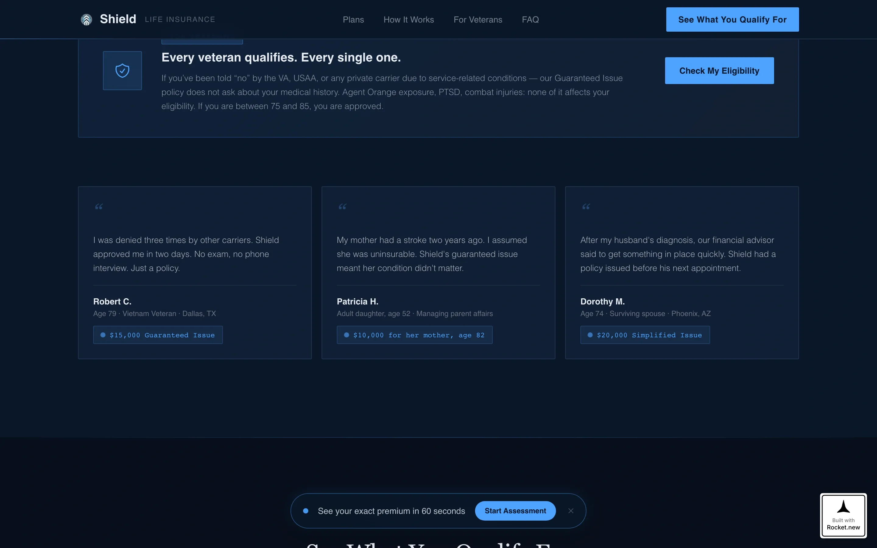
Social Proof and Trust Section
A dedicated section presents specific outcome numbers: approval rates, veteran acceptance callouts, and policy approval timelines. These figures are displayed as data points rather than testimonials, matching the terminal aesthetic and reinforcing the page's authoritative tone.
Page sections overview
| Section | Purpose |
|---|---|
| Hero with Glow | Opens with headline, radial glow, and count-up data widgets |
| Plan Comparison Grid | Lets visitors compare three plan types side by side |
| Qualification Quiz | Guides visitors through five steps to preview eligibility |
| Social Proof Block | Displays approval stats, veteran acceptance, and outcome numbers |
| Final Call to Action | Full-width terminal close with floating pill button |
| Footer | Single-row linear footer with essential links |
Design & branding system
Shield uses a Corporate Precision visual theme that draws from financial dashboard design. The palette is deliberately narrow and purposeful, with each color assigned a specific role so the layout never feels decorative or vague.
- Midnight navy (#0A1628) covers all full-bleed backgrounds and the hero section
- Policy-paper white (#E8ECF1) is used for data cell surfaces, card backgrounds, and readable text areas
- Steel slate (#3D5A80) handles secondary containers and divider rules between sections
- Pulse blue (#4DA3FF) is reserved exclusively for interactive elements, the progress bar glow, hover highlights, and the radial hero glow
Typography pairs DM Sans for all data labels, form fields, and interface elements with Fraunces for editorial headlines, creating a contrast between clinical precision and human warmth.
Mobile & speed optimization
Shield is designed desktop-first to match the financial advisor aesthetic its audience expects. Full mobile responsiveness is built in so the experience remains clear on smaller screens.
- The comparison grid stacks vertically on mobile, keeping plan data readable without horizontal scrolling
- The five-step quiz occupies one full screen per step on all device sizes, maintaining focus and reducing input errors
- Static sections use server-side rendering while interactive components like the quiz and comparison grid are handled as client-side elements
How this template helps you convert
Shield is structured around a single insight: older adults and their caregivers convert when they feel informed, not when they feel pressured. Every design and layout decision supports that principle.
- The quiz earns the lead by showing eligibility and a premium estimate before asking for an email address, so trust is already established at the moment of contact.
- The comparison grid lets visitors self-select their best plan option through interaction, which reduces the perceived sales pressure and increases confidence in the final choice.
Other information about this template
Shield is categorized under Finance and Insurance, specifically within the Senior Life Insurance niche. It is built for the United States market, using USD currency, American insurance terminology, and age brackets that match standard domestic underwriting structures.
- Template style: Dashboard and Data Grid, under the Corporate Precision theme
- Creative direction: Comparison Journey, guiding visitors from awareness to narrowed choice through stacked data grids
- Header concept: Dark Full-Bleed with Glow, no photography or stock imagery used anywhere
- Quiz direction: Assessment-led, with friction removed at the highest-trust moment before contact capture
- Localization: USA, USD, American senior demographics aged 75 through 85 and older


Theme
Corporate Precision
Creative direction
Comparison Journey
Color system
Midnight Blue
Style
Dashboard/Data Grid
Direction
Quiz/Assessment
Page Sections
Radial Glow Hero with Animated Data Widgets
Interactive Three-plan Comparison Grid
Five-step Qualification Quiz
Floating Call-to-action Pill
Social Proof and Trust Data Block
Corporate Precision Visual Theme
Related questions
Who is this template designed for?
Does the quiz require an email address upfront?
Can I adjust the plan types and pricing in the comparison grid?
What makes this template different from a standard insurance landing page?
Is this template suitable for agents who work with veterans?


