Insurance Agency Professional Website Template
Shield is a split-screen insurance agency landing page template built to turn anxious first-timers into confident app users. It follows a Problem→Solution Arc, replacing each familiar insurance headache with a clear in-app answer. The Slate & Sky color system and real product screenshots do the persuading before a word of copy is read.
by Rocket studio
Quick summary
Shield is a single-page, split-screen landing page template for an insurance agency that values plain language over fine print. It guides visitors from confusion to clarity through a structured Problem→Solution Arc, pairing real app screenshots with honest copy. Every scroll resolves a specific anxiety, and every call to action points toward one outcome: the app download.
Who this template is for
This template is built for insurance agencies and insurtech products that want to earn trust fast. It works especially well when the target audience arrives already stressed and needs to feel understood before they act.
- First-time homebuyers researching coverage options late at night
- Freelancers building their own benefits package without employer support
- Small business owners who received a quote they did not fully understand
What problem this template solves
Insurance landing pages often recreate the same confusion they are trying to solve. Dense comparison tables, jargon-heavy headlines, and generic stock photos of smiling families do not help a nervous buyer decide. Shield fixes that by showing the product at work, not just describing it.
- Visitors leave because they cannot quickly see what they get or why it matters
- Complex policy language makes the agency feel untrustworthy before the conversation starts
- Generic page designs fail to connect with buyers who have a specific, immediate fear
What you get with this template
You get a fully structured, single-page layout that guides the visitor through a deliberate emotional journey. The design does the heavy lifting so your copy only needs to confirm what the visuals already prove.
- A 50/50 split-screen layout with distinct left-panel and right-panel roles throughout every section
- A sticky bottom call-to-action bar that appears after the second scroll, with App Store and Google Play badge placements
- A secondary conversion path using a single phone number field for desktop visitors who prefer a text link
Feature list
This section walks through the core built-in capabilities of the Shield template, each grounded in the design and structure described in the brief.
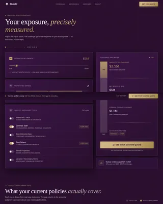
Split-Screen Problem and Solution Pairing
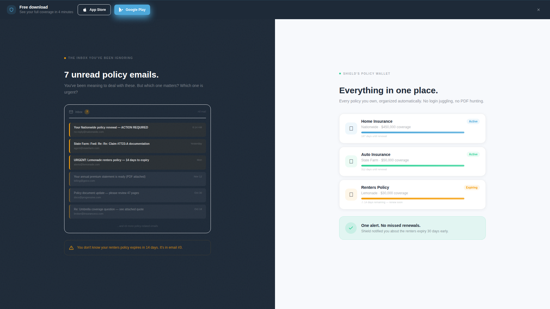
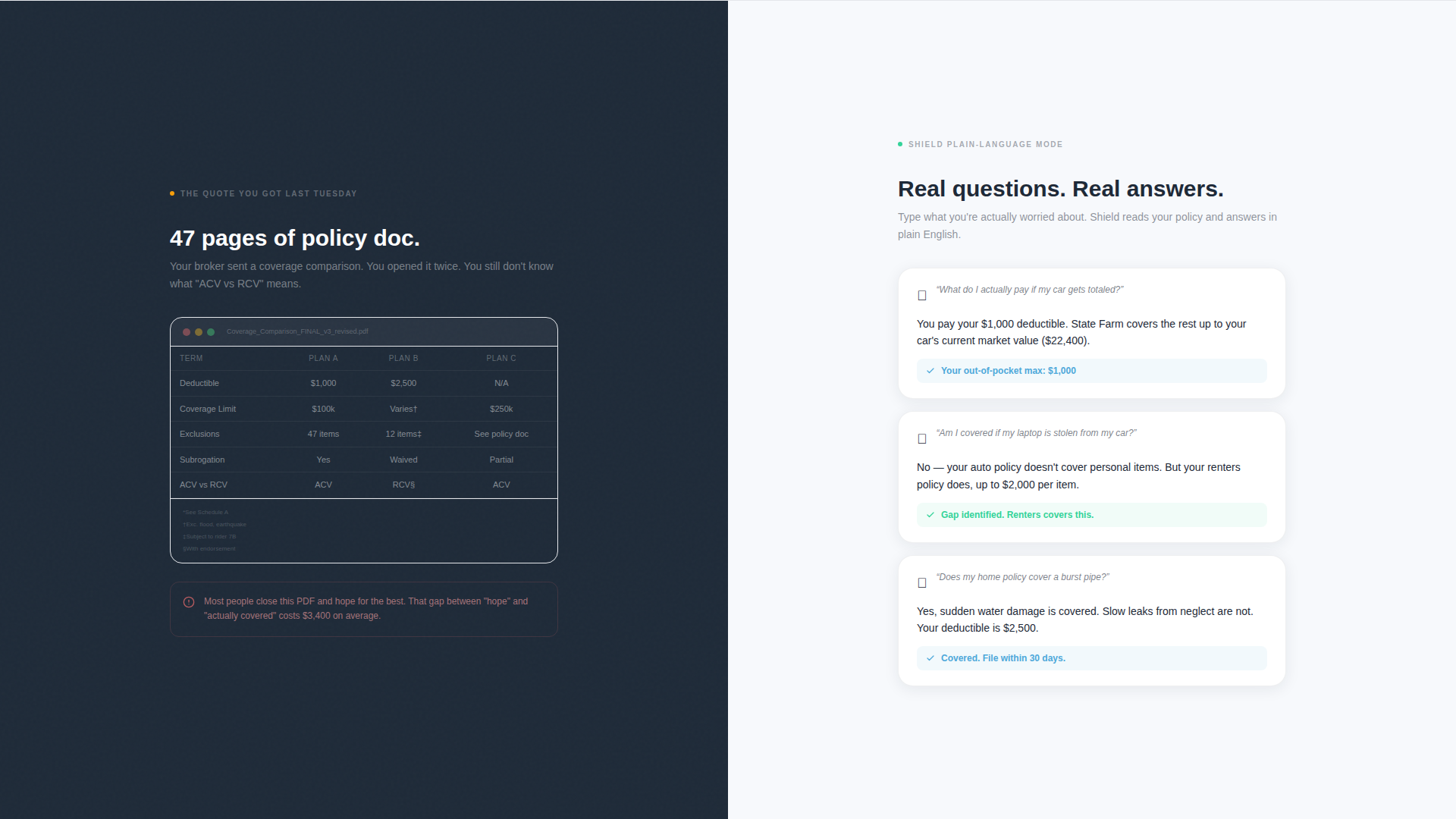
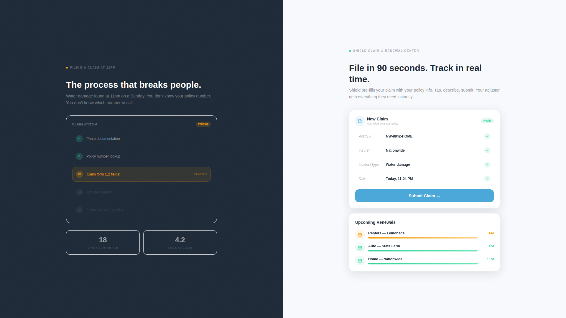
Each section of the page is divided into a left panel showing a familiar pain point and a right panel presenting the in-app solution. The sequence covers four specific anxieties: cluttered policy emails, confusing coverage comparisons, claim filing complexity, and renewal tracking gaps.
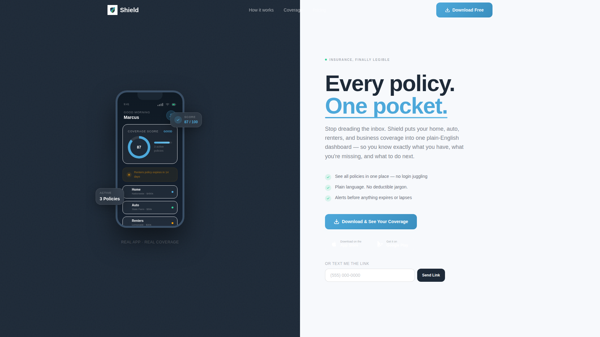
Product Screenshot Header
The header opens with a hand holding a mobile device against a dark slate background. The app screen shows three active policies, a coverage score of 87, and an amber alert for a renters policy expiring in 14 days. No stock photography is used. The product proves itself before the headline is read.
Primary and Secondary Download calls to action
The primary call to action reads "Download & See Your Coverage" and includes paired App Store and Google Play badges. It appears in the header and repeats as a sticky bottom bar after the second scroll. A secondary path offers "Text Me the Link" with a single phone number field for desktop visitors.
Startup Velocity Visual Theme
The template uses the Startup Velocity theme, which keeps layouts lean, purposeful, and fast-feeling. Every design decision reduces visual noise so the visitor's attention stays on the product and the next action.
Slate and Sky Color System
The palette uses four distinct roles: deep charcoal slate for left-panel backgrounds, open-sky blue for calls to action and interactive highlights, cloud-white for right-panel backgrounds, and signal green for checkmarks, savings callouts, and confirmation states.
Rhythmic Scroll Arc Structure
The page is structured so that tension builds then resolves with each section. Each scroll deeper replaces a normalized headache with an in-app fix, so by the time the visitor reaches the final call to action, the download feels like a logical next step rather than a commitment.
Page sections overview
| Section | Purpose |
|---|---|
| Header with App Screenshot | Opens with product proof and primary download call to action |
| Inbox versus. Policy Wallet | First problem/solution split: clutter versus organization |
| Coverage Comparison Split | Second split: jargon table versus plain-language breakdown |
| Claim Filing Section | Third split: filing anxiety versus in-app guided process |
| Renewal Tracking Section | Fourth split: missed renewals versus in-app alert system |
| Sticky Bottom call to action Bar | Persistent download prompt after second scroll |
Design & branding system
The Slate & Sky system gives every element a clear visual role. The palette is not decorative; each color carries meaning that reinforces the page's emotional arc.
- Deep charcoal slate (#1E2A38) anchors left panels, representing the complexity the visitor is leaving behind
- Open-sky blue (#4DA8DA) drives calls to action and interactive highlights, representing the clarity ahead
- Cloud-white (#F7F9FC) keeps right panels open and breathable, and signal green (#34D399) marks positive outcomes like checkmarks and savings callouts
Mobile & speed optimization
The template is designed around a mobile-first conversion goal. Since the primary action is an app download, the page is structured to work well on the devices most likely to complete that action.
- The sticky bottom call-to-action bar is sized and positioned for thumb-reach on smaller screens
- The "Text Me the Link" field gives desktop visitors a frictionless handoff to their mobile device
- The 50/50 split layout is built to reflow cleanly, keeping product screenshots readable at any viewport width
How this template helps you convert
The page earns the download by resolving doubt visually before asking for any action. Each layout decision is intentional and tied directly to conversion behavior.
- The product screenshot header shows real app user interface with real data in the first two seconds, replacing skepticism with recognition before the visitor reads a single word
- The Problem→Solution Arc means each scroll makes the app feel more personally relevant, so by the fourth section the visitor has seen their own problems solved and the download call to action feels like picking up a tool already left out for them
Other information about this template
Shield fits naturally into the insurance agency services space, where visual trust and plain-language communication are the two highest conversion levers. The template's structure supports a range of agency types, from single-product renters insurance apps to multi-line platforms covering home, auto, and commercial policies.
- The template is categorized under Technology and Insurance Agency Website Templates, making it well-suited for insurtech startups and digitally native agencies
- The niche alignment targets Insurance Agency Services Page use cases, where the visitor arrives with a question and needs both emotional reassurance and a clear next step
- The Startup Velocity theme pairs well with agencies positioning themselves as the modern, jargon-free alternative to traditional brokers
Theme
Startup Velocity
Creative direction
Problem→Solution Arc
Color system
Slate & Sky
Style
Split Screen (50/50)
Direction
App Download
Page Sections
Split-screen Problem and Solution Layout
Product Screenshot Hero Header
Primary App Download Ctas
Secondary Text-link Conversion Path
Startup Velocity Theme and Slate & Sky Palette
Rhythmic Scroll Arc Structure
Related questions
Who is the Shield template designed for?
What conversion paths does the template include?
Does the template use real product screenshots or stock photography?
How is the page structured to guide the visitor toward downloading?
Can the Slate & Sky color system be adjusted for a different brand?