Compliance Services | Free Website Template | Rocket
Shield is a zigzag landing page template built for done-for-you compliance services in the food, retail, and hospitality sectors. It guides anxious venue owners from a warm hero section through social proof, vertical-specific benefits, and a before-and-after comparison, then drives them to a pricing page with a single, confident call to action.
by Rocket studio
Quick summary
Shield is a single-page, click-through landing page template designed for compliance service businesses targeting independent café owners, boutique hotel managers, and multi-site retail operators. It uses a warm Dopamine Pop colour palette, an alternating zigzag layout, and a Network Effect visual device to build trust section by section and push visitors to a pricing page.
Who this template is for
This template is built for compliance service providers who want to convert worried venue owners into paying clients. It speaks directly to the anxiety of running a hospitality or retail business while staying on top of food safety paperwork, staff training records, and inspection readiness.
- Independent café and restaurant owners managing Hazard Analysis and Critical Control Points (HACCP) folders and Environmental Health Officer (EHO) visits
- Boutique hotel managers who face surprise inspections and need documentation in order at all times
- Multi-site retail operators who worry about which branch will fail a compliance check next
What problem this template solves
Venue owners in food, retail, and hospitality rarely have time to keep compliance fully up to date. They are running service, managing staff, and handling suppliers all at once. The result is overdue certificates, missing allergen labels, and the dread of an unannounced inspector.
- There is no single page that communicates a done-for-you compliance offer clearly and warmly without overwhelming visitors with forms or jargon
- Compliance service websites often feel clinical and cold, which erodes trust with the very audience they are trying to reassure
- Without a focused click-through flow, potential clients leave before they reach the pricing page
What you get with this template
You get a fully structured, single-page landing page that takes a visitor from anxious stranger to confident pricing-page visitor. Every section is purposefully sequenced to add proof and reduce hesitation.
- A half-page photo and text hero with a primary call to action, a scrolling social proof ticker, and a three-step how-it-works zigzag sequence
- Alternating vertical sections covering food safety, retail compliance, and hospitality, plus a before-and-after comparison block
- A final call-to-action section anchored by a large marigold "Pick Your Plan" button that sends visitors to your onboarding and pricing page
Feature list
This template ships with a deliberate set of components grounded in the brief. Each one serves the click-through goal of moving visitors to the pricing page.
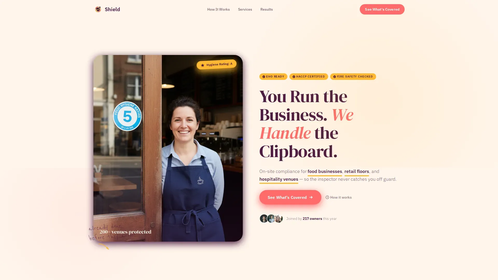
Half-Page Hero with Split Layout
The hero divides into a warm editorial photograph on the left and headline copy on the right. The headline reads "You Run the Business. We Handle the Clipboard." A coral-pink accent sentence names the three service verticals, and a primary call-to-action button sits just above the fold.
Scrolling Social Proof Ticker
A continuously animated ticker runs just below the hero, displaying the "200+ venues protected" count alongside supporting trust signals. This component adds immediate credibility without requiring the visitor to scroll far.
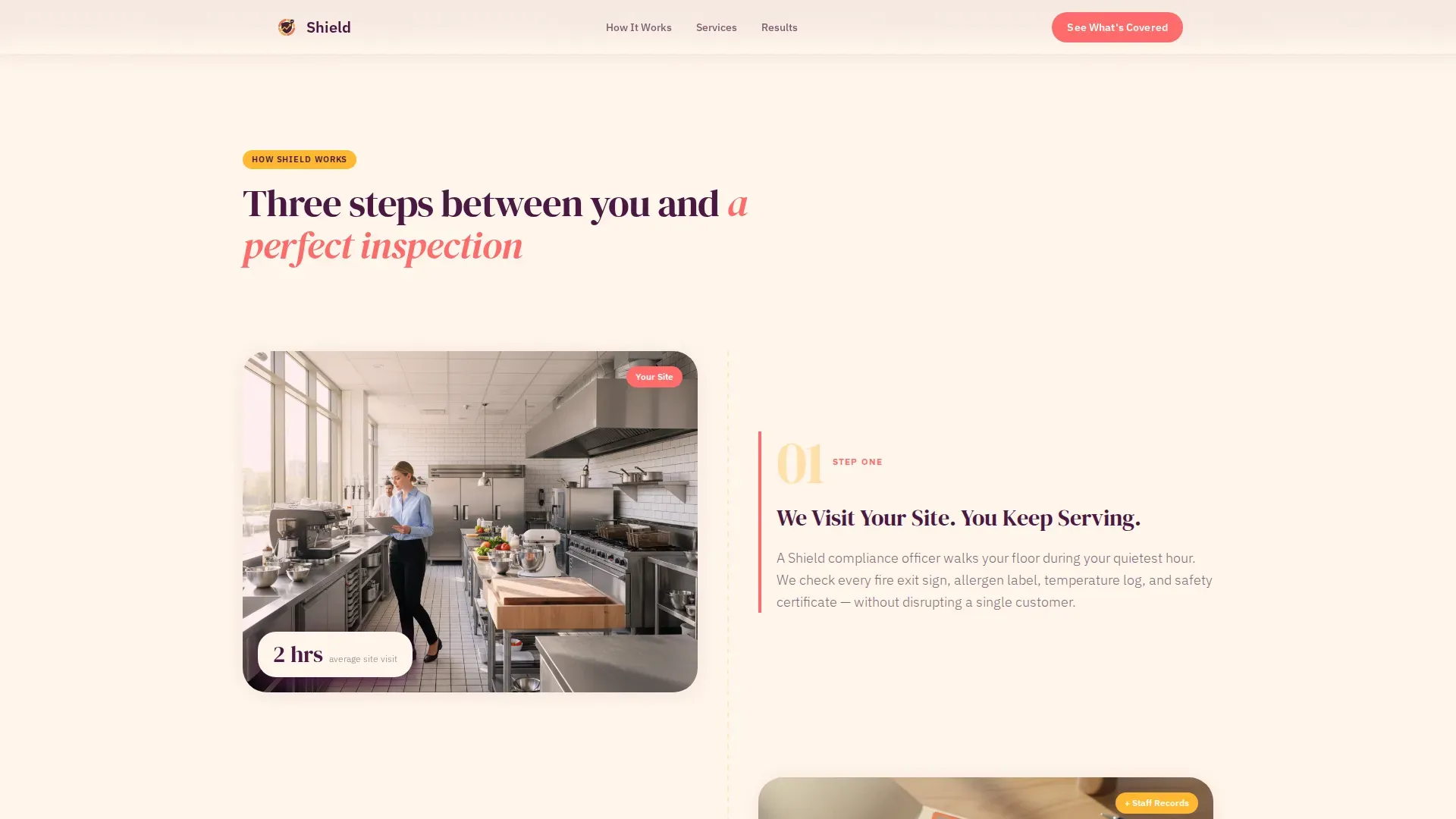
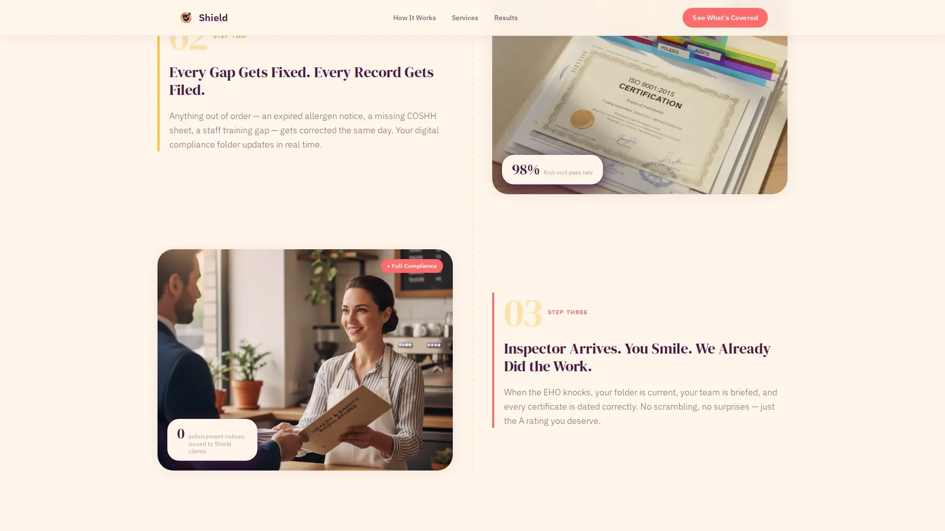
Three-Step Zigzag How It Works
Three alternating sections walk visitors through the compliance process step by step. Each step introduces one more node in the illustrated Network Effect diagram that builds in the page margin as the visitor scrolls.
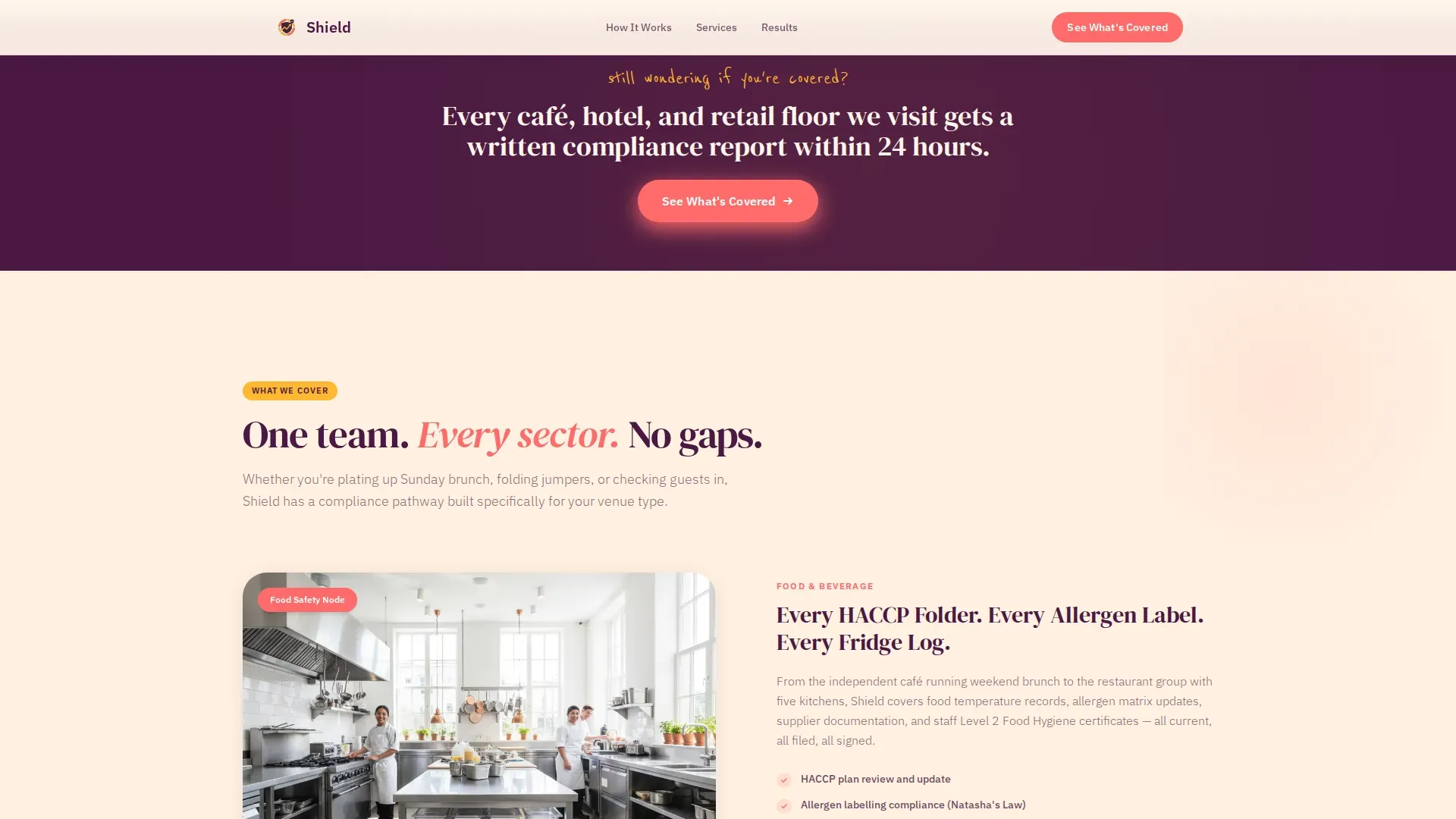
Vertical-Specific Zigzag Sections
Dedicated alternating blocks address food safety, retail compliance, and hospitality compliance as distinct service areas. Coral-pink and marigold alternate as accent leads across these sections to maintain visual rhythm and keep each vertical feeling distinct.
Before and After Comparison Block
A side-by-side section contrasts a messy, solo compliance folder against a Shield-managed one. The left side shows stress and disorder; the right side shows calm and structure. This block is the emotional turning point of the page.
Final Call-to-Action Section
The page closes with a large marigold "Pick Your Plan" button. This section is the page's only conversion destination and is designed to feel inevitable after the scroll journey above it.
Page sections overview
| Section | Purpose |
|---|---|
| Hero split layout | Introduce the offer and capture attention above the fold |
| Social proof ticker | Display venue count and build immediate trust |
| Three-step how it works | Explain the compliance process in plain steps |
| Food safety zigzag | Cover the food and café compliance vertical |
| Retail compliance zigzag | Address retail-specific inspection and labelling needs |
| Hospitality zigzag | Speak to hotel managers and front-of-house compliance |
| Before and after | Show the emotional contrast of solo versus managed compliance |
| Final call to action | Drive visitors to the pricing and onboarding page |
| Footer | Single-row linear links and brand close |
Design & branding system
The visual identity follows a Family First theme executed through a Dopamine Pop colour system. The palette is warm, editorial, and deliberately far from the sterile blues of typical compliance tools.
- Marshmallow white (#FFF5EB) as the page background, coral-pink (#FF6B6B) for primary buttons and section accents, aubergine (#4A1942) for all headlines and navigation text, and sunshine marigold (#FFB830) for hover states, icons, and trust badges
- Typography pairs DM Serif Display for headlines with IBM Plex Sans for body copy, giving the page a confident editorial voice that remains easy to read
- Coral-pink and marigold alternate as accent leads across zigzag sections while aubergine anchors every text block, creating a consistent visual hierarchy throughout the scroll
Mobile & speed optimization
The template is built mobile-first because the target audience, café owners and hotel managers, checks information on a phone between service rushes. Every section is designed to reflow cleanly on smaller screens.
- Scroll-reveal animations and staggered zigzag transitions are set to medium intensity, keeping the page lively without causing jank on mid-range devices
- The ticker animation, hover states on cards, and the Network Effect margin diagram are all implemented with CSS scroll-behaviour to keep motion smooth and lightweight
- Images use optimisation techniques so the hero photograph and editorial visuals load quickly even on mobile connections
How this template helps you convert
This template is a click-through landing page with one destination: the pricing and onboarding page. Every design and copy decision is made to reduce hesitation and make the final click feel like the obvious next step.
- The scrolling ticker, three-step process, and vertical zigzag sections layer proof progressively, so trust compounds with each section rather than asking visitors to believe everything at once
- The before-and-after block delivers the emotional payoff that makes the decision feel personal, not just rational, turning anxiety into relief before the final call to action appears
- The "Pick Your Plan" marigold button appears only after the visitor has mentally offloaded the compliance burden, making the click feel inevitable rather than pressured
Other information about this template
This template is localised for the UK and Ireland market. Copy references EHO visits, HACCP documentation, fire safety checks, and allergen labelling, which are the specific compliance touchpoints that matter most to this audience. Currency references use the pound sterling (£) symbol throughout.
- The page uses no forms or sign-up fields, keeping the visitor journey clean and friction-free until they reach the dedicated pricing page
- The Network Effect creative direction means each scroll section visually adds a new connection line to a growing margin diagram, so the lonely café owner from the hero is surrounded by a full support infrastructure by the time the footer is reached
- The footer follows a linear single-row pattern, keeping the page close tidy and preventing distraction from the final call to action
Theme
Family First
Creative direction
Network Effect
Color system
Dopamine Pop
Style
Zigzag/Alternating
Direction
Click-Through
Page Sections
Half-page Hero with Split Layout
Scrolling Social Proof Ticker
Three-step Zigzag How It Works
Vertical-specific Alternating Sections
Before and After Comparison Block
Final Call-to-action Section
Related questions
Is this template suitable for a single-location café or only for multi-site operators?
Does this landing page include a contact form or sign-up field?
What social proof elements are built into the page?
How many call-to-action buttons does the page include?
Can I adapt the compliance verticals to fit a different service area?


