Critical Illness Insurance Landing Page Template
Shield is a dashboard-style critical illness insurance landing page template built for growing families. It uses animated data counters, an interactive exposure calculator, and a clean Arctic White palette to walk visitors from population-level health statistics down to their own household risk. The result is a precise, data-driven page that earns the click without relying on emotional pressure.
by Rocket studio
Quick summary
Shield is a single-page, data-grid landing page template designed for growing family critical illness insurance products. It opens with animated counters and a probability line graph, then narrows through three data sections toward a personal exposure calculator. The page closes with a persistent "See Your Coverage Options" call-to-action bar and a secondary email-capture link for a family risk report.
Who this template is for
This template is built for insurance professionals, brokers, and financial product teams who need a high-converting landing page that speaks clearly to young families. The design suits anyone selling critical illness plans to dual-income households who have recently taken on a mortgage and are starting to think seriously about their financial security.
- Insurance brokers and independent advisers promoting family critical illness coverage to clients in their early thirties
- Financial product teams at an insurance company launching a new growing family protection plan
- Benefits consultants and human resources departments who manage group health plans and want a focused click-through page for enrollment campaigns
What problem this template solves
Young families carry significant financial exposure. One salary often holds the household together. A critical illness diagnosis can derail a mortgage, drain funds built over years, and force a working partner to leave their job without warning. Standard health coverage is limited in scope and rarely bridges the gap between hospital treatment costs and everyday household bills. The cost of medical emergencies related to critical illnesses is expected to rise due to inflation, making early planning more important than ever.
- Visitors leave pages that feel generic. This template makes the data personal by contracting from population statistics down to the visitor's own household income, mortgage balance, and number of children.
- Insurance landing pages often rely on emotion rather than evidence. Shield uses clean data grids and an interactive calculator so that inaction feels numerically indefensible, not just uncomfortable.
- Forms and friction reduce conversions. This is a click-through page with no form fields in the main flow, removing the barrier between interest and action.
What you get with this template
Shield delivers a complete, ready-to-customise landing page built around an industry-report structure. Every section is laid out and labelled. You get a coherent visual system, three progressive data sections, an interactive calculator block, a persistent call-to-action bar, and a secondary email-capture text link. The template is designed so that a person reading it understands exactly what coverage protects their family and why the numbers demand a decision.
- A full dashboard-style page with animated header counters, a probability line graph, three data grid sections, an interactive personal exposure calculator, a primary call to action block, a persistent bottom call to action bar, and a secondary "Download the Full Family Risk Report" capture link
- A complete Arctic White color system applied across every section, with policy-document navy for headlines and data labels, cool institutional gray for dividers, and a single decisive blue reserved for interactive elements and calls-to-action
- Structured content placeholders across every section so you can drop in accurate policy data, real claims figures, and coverage details without rebuilding the layout
Feature list
This section describes the core built-in features of the Shield template as defined in the source brief.
Animated Data Storytelling Header
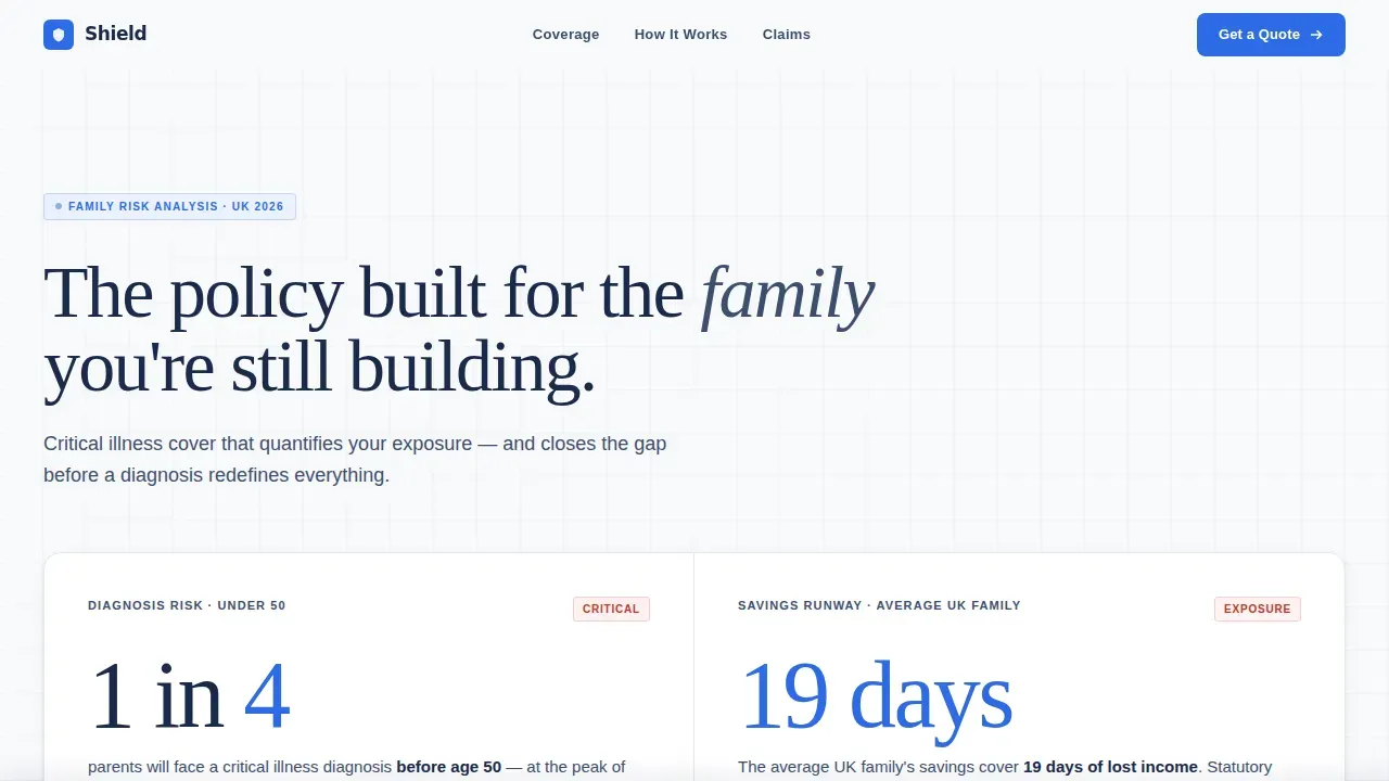
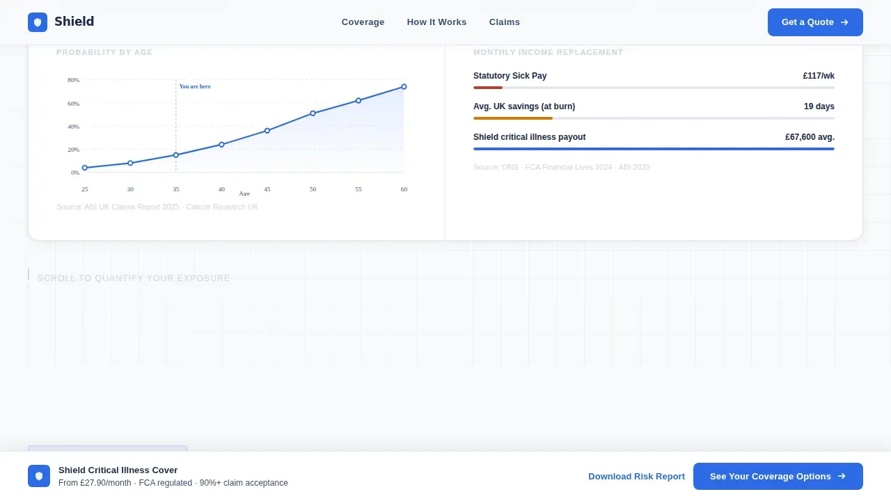
The header opens on a clean white viewport where animated counters tick upward in real time. The first counter builds toward "1 in 4 parents will face a critical illness diagnosis before age 50." A second data point lands as a verdict: "Average UK family savings cover 19 days of lost income." A minimal line graph traces the rising probability curve by age bracket. There are no stock photographs. The silence of the design carries the emotional weight. This approach makes the health risk visible and immediate without relying on soft imagery.
Interactive Personal Exposure Calculator
Section three of the template contracts from population-level data down to the individual visitor. A data-grid calculator allows the visitor to input their mortgage balance, number of children, and household income. The grid instantly reconfigures to display their personal exposure gap. This is the most powerful conversion tool on the page. It transforms abstract risks into a specific number that is hard to ignore. The calculator block is where the visitor moves from awareness to genuine desire to act.
Progressive Industry Report Scroll Structure
The creative direction follows an industry report structure. Scrolling past the header feels like paging through a white paper that gets progressively more personal. Section one presents population-level statistics in clean data grids. Section two narrows to household-level impact, covering mortgage default timelines, childcare cost projections, and partner income dependency ratios. Each scroll transition sharpens the lens from broad to intimate, from "families like yours" to "your family, specifically."
Dual-Layer Call-to-Action System
The primary call-to-action, "See Your Coverage Options," appears first immediately after the interactive calculator. It then reappears as a persistent bottom bar once the visitor scrolls past the main data sections. No form fields appear on this page. The click carries the visitor's calculator inputs forward into the quote engine. This dual-layer system ensures the call to action is always within reach without interrupting the data narrative.
Secondary Email Capture Link
A secondary text link, "Download the Full Family Risk Report," sits alongside the primary call to action. It captures an email address for nurture campaigns without disrupting the main conversion flow. This gives the template two distinct conversion paths: an immediate click-through for visitors who are ready to explore coverage plans, and a softer capture route for visitors who need more time to develop confidence before they enroll.
Corporate Precision Color and Type System
The Arctic White palette is applied with surgical consistency. Background panels use a surgical white at #F8F9FB. Headline type and data labels use a policy-document navy at #1B2A4A. Divider lines and secondary containers use a cool institutional gray at #D0D5DD. A single decisive blue at #2E6BE6 is reserved exclusively for interactive elements, live data points, and the call-to-action. The palette feels like a freshly printed actuarial report, sterile and authoritative.
Page sections overview
| Section | Purpose |
|---|---|
| Animated Counter Header | Delivers real-time animated health statistics and a probability line graph to establish immediate relevance |
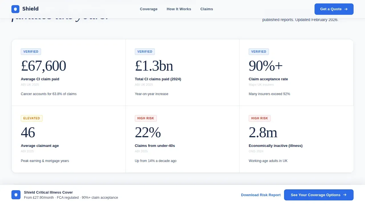
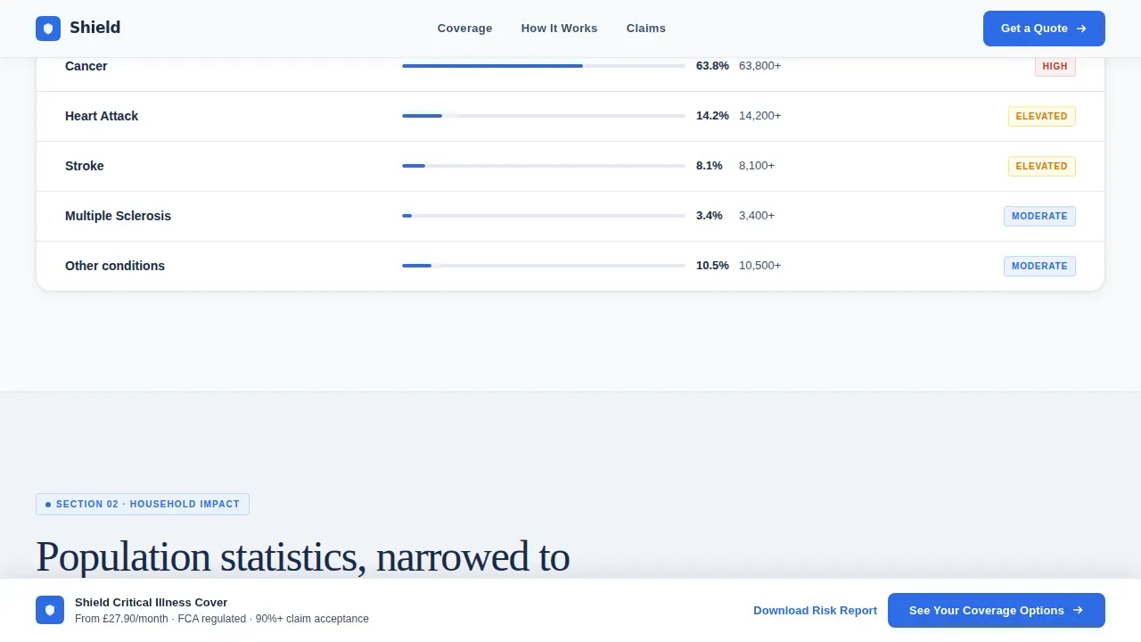
| Population Data Grid | Presents broad critical illness frequency data across age groups to frame the scale of the risk |
| Household Impact Grid | Narrows the data to mortgage default timelines, childcare costs, and partner income dependency ratios |
| Personal Exposure Calculator | Lets visitors input their mortgage, income, and children count to see their individual coverage gap |
| Primary call to action Block | Delivers the "See Your Coverage Options" action prompt immediately after the calculator |
| Persistent Bottom Bar | Re-surfaces the primary call to action as a fixed bar once the visitor scrolls past the data sections |
| Secondary Capture Link | Offers "Download the Full Family Risk Report" as a softer email-capture conversion path |
Design & branding system
The design language is Corporate Precision. Every element on the page earns its place by contributing to a tone that feels authoritative, clinical, and impossible to argue with. The palette and typography work together to communicate that this is a serious product for serious circumstances, not a generic insurance brochure.
- Arctic White color system: surgical white (#F8F9FB) for open background panels, policy-document navy (#1B2A4A) for all headline type and data labels, cool institutional gray (#D0D5DD) for divider lines and secondary containers, and decisive blue (#2E6BE6) used exclusively on interactive elements and calls-to-action
- Typography is set in generous white space with navy type, producing a layout that reads like a clean actuarial report. No decorative photography appears anywhere in the template. The data is the visual.
- The single-color call to action treatment makes every interactive element immediately identifiable. Visitors always know where to act without scanning the page for a button.
Mobile & speed optimization
The template is structured for a mobile-first audience. Over 63% of searches occur on mobile devices, and the page layout is built to remain clear and navigable at smaller screen sizes. The data grids reflow cleanly, the calculator inputs are touch-friendly, and the persistent call to action bar remains accessible at the bottom of the viewport on all devices. A design that loads and responds quickly is essential for keeping visitors engaged long enough to reach the calculator section.
- The page layout reflows across screen sizes without breaking the data grid structure or obscuring the animated counter header
- The persistent bottom call to action bar is always visible on mobile, ensuring the primary action is never more than a thumb-tap away
- The template's minimal image approach, using no stock photography, means the visual payload is delivered through type and data rather than heavy media assets
How this template helps you convert
Shield is engineered as a click-through page. Every section exists to move the visitor one step closer to pressing "See Your Coverage Options." The conversion logic is sequential and deliberate, not scattered.
- The animated header opens with a specific, unavoidable data point about critical illness risk by age, capturing attention and establishing credibility before the visitor has scrolled once. A prominent call-to-action placed above the fold in the header area keeps the primary action visible from the first moment.
- The three-section scroll structure progressively narrows from population health data to household-level cost projections to the visitor's own personal exposure gap. By the time the visitor reaches the calculator, the data has already done the work of making inaction feel unreasonable. Critical illness insurance provides a lump sum payment upon diagnosis of a covered illness, and the calculator makes that value tangible.
- The dual-layer call to action system, appearing once after the calculator and again as a persistent bar, ensures the click is always available the moment the visitor is ready. No form friction, no distractions. The page earns the click by making the data do the persuading.
Other information about this template
The Shield template sits in the Finance and Insurance category, specifically in the Growing Family Insurance subcategory. It is designed for the growing family critical illness insurance niche and is built around a Dashboard and Data Grid template style. The template is a meaningful tool for human resources teams, benefits departments, and insurance professionals who want to present coverage options with clarity and authority.
- Human resources and benefits departments at organisations offering voluntary group health plans to full time employees can adapt this template for internal enrollment campaigns. Employees who access this type of page as part of a benefits communication effort are more likely to enroll when the data is presented clearly. Human resources professionals are responsible for ensuring that eligible employees are aware of available coverage options, and a page like Shield makes that communication more effective.
- The template supports the communication needs of employers who want to encourage employees to evaluate their personal coverage gap. Training sessions and department-level benefits briefings can direct staff to this page as a self-service tool. Human resources teams can use it to address questions about plans, payment terms, and eligibility criteria without scheduling one-to-one office meetings.
- Under federal law, specifically the federal Patient Protection and Affordable Care Act, dependent children must be covered under group and individual plans until age 26. Young adults may remain covered under a parent's plan even if they marry. Those who age out of a parent's group health plan may be eligible for COBRA continuation coverage for up to 36 additional months, or they can purchase individual health benefits plans through the federal Marketplace. These coverage transitions are worth addressing in any benefits communication campaign, and this template can support that effort.
- Critical illness insurance helps with expenses not covered by regular health insurance, such as deductibles and lost income. Having critical illness coverage can help protect your family's financial future during medical emergencies. A life insurance savings plan paired with critical illness coverage can provide comprehensive financial protection. The financial corpus built through a life insurance savings plan can be used for major expenses such as education and home purchases, making it a natural complement to the protection this template promotes.
- Medicaid is a relevant context for some families evaluating their coverage plans. The Ohio Department of Medicaid implemented new features in the Ohio Medicaid Enterprise System to improve provider management. Providers can now see and use new features in the Provider Network Management module of that system. The new features increased visibility for providers of claims submitted by trading partners. Providers are required to complete their revalidation on time to maintain their Medicaid agreements, and it is imperative for providers to update all address and affiliation information in the Provider Network Management module to avoid claims payment issues. The Ohio Department of Medicaid identified several affiliation issues that impact billing organisations' claims, and providers must fully execute all steps when affiliating a rendering provider to their group. The Provider Network Management module includes resources to assist providers in resolving common issues they experience.
- The VA SHIELD biorepository was established to provide a comprehensive repository of specimens related to emerging diseases. A biorepository collects, stores, manages, and distributes biological specimens for research purposes. The goal of the VA SHIELD biorepository is to advance scientific understanding in support of strategies for immediate deployment in clinical environments. Biorepositories play a critical role in advancing medical research and improving health outcomes. Biospecimens collected can be used to develop diagnostic, therapeutic, and preventative strategies for diseases. The VA SHIELD biorepository collects health data along with specimens to enhance research capabilities. Specimens are often de-identified to protect the privacy of donors. Biorepositories like VA SHIELD are essential for understanding the progression of diseases and developing effective treatments. The VA SHIELD biorepository aims to improve the health of Veterans through research and data collection.
- The template is built for a single-page click-through flow. It does not include a navigation menu, which helps keep visitors engaged until they convert. The primary call to action button is prominent, contrasting in decisive blue, and action-oriented. Customer trust can be reinforced by adding trust signals such as industry awards or compliance badges to the appropriate content zones within the template. Testimonials and real customer reviews from policyholders can turn skepticism into confidence and add credibility to the page.
- The shield precision family critical illness insurance landing page template is available to preview and customise on the platform. Contact the support office to access full documentation and development records for this template.
Theme
Corporate Precision
Creative direction
Industry Report
Color system
Arctic White
Style
Dashboard/Data Grid
Direction
Click-Through
Page Sections
Animated Data Storytelling Header
Interactive Personal Exposure Calculator
Progressive Industry Report Scroll
Dual-layer Call-to-action System
Secondary Email Capture Link
Corporate Precision Color System
Related questions
Who is the ideal visitor for a page built on this template?
Does the template include form fields for lead capture?
Can human resources teams use this template for employee benefits campaigns?
What illnesses and conditions does the calculator section reference?
Is this template suitable for promoting coverage alongside life insurance savings plans?



