International Expat Insurance Booking Website Template
Shield is a premium landing page template built for international expat umbrella insurance brokerages. It combines a three-column comparison table, a five-step risk assessment quiz with a live exposure meter, and an authoritative Executive Suite visual identity to convert high-net-worth C-suite visitors into booked consultations. Every section is engineered to surface liability gaps and move visitors toward action.
by Rocket studio
Quick summary
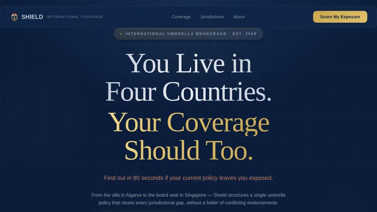
Shield is a single-page landing page template designed for high-net-worth international expat umbrella insurance brokerages. It follows a Problem to Solution creative arc, opening with award badge social proof, escalating through a three-column comparison table that exposes coverage gaps, and closing with a five-step quiz that scores each visitor's global liability exposure and books a consultation.
Who this template is for
This template is built for insurance brokerages, financial services firms, and independent advisors who serve globally mobile, high-net-worth clients. It is especially suited for teams whose book of business includes executives on international assignments, serial entrepreneurs holding assets across multiple countries, and trailing spouses whose personal liability gaps grow with every relocation.
Every design decision, every section of this page, and every interactive component was made with one group in mind: the professional whose clients live across jurisdictions and need coverage that follows them there.
- Insurance brokers and advisors specializing in expat umbrella coverage for C-suite executives
- Financial services companies building a lead generation landing page for globally mobile, high-net-worth individuals
- Marketers and business development teams searching for a polished, conversion-focused insurance landing page template that reflects the gravity of the product
What problem this template solves
Most insurance landing page templates are built for domestic, single-jurisdiction buyers. They are clean, but they are generic. When you are selling layered international liability coverage to a CFO with a villa in Portugal and a board seat in Singapore, a generic template does the opposite of what you need. It signals that your firm does not truly understand the exposure at stake.
Visitors who land on a weak insurance landing page leave without trust, without answers, and without booking. Companies using well-structured landing pages generate significantly more leads than those that do not, yet the majority of insurance landing page designs in the market still rely on outdated form-and-phone layouts that overwhelm sophisticated buyers rather than engage them. Shield solves this directly.
- High-net-worth visitors arrive skeptical. The template leads with credential-heavy award badge imagery and a clear, authority-driven headline to establish trust before a single word of body copy is read.
- Buyers struggling to articulate their own coverage gaps need a structured process to feel the risk. The comparison table and the progressive quiz do this work without requiring a phone call first.
- Brokerages need a landing page that reflects the seriousness of the product. This template signals executive-level authority from the first scroll, so visitors trust the brokerage before they trust the plan.
What you get with this template
Shield delivers a fully designed, section-complete landing page built around the specific conversion workflow of an international expat umbrella insurance brokerage. Every component serves a defined role in the visitor's journey from skepticism to booked consultation. The template is not a general-purpose insurance landing page. It is purpose-built for this niche, this audience, and this sales process.
You get a page that answers the questions visitors arrive with, surfaces the liability gaps they did not know they had, and then presents clear next steps through two distinct conversion paths.
- A complete landing page layout with Hero, three-column Problem Table, Coverage Escalation section, five-step Quiz with live risk meter, Testimonial and PDF Lead Magnet section, and a Linear Single-Row Footer
- An Executive Suite visual identity using the Navy Authority color system, Fraunces serif display typography, and DM Sans body type, all pre-applied throughout the template
- A dual conversion path: a primary "Score My Global Exposure" quiz that ends with a calendar booking embed, and a secondary gated PDF lead magnet form for visitors not yet ready to assess
Feature list
This landing page template delivers purpose-built components designed to navigate a sophisticated buyer through a complex insurance decision. Each feature reflects a deliberate aspect of how high-net-worth clients evaluate and commit to global liability coverage.
Award Badge Hero Ribbon
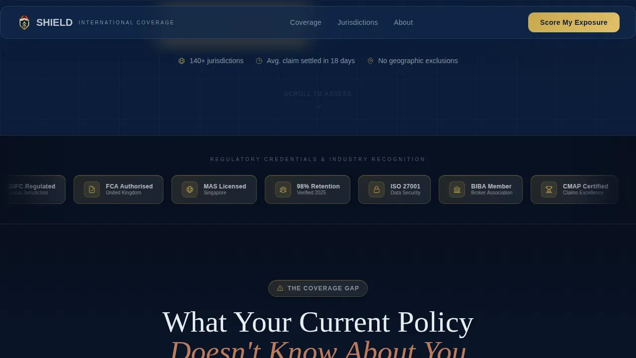
The hero section opens on a deep navy background displaying a horizontal ribbon of award badges. These include AM Best ratings, global broker association seals, jurisdiction-specific regulatory certifications, and client satisfaction marks. Each badge is rendered in metallic gold and silver with dimensional shadow detail, arranged like medals on a dress uniform. A tracked-out silver headline sits above the ribbon. This visual moment establishes authority before the visitor reads a single line of body copy, which is essential for a landing page targeting C-suite users who scan for credibility signals immediately.
Three-Column Comparison Table
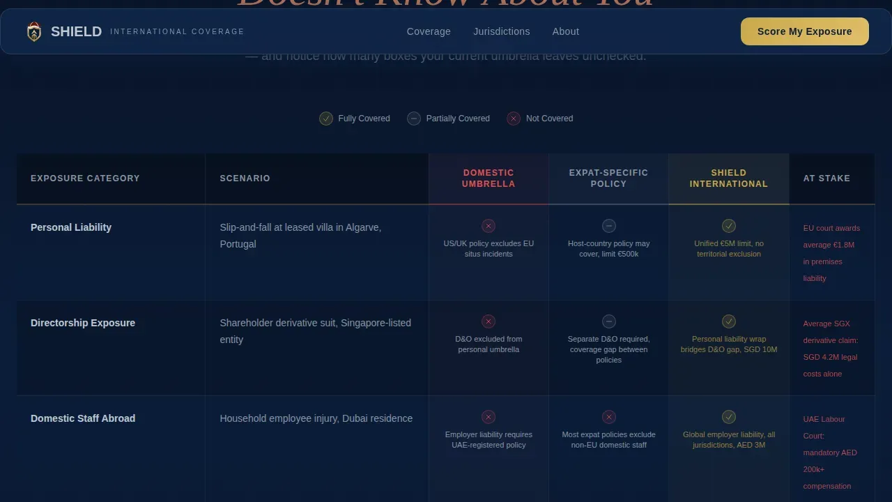
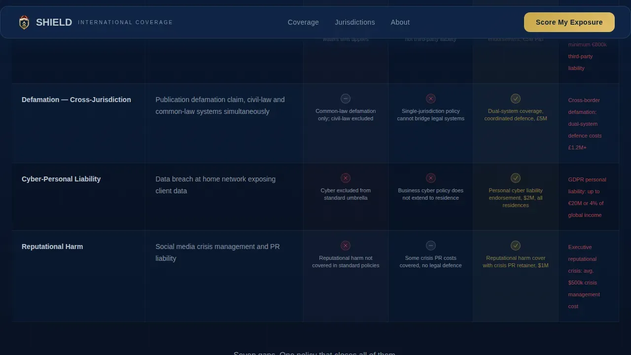
The core of this landing page is a three-column comparison table that sets the insurance plan offered by Shield against what domestic umbrella policies cover and what expat life actually demands. Each row escalates the stakes: personal liability, directorship exposure, domestic staff in foreign jurisdictions, watercraft in Mediterranean ports, and defamation claims across both common-law and civil-law systems. The table does not just inform visitors. It makes them feel the gaps in their current coverage before presenting the unified solution as the logical conclusion. This component is the page's primary education tool and its most persuasive element for visitors who are data-driven decision-makers.
Five-Step Progressive Risk Assessment Quiz
The primary conversion path on this landing page is a five-step progressive quiz. Visitors answer questions about their country of primary residence, number of jurisdictions with assets, current umbrella coverage limit, whether they hold board seats or directorships, and their household staff count. Each answer dynamically adjusts a visible risk meter displayed on-screen. No quote is delivered on the page. The quiz result is a personalized exposure score delivered alongside a calendar embed to book a 20-minute consultation. This process respects the visitor's time, avoids overwhelming them with form fields, and creates a sense of forward momentum and convenience through each stage.
Gated PDF Lead Magnet Path
A secondary conversion path serves visitors who are not yet ready to take the quiz. A downloadable PDF titled "The Expat Liability Gap Report" is gated behind a simple form collecting name and email. This path is essential for the segment of visitors who are still in the research phase. It generates a lead, delivers genuine resources, and keeps the brokerage's team in contact with prospects who will be ready for a consultation later. This is a proven practice in insurance landing page design: give visitors a low-friction next step when the primary call to action feels too large.
Testimonial Blocks and Social Proof Layout
Named testimonial blocks are styled in boardroom mahogany and anchored at a dedicated section of the page. These are positioned after the quiz and before the footer, at the moment when a visitor who has scored their exposure is weighing whether to book. Testimonials from C-suite personas reinforce trust and authority, and professional social proof at this stage of the landing page journey is well established as a conversion driver for high-ticket insurance services. The design keeps these blocks clean and readable, so users can scan and absorb the key message quickly.
Navy Authority Color System and Typography
The entire landing page is built on a four-color system: midnight suiting navy (#0B1D3A) for backgrounds and section dividers, polished cufflink silver (#C0C7D1) for body text and table borders, boardroom mahogany (#5B2C1E) for testimonial blocks and pull quotes, and decisive gold (#C9A84C) reserved exclusively for calls to action and trust indicators. Fraunces serif is the display typeface. DM Sans carries all body and interface text. This combination creates a visual identity that feels like the inside of a diplomatic passport: dense, authoritative, and designed to move the visitor through the page without friction.
Page sections overview
| Section | Purpose |
|---|---|
| Hero Badge Ribbon | Opens on navy with award badge row, headline, and dual call to action |
| Problem Comparison Table | Three-column layout exposing domestic versus expat reality versus Shield coverage |
| Coverage Escalation Rows | Row-by-row stakes escalation with risk indicators across liability categories |
| Five-Step Quiz | Progressive assessment with live risk meter and calendar embed at result |
| Testimonials and PDF | Mahogany testimonial blocks plus gated PDF lead magnet form |
| Linear Single-Row Footer | Clean footer with essential links and contact information |
Design & branding system
The design language of this landing page template is deliberately authoritative. It draws on the visual grammar of executive financial services: the weight of a walnut-paneled boardroom, the precision of a tailored suit, and the quiet confidence of a document that has already been reviewed by three lawyers. Nothing about this page looks like a generic insurance website. It looks like a firm that already understands your situation and has the credentials to back it up.
Every design decision supports the conversion goal. Gold appears only where the eye must land next. Navy holds the space between sections so nothing feels cluttered. Mahogany gives testimonials warmth without softening the authority of the overall page.
- Navy Authority color system: midnight navy (#0B1D3A) dominates backgrounds, silver (#C0C7D1) carries body text, mahogany (#5B2C1E) accents testimonial blocks, and gold (#C9A84C) marks every call to action and trust indicator
- Fraunces serif for display headings and DM Sans for all body and interface text, creating a clear typographic hierarchy that guides visitors through each section
- Award badge imagery in metallic gold and silver with dimensional shadow detail, designed to communicate regulatory credibility and client satisfaction at a glance
Mobile & speed optimization
This landing page template is designed desktop-first, reflecting the reality that high-net-worth clients often engage with long-form financial services content on MacBooks during travel or in office settings. Desktop-first design means the full comparison table, the risk meter, and the quiz interface are each given room to breathe and perform at their best on large screens. At the same time, mobile-responsive design is built into the template so that visitors on smartphones can navigate the page, complete the quiz, and access the gated PDF form without friction.
Mobile-friendly landing pages are essential for any insurance product today. Even executive buyers use their phones to research services while traveling, and a page that breaks on mobile signals poor attention to detail, which is exactly the wrong message for a brokerage selling precision coverage.
- Desktop-first layout prioritizes the full table and quiz experience, while mobile breakpoints ensure every element scales cleanly across screen sizes
- GSAP ScrollTrigger reveal animations, counter animations for the risk meter, and quiz state transitions are built into the interactive components for a polished, high-engagement experience
- The quiz and calendar embed are built as client-side interactive components, while static sections use server-side rendering to keep the initial page load responsive
How this template helps you convert
An insurance landing page converts when it answers the right questions in the right order, at the right moment in the visitor's decision process. Shield is structured around a tested conversion logic: establish authority first, surface the problem second, present the solution third, and then give visitors a clear and low-friction path to act. This is not a landing page that asks visitors to trust the brokerage before it has earned that trust.
The page focuses on a single primary action: booking a 20-minute consultation via the quiz result calendar embed. The secondary path, the gated PDF download, captures visitors who need more time. Both paths generate usable leads for the brokerage's team and move visitors toward a defined outcome.
- The award badge hero establishes regulatory credibility and professional authority in the first three seconds, so visitors who are searching for a trustworthy brokerage feel confident enough to keep reading rather than bouncing.
- The comparison table and coverage escalation section create a felt sense of risk for each visitor, making the brokerage's solution feel essential rather than optional, and priming them to engage with the quiz and take action.
- The five-step quiz personalizes the insurance landing page experience for each visitor, delivering a unique exposure score and a direct calendar booking path, which removes ambiguity about next steps and makes the consultation feel like the natural conclusion.
Other information about this template
Shield is the kind of insurance landing page template that marketers in the financial services space have struggled to find. Most available templates are built for mass-market insurance products: auto insurance comparison pages, healthcare plan enrollment forms, or travel insurance booking flows. Shield is built for none of those. It is built for the niche where the stakes are highest and the buyer is most discerning.
That said, the underlying structure of this template is instructive for any insurance landing page project. The practices it demonstrates, leading with social proof, using a comparison table to create urgency, gating resources behind a form, and providing a low-friction consultation booking path, are transferable best practices that any insurance brokerage team can learn from and apply.
Here is additional context that is useful for anyone evaluating this template for their project or team:
- This template is the Shield Executive Suite Global Expat Umbrella Insurance Landing Page Template, purpose-built for brokerages serving globally mobile, high-net-worth clients with layered international liability coverage needs.
- The landing page plan includes six sections: Hero, Problem Table, Coverage Escalation, Quiz, Testimonials with PDF Lead Magnet, and Footer. Each section has a defined role in the conversion workflow and can be customized to reflect your brokerage's specific services, jurisdictions, and coverage package details.
- The comparison table is the central educational component. It is designed to engage visitors by making the coverage gaps in standard domestic umbrella policies visible and concrete, using row-by-row escalation across liability categories such as personal liability, directorship exposure, domestic staff abroad, watercraft coverage, and defamation claims.
- The quiz is the primary conversion tool. It does the heavy lifting of qualification and objection resolution before the first conversation with your team ever happens. Visitors arrive at the calendar embed already informed about their own exposure, which makes the consultation more productive for both parties.
- The gated PDF path is a secondary lead generation solution for visitors who are not yet ready to score their exposure. It creates a second group of leads from the same page without requiring a separate landing page or additional resources.
- Confidentiality is a genuine concern for high-net-worth clients. The template's design communicates discretion and professional seriousness at every moment, from the executive typography to the absence of aggressive pop-ups or intrusive form elements.
- Global expat umbrella insurance is a distinct product from standard auto insurance, healthcare plan enrollment, or travel insurance. However, many high-net-worth buyers arrive on this page after searching for travel insurance or international health insurance and discovering that those products do not protect against the full scope of their liability exposure abroad. The comparison table is specifically designed to address this moment of discovery.
- High-limit excess liability coverage of the type this landing page promotes typically starts at one million USD or GBP and can extend to ten million or more, stacking on top of existing home, auto, or watercraft policies. The template's coverage escalation section is designed to communicate this scale clearly.
- For corporate clients and companies managing expatriate benefits programs, this landing page template can support a team-level conversation about group insurance structures tailored for executive cohorts, facilitating easier underwriting and potentially better terms.
- Healthcare compliance requirements such as the Affordable Care Act (ACA), ERISA, HIPAA, and FMLA are relevant context for corporate HR and benefits teams who may arrive on this page while searching for international executive insurance solutions. The template can be adapted to address corporate buyers as a secondary audience without disrupting the primary individual C-suite conversion flow.
- Employee benefits programs that include health insurance, dental, disability, and retirement plans often leave gaps in international personal liability coverage. This landing page is designed to surface exactly that gap and present the umbrella insurance plan as the solution.
- Uninsured or underinsured motorist coverage from domestic auto insurance policies frequently does not extend to vehicles driven abroad. This is one example of the gap the comparison table can illustrate for visitors who arrive thinking their existing auto insurance plan covers international incidents.
- Travel insurance covers medical expenses, trip cancellations, and lost luggage. It does not cover directorship liability, foreign staff employment disputes, or defamation claims across jurisdictions. This distinction is an important note for visitors who are currently relying on travel insurance as their only international coverage.
- The template's design system uses art direction principles drawn from diplomatic and executive visual culture, giving the page a sense of gravitas that generic insurance website templates cannot replicate.
- Brokers interested in using this template as the foundation of a larger insurance website can use it as the primary landing page within a multi-page site structure, linking to dedicated service pages, a contact page, and jurisdiction-specific resources.
Theme
Executive Suite
Creative direction
Problem→Solution Arc
Color system
Navy Authority
Style
Comparison Table
Direction
Quiz/Assessment
Page Sections
Award Badge Hero with Authority Headline
Three-column Liability Comparison Table
Five-step Risk Assessment Quiz
Gated PDF Lead Magnet Form
Mahogany Testimonial Blocks
Navy Authority Visual Identity System
Related questions
What type of insurance brokerage is this landing page template designed for?
Can I customize the comparison table rows to match my brokerage's coverage package?
What are the two conversion paths built into this landing page?
Does the quiz deliver a live insurance quote on the landing page?
Is this template suitable for a corporate HR or benefits team audience as well as individual executives?



