Expat Auto Insurance Brokerage Landing Page Template
Shield is a sidebar companion landing page template built for international expat auto insurance brokerages. It guides globally mobile visitors through a five-step coverage-gap diagnostic quiz, pairs educational content with real-time sidebar updates, and closes with a personalized quote request. The design is clean, weightless, and desktop-first, with a confident Problem-to-Solution flow.
by Rocket studio
Quick summary
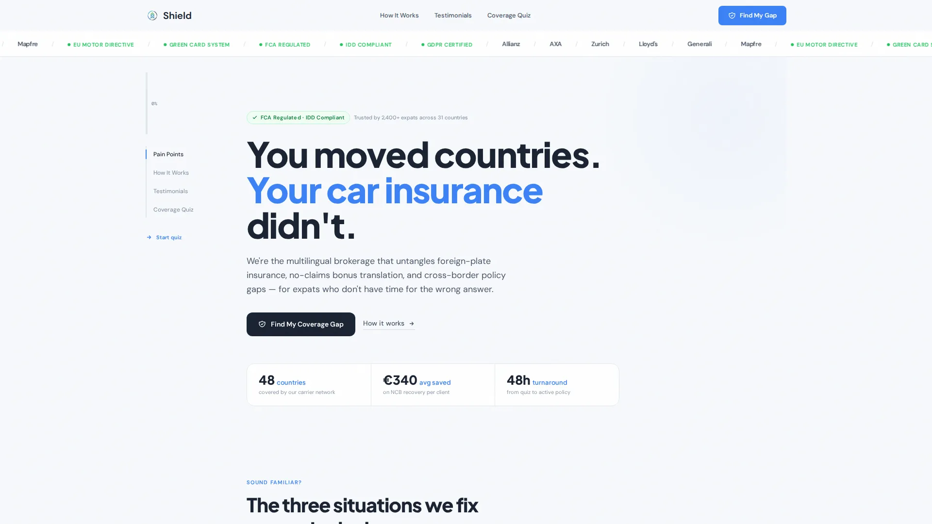
Shield is a single-page template designed for expat auto insurance brokerages. It opens with a bold typographic hero, moves visitors through three pain-recognition cards, and funnels them into a five-step diagnostic quiz. A persistent sidebar companion tracks progress and updates a live coverage-gap meter. The result is a calm, multilingual-feeling experience built for globally mobile drivers.
Who this template is for
This template is built for insurance brokerages that specialize in cross-border vehicle coverage. It works best when your clients are internationally relocated and already frustrated with bureaucratic paperwork they cannot read.
- Expat auto insurance brokerages serving relocated professionals and digital nomads
- HR relocation managers sourcing vehicle coverage for transferred employees
- Independent brokers advising trailing spouses and foreign-plated vehicle owners
What problem this template solves
Expats moving between countries face a specific insurance gap: their existing policy often expires at the border, their no-claims history does not transfer, and local forms are in a language they do not speak. A generic insurance page does nothing to address that complexity. This template is built around that exact pain.
- Visitors arrive anxious and confused; the page immediately names their situation
- Standard landing pages lack the diagnostic depth needed to surface personalized coverage gaps
- Expats are high-intent but low-trust buyers who need proof of expertise before sharing contact details
What you get with this template
You get a fully structured, single-page layout with a sidebar companion rail, an interactive five-step quiz, and a purpose-built content flow that moves a stressed expat from recognition to quote request. Every section is designed to reduce friction and build credibility.
- A five-step diagnostic quiz with real-time sidebar updates and a live coverage-gap meter
- Three scenario pain cards, an educational how-it-works section, and a testimonial block with country-pair tags
- A header logo marquee, a linear single-row footer, and dual USD/EUR display support
Feature list
A quick paragraph before the features: every component in this template is grounded in the brief and serves a specific stage of the visitor's journey, from first recognition to personalized quote.
Five-Step Diagnostic Quiz
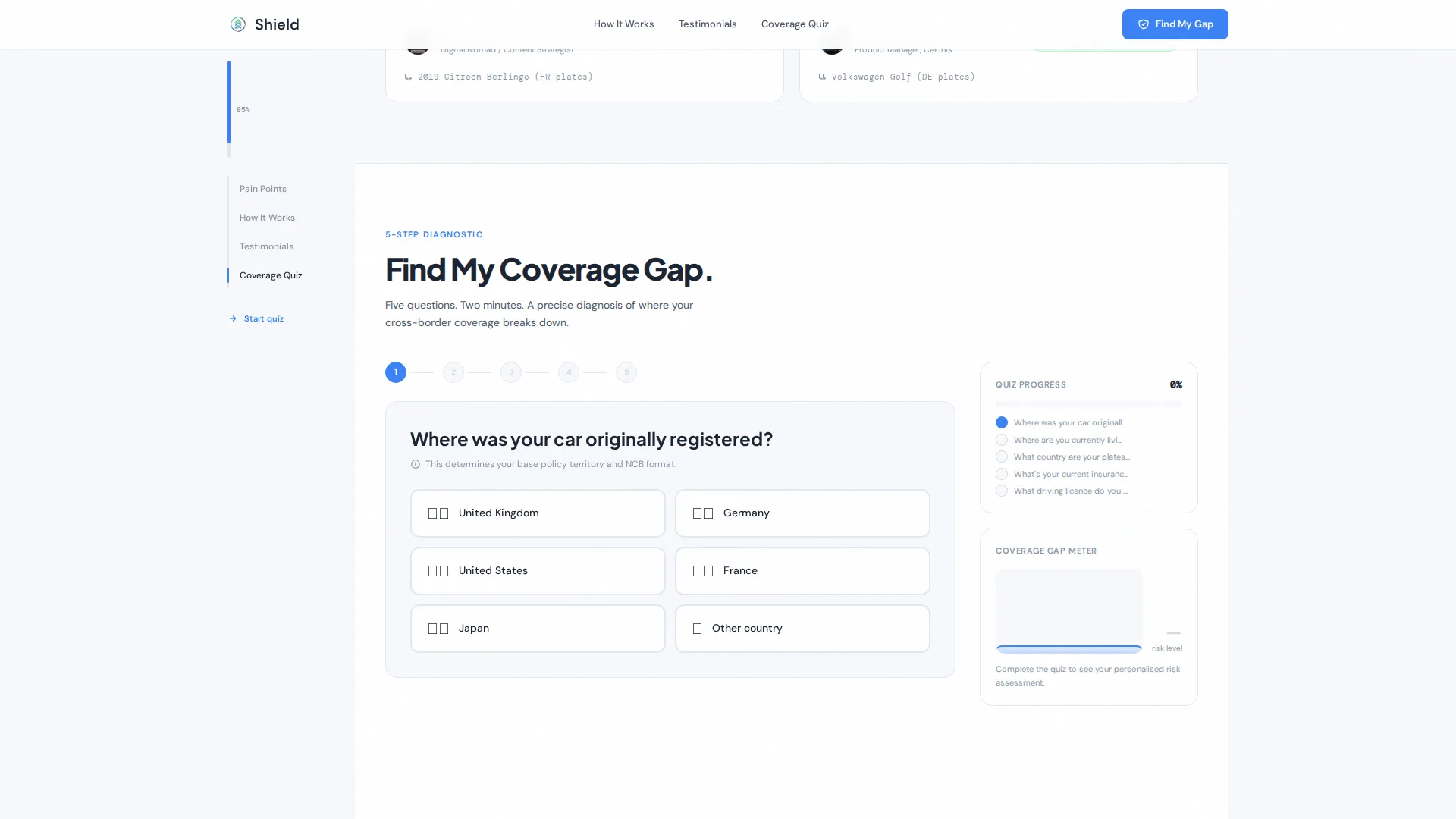
The quiz walks visitors through five focused questions: country of origin, country of residence, vehicle registration country, current policy status, and driving license type. Each step uses large tap targets for fast input, and the sidebar companion updates a visual coverage-gap meter after every answer.
Persistent Sidebar Companion Rail
A narrow left rail tracks quiz completion percentage, displays the current coverage-gap diagnosis, and shows a live estimate that refreshes with each quiz response. On mobile, this rail collapses into a bottom progress bar so the experience stays coherent on smaller screens.
Pain-Recognition Scenario Cards
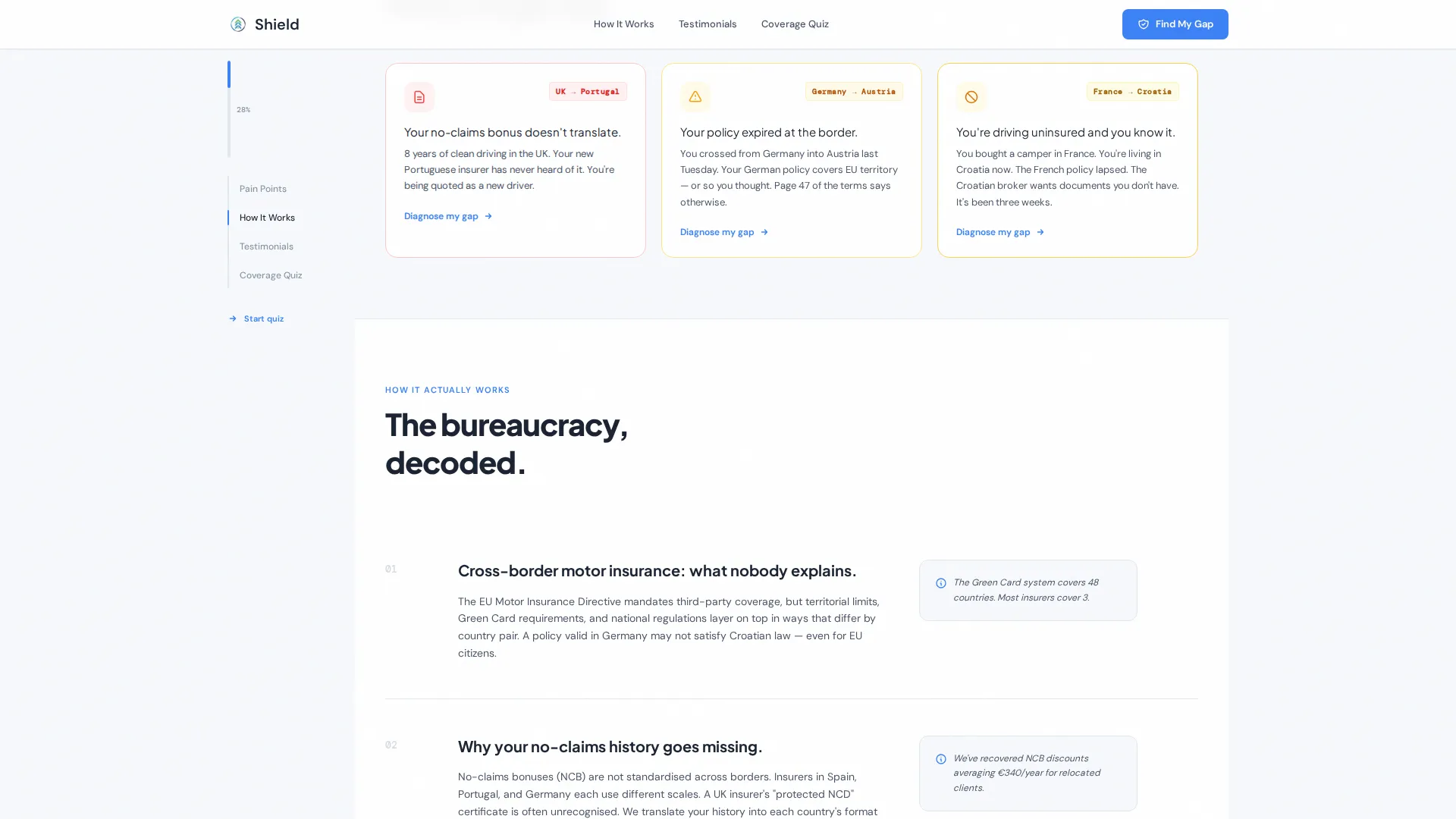
Three short scenario cards sit directly below the header. Each one names a specific expat pain point, an untranslated no-claims bonus, a policy that expired at the border, or a vehicle being driven uninsured. Every card ends with a micro call-to-action that pulls the visitor into the quiz.
Carrier and Regulatory Logo Marquee
The header features a quiet horizontal scrolling strip of carrier and regulatory logos. This builds immediate credibility before a single word of body copy is read, reassuring visitors that the brokerage works with recognized institutions.
Country-Pair Testimonials Block
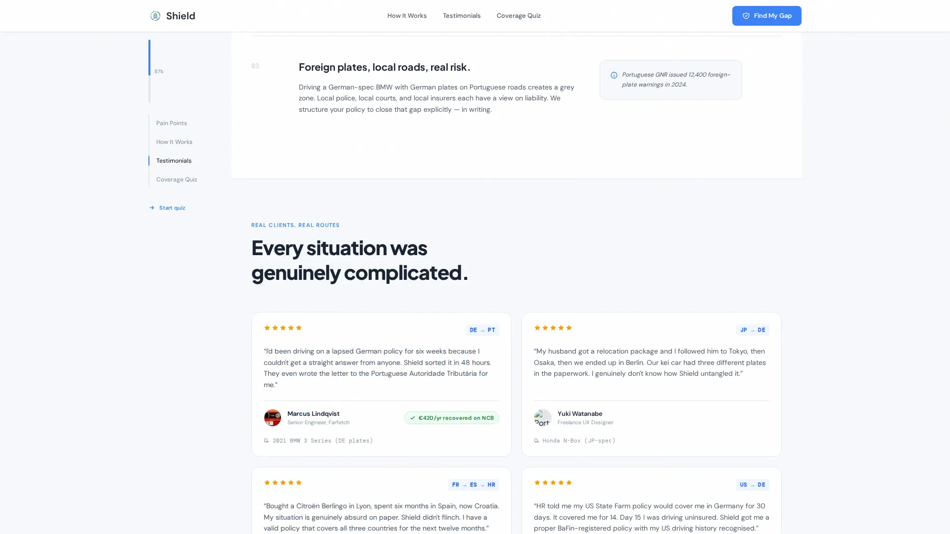
Social proof is tagged by country pair, for example "UK to Spain" or "US to Germany." This makes testimonials feel personally relevant to visitors who are navigating the same relocation corridor, rather than generic five-star reviews.
Educational How It Works Section
An alternating-layout section explains how cross-border motor insurance actually works. It builds trust through context rather than sales language, helping visitors feel informed before they commit to the quiz or the quote step.
Page sections overview
| Section | Purpose |
|---|---|
| Header Logo Bar | Scrolling carrier and regulatory logos build instant credibility |
| Hero Typography Rail | Bold headline and sidebar companion introduce the quiz entry point |
| Pain Cards Block | Three scenario cards name expat frustrations and trigger quiz starts |
| How It Works | Educational alternating layout explains cross-border insurance mechanics |
| Social Proof Block | Country-pair testimonials demonstrate relevant, relatable expertise |
| Five-Step Quiz | Diagnostic flow surfaces coverage gaps and assembles a personalized recommendation |
| Footer Strip | Linear single-row footer closes the page cleanly |
Design & branding system
The visual identity follows a Startup Velocity theme built on a Cloud Canvas color palette. The overall feel is weightless, frictionless, and clean, the kind of interface where complexity has been compressed into calm.
- Core palette: open-sky white (#F7F9FC) background, soft altitude gray (#D4DAE3) for dividers, navigation-pin blue (#3B82F6) for primary interactive elements, and confirmation green (#22C55E) reserved for completed quiz steps and trust badges
- Typography: Plus Jakarta Sans in bold weights for all headings, DM Sans for body copy
- Animation style: high-activity marquee scrolling, quiz step transitions, IntersectionObserver-triggered section reveals, and a live sidebar meter that animates with each answer
Mobile & speed optimization
The template is desktop-first by design, because the sidebar companion rail requires horizontal screen width to function as intended. Mobile visitors still get the full experience through a thoughtful layout collapse.
- On mobile, the persistent sidebar rail collapses into a bottom progress bar, preserving quiz context without blocking content
- Static content sections use server-side rendering, while the interactive quiz runs as a client component to keep initial page load light
- Quiz steps are built with large tap targets for reliable finger input on touch screens
How this template helps you convert
The conversion architecture is layered. It builds trust before asking for anything, then collects contact details only after delivering clear personal value.
- The pain cards create immediate recognition, which lowers the visitor's guard and increases quiz starts before any credential-checking behavior kicks in.
- The sidebar coverage-gap meter makes the quiz feel productive rather than intrusive, so visitors complete all five steps and arrive at the summary feeling informed rather than sold to.
- The final quote step is gated behind only an email address and a WhatsApp number, reducing form abandonment among expats who prefer messaging over inbox communication.
Other information about this template
This template is part of the Startup Velocity theme family and uses the Cloud Canvas color system throughout. A few additional details worth knowing before you customize:
- The page supports dual USD and EUR price display to serve an internationally mixed audience
- Regulatory context is written for a European cross-border environment, making it a natural fit for EU-corridor relocation cases
- The footer follows Pattern 1, a linear single-row layout that keeps the page exit clean and uncluttered
- The hero section intentionally uses no hero image; the white space itself communicates speed and modernity
- Localization is set to English by default, with the layout and content structure designed to accommodate European regulatory language
Theme
Startup Velocity
Creative direction
Problem→Solution Arc
Color system
Cloud Canvas
Style
Sidebar Companion
Direction
Quiz/Assessment
Page Sections
Five-step Coverage-gap Diagnostic Quiz
Persistent Sidebar Companion Rail
Pain-recognition Scenario Cards
Carrier and Regulatory Logo Marquee
Country-pair Testimonials Block
Educational How It Works Section
Related questions
What is the Shield template designed to do?
Who is the target audience for this template?
How does the sidebar companion work?
What information does the quiz collect?
Can this template work for a mobile audience?



