Immersive Insurance Agent Personal Brand Landing Page
Shield is a dark, immersive landing page template built for insurance agents who lead with personality and expertise. It uses an asymmetric 60/40 grid, a cinematic scroll experience, floating parallax portraits, and a rich content hub structure to turn first-time visitors into engaged, trust-ready leads seeking coverage clarity.
by Rocket studio
Quick summary
Shield is a single-page landing page template designed for insurance agents building a personal brand. It pairs a cinematic, documentary-style scroll with an asymmetric 60/40 layout. The dark, iridescent visual identity feels premium and intimate. The page guides visitors from introductory content through to a clear conversion offer, earning trust before asking for anything.
Who this template is for
This template is built for insurance professionals who want to be recognized as a trusted guide, not just a service provider. It works best for agents who already produce educational content and want a focused, visually striking presence online.
- Independent insurance agents building a personal brand around clarity and expertise
- Agents serving first-time homebuyers, young families, and small business owners
- Professionals who use content, video, and downloadable resources to generate leads
What problem this template solves
Most insurance agent pages feel transactional and cold. Visitors land, see a generic form and a stock photo, and leave without any sense of who they are dealing with. Shield solves that by creating a page that feels like a conversation rather than a brochure.
- Visitors scroll past impersonal corporate-style pages without connecting or converting
- Agents with real expertise have no structured way to showcase that depth in one place
- The gap between "I found this agent" and "I trust this agent" is too wide on typical pages
What you get with this template
You get a fully designed landing page built around a content hub model. Every section is pre-structured to support educational depth, personal presence, and a clear lead-capture flow. The layout, animations, and color system are all included.
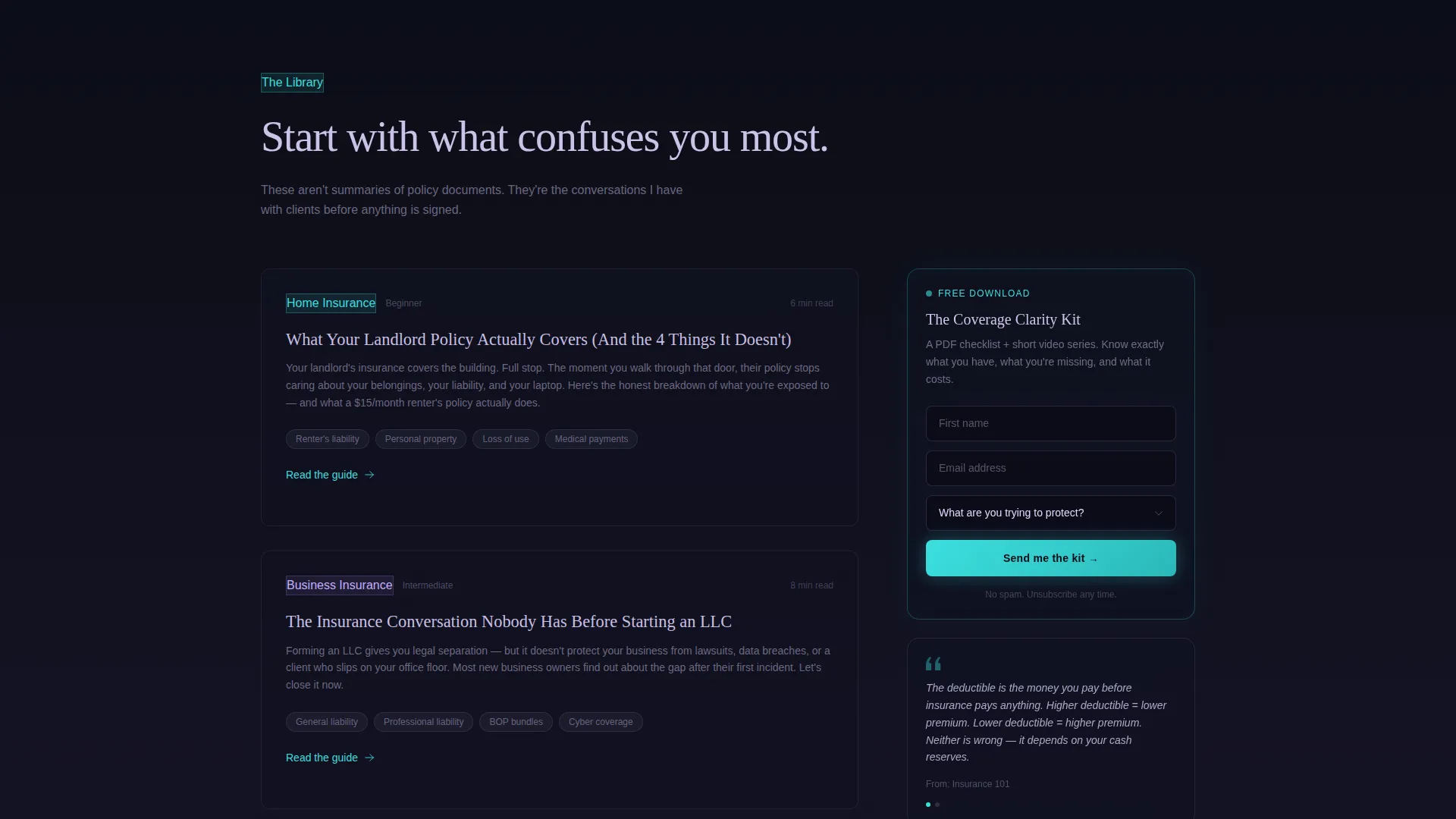
- An asymmetric 60/40 grid with a content-heavy left column and a sticky contextual right rail
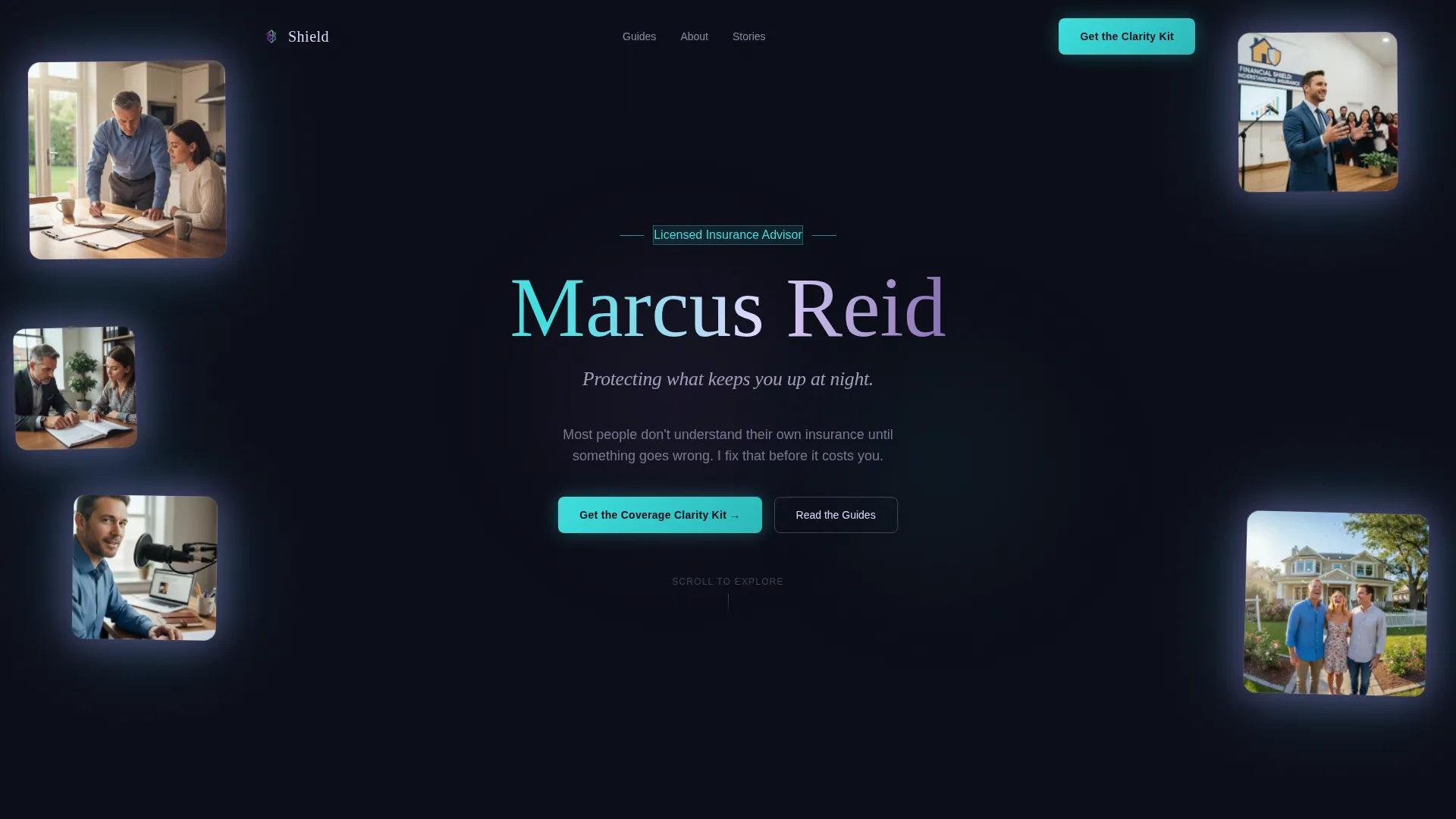
- A floating parallax header featuring multiple layered agent portraits with iridescent drop shadows
- A cinematic scroll sequence with fade-in, upward-drift section transitions throughout the page
- A persistent sticky lead capture card in the right rail and a full-width repeat form section near the footer
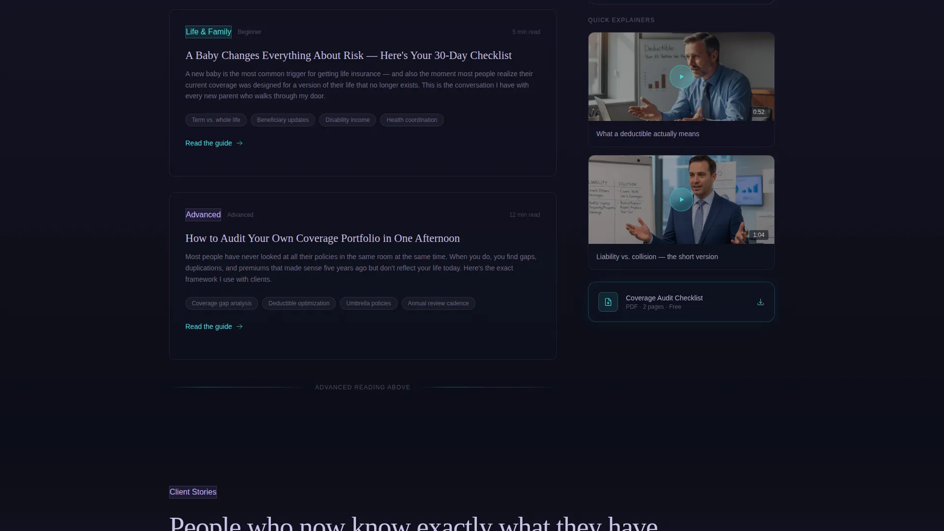
- Pre-structured long-form content slots for guides, pull quotes, PDF thumbnails, and short video embeds
- A two-path conversion system with a primary downloadable kit offer and a secondary booking call to action
Feature list
This section outlines the core functional and design capabilities built into the Shield template, each grounded in the layout and interaction details described in the source brief.
Asymmetric 60/40 Content Grid
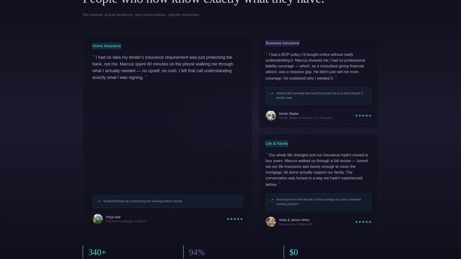
The page uses a fixed 60/40 column split. The wider left column holds long-form educational guides and escalating content sections. The narrower right column anchors pull quotes, downloadable resource thumbnails, and short video clips. This structure keeps the visitor reading while keeping conversion tools always nearby.
Floating Parallax Portrait Header
The header displays five or six candid agent portraits that drift and layer at slightly different depths across the viewport. The images overlap at the edges and cast soft iridescent drop shadows onto the void-black background. The agent's name threads between the photos in large, light-weighted type, creating an immediate sense of presence and authenticity.
Cinematic Scroll Sequence
Each content section fades in with a slow opacity shift and a subtle upward drift as the visitor scrolls. The effect mirrors a documentary edit, making the page feel like scenes cutting into view. Section backgrounds shift progressively from pure black toward a faint violet wash, signaling content depth without breaking the visual mood.
Escalating Content Hub Structure
Content sections are organized from introductory to advanced, rewarding visitors who scroll deeper. Topics progress from foundational insurance concepts through to portfolio auditing and business coverage. This structure creates a binge-worthy reading experience that builds agent credibility with every section.
Persistent Sticky Lead Capture Card
A lead capture card follows the visitor through the middle third of the page on the right rail. It collects first name, email, and a single dropdown asking what the visitor is trying to protect. The same form reappears as a full-width section before the footer, giving two clear opportunities to convert.
Timed Secondary Conversion Path
The secondary call to action, "Book a 15-Minute Coverage Review," only appears after the visitor has scrolled past at least two content sections. This earns the ask by letting the content demonstrate value first, making the booking prompt feel natural rather than pushy.
Page sections overview
| Section | Purpose |
|---|---|
| Floating Portrait Header | Introduces the agent with layered parallax photos and name typography |
| Agent Name Block | Sets name, subline tagline, and immediate emotional tone |
| Content Hub Opening | Anchors the page as an educational resource, not a sales pitch |
| Long-Form Guide Slots | Houses in-depth articles on homeowner, family, and business coverage topics |
| Sticky Right Rail | Displays pull quotes, PDF thumbnails, and short video clips alongside content |
| Escalating Content Sections | Progresses from introductory to advanced coverage topics as visitor scrolls |
| Persistent Capture Card | Sticky lead form collecting name, email, and protection goal dropdown |
| Secondary call to action Reveal | Timed booking prompt appearing after two content sections have been passed |
| Full-Width Form Section | Repeat lead capture block before the footer for final conversion opportunity |
| Footer Area | Closes the page and supports any remaining agent contact or link details |
Design & branding system
Shield uses an AI Iridescent color system built on a void-black base. The palette feels futuristic and premium without relying on gold, marble, or traditional luxury cues. Every color has a specific role in guiding attention and signaling interaction.
- Deep void black (#0B0D17) dominates all backgrounds and bleeds edge to edge for full immersion
- Shifting violet (#7B5EA7) anchors section transitions and hover states, signaling movement through the page
- Liquid holographic teal (#3CDFDF) fires on calls to action and data callouts for maximum contrast
- Pale iridescent highlight (#E0D7FF) ghosts across headline edges, card borders, and divider lines like light through a prism
Mobile & speed optimization
The Shield template is designed with a layout that adapts from the full asymmetric desktop grid down to a single-column mobile flow. The cinematic scroll transitions and parallax portrait effects are structured to function within a responsive layout framework.
- The 60/40 grid collapses gracefully so content sections stack cleanly on smaller screens
- The sticky right rail converts to inline placement on mobile, keeping resource cards and forms accessible
- Parallax depth and fade-in transitions are applied in a way that supports smooth rendering across modern devices
How this template helps you convert
Shield is designed around a principle of earning trust before making an ask. The layout and pacing are intentional, moving the visitor from curious to convinced before any form appears.
- The floating portrait header establishes a human face and a personal voice immediately, reducing the anonymity that makes visitors distrust insurance pages
- The escalating content hub builds credibility section by section, so by the time the lead capture card is visible, the visitor already has a reason to share their name and email
- The timed secondary booking prompt appears only after the visitor has engaged with real content, making the "Book a Review" ask feel earned rather than interruptive
Other information about this template
Shield belongs to the Personal and Resume category with a subcategory focus on insurance agent profiles. It is built specifically for the insurance agent personal brand website niche. A few additional details worth knowing before you build with this template:
- The template style is classified as Asymmetric Grid (60/40) and the creative direction follows a Cinematic Sequence approach
- The header concept is Floating Photos, and the landing page direction is Content and Resource hub
- The theme is Dark Immersive, and the color system is AI Iridescent, a combination that distinguishes this page from typical light-mode insurance agent sites
- The intersection match score for this template's niche and design combination is 13, indicating a tightly focused use case
- This template is best suited for agents who have or plan to create written guides, short videos, and downloadable resources to populate the content hub sections
Theme
Dark Immersive
Creative direction
Cinematic Sequence
Color system
AI Iridescent
Style
Asymmetric Grid (60/40)
Direction
Content/Resource
Page Sections
Asymmetric 60/40 Content Grid
Floating Parallax Portrait Header
Cinematic Scroll Transitions
Escalating Content Hub Structure
Persistent Sticky Lead Capture Card
Timed Secondary Booking Prompt
Related questions
Who is the Shield template designed for?
What kind of content does this template support?
How does the lead capture work in this template?
What makes this template visually different from a standard insurance page?
Can I use Shield if I don't have video content ready yet?



