Instant Micro-Insurance Landing Page Template
Shield is a single-page landing page template built for instant micro-insurance platforms. It features a split-screen comparison layout, an animated shield hero section, a live policy activation counter, and an inline free-trial form. Designed for gig workers, freelancers, and event sellers, it communicates the speed and simplicity of bite-sized coverage against legacy insurance in one clean, mobile-first page.
by Rocket studio
Quick summary
Shield is a conversion-focused landing page template for micro-insurance platforms. It uses a 50/50 split-screen comparison layout to contrast legacy insurance with instant, affordable coverage. The page guides visitors from a bold hero headline through three side-by-side comparisons to a no-credit-card free policy form, all in a crisp Arctic White fintech design system.
Who this template is for
This template is built for fintech founders, insurtech startups, and independent product teams launching instant coverage platforms. It speaks directly to an audience that values speed, clarity, and zero friction in the sign-up experience.
- Micro-insurance and insurtech product teams who need a fast, credible launch page
- Gig economy platform builders targeting freelancers, digital nomads, and event sellers
- Small business owners or developers building single-event or short-window coverage tools
What problem this template solves
Traditional insurance landing pages are cluttered, jargon-heavy, and built around annual commitments. They fail the gig worker who needs coverage by morning and the nomad who cannot afford to decode a 14-page policy PDF. This template removes that friction entirely.
- Replaces confusing policy language with three sharp visual comparisons that make the value obvious
- Removes the credit card barrier by centering the page around a free 24-hour trial activation
- Replaces a slow, multi-step sign-up with a three-field inline form that works on any phone screen
What you get with this template
You get a fully structured, single-page layout that takes a visitor from skepticism to activation in one scroll session. Every section is purposeful, and nothing decorative competes with the conversion path.
- A hero section with an oversized headline, animated shield assembly, and a live policy counter
- Three scroll-triggered split-screen comparison panels built to show the old world versus the new
- A pinned bottom call-to-action and an inline free policy form with asset type, date picker, and email fields
Feature list
This template includes the following built-in features and designed components.
Animated Hero with Live Counter
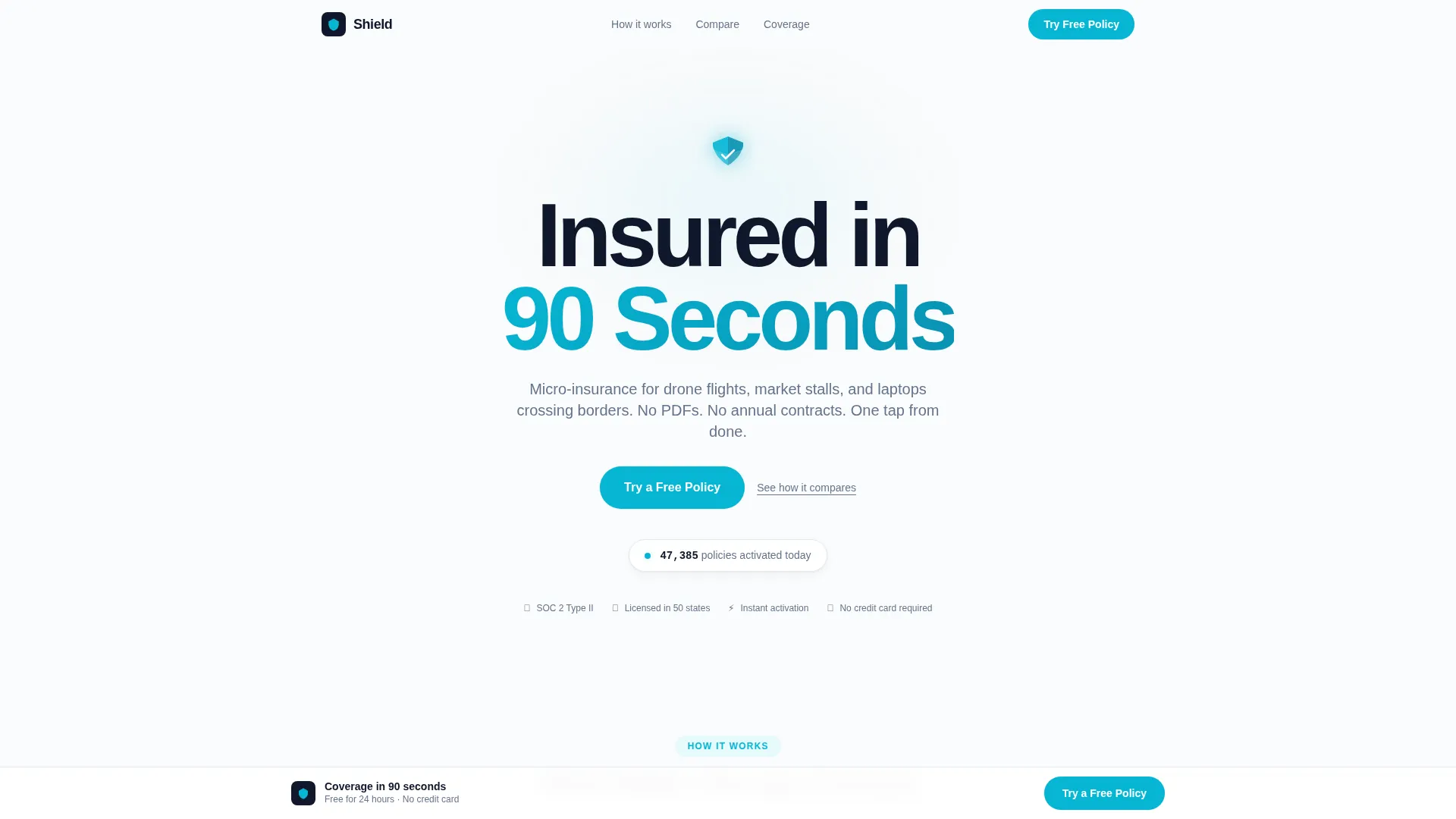
The hero displays a giant centered headline set in bold DM Sans against Arctic White. A small shield icon assembles itself from four fragments as the page loads. Beneath the headline, a live counter ticks through real policy activations using JetBrains Mono, adding instant social proof above the fold.
Scroll-Triggered Split-Screen Comparisons
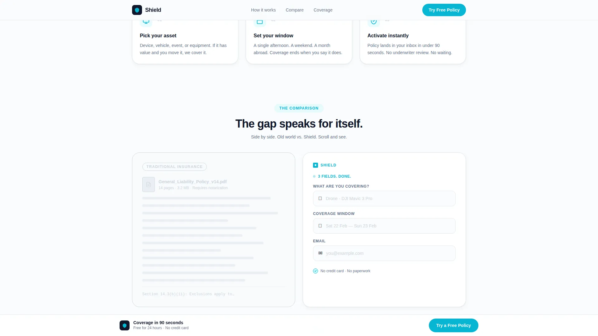
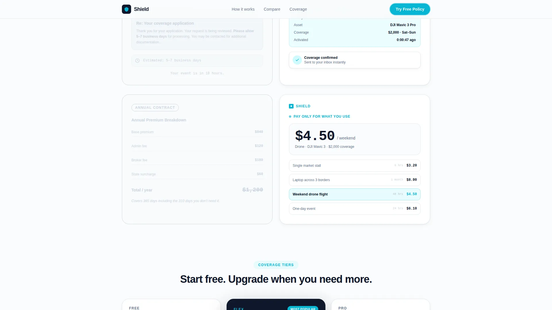
Three 50/50 split panels reveal as the visitor scrolls. The left side shows a grayed-out legacy scenario, such as a 14-page PDF or a five-to-seven business day wait. The right side glows in full Arctic contrast with electric teal highlights, showing the Shield alternative. Each comparison slides in independently for a clean, argument-free reveal.
Inline Free Policy Form
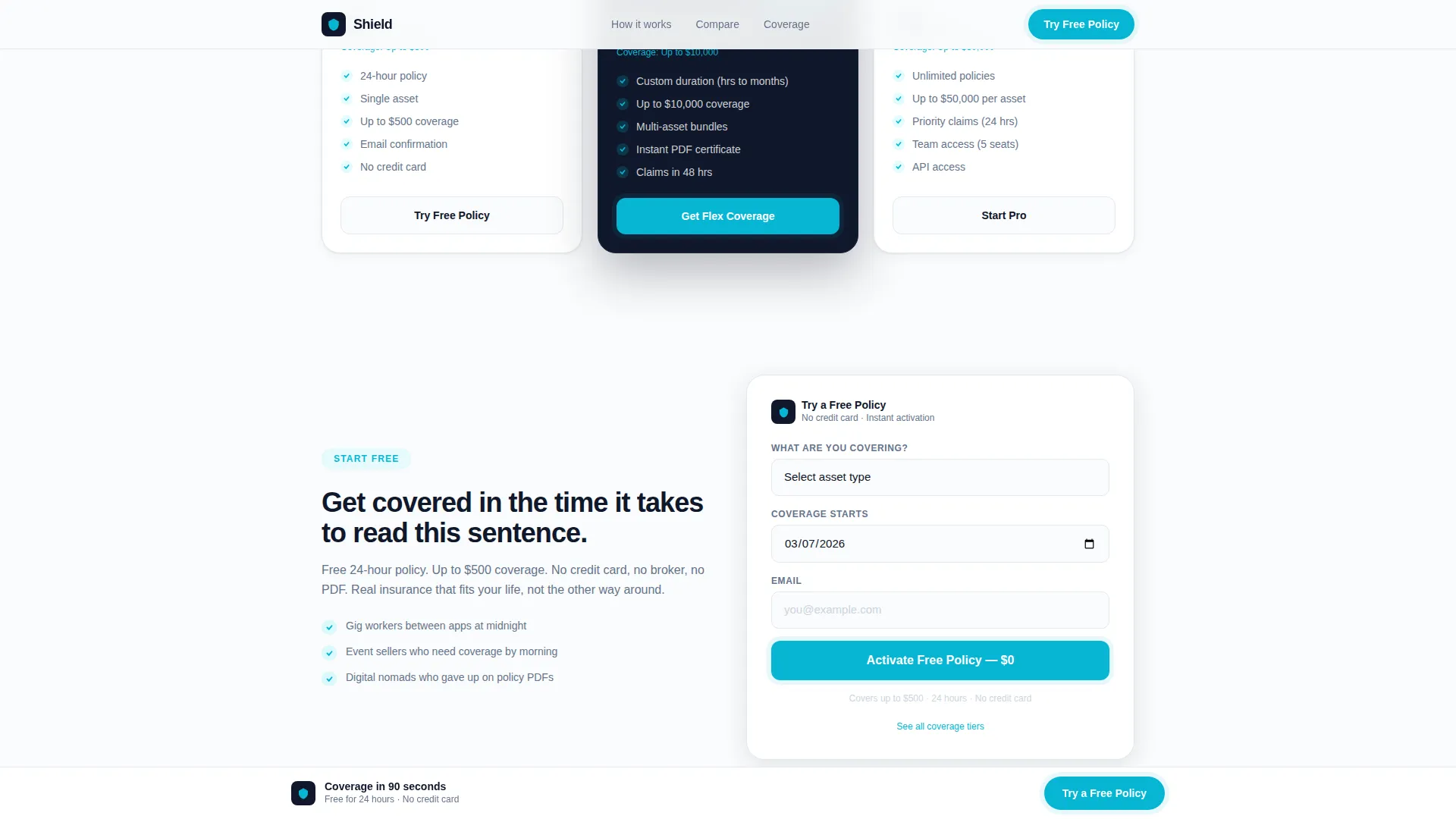
A three-field inline form collects asset type via dropdown, a coverage start date via date picker defaulting to today, and an email address. No credit card is required. The form covers up to $500 in protection for 24 hours, giving new users a real taste of the product. A secondary text link below reads "See all coverage tiers" for visitors who want to compare before committing.
Pinned Bottom Call-to-Action
After the second comparison panel, a "Try a Free Policy" button pins to the bottom of the viewport and stays visible as the visitor continues scrolling. This keeps the primary conversion action reachable at any point in the page without interrupting the scroll story.
Dashboard Pro Design System
The entire template uses a precisely defined Arctic White color system. Clinical snow white (#FAFBFC) dominates the background. Deep polar navy (#0F172A) anchors headlines and data panels. Slate graph-line gray (#64748B) handles body text and secondary interface elements. Electric teal (#06B6D4) is reserved exclusively for interactive elements, toggle states, and call-to-action pulses.
Footer with Horizontal Flow Pattern
The footer uses a horizontal flow layout that keeps the page's clean, fintech-whiteboard feel all the way to the bottom. It provides a clear close to the page without visual noise.
Page sections overview
| Section | Purpose |
|---|---|
| Hero Headline | Introduce the platform with "Insured in 90 Seconds," the shield assembly animation, and a live activation counter |
| Primary call to action | Surface the "Try a Free Policy" button immediately below the hero before any scroll |
| Comparison Split 1 | Contrast a 14-page PDF policy document with a three-field mobile form |
| Comparison Split 2 | Contrast a 5-7 business day activation email with a real-time confirmation |
| Comparison Split 3 | Contrast a $1,200 annual premium with a $4.50 weekend-only charge |
| Pinned call to action Bar | Re-surface the primary call-to-action pinned to the bottom after the second comparison |
| Free Policy Form | Collect asset type, coverage date, and email with no credit card required |
| Page Footer | Close the page with a clean Vercel-style horizontal flow footer |
Design & branding system
The visual identity follows a Dashboard Pro theme that feels like a fintech command center stripped of everything unnecessary. Typography is set in DM Sans for headlines and JetBrains Mono for counters and data fields, creating a clear hierarchy between editorial and functional content.
- Arctic White (#FAFBFC) background, Deep Polar Navy (#0F172A) headlines, Slate Gray (#64748B) body text
- Electric Teal (#06B6D4) used only on interactive elements, toggle states, and call-to-action pulses
- Aggressive intentional whitespace that signals precision and respect for the visitor's attention
Mobile & speed optimization
This template is built mobile-first because its target users are gig workers checking coverage options on a phone at midnight. The layout decisions, form design, and animation approach all reflect that priority.
- The three-field inline form is thumb-friendly, with a date picker defaulting to today and a single-tap dropdown
- Scroll-triggered comparison reveals use CSS animations and Intersection Observer, keeping the page light without heavy libraries
- The pinned bottom call-to-action stays visible and reachable on small screens throughout the scroll session
How this template helps you convert
Every structural decision in this template moves a hesitant visitor closer to activating a free policy. Nothing on the page argues. It simply shows the gap between old and new, then makes the next step obvious.
- The comparison scroll sequence does the persuasion work silently. By the third panel, the price and speed difference is undeniable, and the visitor arrives at the form already convinced.
- The no-credit-card free policy form lowers the commitment barrier to nearly zero. A real 24-hour policy covering up to $500 gives users an experience worth upgrading from, creating a natural conversion moment.
Other information about this template
This template is categorized under Finance and Insurance, with a specific focus on the InsurTech and Digital Insurance subcategory. It is designed for the micro-insurance platform niche, where speed of activation and transparent pricing are the two primary conversion levers.
- The template is built for English-language, United States market delivery, using USD pricing and MM/DD/YYYY date formatting
- Social proof is handled through the live policy activation counter and trust badge placements rather than static testimonials
- The "See all coverage tiers" secondary link supports visitors who need to compare plans before committing to the free trial flow
- The template style is Split Screen (50/50), and the creative direction is a Comparison Journey that deliberately grays out the old-world panel while the Shield panel glows
Theme
Dashboard Pro
Creative direction
Comparison Journey
Color system
Arctic White
Style
Split Screen (50/50)
Direction
Freemium/Trial
Page Sections
Animated Hero with Live Policy Counter
Scroll-triggered Split-screen Comparisons
No-credit-card Inline Policy Form
Pinned Bottom Call-to-action
Dashboard Pro Arctic White Design System
Related questions
Does the free policy form require a credit card?
What asset types are included in the form dropdown?
Can I update the comparison panels with my own pricing and scenarios?
Is this template designed for mobile users?
What is included in the page footer?



