Insurance Coverage Gap Calculator & Assessment Website Template
Shield is a split-screen insurance agency landing page template built around a live coverage gap calculator. It pairs agency credibility with interactive tools, guiding visitors through life, property, liability, and umbrella coverage layers before asking them to book a consultation. The Midnight Blue command-center design keeps the experience focused, confident, and conversion-ready from the first scroll.
by Rocket studio
Quick summary
Shield is a single-page, split-screen insurance landing page template designed for agencies that want to earn trust before asking for a form submission. The coverage gap calculator sits above the fold and personalizes the pitch in real time. Every section, from the agency timeline to the carrier logos, builds on what the visitor already entered, making the insurance landing page feel tailored rather than generic.
Who this template is for
This template is built for insurance agencies that serve clients going through life transitions. It works equally well for a boutique firm and a growing regional insurance company that needs a professional digital presence fast. Designers, developers, and marketers who build landing pages for insurance clients will also find the layout ready to customize with minimal effort.
- New homeowners, new parents, and small business owners who are the primary target audience for this type of insurance landing page
- Insurance agencies and independent brokers who want high converting landing pages that do the selling through utility
- Web designers and developers who need a fully structured insurance landing page template to adapt for a client
What problem this template solves
Most people visit an insurance website and leave without acting because the page feels generic and the forms feel intrusive. A good insurance landing page has to earn attention before it can ask for a commitment. This template solves that by leading with a calculator rather than a contact form, letting visitors see their own coverage exposure before they sign anything.
- Visitors feel overwhelmed by complex insurance options and policy language before they can make a decision
- Standard landing pages ask for personal data too early, reducing the conversion rate before trust is established
- Agencies lack a clear visual structure that guide visitors from awareness to consultation booking in a single scroll
What you get with this template
Shield delivers a complete, ready-to-customize insurance landing page built around five distinct content sections. Each section is designed to add a layer of trust and relevance as the visitor scrolls, ending with a strong call to action that routes to a quote consultation page. The template includes all layout files, typography settings, color tokens, animation configurations, and interactive components needed to launch a professional insurance landing page.
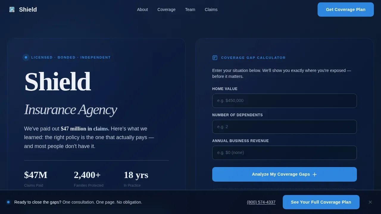
- A live coverage gap calculator pre-loaded in the hero section, with fields for home value, number of dependents, and business revenue
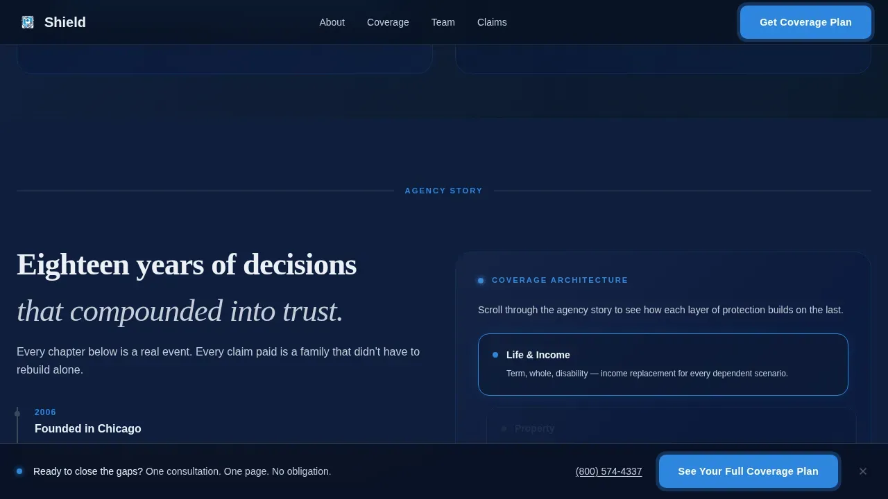
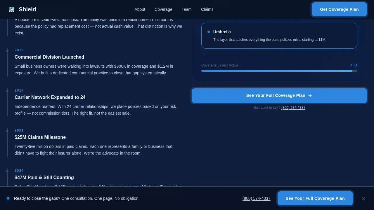
- A dated agency timeline with a dynamic coverage snapshot that updates in the right rail as the visitor scrolls through life, property, liability, and umbrella layers
- A sticky call-to-action bar that activates after 40 percent scroll depth, plus two additional placements of the primary call to action inside the page
Feature list
This insurance landing page template ships with a focused set of interactive and visual features. Each one is grounded in what the prompt specifies, and each one serves the single goal of converting an insurance landing page visitor into a booked consultation.
Live Coverage Gap Calculator
The calculator sits in the hero section above the fold and is ready to use on arrival. Visitors enter home value, number of dependents, and business revenue. The right rail updates a personalized coverage snapshot in real time. Breaking the calculation into clear input fields reduces cognitive load and avoids overwhelming visitors with too much at once. No sensitive personal data is required to see an initial result.
Split-Screen Lateral Layout
The 50/50 split-screen layout keeps agency credibility on the left and interactive output on the right throughout the page. As visitors scroll, content slides in from alternating sides using lateral motion, creating a breathing rhythm that keeps users engaged without cluttering the page with competing elements. White space is used deliberately to separate content panels and maintain readability.
Multi-Placement Call-to-Action System
The primary call to action, "See Your Full Coverage Plan," appears three times: inside the calculator results, after the agency timeline, and as a sticky bottom bar triggered at 40 percent scroll depth. A secondary text link with a live phone number sits beneath each call to action for visitors who prefer to call rather than fill out a form. This structure supports a strong conversion rate without overwhelming visitors.
Dark Glass Panel Hero Section
The hero uses two frosted, semi-transparent glass panels floating over a slow-motion deep-navy gradient background. The left panel displays the agency name and a credibility statement referencing $47M in paid claims. The right panel holds the calculator. Subtle light reflections animate as the background shifts, creating depth and a catchy headline treatment that feels commanding without being loud.
Scrollable Agency Timeline
The left rail of the mid-page section walks through the agency story in short, dated chapters. Founding year, first million-dollar claim paid, team growth, and carrier partnerships are each presented as a chapter. The right rail updates dynamically with each chapter, adding coverage layers in sequence. This lateral slide-in motion acts as a guide for visitors through the agency's proof points before the team portraits and carrier logos appear.
Social Proof and Trust Signal Section
The template includes a dedicated section for team portraits and carrier logos positioned after the coverage layers. These elements function as trust signals that build credibility at the moment visitors are closest to booking. Reviews and industry awards placements are supported near the calculator output, following best practices for building confidence on insurance landing pages.
Page sections overview
| Section | Purpose |
|---|---|
| Hero Glass Panels | Introduce agency and activate the coverage gap calculator above the fold |
| Agency Timeline Rail | Walk through dated milestones while updating the right-rail coverage snapshot |
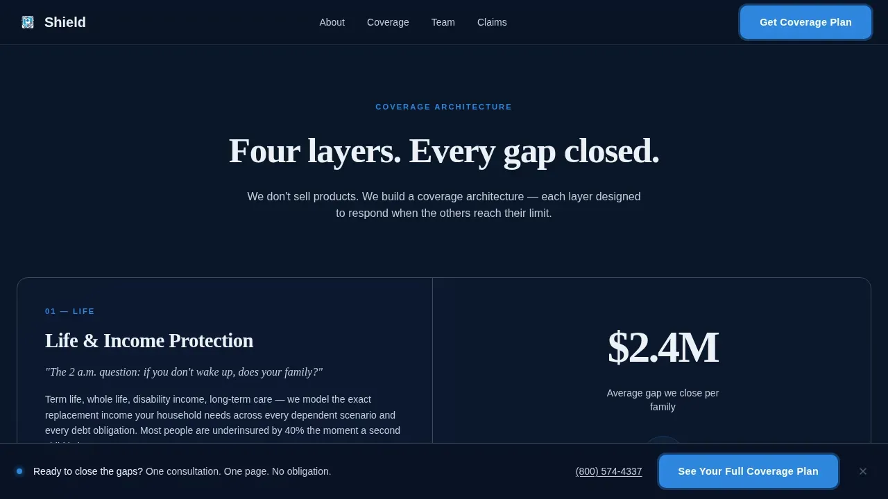
| Coverage Layers Reveal | Staggered reveal of life, property, liability, and umbrella coverage categories |
| Team and Carriers | Display portraits and carrier logos as social proof and trust signals |
| Final Call to Action | Full-width dark panel with the primary call to action routing to the consultation page |
| Footer Row | Linear single-row footer with links and contact information |
Design & branding system
Shield uses a Midnight Blue color system that feels like the bridge of a ship at night. Every color has a defined role, and the typography pairing keeps emotional headlines separate from functional interface text. The visual style communicates security and control without relying on stock-photo clichés.
- Color tokens: deep navy (#0A1628) for backgrounds, policy-paper white (#EDF0F5) for body text and open space, steel-gray (#3A4A5C) for divider lines between content panels, and signal-blue (#2E86DE) for all interactive elements and active states
- Typography: Fraunces for display and emotional headlines, DM Sans for body copy and user interface elements, giving the branding system a clear hierarchy between feeling and function
- Motion style: GSAP ScrollTrigger drives lateral slide-ins, a radar pulse effect on signal-blue accent elements, and a parallax background gradient that shifts behind the glass panels
Mobile & speed optimization
The template is built desktop-first to support the calculator interaction, but the layout is fully responsive for mobile visitors. Every section reflows cleanly at smaller viewports. Mobile-first best practices are embedded in the template structure so the page loads fast and remains easy to read and tap on smartphones.
- The calculator collapses to a single-column flow on mobile, keeping the input fields accessible without horizontal scrolling
- The sticky call-to-action bar adapts to mobile viewport height, remaining visible without blocking content
- Static content sections use server components while the calculator and scroll logic use client components, keeping the page load efficient across devices
How this template helps you convert
An effective insurance landing page blends clear, trust-based design with interactive tools that provide immediate value. Shield is structured to move visitors from curiosity to commitment through a sequence that feels helpful rather than pushy. Companies using landing pages generate significantly more leads than those that do not, and this template is built to support that outcome through every design decision.
- The calculator delivers a personalized coverage snapshot before any form is submitted, establishing the agency's value proposition through utility rather than persuasion, and keeping users engaged throughout the page
- Trust signals including the $47M claims paid stat, carrier logos, team portraits, and customer reviews appear at the right moments in the scroll sequence to build trust progressively and support a stronger conversion rate
- The three-placement call-to-action system, paired with a direct phone link beneath each button, removes friction for every type of visitor whether they prefer to sign up online or call directly
Other information about this template
Shield is a great example of how a good insurance landing page can serve multiple insurance products within a single focused layout. The template can support auto insurance, travel insurance, health insurance landing page flows, and property coverage without restructuring the core layout. It is also a practical reference for marketers and designers building insurance landing pages for life stages and business clients with specific needs.
- The creation process is simplified because all layout files, color tokens, animation settings, and interactive components are included and ready to customize
- No-code tools allow users to adapt the template components and elements without extensive coding skills; drag-and-drop functionality and pre-designed structure simplify the process of saving time during setup
- The template is relevant to a wide range of insurance business use cases: a health insurance landing page, a liability-focused landing page for small business owners, or a combined personal and commercial insurance website
- Designers can freely adjust the branding, swap color tokens, update images, and change links to match any insurance company identity while keeping the page layout and conversion logic intact
- The template supports multi-step forms to streamline data collection, and the layout accommodates analytics tracking and conversion rate monitoring so marketers can run relevant tests over time
- The shield trusted coverage gap calculator insurance agency landing page template is listed in the Insurance Agency Website Templates subcategory and is ready to explore and deploy immediately
Theme
Dynamic Motion
Creative direction
Calculator/Tool First
Color system
Midnight Blue
Style
Split Screen (50/50)
Direction
Click-Through
Page Sections
Live Coverage Gap Calculator
Split-screen Lateral Scroll Layout
Multi-placement Call-to-action System
Dark Glass Panel Hero Section
Scrollable Dated Agency Timeline
Social Proof and Trust Signal Section
Related questions
Can I customize the calculator fields for different insurance products?
Does this template work for a small insurance company or solo broker?
How does the sticky call-to-action bar work?
Is the page optimized for mobile visitors?
Can I use this template for a health insurance landing or other coverage types?



