Military Service Member Insurance Comparison Website Template
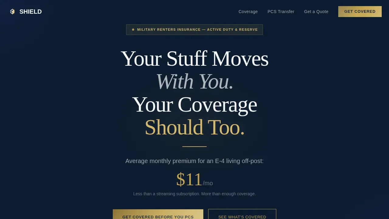
Shield is a split-screen military renters insurance landing page built for service members who move often and need coverage that keeps pace. The design uses a Navy Authority color system, a scroll-driven Comparison Journey layout, and a three-field lead generation form that personalizes quotes by duty station, pay grade, and housing status without asking for sensitive personal information upfront.
by Rocket studio
Quick summary
Shield is a single-page insurance landing page template built specifically for military renters insurance providers. It uses a 50/50 split-screen layout, a deep navy and brass color system, and a scroll-linked Comparison Journey to move service members from awareness to a completed quote form. Every section earns trust and makes the cost of being uninsured feel real.
Who this template is for
This template is built for insurance companies and agencies marketing renters coverage directly to active-duty service members and their families. It serves the specific needs of providers who understand that a standard insurance landing page misses the military audience entirely.
- Insurance businesses targeting E-4s signing their first off-post lease or junior officers doing a permanent change of station, commonly called a PCS move
- Designers and marketers building high converting landing pages for the defense and insurance vertical
- Agencies creating a professional insurance website for a client whose customers live on or near military installations across the United States
What problem this template solves
Most people shopping for renters insurance face a generic insurance landing page that was built for suburban homeowners, not service members rotating between duty stations every eighteen months. That mismatch costs insurance companies leads and costs service members real protection.
- Traditional insurance landing pages overwhelm visitors with options irrelevant to military life, such as car storage rules and fixed-address billing cycles
- Service members need an insurance landing page that addresses PCS moves, barracks rooms, off-base apartments, and deployment storage in plain language
- Standard forms ask for too much personal information too early, reducing conversion rate before the visitor even sees the coverage details
What you get with this template
You get a fully structured, design-ready insurance landing page with every section, component, and layout decision already made. The template is built to guide visitors through a clear journey from problem awareness to quote submission, saving time for both the design team and the end user.
- A five-section landing page layout including a hero, three split-screen comparison panels, a lead generation form section with social proof, and a linear single-row footer
- Pre-built design files using the Navy Authority color system with detailed information on typography, spacing, and component states ready for customization
- A mobile-first layout with a floating call to action bar and a sticky left panel scroll interaction that keeps users engaged throughout the comparison journey
Feature list
This insurance landing page template includes purpose-built features that serve the military insurance audience. Each design element and interactive component was chosen to support a high conversion rate without overwhelming visitors.
Scroll-Linked Split-Screen Comparison
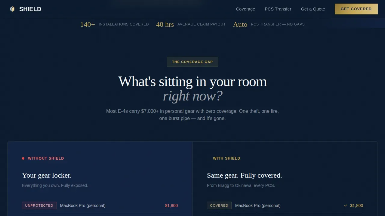
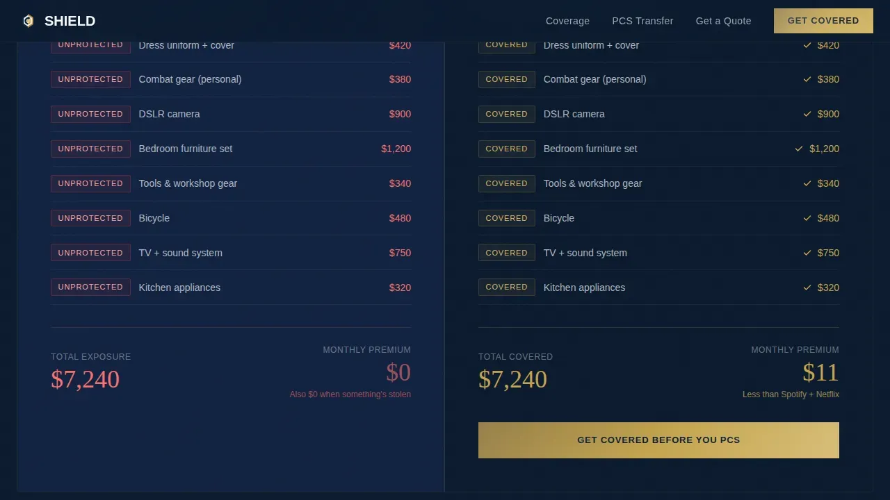
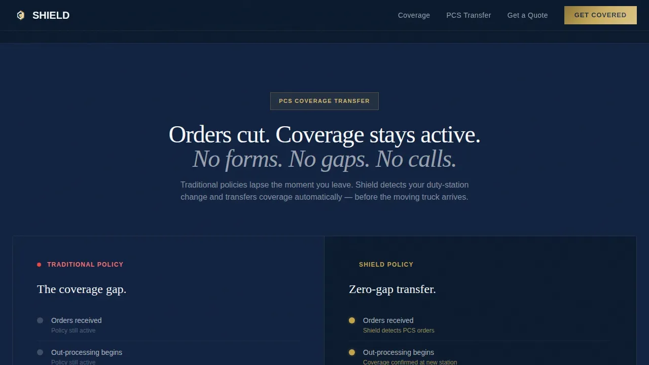
The core design engine of this landing page is a 50/50 split layout where the left panel stays fixed while the right panel scrolls through three escalating comparison states. The first split shows a barracks room inventory with dollar values uninsured versus fully covered. The second split uses a duty-station map to show how traditional insurance policies lapse during a PCS move versus continuous coverage that transfers automatically. The third split covers deployment storage and liability scenarios to make the cost of being uninsured undeniable by the halfway scroll point.
Brass-Accented Navy Authority Design System
The visual design background is built on deep dress-blue navy (#0B1A2E) as the dominant background color, with polished brass (#C5A44E) reserved strictly for calls to action and key financial figures. A blue background approach across header fields creates immediate authority. Starched white (#F7F8FA) opens breathing room between sections, and gunmetal gray (#4A5568) handles body text and dividers. The palette conveys the security and professionalism that an insurance company in this niche must project.
Giant Headline Hero Section
The hero section places a large serif headline centered on the deep navy background field with no hero image distractions. A brass-colored underline rule sits beneath the headline. A subline in starched white displays the average monthly premium. This approach communicates the value proposition immediately, as compelling hero sections should, using white space and typographic authority rather than imagery.
Three-Field Personalized Quote Form
The lead generation form asks for three data points only: duty station via a dropdown of major installations, pay grade from E-1 through O-6, and whether the applicant lives on-post or off-post. This frictionless form approach follows best practices for insurance landing pages, which recommend keeping forms as minimal as possible to improve conversion rate. No personally identifiable information is required at the quote stage.
Rank-Specific Social Proof Panel
The form section pairs with a social proof block featuring rank-specific testimonials from an E-4, a military spouse, and an O-2 junior officer. Trust signals at this location in the page directly support the conversion goal. Every element on a well-structured insurance landing page works toward converting visitors into leads, and authentic rank-level testimonials do that job efficiently.
Interactive Gear Calculator Link
A secondary path labeled "See What's Covered" links to an interactive gear calculator that lets cautious visitors self-educate before committing to the form. This gives the insurance company a way to support different buyer decision speeds without sending visitors away from the landing page entirely.
Page sections overview
| Section | Purpose |
|---|---|
| Hero Headline | Establish authority and display average premium immediately |
| Split Comparison One | Show inventory cost gap between uninsured and covered states |
| Split Comparison Two | Map PCS coverage gap versus automatic transfer |
| Split Comparison Three | Escalate deployment storage and liability stakes |
| Lead Gen Form | Capture duty station, pay grade, and housing status |
| Social Proof Panel | Rank-specific testimonials to build trust before submission |
| Footer | Linear single-row links and company information |
Design & branding system
The branding system follows an Executive Suite theme. The design feels like a commander's desk: dark lacquer authority, brass nameplate accents, and crisp letterhead white. Typography uses a tall tight serif for headlines and a clean sans-serif for body and interface elements, keeping the insurance website readable at every screen size.
- Color roles are strictly assigned: navy dominates backgrounds and headers, brass appears only on calls to action and key figures, white creates breathing room, and gunmetal carries fine print and dividers without competing
- Branding elements like the brass underline rule and the serif headline weight are repeatable design components that designers can adjust to match a specific company identity while keeping the authority feel intact
- All design files are organized with clear labeling so teams can locate, edit, and customize elements quickly without rebuilding from scratch
Mobile & speed optimization
A mobile-friendly landing page is essential because most people in the service member audience act on their phones, often from on-base locations with limited time. The template is built mobile-first, with layout decisions that prioritize convenience on smaller screens.
- The floating call to action bar pins to the bottom of the mobile screen after the first comparison split, keeping the primary action visible and tappable without requiring users to scroll back to the top
- The sticky left panel interaction is adapted for mobile so that the comparison journey remains clear and users engaged even on narrow viewports
- Static sections use lightweight rendering approaches and client-side scroll interactions are isolated to the comparison component to keep the landing page responsive across connection types common on military installations
How this template helps you convert
Insurance landing pages exist to get new leads for insurance companies, and 69% of all insurance purchases begin with a simple search. This template is structured to capture that intent and turn it into a submitted form.
- The Comparison Journey escalates stakes across three scroll stages, making the coverage gap feel personal and specific before the form ever appears, which increases the likelihood that visitors arrive at the quote step already motivated
- The three-field form removes friction by asking only for duty station, pay grade, and housing status, following the landing page best practice of simplifying forms to improve conversion rate and reduce bounce
- Trust signals appear at the exact moment a visitor must decide whether to submit, with rank-specific testimonials and visible coverage details that help the insurance company build trust at the highest-leverage point on the page
Other information about this template
This section covers additional context relevant to insurance providers, designers, and marketers evaluating this template against broader landing page needs.
The Shield military renters insurance landing page template is a great example of how niche specificity improves insurance landing page performance. A generic insurance landing page cannot address the unique combination of PCS moves, barracks room coverage, deployment storage, personal liability for gear, and on-base discount options that military renters insurance requires.
Coverage options built into the page narrative include personal property, personal liability, and replacement cost coverage for belongings. The comparison panels reference waiving deductibles for damaged or stolen uniforms and gear, on-base discount savings, and PCS transit protection for belongings in government-approved storage. These are the insurance options most relevant to the target audience and they appear in plain language rather than policy jargon.
Designers and agencies working across the broader insurance vertical will recognize familiar structural patterns here. A life insurance landing page and a health insurance landing page share the same foundational rules: clear messaging, short forms, and strong calls to action. This template applies those rules to the military renters niche with the same discipline. If your company also markets auto insurance, health insurance, life insurance, or travel insurance, the structural logic of this landing page transfers directly to those pages with branding adjustments.
This template prioritizes professional design systems compatible with tools like Figma, Adobe XD, and Sketch. The files are organized with a well-labeled structure so that any member of a design or marketing team can access, edit, and hand off components without confusion. Templates like this one include pre-built sample pages and pixel-perfect components that help designers accelerate their workflow considerably.
The landing page design reflects trust, security, and professionalism. Those qualities are not decorative in the insurance business. They are functional requirements. An insurance company marketing to service members must signal that it understands the customer's life before asking for any personal detail. This template does that job through design authority rather than words alone.
- Compatible with major design tools including Figma, Adobe XD, Sketch, and Adobe Photoshop
- Includes pre-designed component files with clearly labeled layers and organized pages for easy handoff
- Uses free Google Fonts-compatible typefaces to keep the insurance website production-ready without additional licensing costs
- Suitable for insurance companies, agencies, marketers, and independent designers building in the military or broader insurance vertical
- The life insurance landing page and health insurance landing page structural patterns translate directly when adapting this template for related insurance products
Theme
Executive Suite
Creative direction
Comparison Journey
Color system
Navy Authority
Style
Split Screen (50/50)
Direction
Lead Generation
Page Sections
Scroll-linked 50/50 Comparison Layout
Three-field Lead Generation Form
Navy Authority Branding System
Rank-specific Social Proof Block
Interactive Gear Calculator Secondary Path
Floating Mobile Call to Action Bar
Related questions
Who is the ideal buyer for this landing page template?
What coverage information does the template highlight?
Can designers customize the branding and colors?
Does the template work well on mobile devices?
Is this template only useful for military renters insurance?



