Financial Literacy & Education Professional Website Template
Shield is a dark-luxury lead generation landing page for a real estate asset protection course. Built around a scroll-animated comparison table, it guides W-2 professionals and small landlords from fear to action. The page captures leads through a progressive form offering a free asset-vulnerability assessment, using visual urgency and structured contrast to convert passive readers into enrolled students.
by Rocket studio
Quick summary
Shield is a single-page lead generation template for a real estate legal education course. It uses a scrolling comparison table to show investors exactly what is at stake without an entity structure. The page captures qualified leads through a progressive form and a dual call-to-action system, all wrapped in a deep plum-black, ambient-glow visual identity.
Who this template is for
This template is built for course creators, educators, and legal education businesses in the real estate investing space. It fits any offer that teaches asset protection, entity structuring, or risk reduction to property owners.
- W-2 professionals preparing to buy their first rental property and looking to understand legal exposure before closing
- House-hackers and early landlords who hold property in their personal name and want a structured, professional course to guide their next step
- Small portfolio landlords managing four to ten units who rely on basic free templates and have not yet restructured their holdings
What problem this template solves
Most real estate investors do not realize their personal assets are exposed until a lawsuit arrives. A general-purpose landing page cannot create that moment of clarity. This template is built specifically to make the risk visceral, measurable, and solvable.
- Visitors arrive curious but unconvinced; the scroll-animated comparison table forces a side-by-side reckoning between unprotected and protected outcomes
- Without a qualifying lead form, course creators cannot segment their audience by property count or entity status; this template captures that data progressively
- A single flat page with one call to action loses the visitor who is not ready to commit; the dual call-to-action system gives both warm and cold leads a relevant next step
What you get with this template
This template delivers a fully designed, single-page layout ready for a real estate asset protection course. Every section is structured to move the visitor from awareness to action without friction.
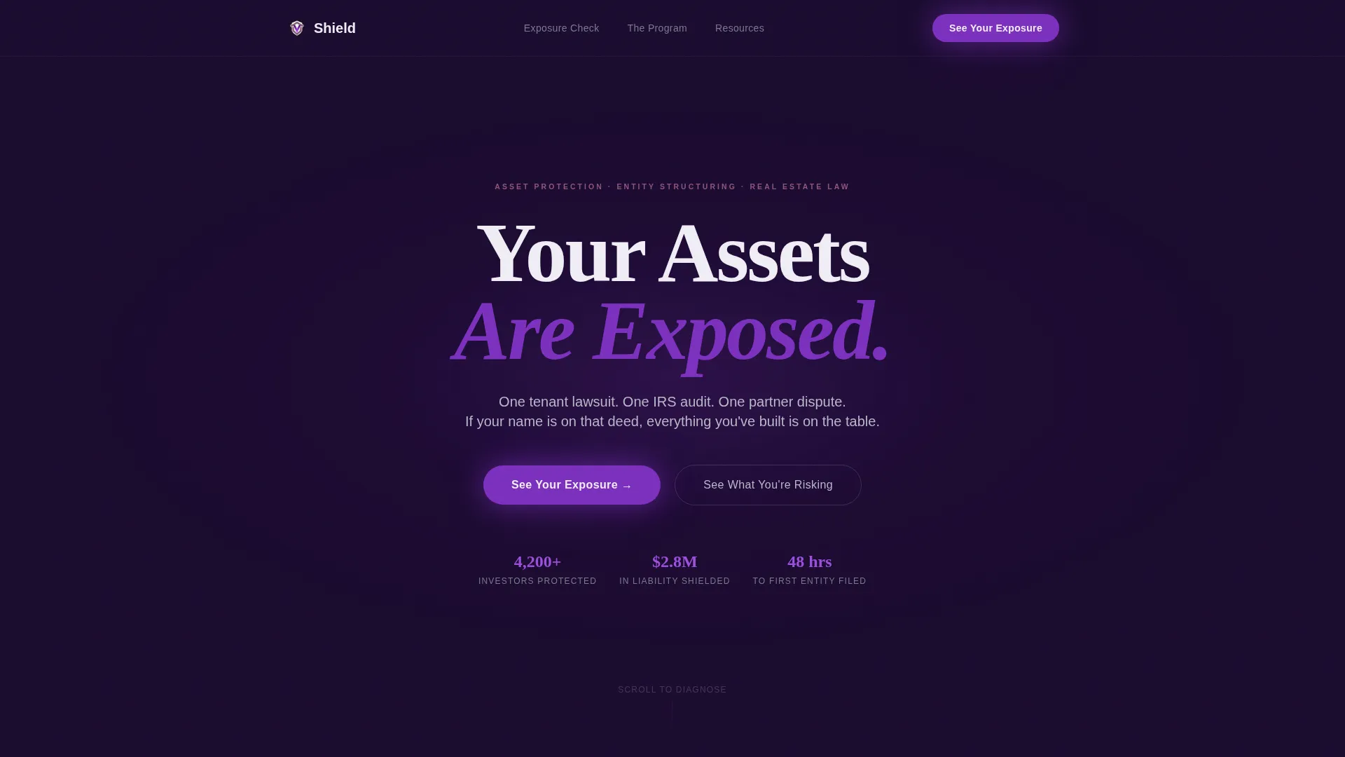
- A dark full-bleed hero section with a breathing electric violet glow animation and a single serif headline: "Your Assets Are Exposed."
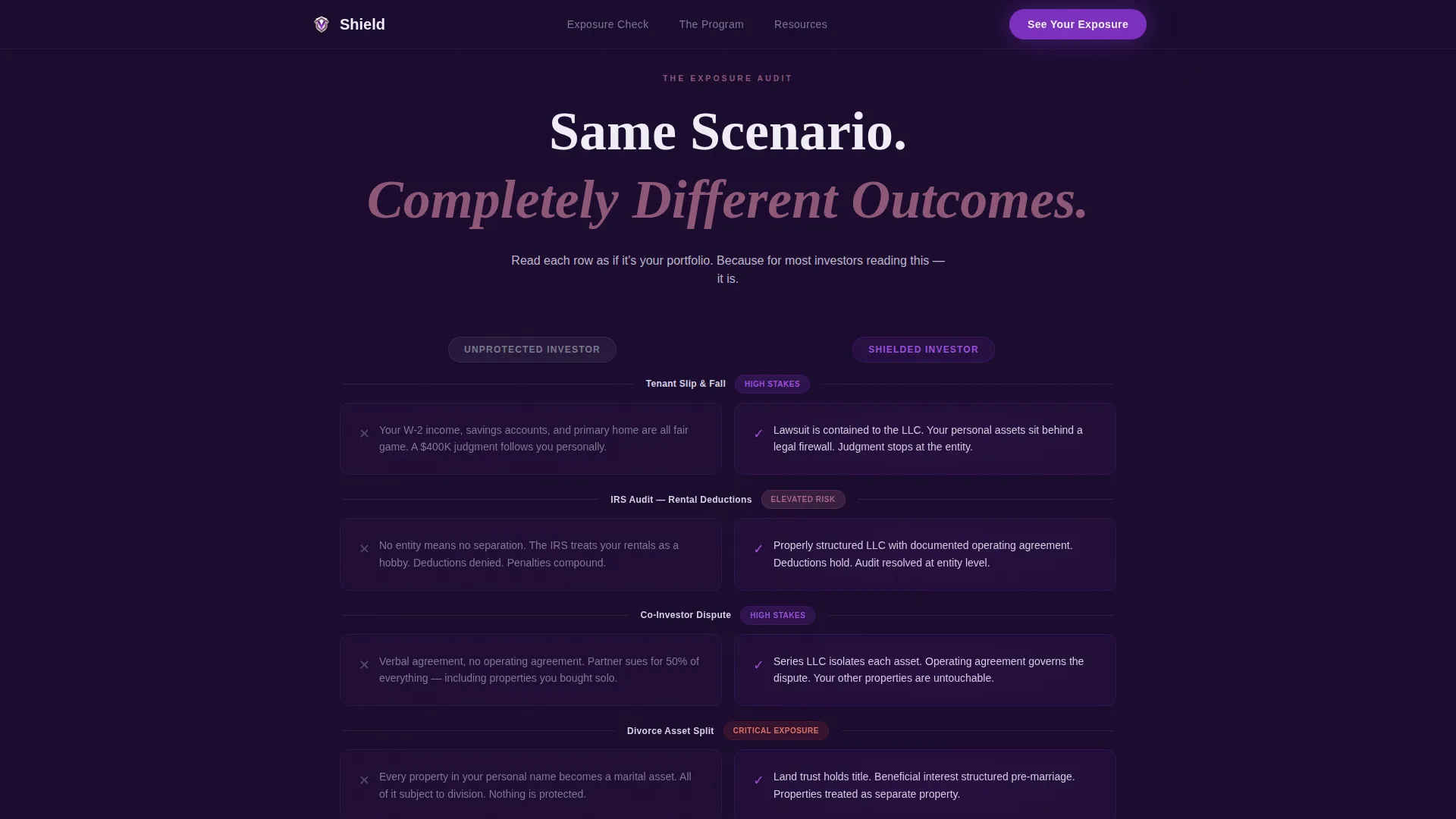
- A scroll-triggered, six-row comparison table that animates row by row, contrasting the unprotected investor outcome with the shielded investor outcome across real scenarios including tenant injury, IRS audit, partner dispute, and divorce asset split
- A progressive lead generation form with a primary call to action ("See Your Exposure") that reveals qualifying dropdowns after initial engagement, plus a secondary call to action ("Download the Entity Structuring Cheatsheet") for visitors not yet ready to assess
Feature list
This template is engineered around one goal: turning a skeptical visitor into a qualified lead. Every built-in feature serves that purpose directly.
Breathing Glow Hero Animation
The hero uses a CSS keyframe animation that pulses a radial electric violet glow behind the headline. The glow expands and contracts like a heartbeat, creating a sense of urgency without relying on images or video.
Scroll-Triggered Comparison Table
Six scenario rows animate into view one at a time as the visitor scrolls. The unprotected column renders in flat gray. The shielded column glows faintly violet. The contrast builds tension naturally and escalates with each row.
Mid-Table Testimonial Break
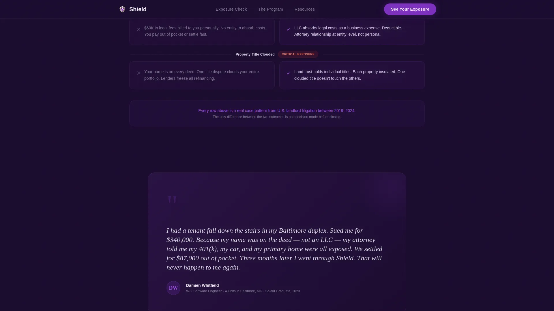
Halfway through the comparison table, a dark panel interrupts the scroll with a single landlord testimonial. The break is intentional: it shifts the emotional register from fear to proof before the table resumes with course tier comparisons.
Progressive Lead Generation Form
The form reveals fields in two stages. Name and email appear first. After engagement, qualifying dropdowns slide in: number of properties owned and current entity structure. This reduces early friction and improves completion rates.
Dual Call-to-Action System
Two distinct calls to action serve visitors at different readiness levels. The primary call to action offers a free asset-vulnerability assessment by email. The secondary call to action offers a downloadable entity structuring cheat sheet for visitors who need more time.
Tier Comparison Table Pivot
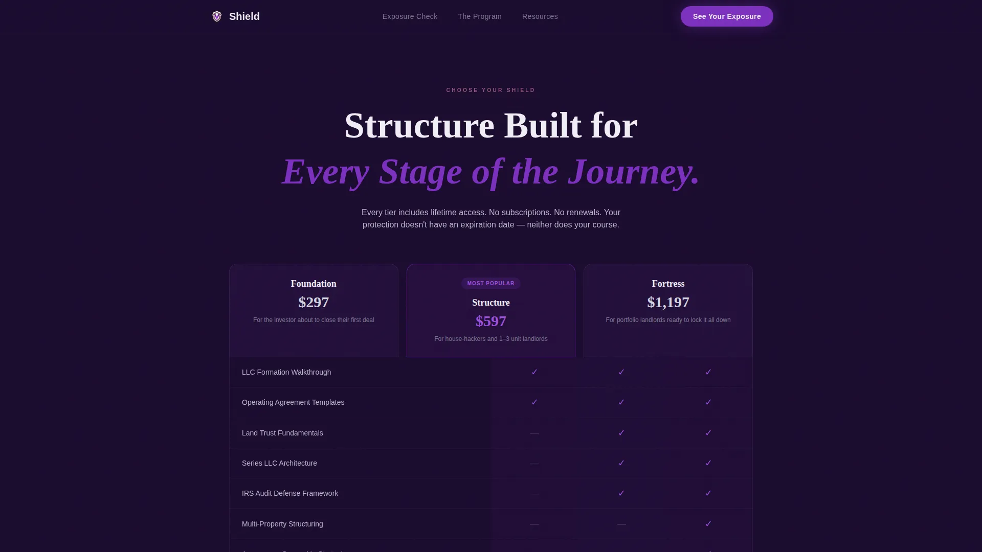
The same comparison table format used for outcome scenarios transitions seamlessly into a course tier comparison. The visual language stays consistent, so the visitor moves from fear to solution without noticing the shift.
Page sections overview
| Section | Purpose |
|---|---|
| Hero with Glow | Opens with urgent headline and breathing violet animation to establish stakes immediately |
| Outcome Comparison Table | Six animated rows contrast unprotected and shielded investor scenarios side by side |
| Mid-Table Testimonial | Dark panel break delivers social proof midway through the scroll journey |
| Course Tier Comparison | Same table format pivots to compare course enrollment options |
| Lead Generation Form | Progressive form captures name, email, property count, and entity status |
| Single-Row Footer | Clean linear footer closes the page without distraction |
Design & branding system
The visual identity follows a dark luxury aesthetic that feels like a private equity office after hours. Every color choice and type pairing reinforces authority and calm urgency.
- Color palette: deep plum-black (#1A0A2E) for full-bleed backgrounds, muted silver (#B8B8C8) for body text and rules, dusty mauve (#8E5775) for secondary containers and hover states, and electric violet (#7B2FBE) reserved exclusively for calls to action and glowing accents
- Typography: Fraunces serif for display headlines and DM Sans for all body copy, creating a contrast between gravitas and readability
- Texture and motion: a grain overlay adds tactile depth, while CSS animations handle the breathing glow and scroll-triggered row reveals without relying on external libraries
Mobile & speed optimization
The template is desktop-first, designed for W-2 professionals researching on laptops during evening hours. Full mobile support is included so the experience holds across all screen sizes.
- Layout and comparison tables reflow cleanly on smaller screens, preserving the side-by-side contrast logic without horizontal scrolling
- All animations use native CSS and the Intersection Observer API, keeping motion smooth without heavy JavaScript dependencies
How this template helps you convert
Every design and layout decision in this template points toward a single outcome: a visitor who opts in. The page earns the click by making inaction feel costlier than action.
- The comparison table acts as a self-diagnosis tool. By the time visitors reach the form, they have already identified their own exposure across six real-world scenarios and are primed to act.
- The progressive form lowers the barrier to entry. Asking only for name and email first reduces hesitation, while the qualifying dropdowns that follow segment leads automatically by property count and entity status.
- The dual call-to-action design captures both high-intent and research-mode visitors. No one leaves without a relevant next step, whether that is a free assessment or a downloadable cheat sheet.
Other information about this template
This template is categorized under Finance and Insurance, specifically within the Financial Literacy and Education subcategory, with a niche focus on real estate investing courses. It is built for the United States market, using USD formatting and MM/DD/YYYY date conventions.
- The template style is a Comparison Table layout, using the Comparison Journey creative direction to guide visitor psychology from problem awareness through to course enrollment
- The header concept is a Dark Full-Bleed with Glow, executed through pure CSS without stock photography or lifestyle imagery
- The color system is labeled Plum Executive, and the theme is Legal Shield, both of which inform the overall tone of quiet authority and structured confidence
- The page localization targets a USA audience, and all copy, form fields, and pricing references are formatted accordingly
Theme
Legal Shield
Creative direction
Comparison Journey
Color system
Plum Executive
Style
Comparison Table
Direction
Lead Generation
Page Sections
Breathing Glow Hero Animation
Scroll-triggered Comparison Table
Mid-table Testimonial Break
Progressive Lead Generation Form
Dual Call-to-action System
Course Tier Comparison Pivot
Related questions
Who is the ideal buyer for this template?
Can I customize the comparison table rows?
Does the form connect to an email platform automatically?
What makes the dual call-to-action design effective?
Is this template suitable for a course with multiple pricing tiers?



