College Student Insurance Specialist Cost Calculator Website Template
Shield is a single-page critical illness insurance landing page template built for college students and their families. It opens with an interactive cost calculator, then walks visitors through a series of alternating comparison sections that reveal the gap between campus health coverage and real critical illness costs. The design follows an Executive Suite aesthetic in Monochrome Steel tones.
by Rocket studio
Quick summary
Shield is a focused, single-page insurance landing page template designed for college student critical illness coverage. It combines a real-time cost calculator with a zigzag comparison layout to show visitors exactly how large the gap is between their current plan and actual out-of-pocket risk. The result is a page that earns trust before it asks for a click.
Who this template is for
This template is built for insurance providers, brokers, and agents who sell critical illness policies to the college student market. It speaks directly to the financial anxieties of students, parents, and recent graduates who are navigating coverage gaps.
- Juniors and seniors on a campus health plan who need to understand what it does not cover
- Parents co-signing student loans who are doing worst-case financial planning
- Recent graduates aging off a family plan with no employer coverage in place
What problem this template solves
Most college students assume their campus health plan is sufficient. A critical illness diagnosis, such as cancer at age 22, can generate over $42,000 in out-of-pocket costs that a standard campus plan will not cover. This template makes that gap impossible to ignore.
- Campus health plans cover urgent care but leave chemotherapy co-pays and long-term treatment costs largely unpaid
- Students and parents have no single place to compare their current coverage against what a critical illness policy actually provides
- Visitors arrive uncertain and leave without acting because no tool has quantified their specific risk in plain numbers
What you get with this template
You get a complete, conversion-focused landing page structured around a calculator-first entry point and a progressive comparison narrative. Every section is designed to move the visitor from awareness to action without relying on emotional imagery.
- A real-time cost estimator header that accepts age, college year, and current coverage status as inputs
- A series of alternating zigzag comparison sections that escalate the coverage gap with each scroll
- A persistent bottom-viewport call-to-action and secondary text links placed after each comparison section
Feature list
This template delivers the following purpose-built components, each grounded in the Executive Suite design direction and click-through conversion goal.
Real-Time Cost Calculator Header
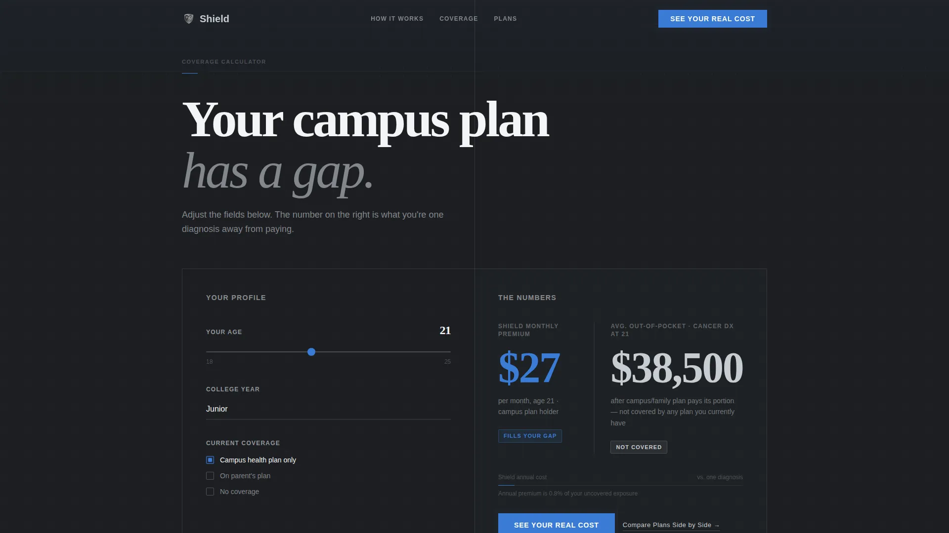
The page opens with a sleek calculator on a deep charcoal field. Visitors enter their age, college year, and current coverage status. As each field is adjusted, a live figure appears on the right showing the monthly cost of a critical illness policy alongside the average out-of-pocket cost of a cancer diagnosis at age 22. Two numbers, side by side, separated by a thin vertical rule.
Zigzag Comparison Sections
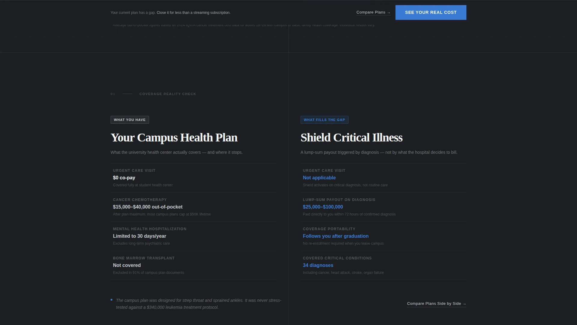
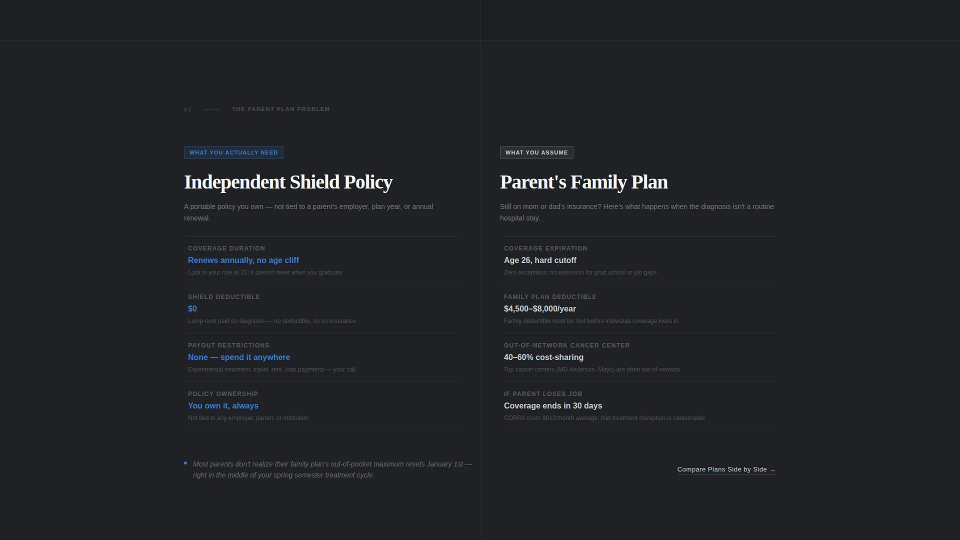
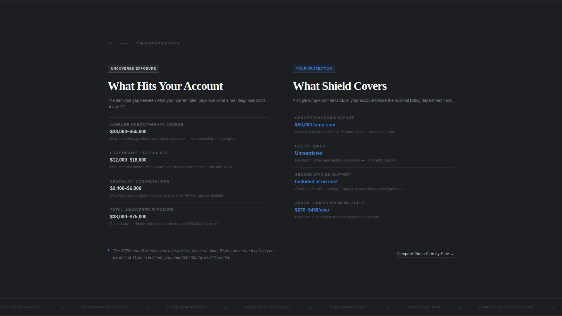
Each alternating section places what the visitor currently has on one side against what they are missing on the other. Comparisons escalate from campus plan versus critical illness coverage, to parental plan portability limits, to zero-deductible urgent care versus $15,000 chemotherapy co-pays. The layout reads like a financial advisor walking through documents one page at a time.
Persistent Click-Through Call to Action
The primary call-to-action button labeled "See Your Real Cost" appears first inside the calculator result. After the second section, it locks to the bottom of the viewport and stays visible throughout the rest of the scroll. Clicking routes the visitor to the carrier's quote application pre-filled with their calculator inputs.
Secondary Comparison Text Links
A secondary text link reading "Compare Plans Side by Side" appears beneath each zigzag section. This gives hesitant visitors one more layer of evidence before they commit, without cluttering the visual hierarchy of the primary call-to-action flow.
Executive Suite Visual System
The entire page runs on a Monochrome Steel palette. Deep charcoal backgrounds, brushed gunmetal section dividers, polished silver body text, and a single boardroom blue accent reserved exclusively for calls to action and interactive highlights. No stock photos, no decorative imagery, just type and numbers.
Page sections overview
| Section | Purpose |
|---|---|
| Calculator estimator header | Opens with age, college year, and coverage inputs; animates real-time cost comparison |
| Campus plan comparison | Contrasts campus health plan limits against critical illness coverage benefits |
| Parental plan section | Shows portability gaps between family coverage and an independent policy |
| Chemotherapy cost section | Escalates the gap with specific co-pay figures versus critical illness payouts |
| Persistent call to action bar | Locks to bottom viewport after second section; routes to pre-filled quote application |
Design & branding system
The template follows an Executive Suite theme built entirely on the Monochrome Steel color system. Every visual choice communicates competence and financial clarity rather than warmth or reassurance.
- Deep charcoal (#1C1E21) for primary backgrounds, brushed gunmetal (#4A4E54) for section dividers, and polished silver (#C8CDD3) for body text and data labels
- Boardroom blue (#3A7BD5) used exclusively on call-to-action buttons and interactive calculator highlights, with no secondary decorative color applied anywhere else
- No stock photography, no lifestyle imagery; the visual language is numbers, labels, and precise typographic contrast
Mobile & speed optimization
The template is structured for clean rendering across screen sizes. The calculator layout and zigzag sections reflow naturally for smaller viewports without losing the comparative side-by-side intent.
- The calculator inputs stack vertically on mobile while the animated cost figures remain prominently visible beneath them
- The persistent bottom-viewport call-to-action is designed to remain accessible on touch screens without obscuring content
- Zigzag sections convert to a single-column stacked layout on narrow screens, preserving the escalating comparison narrative in scroll order
How this template helps you convert
Shield is engineered around a single conversion goal: get the visitor to click "See Your Real Cost" and arrive at the quote application with their data already entered. Every structural decision supports that outcome.
- The calculator creates personal investment immediately. Visitors who enter their own age and coverage status are far more likely to act on the number they see than on a generic statistic.
- Each zigzag section raises the stakes of inaction by one measurable degree. By the time the visitor reaches the final comparison, the gap between their current coverage and actual risk is numerically precise and hard to rationalize away.
- The persistent call-to-action removes friction at the moment of decision. The visitor does not need to scroll back up or search for a next step. The button is always present, always accessible, and pre-loaded with their calculator inputs.
Other information about this template
This template was designed specifically for the college student critical illness insurance market. It suits any insurance provider or independent broker looking to target this underserved demographic with a data-forward, high-trust page experience.
- The template style is Zigzag/Alternating, following a Comparison Journey creative direction under an Executive Suite theme
- The header concept is a Calculator/Estimator, and the landing page direction is Click-Through, both of which are fully expressed in the built layout
- This template is well-suited for use within landing page builders that support custom color systems and interactive input components
Theme
Executive Suite
Creative direction
Comparison Journey
Color system
Monochrome Steel
Style
Zigzag/Alternating
Direction
Click-Through
Page Sections
Real-time Cost Calculator Header
Zigzag Comparison Layout
Persistent Bottom-viewport Call to Action
Secondary Comparison Text Links
Executive Suite Monochrome Steel Design
Related questions
Who is the ideal visitor for this landing page?
What makes the calculator section different from a standard quote form?
Does the template include the quote application itself?
Can this template support a product other than student critical illness insurance?
Why does the design avoid photography and warm colors?



