College Student Insurance Professional Website Template
Shield is a single-page life insurance landing page built for college students. It uses an animated comparison table, a scrolling cost curve, and a three-step quote form to show why locking in a low premium now beats waiting. The dark Monochrome Steel design feels modern and trustworthy, and every element pushes toward one action: getting a rate before graduation.
by Rocket studio
Quick summary
Shield is a conversion-focused life insurance landing page aimed at college students. It pairs a cinematic dark design with a problem-to-solution scroll arc. The comparison table sits at the page's core, flanked by an animated cost curve and testimonial cards. The goal is simple: make waiting feel irrational and locking in a rate feel obvious.
Who this template is for
This template is built for insurance providers and agents who want to reach college students before they graduate. It works especially well for teams selling term life policies priced for young, healthy adults who have never thought about coverage before.
- Insurers and brokers targeting juniors, seniors, and first-generation graduates
- Agents focused on nursing, pre-med, or tech students carrying significant future debt
- Insurance brands that want a modern, lead-generation page that feels nothing like a traditional policy site
What problem this template solves
Most college students do not own life insurance because no one has shown them the cost of waiting. A generic product page does not solve that. Shield is designed to make the financial consequence of delay visible and personal in real time.
- Visitors rarely understand that premiums rise with age, so abstract copy does not move them
- Standard insurance forms feel clinical and slow, pushing younger audiences away before they convert
- First-generation students and co-signers need a page that speaks to their specific financial stakes, not a one-size-fits-all pitch
What you get with this template
You get a complete, single-page layout built around one conversion goal: capturing a quote request from a college-age visitor. Every section is designed to reduce doubt and increase urgency in the right order.
- A full-bleed animated header with a typing headline and breathing radial glow effect
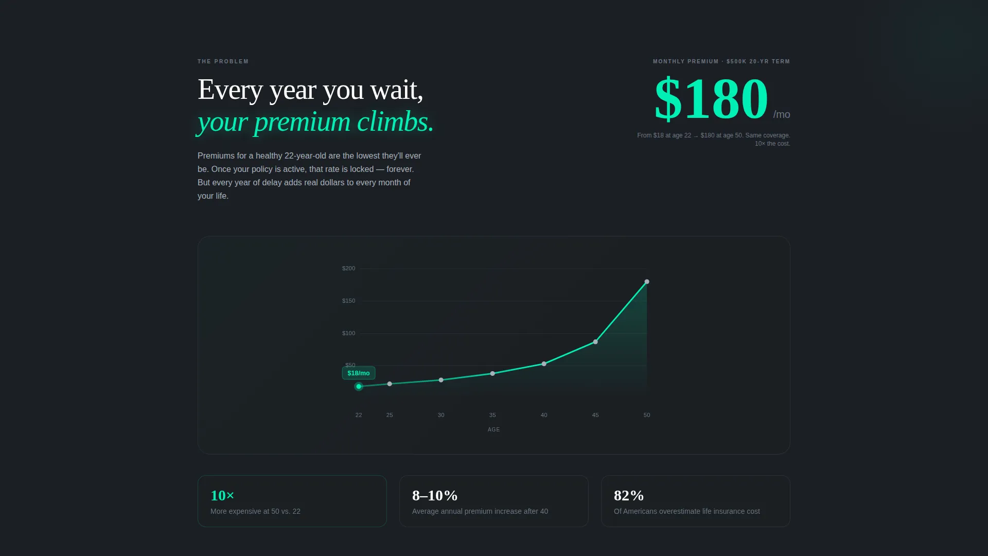
- An animated cost curve in the problem section, with dollar figures that tick upward as the visitor scrolls
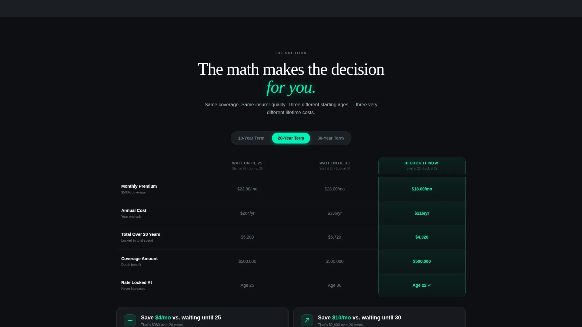
- A three-column comparison table with a toggle for switching between 10, 20, and 30-year term lengths
- Three student testimonial cards and a closing section anchoring the primary call to action
- A three-step progressive quote form and a secondary instant-estimate calculator
Feature list
Animated Scrolling Cost Curve
The problem section renders a live cost curve that rises as the visitor scrolls down the page. Specific dollar figures tick upward in real time, turning an abstract stat about premium increases per decade into a felt, personal number. The effect makes the cost of waiting tangible before the visitor even reaches the solution.
Three-Column Comparison Table
The comparison table presents three scenarios side by side: waiting until age 25, waiting until age 30, and locking in now. Each column shows monthly premium, total cost over 20 years, and coverage amount using specific figures, not rounded estimates. The "Lock It Now" column glows in electric mint while the other two sit in muted steel, making the right choice visually obvious.
Term Length Toggle
A toggle beneath the comparison table lets visitors switch between 10, 20, and 30-year term lengths. The numbers update to reflect each choice, and the savings gap between waiting and acting widens visibly with every longer term. This feature keeps engaged visitors on the page longer while reinforcing the central message.
Three-Step Progressive Quote Form
The quote form breaks the signup process into three focused steps. Step one asks for age and university with auto-suggest enabled. Step two uses a slider for smoking status and coverage interest. Step three captures email and phone alongside a reassuring micro-copy line about no medical exam and a 90-second quote time.
Instant-Estimate Calculator
A secondary conversion path lets visitors see their estimated premium before committing any contact details. The calculator returns an instant number, reducing friction for visitors who are curious but not yet ready to fill in a full form. This path keeps hesitant visitors engaged rather than losing them to a bounce.
Student Testimonial Cards
Three testimonial cards appear in the social proof section, each representing a different student profile: a pre-med student, a computer science major with startup equity, and a first-generation graduate supporting siblings. Each card carries a single sentence ending with the student's actual monthly premium, making the cost feel real and relatable.
Page sections overview
| Section | Purpose |
|---|---|
| Full-Bleed Header | Opens with cinematic glow and typing headline to hook attention immediately |
| Animated Cost Curve | Shows premium growth by age in real time to establish urgency |
| Comparison Table | Contrasts three timing scenarios with specific figures and a term toggle |
| Student Testimonials | Builds trust with three relatable student voices and real premium figures |
| Closing call to action Section | Anchors the primary "Lock My Rate" button and closes the conversion arc |
| Progressive Quote Form | Captures leads in three steps with low friction and reassuring micro-copy |
| Instant-Estimate Calculator | Offers a no-commitment preview to keep hesitant visitors in the funnel |
Design & branding system
The visual identity follows a Startup Velocity theme built on a Monochrome Steel color system. The palette uses deep gunmetal, near-black charcoal, and brushed chrome for structure, with a single electric mint accent reserved for calls to action, toggle states, and data highlights. The effect feels like a backlit aluminum laptop screen in a dark library: precise, engineered, and quietly confident.
- Backgrounds alternate between near-black charcoal (#0D0F12) and deep gunmetal (#1B1F24) to create depth without introducing any warm color
- Body text sits in brushed chrome (#A8B2BD) for effortless readability against the dark field, while electric mint (#00F0B5) appears only on interactive and high-priority elements
- The header uses a soft radial glow of electric mint that pulses once at center-screen, referencing a heartbeat monitor and signaling that this is not a traditional insurance brand
Mobile & speed optimization
The layout is built as a single-page structure, which keeps the scroll path linear and the load footprint light. Every interactive element, including the cost curve, the comparison toggle, and the multi-step form, is designed to work cleanly on a small screen without losing its visual impact.
- The three-step form and the instant-estimate calculator are structured to function as thumb-friendly vertical flows on mobile devices
- The alternating dark backgrounds and high-contrast mint accents maintain readability and visual hierarchy on any screen size without relying on images or illustrations
How this template helps you convert
The page is engineered as a lead generation machine. Every scroll step moves a skeptical college student closer to the form by making the cost of inaction feel personal and specific.
- The animated cost curve and comparison table work together to make the financial argument before any sales copy appears, so the visitor arrives at the form already convinced rather than still unconvinced.
- The dual conversion path, a full quote form and a low-commitment instant-estimate calculator, means visitors at different levels of readiness both have a clear next step, which reduces bounce and increases total lead volume.
Other information about this template
Shield is a purpose-built template for the college student life insurance niche within the broader finance and insurance category. It is a strong fit for any campaign targeting young adults who are approaching financial independence for the first time.
- The template is categorized under Finance and Insurance, with a specific focus on the college student insurance subcategory
- The Problem-to-Solution Arc creative direction ensures that every section builds on the last, so a visitor who scrolls to the bottom has already moved through a complete persuasion sequence
- The Comparison Table template style makes this page particularly effective for products where the cost of delay is the primary sales argument
- The header concept, a dark full-bleed void with a pulsing glow, is deliberately cinematic and non-traditional, which helps the brand stand apart from legacy insurance providers in a student's feed or search results


Theme
Startup Velocity
Creative direction
Problem→Solution Arc
Color system
Monochrome Steel
Style
Comparison Table
Direction
Lead Generation
Page Sections
Animated Scrolling Cost Curve
Three-column Comparison Table
Term Length Toggle
Three-step Progressive Quote Form
Instant-estimate Calculator
Student Testimonial Cards
Related questions
Can I update the premium figures in the comparison table?
How does the dual conversion path work?
Does the page support different term lengths?
Can I replace the placeholder testimonials with real student quotes?
Is the dark Monochrome Steel design customizable?


