Newlywed Renters Insurance Comparison Landing Page
Shield is a comparison table landing page built for newlywed couples shopping their first shared renters policy. A live two-field calculator drives a side-by-side carrier table with odometer animations and signal-green highlights on the best value per row. A pinned "Lock In This Rate" button and a partner email capture turn one visitor into two leads without friction.
by Rocket studio
Quick summary
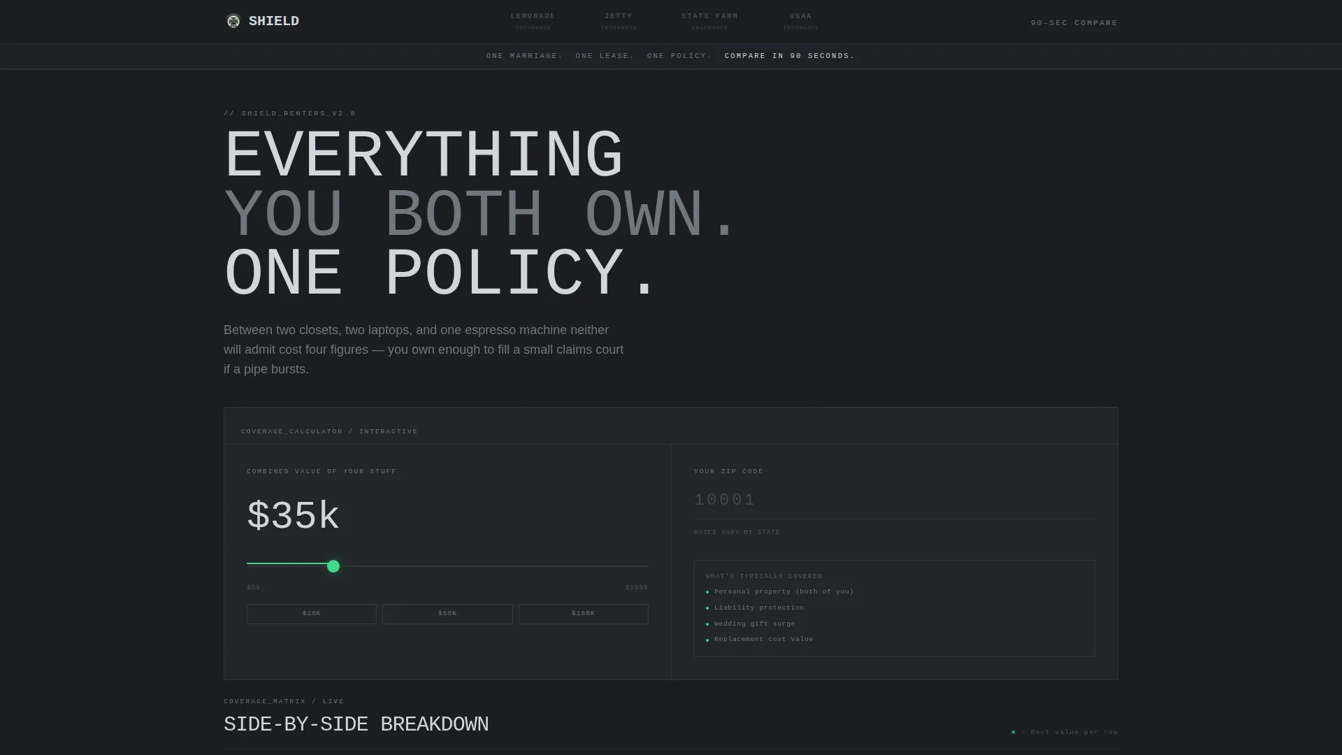
Shield is a single-page, calculator-first renters insurance comparison tool designed for newly married couples. Visitors set their combined belongings value on a slider and enter their ZIP code. The live comparison table populates instantly, showing monthly premiums, deductibles, liability limits, and coverage details across four carriers. Every cheapest cell glows signal-green, and a pinned call-to-action button follows the visitor to the bottom of the viewport.
Who this template is for
This template is built for insurance brands, InsurTech products, and direct-to-consumer comparison services targeting couples in their mid-to-late twenties who have just signed a lease together. It suits teams who want a data-forward, lead-generating landing page without a heavy editorial design.
- Newlywed couples aged 25 to 32 shopping their first joint renters policy
- Live-in partners consolidating two separate existing policies into one
- Insurance comparison platforms looking to convert calculator interactions into carrier click-throughs
What problem this template solves
Couples shopping renters insurance together face a fragmented experience. They visit multiple carrier sites, re-enter the same details repeatedly, and struggle to compare coverage types side by side. Shield removes that friction entirely.
- Visitors enter their data once and see all four carriers compared in a single table
- Abstract monthly costs become tangible through real scenario breakdowns like burst pipes and stolen bikes
- The pinned call-to-action passes all calculator inputs to the carrier quote page via URL parameters, so no data is re-entered
What you get with this template
Shield delivers a fully structured, high-interactivity landing page ready to customize for any newlywed renters insurance product. Every section is purpose-built to move a first-time joint policyholder from curiosity to a click-through in under two minutes.
- A hero section with a carrier logo bar and a two-field inline calculator driving a live comparison table
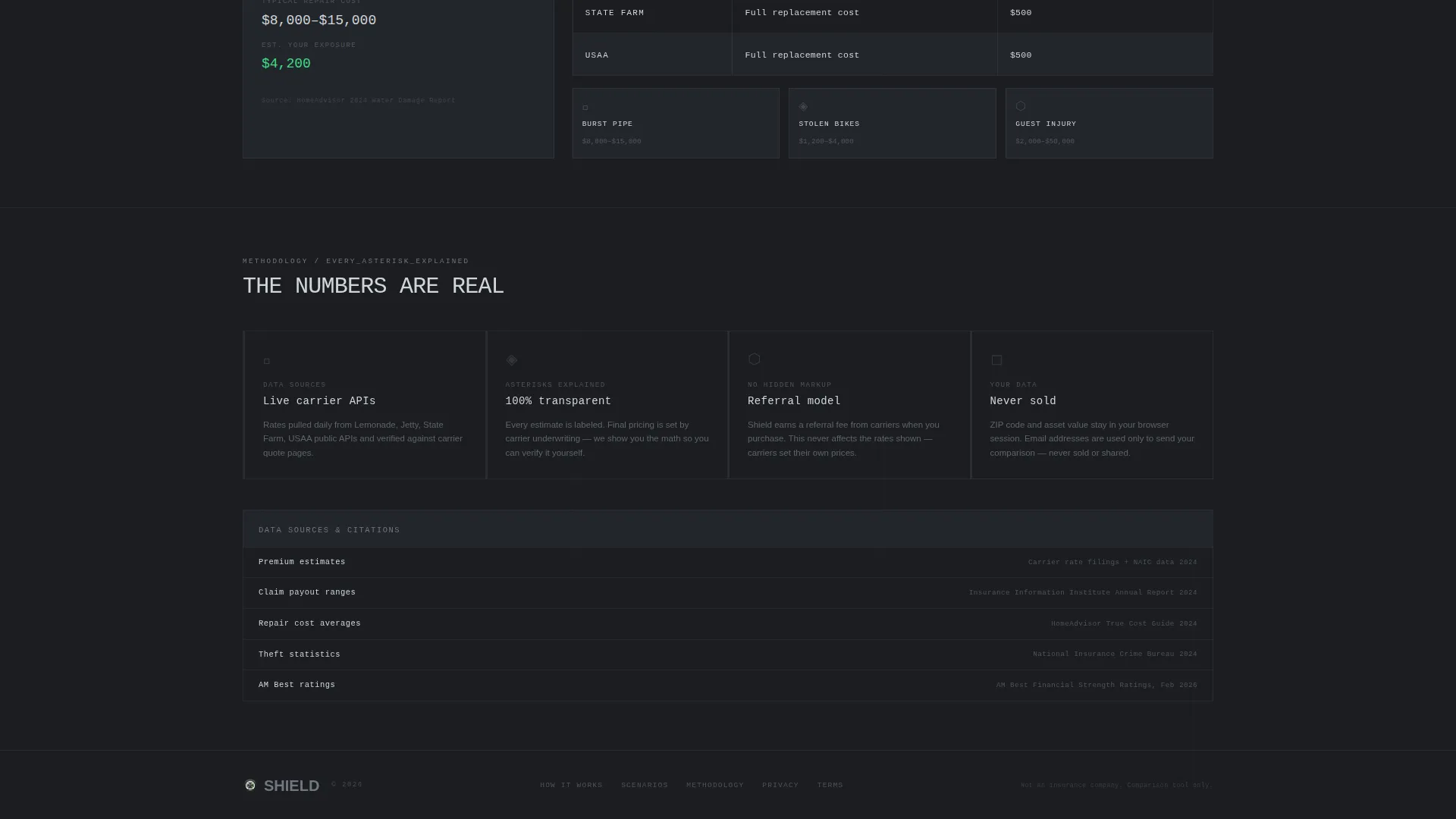
- Four secondary scenario cost tables covering burst pipe, stolen bikes, and guest injury claims
- A trust rail with cited sources and tooltip explanations for every asterisk
- A viewport-pinned "Lock In This Rate" call-to-action button showing the visitor's selected carrier and live monthly cost
- A dual email capture that collects the visitor's address and their partner's address in a single step
Feature list
The sections below describe each major functional component included in the Shield template.
Live Two-Field Calculator
Visitors set their combined belongings value using a drag slider ranging from five thousand to one hundred and fifty thousand dollars, then enter their ZIP code. The comparison table below populates live as soon as either field is touched, giving instant feedback without a page reload.
Carrier Comparison Table
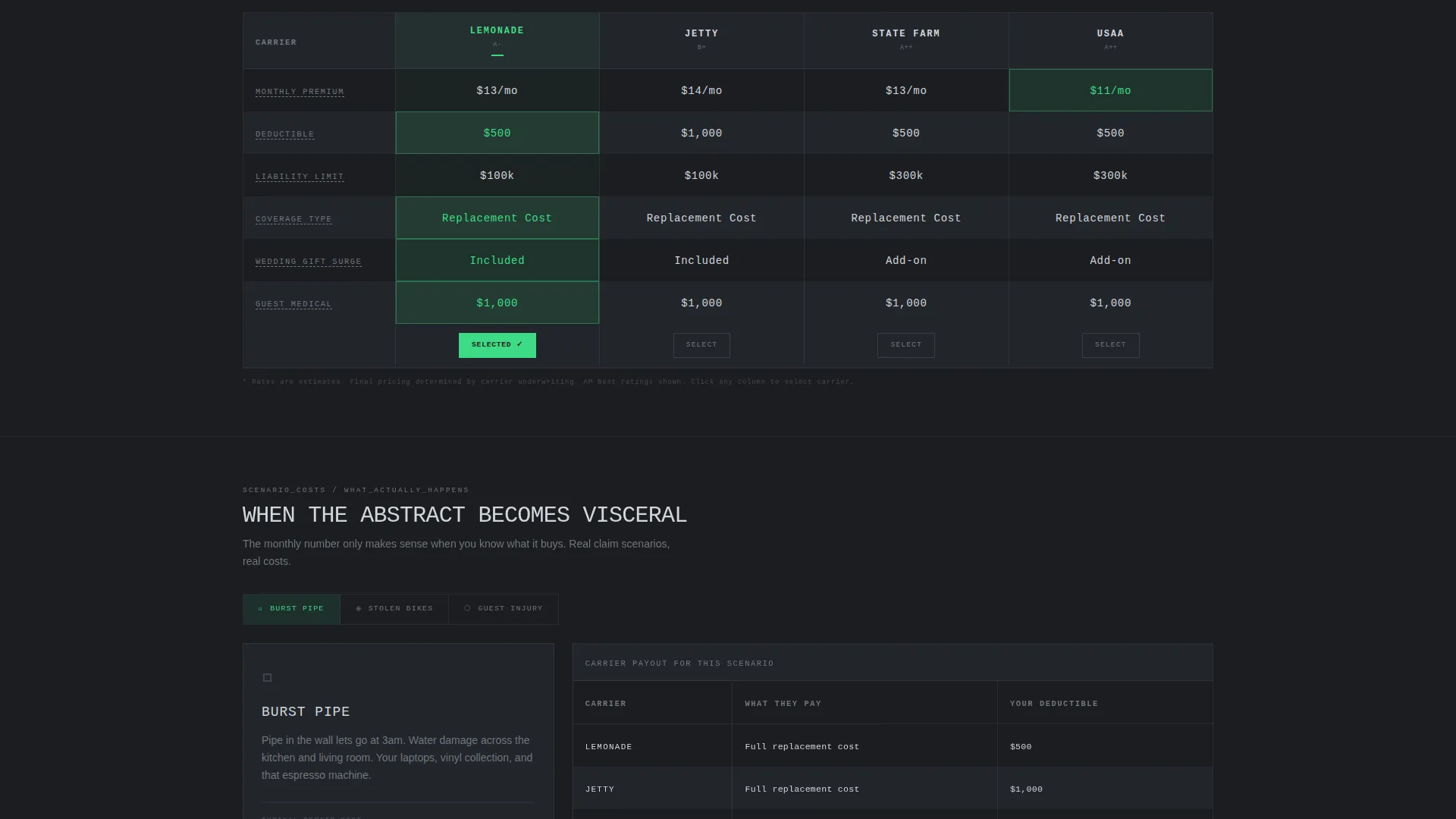
A four-column, six-row table displays monthly premium, deductible, liability limit, replacement cost versus actual cash value, and wedding-gift surge coverage across all four carriers simultaneously. The cheapest cell in each row pulses with a signal-green highlight so the best value is always obvious at a glance.
Odometer Number Animations
Every numeric cell in the comparison table rolls into its value like a mechanical odometer when the table populates or updates. The effect makes data feel dynamic and precise rather than static, reinforcing the Data Command visual theme.
Scenario Cost Breakdowns
As the visitor scrolls past the primary table, secondary tables present real-world claim scenarios. Burst pipe damage, stolen bicycles, and a guest injury at home each get their own cost column, turning an abstract monthly figure into a concrete financial picture.
Pinned Call-to-Action Button
Once the calculator is engaged, a "Lock In This Rate" button pins to the bottom of the viewport. It displays the visitor's currently selected carrier name and live monthly cost. Clicking it passes all calculator inputs to the carrier's quote page via URL parameters so the visitor never re-enters their data.
Partner Email Capture
A secondary text link beneath the pinned button reads "Email this comparison to your partner." Clicking it opens an inline form that collects two email addresses at once, converting a single visitor interaction into two simultaneous leads.
Page sections overview
| Section | Purpose |
|---|---|
| Carrier Logo Bar | Establishes credibility with four desaturated carrier logos that flare on hover |
| Hero Calculator | Two-field inline tool that drives the live comparison table below |
| Comparison Table | Four-carrier, six-row data grid with odometer animations and green best-value highlights |
| Scenario Cost Tables | Secondary tables showing real claim costs for burst pipe, stolen bikes, and guest injury |
| Trust Rail | Cited sources and tooltip explanations for every data point and asterisk |
| Pinned Call to Action | Viewport-fixed button showing live carrier and cost, linking to carrier quote page |
| Partner Email Capture | Dual email form converting one visitor into two leads |
| Footer | Linear single-row footer strip |
Design & branding system
Shield uses a Data Command visual theme built on the Monochrome Steel color system. The palette feels like the back panel of a high-end amplifier: matte dark surfaces broken only by the precise gleam of machined metal. Signal-green appears exclusively on interactive elements and the primary call-to-action button, never as decoration.
- Forge-black (#1B1D21) for all backgrounds, with table rows alternating against a barely-there lifted tone (#22252A)
- Brushed titanium (#71767E) for body text and desaturated logo states, polished chrome (#D1D5DB) for all headings
- JetBrains Mono for all data labels and numeric cells, DM Sans for all body prose
- Signal-green (#3DDB85) reserved exclusively for the cheapest table cell highlights, the pinned call-to-action button, and other interactive touch points
Mobile & speed optimization
Shield is designed desktop-first to deliver the full calculator and comparison table experience on wider screens. It includes a complete mobile-responsive fallback so the tool remains usable on smaller devices.
- The comparison table collapses gracefully on narrow viewports so all six coverage rows remain readable without horizontal scrolling
- The pinned call-to-action button adapts to mobile safe areas so it never overlaps critical table content
- Calculator client components are separated from static server-rendered sections to keep the initial load lean
How this template helps you convert
Shield is structured to move a hesitant couple from a cold page view to a carrier click-through in the fewest possible steps.
- The calculator engages visitors before they read a single paragraph, creating immediate personal investment in the results displayed below
- The pinned "Lock In This Rate" button stays visible throughout the entire scroll journey, and its live cost and carrier display make the decision feel already made
- The partner email capture turns a solo visit into a shared decision, doubling lead volume from a single page interaction without adding a separate form or step
Other information about this template
Shield is localized for the United States market, using USD currency and MM/DD/YYYY date formatting throughout all data displays. It is suited to any InsurTech or direct-to-consumer insurance comparison product operating in the newlywed renters insurance space.
- Animation intensity is high: odometer rolls, scroll-reveal row entrances, and the signal-green cell pulse are all included
- The header concept is a Logo Bar, a slim horizontal strip running across the top of the viewport at full width
- The landing page direction is Click-Through, meaning the primary conversion action passes the visitor directly to a carrier quote page with all inputs pre-filled via URL parameters
- The creative direction is Calculator/Tool First, placing the interactive tool above all editorial copy so data does the persuading
- The template style is a Comparison Table layout, purpose-built for side-by-side product evaluation in the Finance and Insurance category

Theme
Data Command
Creative direction
Calculator/Tool First
Color system
Monochrome Steel
Style
Comparison Table
Direction
Click-Through
Page Sections
Live Two-field Calculator
Four-carrier Comparison Table
Odometer Number Animations
Scenario Cost Breakdown Tables
Viewport-pinned Rate Button
Dual Partner Email Capture
Related questions
Can I change the four carriers shown in the comparison table?
Does the live calculator require a backend connection to work?
How does the partner email capture collect two addresses at once?
Is this template localized for markets outside the United States?
Can this comparison table layout work for insurance products beyond renters coverage?



