Precision Coverage Gap | Free Website Template | Rocket
Shield is a precision-built landing page template for furniture and household insurance risk management firms. It uses a zigzag Spec Sheet layout to expose coverage gaps section by section, pairing "Their Policy" versus "Shield Coverage" comparisons with a live inline calculator. The result is a data-dense, high-converting page that makes the financial case before visitors reach the call to action.
by Rocket studio
Quick summary
Shield is a single-page landing page template crafted for insurance and risk management companies targeting homeowners, landlords, and estate executors. It follows a Comparison/Versus design style with a Spec Sheet zigzag layout, a Midnight Blue color system, and a live coverage gap calculator. Every section is built to address underinsurance gaps with actuarial precision and cold visual authority.
Who this template is for
Shield is built for insurance professionals and risk management companies who need landing pages that do the selling through data, not persuasion alone. This template fits businesses that work with high-value residential contents and need a page that earns trust fast.
- Homeowners with six-figure interiors who have never properly inventoried their possessions
- Landlords managing multiple furnished rental units across different price tiers
- Estate executors who need documented appraisals for probate proceedings
What problem this template solves
Standard insurance typically only pays actual cash value, which may not cover the full replacement cost of furniture and household contents. A coverage gap can lead to significant financial losses that most homeowners never anticipate. This template helps companies address that gap clearly and immediately.
- Most clients do not know their current policy leaves thousands in contents unprotected
- Depreciation schedules and policy sublimits are complex topics that standard pages fail to explain clearly
- Visitors need a structured process to find their exposure before they will act
What you get with this template
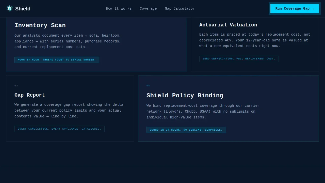
Shield provides a complete, ready-to-use landing page layout designed for insurance companies. Every element is named, grouped, and easy to locate, making it straightforward to customize for your specific coverage offering.
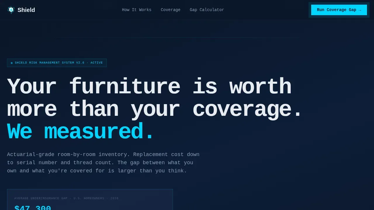
- A hero section with a scrolling carrier logo bar and an animated underinsurance counter
- Three zigzag Spec Sheet rows comparing depreciation-based policies against replacement-cost coverage
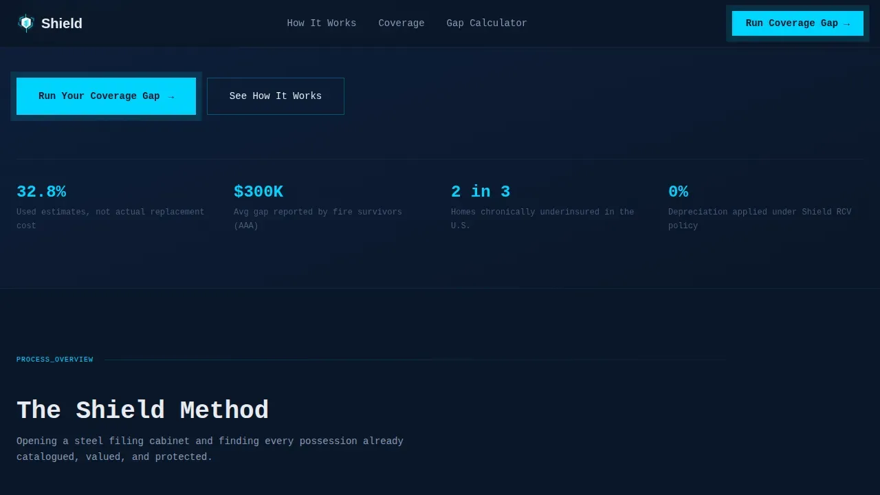
- A two-field inline coverage gap calculator with a live deficit bar and a secondary audit form
Feature list
Shield delivers a focused set of design and conversion features crafted to protect your message and lead visitors toward action.
Carrier Logo Bar with Animated Marquee
The hero opens with a horizontal ribbon of institutional carrier logos scrolling against the deep navy background. This element builds security and credibility before a single line of body copy is read, ensuring your audience sees institutional weight immediately.
Zigzag Spec Sheet Comparison Layout
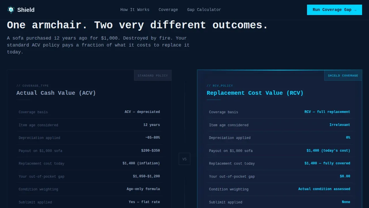
Three alternating zigzag rows escalate coverage stakes from a single armchair to a full furnished property. Each row isolates a comparison axis, ensuring the gap between a standard policy and Shield coverage is easy to find and impossible to ignore.
Live Coverage Gap Calculator
A two-field inline calculator lets users enter their estimated furnishing value and current policy limit. It instantly renders a deficit bar in signal cyan, making the financial gap visual and personal. This is the core conversion element on the page.
Animated Underinsurance Counter
A scroll-triggered counter ticks upward showing the average underinsurance gap in dollars. This data-driven device makes the issue concrete and urgent without relying on written claims alone.
Scroll-Triggered Section Reveals
Each zigzag block uses scroll-triggered reveal animations, keeping the page feeling dynamic and ensuring users engage with each comparison row before landing on the calculator.
Minimal Lead Capture Form
A secondary call to action opens a short form requesting property type, number of furnished rooms, and email. Keeping the form to three to five fields reduces drop-off and makes the process easy for busy clients.
Page sections overview
| Section | Purpose |
|---|---|
| Hero Logo Bar | Establish carrier credibility with scrolling institutional logos |
| Animated Counter | Show average underinsurance gap as a live dollar figure |
| Spec Sheet Row 1 | Compare single armchair ACV depreciation versus Shield replacement cost |
| Spec Sheet Row 2 | Compare living room sublimits versus room-by-room audit coverage |
| Spec Sheet Row 3 | Compare full property undervaluation versus comprehensive Shield inventory |
| Coverage Gap Calculator | Let users calculate their personal coverage deficit instantly |
| Audit Capture Form | Collect property details and email for room-by-room audit leads |
| Footer | Single-row linear footer with branding and essential links |
Design & branding system
Shield uses a Data Command visual style that feels like a Bloomberg terminal applied to residential insurance. The design is cold, authoritative, and precise, ensuring your branding reads as institutional rather than promotional.
- Midnight Blue palette: deep terminal navy (#0A1628) for primary backgrounds, tactical slate (#1B2A4A) for alternating blocks, ledger white (#E8ECF1) for body text and data labels, and signal cyan (#00D4FF) for interactive elements and call-to-action pulses
- Typography pairing: JetBrains Mono for headlines and data labels, DM Sans for body copy, creating a clear contrast between spec-sheet precision and readable body text
- Each "Their Policy" block uses muted slate with redacted-style fine print, while each "Shield Coverage" block uses signal cyan highlights, making comparisons visually immediate
Mobile & speed optimization
Shield is designed desktop-first to support the data-dense Spec Sheet layout, with a responsive structure that adapts cleanly to smaller screens. The template is built for ease of use across platforms without sacrificing the visual weight of its comparison architecture.
- Server Components handle static sections, keeping the page fast and reducing unnecessary client-side load
- The calculator and animated counter run as Client Components, ensuring interactive elements remain smooth without slowing the full page
- Large, thumb-friendly buttons on the call-to-action and audit form keep mobile users engaged and moving forward
How this template helps you convert
Shield is built around Comparison/Versus conversion logic. The page does not ask visitors to trust a claim. It shows them a number, then shows them a bigger number, and then lets them calculate their own gap. By the time users reach the call to action, the data has already made the case.
- The zigzag Spec Sheet rows build cumulative urgency. Each comparison escalates stakes from one chair to an entire property, making the coverage issue feel personal and growing.
- The inline calculator converts abstract risk into a specific dollar deficit, giving users a concrete reason to act and making informed decisions easy without needing insurance expertise.
- A clear, signal-cyan call-to-action button anchors each stage, ensuring the next step is always visible and easy to find without competing navigation pulling users away.
Other information about this template
Shield is a professionally designed template that goes well beyond what free templates typically offer in terms of layout complexity, interactivity, and data-driven visual design. It is built for insurance companies and risk management businesses that are investing in landing pages that reflect their authority.
- The shield precision coverage gap landing page template is designed for US-market insurance terminology and USD currency, making it immediately usable for domestic businesses without localization edits
- Professionally designed templates provide higher quality and better customization options compared to free templates, particularly when landing pages require interactive components like live calculators
- The template can be adapted to fit the specific style and standards of various industries, including finance, real estate, and estate management, by updating branding colors and copy
- A cohesive data-driven framework across every section ensures that engagement stays high and mixed messaging does not create gaps in the user journey
- Content is crafted to demystify complex insurance terminology, focusing on providing peace of mind and confidence to each visitor who lands on the page
Theme
Data Command
Creative direction
Spec Sheet
Color system
Midnight Blue
Style
Zigzag/Alternating
Direction
Comparison/Versus
Page Sections
Carrier Logo Bar with Animated Marquee
Zigzag Spec Sheet Comparison Layout
Live Coverage Gap Calculator
Animated Underinsurance Counter
Minimal Audit Lead Capture Form
Scroll-triggered Section Reveals
Related questions
Who is the Shield template built for?
Does the Shield template include a working coverage gap calculator?
Can I customize the colors and branding in Shield?
How does the zigzag layout help users understand their coverage gaps?
Is Shield a better choice than free templates for insurance landing pages?


