Retiree Insurance Comparison Website Template
Shield is a dashboard-style Medicare comparison landing page template built for retiree insurance brokerages. It guides newly eligible adults through a structured Comparison Journey, using interactive data cards, a prescription cost simulator, a geographic network filter, and a progressive gated form to help visitors compare plans and connect with an advisor before their first premium is due.
by Rocket studio
Quick summary
Shield is a Corporate Precision landing page template designed for retiree health insurance brokerages. It transforms a dense Medicare decision into a calm, data-led scroll experience. Visitors compare Medicare Advantage plans, standalone drug plans, and supplement options side by side, then filter results by county, simulate prescription costs, and submit a three-field form to download a personal plan comparison report.
Who this template is for
This template is built for brokerages and independent insurance agents who help clients navigate Medicare enrollment. It works equally well for solo advisors and multi-advisor agency teams who want a professional, trustworthy web presence.
- Newly eligible sixty-five-year-olds who need to compare plans before their first premium is due
- Adult children in their forties and fifties doing late-night research on behalf of aging parents
- Early retirees bridging a coverage gap between employer health plans and Medicare eligibility
What problem this template solves
Choosing between Medicare Advantage plans, supplement options, and standalone drug plans is genuinely hard. Most people arrive at a brokerage website overwhelmed, having already received a kitchen table full of mailers. An effective landing page must bridge the gap between complex insurance options and clear decision-making, and that is exactly the problem this template addresses.
- Visitors cannot easily compare monthly premiums, annual deductibles, and maximum out-of-pocket costs across plan types without a structured visual tool
- Most brokerage pages bury their calls-to-action and fail to reward visitors for sharing contact details
- Enrollment periods, network limitations, and drug formulary details are rarely explained in plain language on a single page
What you get with this template
Shield delivers a fully structured, single-page comparison experience with every section purpose-built for the Medicare decision journey. Each scroll block narrows the visitor's options rather than adding noise. The page earns trust through data transparency before it asks for anything in return.
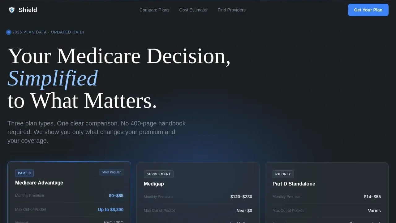
- A dark full-bleed hero with a radial signal-blue glow and a three-column coverage comparison card showing Medicare Advantage, Medigap, and Part D side by side
- An interactive plan toggle grid, a prescription cost simulator, a geographic network filter, and a progressive three-field gated download form
- A bottom-rail embedded calendar widget for booking a fifteen-minute Medicare review alongside a minimalist single-row footer
Feature list
This template packages several high-complexity interactive components into one coherent Comparison Journey layout. Each feature below is grounded directly in the template brief.
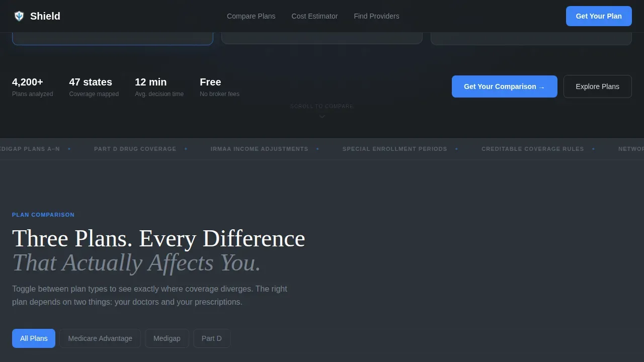
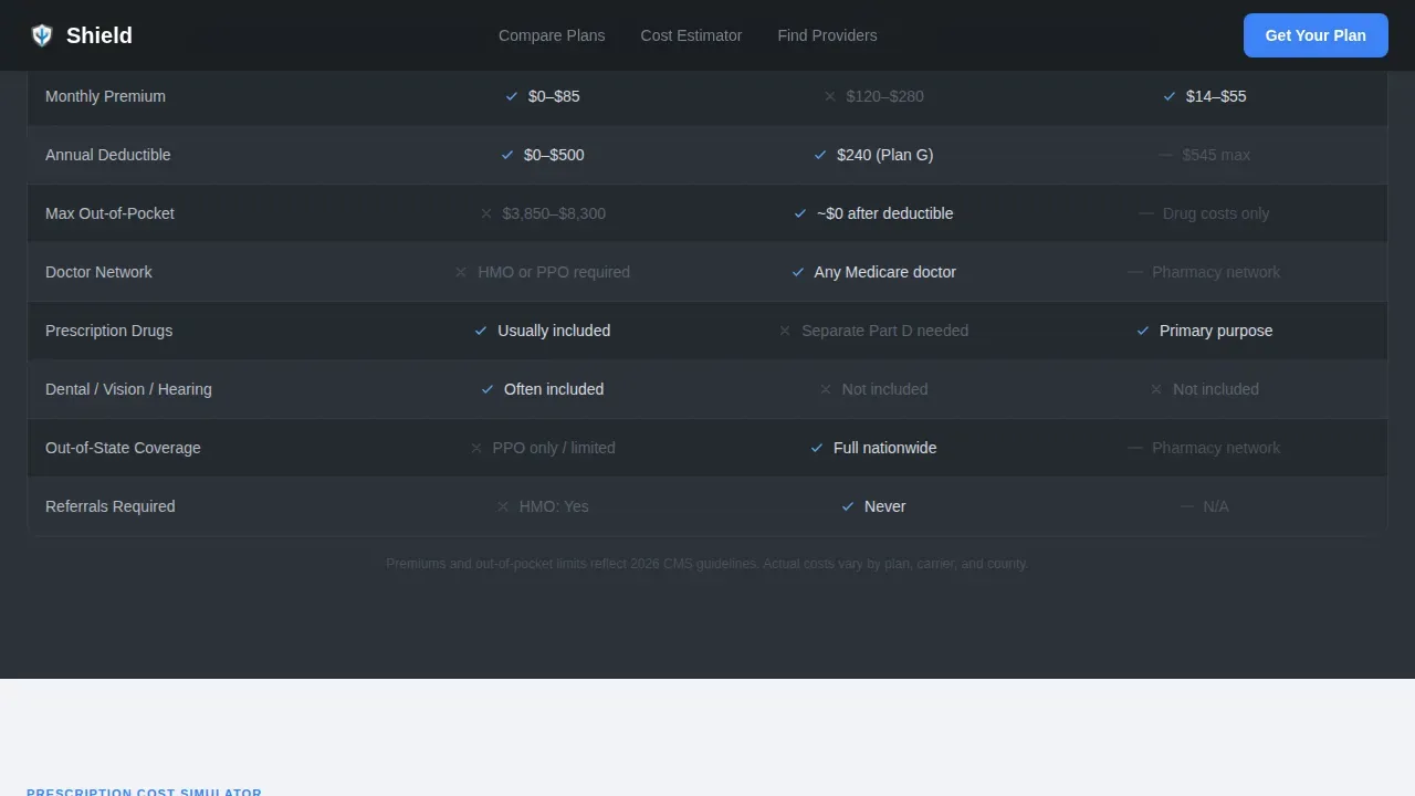
Interactive Three-Column Plan Comparison Grid
The plan comparison grid sits above the fold and lets visitors toggle between Medicare Advantage plans, Medigap coverage, and standalone Part D drug plans. Each column is a data card showing monthly premiums, annual deductibles, copayments for services, and the maximum out-of-pocket (MOOP) limit for in-network care. Plans are clearly labeled to distinguish between HMO, PPO, and Special Needs Plan types so visitors understand their network flexibility at a glance. HMO plans require members to use a defined network of doctors and obtain referrals for specialists. PPO plans, including preferred provider organization structures, allow members to see any provider, though in-network care is typically less expensive. Strategic color hierarchy highlights advantages in the comparison table to draw attention to preferred options, and star ratings provide visual indicators of plan quality as rated by Medicare.
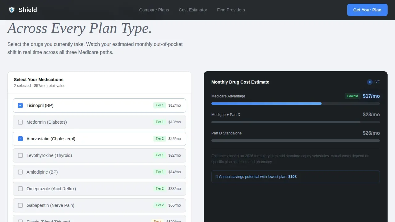
Prescription Cost Simulator
The prescription cost simulator lets visitors enter their current drugs and watch out-of-pocket projections shift across plan types in real time. This is important because comparing drug plans requires checking each plan's formulary to verify whether specific medications are covered and at which copayment tier. The simulator helps visitors determine whether a plan's built-in Part D benefit covers their prescriptions before they enroll. A total cost breakdown, including monthly premiums, annual deductibles, and copayments for services, updates live as the visitor adjusts their medication list.
Geographic Network Filter
Visitors enter their zip code and watch provider networks light up or dim on a minimal county-level map. This feature is essential because Medicare Advantage plans are sold by county and by state, so the plans available in one area may not be available in another. A provider network checker allows visitors to verify whether their primary care doctor, specialist, or local hospital is in-network for any given plan. Zip code input is a prominent, mandatory first step to ensure that every plan displayed is actually available in the visitor's service area.
Progressive Gated Download Form
The gated form uses three sequential fields: zip code first, then age, then email. Each field unlocks a visible layer of comparison data, rewarding disclosure with immediate value rather than hiding everything behind a wall. This approach follows a lead-generation model where offering educational resources in exchange for contact information captures qualified prospects. The form is designed to keep the process short, clear, and low-friction so visitors feel confident submitting their details without concern.
Bottom-Rail Consultation Booking Widget
An embedded calendar widget anchors the bottom rail of the page and offers a secondary conversion path: "Book a 15-Minute Medicare Review." This gives visitors who want to speak directly with a licensed insurance agent a frictionless way to contact the team and schedule time. It complements the download form by serving visitors who prefer a direct phone or video conversation over a self-serve report.
Page sections overview
| Section | Purpose |
|---|---|
| Dark Hero | Display glowing three-column coverage comparison card with headline |
| Plan Toggle Grid | Compare Medicare Advantage, Medigap, and Part D interactively |
| Prescription Simulator | Enter drugs and view out-of-pocket cost projections by plan |
| Geographic Network Filter | Enter zip code to verify county-level provider network availability |
| Progressive call to action Form | Three-field gated download unlocking comparison data layer by layer |
| Booking Rail Footer | Embedded calendar for scheduling a fifteen-minute Medicare review |
Design & branding system
Shield uses a Corporate Precision visual identity that feels like the interface of a high-end medical device: sterile without being cold, authoritative without being intimidating. The Monochrome Steel color system creates a calm, focused environment where every color has a deliberate role.
- Deep gunmetal (#1B1F23) and cool mist gray (#D7DAE0) alternate as section backgrounds; brushed steel mid-tone (#5C6370) carries body text and secondary labels
- Signal blue (#3B82F6) appears exclusively on interactive elements and live data points, including toggle controls, form fields, and the booking widget call-to-action button
- Typography uses DM Sans for body text and user interface labels, paired with Fraunces serif for headlines, giving the page a confident, editorial authority without feeling clinical
Mobile & speed optimization
Although the template is designed desktop-first to match the kitchen-table research context of its primary audience, it ships with full mobile support. Large tap targets and high-contrast fonts make every interactive element usable on a phone screen, and the layout reflows cleanly across device sizes.
- The prescription simulator, plan toggle grid, and zip code filter are all built as client-side interactive components, while static sections use server components to keep load times practical
- GSAP scroll-reveal animations, staggered data card entrances, and number count-up effects are implemented with performance in mind so they enhance rather than delay the experience
- Above-the-fold focus places key benefits and calls-to-action where users see them without scrolling, following best practice for both desktop and mobile visitors
How this template helps you convert
Shield is structured around a progressive disclosure model: each section of the page does real analytical work before asking the visitor to act. The page earns the click by proving it already understands the visitor's situation.
- The hero presents three-column coverage data immediately above the fold, so visitors see value before they scroll. Clear calls-to-action are visible without any interaction, and the signal-blue accent color guides the eye directly to the next step.
- The sequential download form converts research intent into a qualified lead by delivering a personalized plan comparison report. Visitors who fill in their zip code, age, and email receive a concrete deliverable, making the act of submitting contact details feel like a fair exchange rather than a solicitation.
- The bottom-rail booking widget captures visitors who prefer to speak with someone directly, ensuring the page serves both self-directed researchers and those who want a licensed insurance agent to walk them through the details.
Other information about this template
Shield is purpose-built for the retiree health insurance niche and reflects the regulatory and informational environment Medicare brokerages operate in. Several additional details are worth noting for agency teams and individual advisors evaluating this template.
- CMS (Centers for Medicare and Medicaid Services) compliance context: the template is designed to present plan details in a transparent, factual format consistent with how CMS expects plan information to be communicated. CMS evaluates Medicare Advantage plans annually using a 5-star rating system, and the comparison grid includes a star-rating display so visitors can gauge plan quality at a glance.
- Enrollment period guidance is woven into the page's educational content. Visitors learn that they can enroll in a Medicare Advantage plan during the Annual Enrollment Period, which runs from October 15 to December 7 each year. If they miss that window, the Open Enrollment Period runs from January 1 to March 31. A Special Enrollment Period may also apply if the visitor qualifies due to certain life events.
- To enroll in a Medicare Advantage plan, a visitor must be eligible for Medicare Part A and Part B. The template's progressive form collects the zip code and age fields first, which helps the brokerage determine eligibility before the visitor reaches the email step.
- The template's comparison table is structured to support review of monthly premiums, annual deductibles, copayments for services, and extra benefits such as dental, vision, hearing aid allowances, and an Over-the-Counter (OTC) allowance for health item purchases.
- Original Medicare (Part A and Part B) serves as the baseline reference point in the plan comparison section, so visitors who are researching the difference between original Medicare and Medicare Advantage plans can find that context directly on the page.
- Medicare supplement plans (also called Medigap) are presented as one of the three primary options in the comparison grid, ensuring visitors understand all available paths before they enroll.
- The Shield Precision Medicare Comparison Landing Page Template is sold as a design and layout template. Brokerage teams are responsible for populating accurate plan data, maintaining CMS-compliant content, and connecting the form and booking widget to their preferred contact and scheduling services.
- Social proof elements in the template include an enrollment count metric, advisor credential display, and plan comparison stats, giving the brokerage team clear slots to log real numbers that protect and reinforce visitor trust.
- The template does not include pre-built third-party integrations. Teams should verify which scheduling and form services they plan to connect before submitting the site for review.
- For brokerages that reside in states with unique Medicare rules or that serve clients across multiple counties, the geographic network filter section can be adapted to reflect local provider network details.
- The page uses a minimalist navigation approach, removing unnecessary links to keep visitors focused on the comparison journey from hero to form.
- A direct contact option, including a visible phone number and the booking widget, is built into the page so visitors can reach the team at any point in their research process.
Theme
Corporate Precision
Creative direction
Comparison Journey
Color system
Monochrome Steel
Style
Dashboard/Data Grid
Direction
Content/Resource
Page Sections
Interactive Plan Comparison Toggle Grid
Prescription Cost Simulator
County-level Network Filter
Progressive Three-field Gated Form
Bottom-rail Consultation Booking Widget
Atmospheric Dark Hero with Data Visualization
Related questions
What Medicare plan types does this template compare?
How does the prescription cost simulator work?
Can I customize the plan data shown in the comparison grid?
Who is this template best suited for?
How does the gated download form capture leads?


