High Net Worth Individual Insurance Booking Website Template
Shield is a high net worth individual travel insurance landing page template built for ultra-premium underwriters. It combines a cinematic dark interface with a five-step risk assessment quiz, animated stat counters, and an interactive coverage gap map. The result is a single-page flow that converts family office managers, wealth advisors, and executive assistants into qualified consultation bookings.
by Rocket studio
Quick summary
Shield is a precision-crafted landing page template for high net worth individual travel insurance providers. It pairs a Data Command visual identity with a Stats-First Impact layout and a five-step progressive assessment quiz. Every section is designed to surface risk, build trust, and guide qualified prospects toward a private consultation booking.
Who this template is for
This template is built for ultra-premium travel insurance underwriters and concierge risk advisory firms serving high net worth clients. It speaks directly to the professionals who manage complex, multi-leg itineraries at the highest asset level.
- Family office managers and wealth advisors coordinating travel across multiple regions and jurisdictions
- Executive assistants booking last-minute private aviation who need proof of cover before departure
- Bespoke underwriters offering coverage for private jets, chartered yachts, and remote medical evacuations
What problem this template solves
Standard insurance landing pages are built for standard clients. They rely on generic copy, stock photography, and simple contact forms that do nothing to communicate the scale or specificity of high net worth individual travel insurance. This template solves that mismatch entirely.
- Prospects arrive without a clear sense of their own exposure, so the template quantifies risk before asking for anything
- Conventional pages fail to communicate the difference between commodity coverage and bespoke, itinerary-calibrated underwriting
- Decision-makers in family offices and wealth advisory firms need to feel confident before engaging, and generic layouts do not deliver that confidence
What you get with this template
You get a fully structured, single-page layout with six distinct sections, each designed to move a high-value prospect through a deliberate conversion sequence. The template includes all visual components, interactive elements, and copy scaffolding described below.
- A hero section with an animated teal wireframe globe, flight-path arcs, and a cinematic platinum headline
- A zigzag stats layout with scroll-triggered animated counters and alternating left-right proof blocks
- A five-step progressive assessment quiz with a personalized risk score displayed on a teal radial gauge
Feature list
This template is built around a tight set of high-impact components. Each one earns its place on the page.
Animated Wireframe Globe Hero
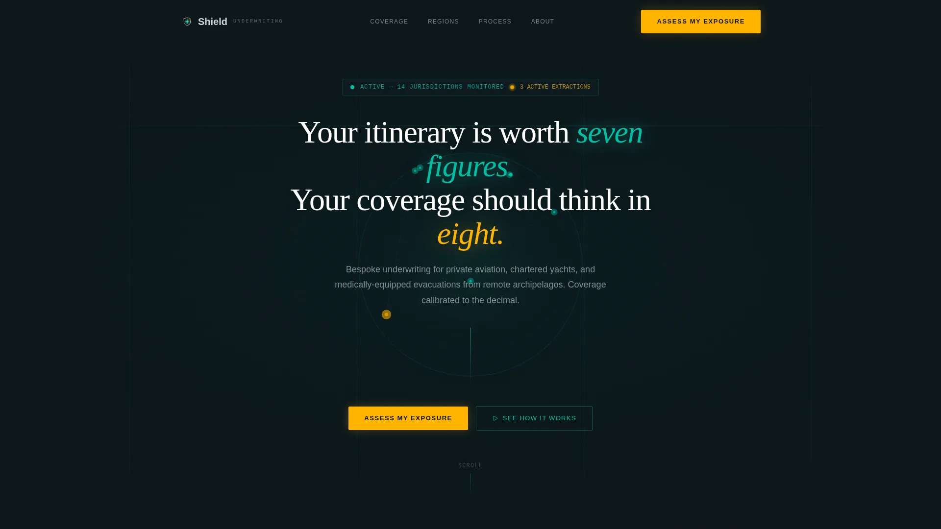
The header opens on a full-bleed near-black canvas. A softly glowing teal wireframe globe rotates at the center, with flight-path arcs tracing between coverage jurisdiction nodes. Amber pinpoints pulse where active claims or evacuations are simulated, creating an immediate sense of live operational awareness.
Zigzag Stats-First Layout
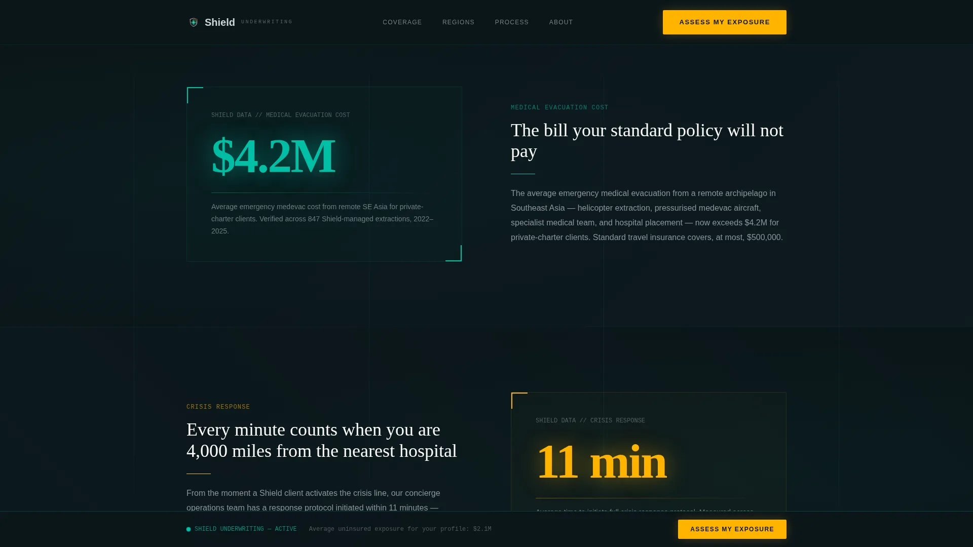
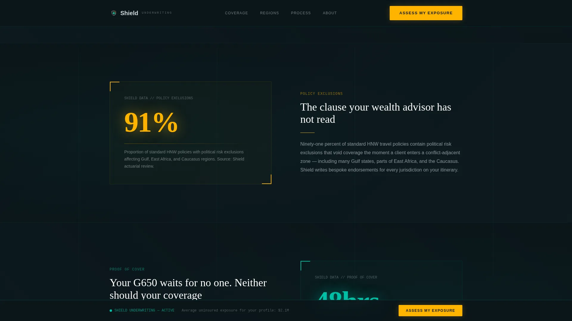
Alternating left-right content blocks open each section with an oversized animated statistic before delivering its context. Examples include a $4.2 million emergency medical evacuation cost and an 11-minute concierge crisis response time. The rhythm builds an actuarial case that feels visceral rather than bureaucratic.
Interactive Coverage Gap Map
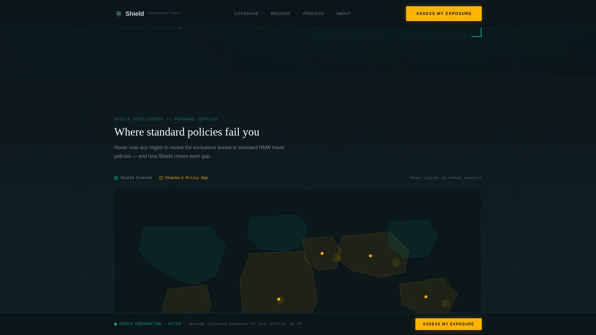
A dark interstitial section features an interactive scalable vector graphic world map. Hovering over regions reveals exclusion gaps found in standard travel policies. Visitors see their own vulnerability mapped visually before the solution is presented, making the coverage conversation concrete and personal.
Five-Step Progressive Assessment Quiz
The quiz opens when a prospect clicks the primary amber call-to-action button labeled "Assess My Exposure." Step one captures trip frequency and destinations via an interactive map selector. Steps two and three collect asset exposure and current coverage data. Step four displays a personalized risk score on a teal radial gauge. Step five collects name, email, and preferred contact window to book a private consultation.
Floating Call-to-Action Bar
After the second zigzag section, the "Assess My Exposure" button pins as a floating bar that stays visible during scroll. This keeps the primary conversion action accessible throughout the entire page without interrupting the reading experience.
Micro-Stat Reward System
Each quiz step rewards completion with a contextual micro-statistic, for example: "Clients like you typically carry $2.1M in uninsured exposure." This mechanism makes the quiz itself the value proposition, so the final contact form feels like a natural next step rather than a cold request.
Page sections overview
| Section | Purpose |
|---|---|
| Hero Globe Header | Establishes premium authority with animated globe, flight arcs, and cinematic headline |
| Zigzag Stat Blocks | Builds actuarial proof through alternating animated stat and context pairings |
| Coverage Gap Map | Reveals regional policy exclusions interactively to surface prospect vulnerability |
| Assessment Quiz Flow | Guides prospects through five steps to generate a personalized risk score |
| Consultation Call to Action | Dark interstitial with floating bar drives private consultation bookings |
| Footer Row | Linear single-row footer with essential links and contact references |
Design & branding system
The visual identity follows a Data Command theme. Think a Bloomberg terminal redesigned by a Swiss watch house: dense with precision information, yet surgically elegant in its layout and spacing.
- Color system uses deep command-screen black (#0B1519) as the base, primary teal (#00BFA6) for accents and card borders, muted platinum (#D0D6DC) for body text and divider lines, and electric amber (#FFB300) reserved exclusively for calls to action and risk-alert highlights
- Typography pairs Fraunces serif display headlines with DM Sans for body copy and interface elements, creating a contrast between editorial authority and functional clarity
- Animations include a canvas-rendered globe, scroll-triggered counter reveals using IntersectionObserver, and CSS keyframe transitions throughout the quiz and map interactions
Mobile & speed optimization
The template is designed desktop-first, reflecting the family office and wealth advisory context where decisions are made on large screens. Full mobile support is included for all sections.
- Interactive components including the quiz, coverage map, and floating call-to-action bar are built as client-side components to keep interactivity smooth across devices
- Static sections use server-rendered markup to reduce load overhead on the heaviest visual sections
- The zigzag layout and radial gauge reflow cleanly at smaller breakpoints without losing visual hierarchy
How this template helps you convert
The conversion architecture in this template is intentional at every step. It does not rely on a single contact form.
- The animated stats and coverage gap map surface a prospect's risk before they are asked to act, so the "Assess My Exposure" call to action arrives at the moment of maximum relevance rather than as a cold opener.
- The five-step quiz collects progressive data while delivering personalized insight at each step, turning the lead capture process into a consultative experience that pre-qualifies the prospect for the private consultation that follows.
Other information about this template
This template is categorized under Finance and Insurance, with a specific focus on the High Net Worth Individual Insurance subcategory and the High Net Worth Individual Travel Insurance niche.
- The intersection match score for this template's niche alignment is 13, indicating a strong fit between the template's design direction and the target market segment
- The template style is Zigzag/Alternating, and the landing page direction is Quiz/Assessment, both of which are defined in the matched intersection row for this configuration
- The header concept is classified as Dark Full-Bleed with Glow, and the creative direction is Stats-First Impact, making this template a strong fit for underwriters who need to demonstrate scale and specificity before asking for contact information
- Localization is set to English with United States Dollar denomination and a global coverage context, suitable for international high net worth individual travel insurance providers
Theme
Data Command
Creative direction
Stats-First Impact
Color system
Teal Catalyst
Style
Zigzag/Alternating
Direction
Quiz/Assessment
Page Sections
Animated Wireframe Globe Hero
Zigzag Stats-first Proof Blocks
Interactive Coverage Gap Map
Five-step Progressive Risk Assessment
Floating Amber Call-to-action Bar
Micro-stat Reward Mechanism
Related questions
Who is this landing page template designed for?
What makes the quiz section different from a standard contact form?
Can I adapt the animated stats to reflect my own figures?
Does this template support mobile users?
What is included in the footer of this template?



